
As of September 2024 the CSV file for the New Zealand data can now be
downloaded from GitHub:
https://
You can download other files from Kirsch's S3 server, but they are not generally required by the scripts I have posted on this page. The total size of the files on the S3 server was about 1.3 GB the last time I checked:
brew install rclone printf %s\\n '[ kirsch] ' type=s3 provider=Other access_ key_ id=C p Q W G b h G X n 5 2 F 3 h S g d q Q secret_ access_ key=b v v i t C h 5 B k y G K 2 v f 3 Z l l F q j o L f T 1 G 3 N g A z e j Q 1 P K endpoint=truenas. skirsch. com: 9003 acl=private>~/. config/ rclone/ rclone. conf rclone sync kirsch:/ data- transparency data- transparency
You can also download the data with Cyberduck:
https://truenas., set "Access Key ID" to
C, set "Secret
Access Key" to
b, and click "Connect".
There's also mirrors for old versions of Kirsch's S3 server here:
https://
Much of my analysis on this page relies on "buckets" files which were generated from the
original version of the CSV file, and which show the number of deaths
and person-days grouped by date, dose number, weeks since vaccination,
and single year of age. In this file people are removed under previous
doses after a new dose: f/
In November 2023, Steve Kirsch published record-level vaccination
data from New Zealand which he said he received from a whistleblower who
worked for the New Zealand Ministry of Health. [https://
The real name of the whistleblower is Barry Young. At first his
LinkedIn profile said that he has worked at Bank of New Zealand from
2010 until the present, and that he only worked at the NZ Ministry of
Health from 2008 to 2010, but later he added a new entry to his profile
which said that in 2018 he started to work again at the Ministry of
Health: [https://
People were doubting if the whistleblower actually worked for the New
Zealand health authorities, but an article about him said that "Te Whatu Ora Health New Zealand is investigating a staff
member accused of spreading Covid-19 misinformation using its
data." [https://
Kirsch's Substack post said that "we were only given 4M of the 12M records in New Zealand" and that "The data from New Zealand is not perfect; it is not a complete sample. For example, for some people, the first record in the database is Dose #3."
Someone from New Zealand who spoke to Barry Young wrote the
following: [https://
During New Zealand's Covid-19 vaccination drive, individuals had a choice of the type of location where they could receive an injection.
These choices were funded via different payment models:
- Bulk-funded providers, including drop-in mass vaccination centres and community mobile vaccination vans, working towards targets.
- Smaller pay-per-dose providers, including chemists, GP clinics, etc.
The payment system data exposed by the whistleblower was the latter of these two options.
Some individuals may have had injections in both settings, which would account for records for some doses and not others.
On the website of the New Zealand Ministry of Health, there is a
PowerPoint presentation about the pay-per-dose system which says: "Price Per Dose (PPD) is a
payment mechanism that automatically processes the vaccination records
on a weekly basis in CIR. Through the Price Per Dose mechanism,
Providers do not need to issue, send or wait for invoices to be
processed in order to be paid." [https://
Kirsch's S3 server has a file called
About the New Zealand files. which provides a bit more
details:
The record level .csv file has 4M rows. All the information is randomized so that the statistics are intact but all the fields of every record have been randomized so it will not match any fields of the original record. If there is a match to someone living, that is simply an unavoidable coincidence.
4,193,438 total database records of people who were vaccinated (dead and alive).
2,215,730 unique people are covered in the database.
37,285 unique people died were reported in the data and summarized in the time-series cohort analysis.
66,005 total records for those who have died (so average of less than 2 vaccination records per dead person)
The data is approximately 33% of all New Zealand vaccination records.
Only people who were vaccinated are included in the data. So you cannot use the unvaccinated as a control group.
There was a disproportionate draw on each dose (i.e., for some doses we got a greater percentage of records than other doses).
This database will not contain all records of every person who has a record, e.g., the first record to appear may be on dose 3.
Unvaccinated people never died because the database only had entries for people who received at least one vaccine.
The database is skewed over time in terms of which reports got into this database. That's why you want to look at the death over time for a given dose and deaths per person year, and do NOT compare absolute death rates in a dose unless you are doing a time series cohort analysis where you are calculating death per person days.
I don't understand how it's possible to randomize all fields while simultaneously keeping the statistics intact like Kirsch wrote, because you would have to sacrifice some fidelity in the statistics even if you only randomized a single field.
When Kirsch did a presentation about the data at MIT, he said: "You get the original data - which we have obfuscated so
we don't get into trouble - it's all HIPAA-compliant - but we preserved
all of the fidelity of the data so that we have shifted things such that
the statistics are identical even though no record matches anything
about any of the people given." [https://
During an interview on InfoWars, Kirsch said: "We
have the original data. It's been anonymized so we don't run into any
privacy issues or HIPAA violations. But it's been anonymized in a way
that we maintain the statistical fidelity of the data. In other words we
time-shifted all of the dates relative to each other, but the dates
relative to each other are the same. We just shifted them slightly in
time so that you can still do the statistical analysis without violating
anyone's privacy." [https://
Kirsch said that each record contained auditing information which
confirmed the authenticity of the data: "Anyone who
claims the NZ data is fraudulent is trying to gaslight you. I've spent
weeks analyzing the data. It's not fraudulent. The NZMH has NEVER said
it was fraudulent. You don't get arrested for exposing data that is not
real. There is auditing information on each record that confirms the
authenticity of the data." [https://
Barry Young's dataset includes data for about two and half years, because the earliest death is on 2021-05-09 and the last death is on 2023-10-27, and the earliest vaccination is on 2021-04-08 and the last vaccination is on 2023-10-20.
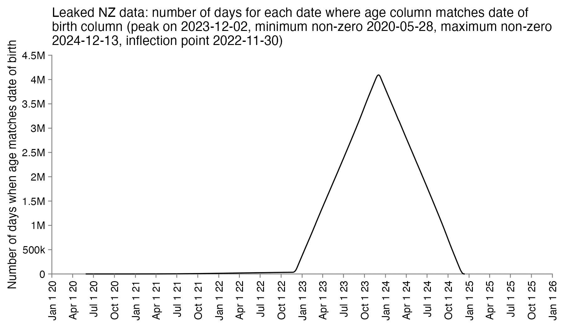
At first I thought that the value of the age column indicated age on the date of vaccination, but the age is always the same in each entry for a patient, so for example the age of patient 1 is listed as 72 on rows for doses given in both 2021 and 2023:
$awk ' NR==1||/^ 1,/ ' nz- record- level- data- 4M- records. csv| csvtk pretty| sed 2d mrn batch_ id dose_ number date_ time_ of_ service date_ of_ death vaccine_ name date_ of_ birth age 1 1 2 07- 24- 2021 Pfizer BioNTech COVID- 19 05- 23- 1951 72 1 1 1 06- 19- 2021 Pfizer BioNTech COVID- 19 05- 23- 1951 72 1 104 5 05- 07- 2023 Pfizer Comirnaty Original/ Omicron BA. 4- 5 15/ 15 mcg 05- 23- 1951 72
So the column for the age probably corresponds to the age of the patient on a certain date. In order to reverse engineer which date it was, I went through each date in the years 2020 to 2025 and I checked how many patients had an age column which matched the date of birth column. I got the highest number of matches for December 2nd 2023, the last date with non-zero matches was December 13th 2024, and the number of matches goes linearly down to almost zero up to November 30th 2022 when there's an inflection point, but after that it takes over a year until the number of matching dates goes down to completely zero in May 2021. So basically the age column seems to correspond to the age around December 2st 2023, and the dates of birth seem to have been shifted by at most around 11 days backwards or forwards:
In an X Space where Kirsch was asked to describe the obfuscation
procedure, he said: "The transformation is very
unlikely to have shifted someone's data by over 30 days. It's very
unlikely to have shifted someone's data by over 10 days." [https://
Later my suspicion was confirmed because Kirsch added a file to his S3 server which explained the obfuscation method:
$cat data- transparency/ Code/ time- series\ analysis/ obfuscation_ algorithm. txt " For each person, a non- zero date offset was chosen from a gaussian distribution with sigma=7 and all of the dates for that record were offset for that same amount, so the differences between dates are identical. " date_ delta = 0 while date_ delta == 0: date_ delta = int( random. normalvariate( 0, 1) * 7) This means that every record was altered. No record was left intact. Every date was time shifted by the same amount. Note: The " Age" field was inserted as a convenience item for use in Excel. Anyone doing serious work on the data should always use the date of birth to compute the exact age at the time of the record.
Kirsch's description says that a random number was chosen "for each person", but it's not clear if different
randoms number may have been used in different lines for the same
person. However as evidence that all the lines of a person were shifted
by the same amount of days, a website about COVID vaccinations in New
Zealand said that the standard gap between the first two Pfizer vaccines
was 3 weeks or more. [https://
>t=as. data. frame( data. table:: fread( " nz- record- level- data- 4M- records. csv")) > for( i in grep( " date", colnames( t))) t[, i] =as. Date( t[, i], "% m-% d-% Y") > me=t[ t$ dose_ number==1, c( 1, 4)]| > merge( t[ t$ dose_ number==2, c( 1, 4)], by=1) > head( sort( table( me[, 3]- me[, 2]), T), 30) 21 42 28 22 43 35 23 49 56 44 27 144609 121862 47806 35671 26362 24864 18890 17422 17251 17244 16413 24 41 25 45 26 29 46 36 34 40 39 15785 15744 14393 14328 13802 13661 12171 11858 11384 11250 10947 48 47 30 38 37 31 32 33 10782 10624 10494 10359 10178 9610 9323 9300
The difference between the age column and the age at vaccination is between 0 and 3 years, and the most common difference is 2 years:
>t=as. data. frame( data. table:: fread( " nz- record- level- data- 4M- records. csv", showProgress=F)) > for( i in grep( " date", colnames( t))) t[, i] =as. Date( t[, i], "% m-% d-% Y") > library( lubridate); table( t$ age- t$ date_ of_ birth%--% t$ date_ time_ of_ service%/% years()) 0 1 2 3 256801 1042553 2571549 322535
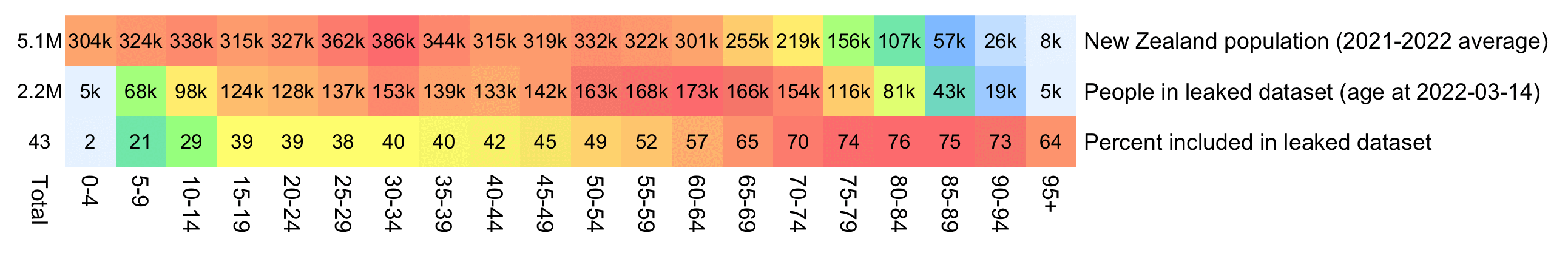
WelcomeTheEagle made this image which appears to show that Young's
dataset includes almost all of the New Zealand population aged 85 and
above: [https://

However WelcomeTheEagle got the age of each person from the value of the age column, which is the age on December 2nd 2023 (or possibly December 1st), which can be up to three years higher than the age of people at the beginning of the dataset in 2021.
The average date of vaccination in the dataset is on March 14th 2022, so when I calculated the age of each person on that date instead, I only got about 73% people included in the age group 90-94:
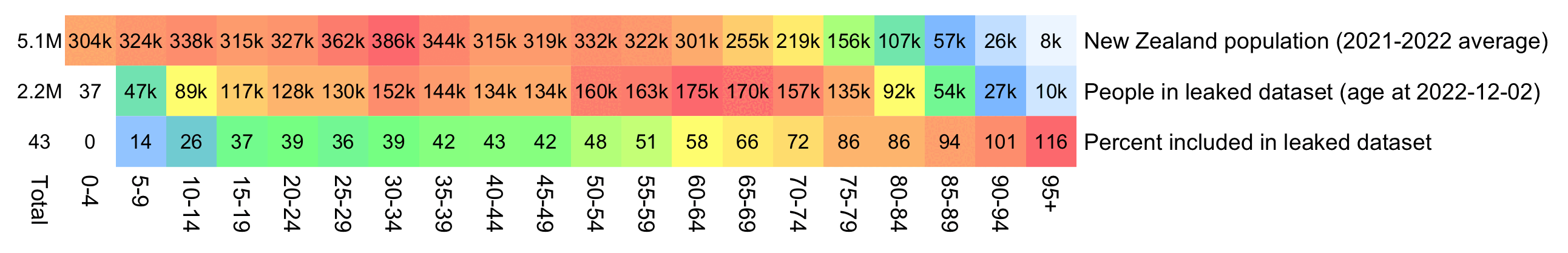
But when I calculated the age on December 2nd 2023, I got over 100% people included in the age groups 90-94 and 95+:
An even more accurate way to calculate the age composition might be to calculate the total person-years within each age group, and to then divide it by the ratio between total person-years and total people (which is about 1.7):
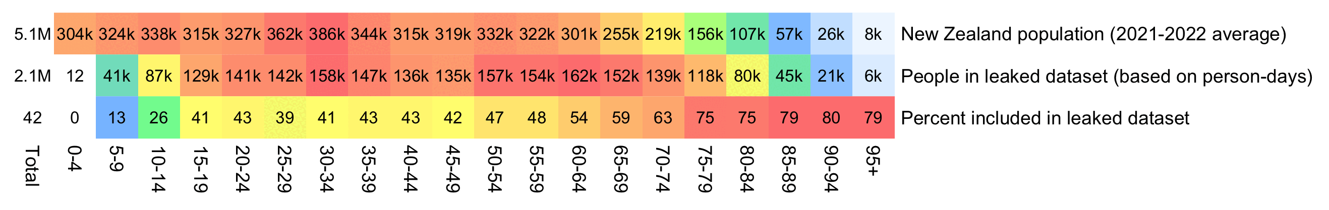
pop=tail(read. csv( " https:// sars2. net/ f/ nz_ infoshare_ population. csv"), 2)[,- 1]| > colMeans() m=data. frame( ' New Zealand population (2021- 2022 average) ' =tapply( pop, 0: 95%/% 5* 5, sum), check. names=F) rownames( m) =paste0( seq( 0, 94, 5), "- ", seq( 4, 94, 5))| > c( " 95+ ") t=as. data. frame( data. table:: fread( " nz- record- level- data- 4M- records. csv")) for( i in grep( " date", colnames( t))) t[, i] =as. Date( t[, i], "% m-% d-% Y") # meandate=mean( #t$ date_ time_ of_ service) # meandate=as. #Date( " 2023- 12- 2") birth=t$ #date_ of_ birth[! duplicated( t$ mrn)] yeardiff=\( #x, y){ x=as. POSIXlt( x); y=as. POSIXlt( y); x$ year- y$ year- pmax( x$ mon< y$ mon, x$ mon==y$ mon& x$ mday< y$ mday)} age=table( #pmax( 0, pmin( yeardiff( meandate, birth), 95)%/% 5* 5)) m=cbind( #m, " People in leaked dataset (age at 2022- 12- 02) " =c( age)) total=colSums( #m) m=cbind( t=t[m, " Percent included in leaked dataset" =m[, 2]/ m[, 1]* 100) order( t$ date_ time_ of_ service),]; t=t[! duplicated( t$ mrn),] meandays=mean( as. numeric( pmin( t$ date_ of_ death, max( t$ date_ of_ death, na. rm=T), na. rm=T)- t$ date_ time_ of_ service)) buck=read. table( " https:// sars2. net/ f/ month_ dose_ week_ single_ age. txt", header=T)| > subset( dose> 0) age=tapply( buck$ alive, pmin( 95, buck$ age)%/% 5* 5, sum)/ meandays m[[ paste0( " People in leaked dataset (based on person- days) ")]] =age m$ " Percent included in leaked dataset" =m[, 2]/ m[, 1]* 100 disp=apply( m, 2,\( x) ifelse( x> 1e3, paste0( round( x/ 1e3), " k"), round( x))) sum=colSums( m) disp=rbind( paste0( round( sum[ 1: 2]/ 1e6, 1), " M")| > c( round( sum[ 2]/ sum[ 1]* 100)), disp) m=rbind( Total=0, apply( m, 2,\( x) x/ max( x))) pheatmap:: pheatmap( t( m), filename=" 1. png", display_ numbers=t( disp), cluster_ rows=F, cluster_ cols=F, legend=F, cellwidth=20, cellheight=20, fontsize=9, fontsize_ number=8, border_ color=NA, number_ color=" black", breaks=seq( 0, 1,, 256), colorRampPalette( colorspace:: hex( colorspace:: HSV( c( 210, 210, 130, 60, 40, 20, 0), c( 0,. 5,. 5,. 5,. 5,. 5,. 5), 1)))( 256))
In the old age groups which account for most deaths, there's a decreasing trend in crude mortality rate in New Zealand:
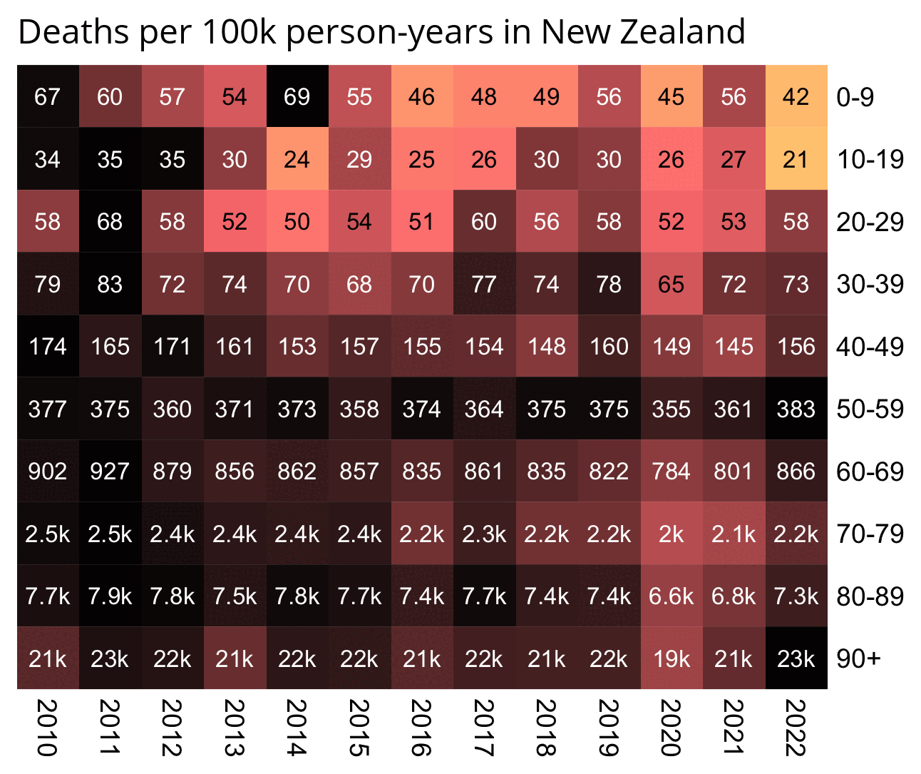
pop=read.csv( " https:// sars2. net/ f/ nz_ infoshare_ population. csv")| > subset( year> =2010) death=read. csv( " https:// sars2. net/ f/ nz_ infoshare_ deaths. csv")| > subset( year> =2010) death=cbind( death[, 1: 96,], rowSums( death[, 97: 102])) d=data. frame( year=pop[, 1], pop=unlist( pop[,- 1]), death=unlist( death[,- 1]), age=rep( 0: 95, each=nrow( pop))) a=aggregate( d[, 2: 3], list( year=d$ year, age=d$ age%/% 10* 10), sum) a$ cmr=a$ death/ a$ pop* 1e5 m=xtabs( cmr~ age+ year, a) rownames( m) =c( head( paste0( rownames( m), "- ", as. numeric( rownames( m))+ 9),- 1), " 90+ ") kimi=\( x){ e=floor( log10( ifelse( x==0, 1, abs( x)))); e2=pmax( e, 0)%/% 3+ 1; x[] =ifelse( abs( x) < 1, x, paste0( round( x/ 1e3^( e2- 1), ifelse( e%% 3==0, 1, 0)), c( " ", " k", " M", " B", " T")[ e2])); x} disp=kimi( m) m=t( apply( m, 1,\( i) i/ max( i))) pheatmap:: pheatmap( m, filename=" 0. png", display_ numbers=disp, cluster_ rows=F, cluster_ cols=F, legend=F, cellwidth=21, cellheight=21, fontsize=9, fontsize_ number=8, border_ color=NA, na_ col=" white", number_ color=ifelse( m>. 8* max( m, na. rm=T), " white", " black"), breaks=seq( 0, max( m, na. rm=T),, 256), colorRampPalette( colorspace:: hex( colorspace:: HSV( c( 210, 210, 210, 130, 60, 30, 0, 0, 0), c( 0,. 25, rep(. 5, 7)), c( rep( 1, 7),. 5, 0))))( 256)) system( " mogrify -trim 0. png; convert 0. png -bordercolor white -gravity northwest -splice x14 -size `identify -format %w 0. png` x -pointsize 48 caption: ' Deaths per 100k person- years in New Zealand' +swap -append -trim -border 24 +repage 1. png") system( " qlmanage -p 1. png& >/ dev/ null")
There are several anomalies in the CSV file published by Kirsch, but they may have been caused by the procedure that was used to obfuscate the data, or they may have been caused by errors in manual data entry.
There are 47 combinations of patient ID and dose number which are listed twice in the CSV file. For example patient 152535 got the first dose twice the same day, with one entry for AstraZeneca and another entry for Pfizer:
$cut -d, -f1, 3 nz- record- level- data- 4M- records. csv| awk '{++ a[$ 0]} END{ for( i in a)++ b[ a[ i]]; for( i in b) print b[ i], i} ' 4193345 1 47 2 $ cut -d, -f1, 3 nz- record- level- data- 4M- records. csv| awk ' a[$ 0]++ '| sed 1q # ID of first patient which received the same dose number twice 152535,1 $ awk -F, ' NR==1||$ 1==152535' nz- record- level- data- 4M- records. csv mrn, batch_ id, dose_ number, date_ time_ of_ service, date_ of_ death, vaccine_ name, date_ of_ birth, age 152535, 35, 1, 12- 07- 2021,, AstraZeneca, 08- 02- 1976, 47 152535, 36, 1, 12- 07- 2021,, Pfizer BioNTech COVID- 19, 08- 02- 1976, 47 152535, 51, 2, 01- 28- 2022,, Pfizer BioNTech COVID- 19, 08- 02- 1976, 47
There are 4 patients whose date of vaccination is later than the date of death:
>t=read. csv( " nz- record- level- data- 4M- records. csv") > t2=t[ t$ date_ of_ death! =" ",] > t2[ as. Date( t2$ date_ time_ of_ service, "% m-% d-% Y") > as. Date( t2$ date_ of_ death, "% m-% d-% Y"),]| > print. data. frame( row. names=F) mrn batch_ id dose_ number date_ time_ of_ service date_ of_ death 48496 101 5 04- 10- 2023 03- 19- 2023 232769 104 5 05- 16- 2023 05- 14- 2023 1300857 63 4 07- 14- 2022 03- 30- 2022 1764231 60 4 06- 28- 2022 06- 25- 2022 vaccine_ name date_ of_ birth age Pfizer Comirnaty Original/ Omicron BA. 4- 5 15/ 15 mcg 10- 15- 1937 85 Pfizer Comirnaty Original/ Omicron BA. 4- 5 15/ 15 mcg 01- 07- 1954 69 Pfizer BioNTech COVID- 19 12- 28- 1955 66 Pfizer BioNTech COVID- 19 05- 08- 1931 91
There are also patients who received the first dose later than the second dose:
$awk ' NR==1||/^ 928462,/ ' nz- record- level- data- 4M- records. csv mrn, batch_ id, dose_ number, date_ time_ of_ service, date_ of_ death, vaccine_ name, date_ of_ birth, age 928462, 22, 1, 10- 11- 2021,, Pfizer BioNTech COVID- 19, 09- 11- 1972, 51 928462, 22, 2, 08- 31- 2021,, Pfizer BioNTech COVID- 19, 09- 11- 1972, 51 928462, 49, 3, 02- 03- 2022,, Pfizer BioNTech COVID- 19, 09- 11- 1972, 51
The maximum number of vaccination entries per patient ID is 8. There are a couple of lines where the dose number is much higher than 8, but some of them might errors in data entry, because there is even one patient whose highest dose number is 32:
$awk -F, ' NR> 1{ a[$ 1]++} END{ for( i in a) b[ a[ i]]++; for( i in b) print i, b[ i]} ' nz- record- level- data- 4M- records. csv| sort -n # number of patients ID with each number of entries 1 910958 2 784859 3 401014 4 85288 5 33099 6 505 7 5 8 1 $awk -F, ' NR> 1{ a[$ 3]++} END{ for( i in a) print i, a[ i]} ' nz- record- level- data- 4M- records. csv| sort -n # count of entries for each dose number 1 966994 2 1034807 3 1053284 4 762241 5 369371 6 6633 7 76 8 20 9 1 10 1 11 1 12 3 16 1 20 1 24 1 28 1 29 1 32 1
There are 581 people who have different birthdays on different lines, but it might be an artifact of the obfuscation procedure where the dates of birth and vaccination were shifted by a random number of days (even though from Kirsch's description of the procedure, it seemed that all dates of the same person were always shifted by the same amount of days):
$cut -d, -f1, 7 nz- record- level- data- 4M- records. csv| awk '! a[$ 0]++ '| awk -F, '++ a[$ 1] ==2'| wc -l 581 $ awk ' NR==1||/^ 292629,/ ' nz- record- level- data- 4M- records. csv mrn, batch_ id, dose_ number, date_ time_ of_ service, date_ of_ death, vaccine_ name, date_ of_ birth, age 292629, 13, 1, 09- 04- 2021,, Pfizer BioNTech COVID- 19, 08- 30- 1975, 48 292629, 16, 2, 09- 25- 2021,, Pfizer BioNTech COVID- 19, 09- 29- 1975, 48
A note in the file Medicare- on Kirsch's S3
server also said that "A small portion of the
Medicare records have people who got vaccinated AFTER they died. These
records have been deleted." So errors like this also seem to
exist in other datasets.
Barry Young's presentation included the table below which shows the
ten batches with the highest percentage of deaths per dose: [https://

I noticed that the numbers in Young's table don't match the CSV file published by Kirsch, because for example batch 1 has a total of 711 doses in the table above but 4,386 doses in the CSV file. In the table above there's 5 different batches which have over 10% deaths, but in the CSV file there's only one batch with over 10% deaths:
$awk -F, ' NR> 1{ n[$ 2]++; n2[$ 2][$ 1]}$ 5{ d[$ 2]++; d2[$ 2][$ 1]} END{ for( i in d) print i FS n[ i] FS d[ i] FS 100* d[ i]/ n[ i] FS length( n2[ i]) FS length( d2[ i]) FS 100* length( d2[ i])/ length( n2[ i])} ' nz- record- level- data- 4M- records. csv| sort -t, -rnk4|( echo batch, doses_ given, doses_ leading_ to_ deaths, doses_ leading_ to_ deaths_ pct, persons, deaths, deaths_ per_ person_ pct; head)| column -ts, batch doses doses_ leading_ to_ death doses_ leading_ to_ death_ pct persons deaths deaths_ per_ person_ pct 1 4386 674 15. 3671 2979 375 12. 5881 3 6213 317 5. 10221 4875 264 5. 41538 8 3986 203 5. 09282 3774 193 5. 11394 2 16627 754 4. 53479 13518 596 4. 40894 7 1288 56 4. 34783 1232 51 4. 13961 72 10624 356 3. 3509 10622 356 3. 35153 4 7111 237 3. 33286 7015 233 3. 32145 71 20325 620 3. 05043 20276 619 3. 05287 35 103143 3141 3. 04529 102759 3129 3. 04499 32 42178 1281 3. 03713 41866 1277 3. 05021
Some people received two doses from the same batch, so they are counted twice in columns 2-4 above but only once in columns 5-7, so for example there are 375 people who died after receiving batch 1, but many of them received two doses from batch 1 so there are 674 doses in batch 1 which led to a death. There are also a few patients who received 3 or 4 doses from the same batch but no patients who received 5 or more doses from the same batch.
Uncle John Returns figured out that people who later went on to have
a subsequent dose were excluded from Young's table. [https://
>t=read. csv( " nz- record- level- data- 4M- records. csv") > t2=t > for( i in grep( " date", colnames( t2))) t2[, i] =as. Date( t2[, i], "% m-% d-% Y") > t2=t2[ rev( order( t2$ date_ time_ of_ service)),] > t2=t2[! duplicated( t2$ mrn),] > d=as. data. frame( table( batch=t2$ batch_ id)) > colnames( d)[ 2] =" doses" > d$ deaths=table( factor( t2$ batch_ id[! is. na( t2$ date_ of_ death)], d$ batch)) > d$ pct=100* d$ deaths/ d$ doses > d=d[ order(- d$ pct),] > head( d, 10)| > print. data. frame( row. names=F) batch doses deaths pct 1 711 152 21. 378340 8 221 38 17. 194570 3 310 48 15. 483871 4 364 37 10. 164835 6 1006 102 10. 139165 2 1018 99 9. 724951 7 38 3 7. 894737 72 5882 280 4. 760286 62 18173 834 4. 589226 71 11019 504 4. 573918
However Young's method exaggerates the percentage of deaths in the early batches, because a common reason why some person would only get a vaccine from batch 1 but not subsequent batches was that the person died before they could get more vaccine doses. And in Young's table, the seven batches with the highest percentage of deaths were all early batches with an ID below 10. It would probably be more accurate to use a "bucket" system where you would calculate deaths per person-years, and where you would include people who later got a dose from another batch under the person-years of the earlier batch until they got the next batch.
In his presentation Barry Young pointed out that in the 2010s, New Zealand had only a handful of days which had more than 120 deaths, such as during the Christchurch earthquake in 2011, but in 2021 and 2022 after COVID vaccines had been rolled out, there was a much higher number of days which had more than 120 deaths:

However according to the Short-Term Mortality Fluctuations dataset, the average number of deaths per day in New Zealand increased from about 83 in 2011 to about 94 in 2019:
>t=read. csv( " https:// www. mortality. org/ File/ GetDocument/ Public/ STMF/ Outputs/ NZL_ NPstmfout. csv") > t2=t[ t$ Sex==" b" & t$ Year> =2011,] > round( tapply( t2$ Total, t2$ Year, mean)/ 7, 1) 2011 2012 2013 2014 2015 2016 2017 2018 2019 2020 2021 2022 2023 82. 9 82. 3 80. 7 85. 0 86. 8 85. 6 92. 0 90. 8 93. 6 89. 5 95. 6 105. 7 103. 3
So therefore it would make more sense to use the linear trend in
deaths before COVID as the baseline, and to then count how many days
have a number of deaths that's more than a given threshold above the
baseline. [https://
>isoweek=\( year, week, weekday=1){ d=as. Date( paste0( year, "- 1- 4")); d-( as. integer( format( d, "% w"))+ 6)%% 7- 1+ 7*( week- 1)+ weekday} > xy=data. frame( x=isoweek( t2$ Year, t2$ Week, 4), y=t2$ Total) > past=xy$ x< as. Date( " 2020- 1- 1") > model=predict( lm( y~ x, xy[ past,]), xy) > diff=xy$ y- model > dates=xy$ x[ diff/ sd( diff[ past]) > =2] > dates [1] " 2011- 02- 24" " 2011- 08- 18" " 2011- 09- 08" " 2012- 07- 12" " 2012- 07- 19" " 2015- 07- 30" " 2015- 08- 06" [8] " 2015- 08- 13" " 2017- 07- 20" " 2017- 07- 27" " 2017- 08- 03" " 2017- 08- 10" " 2019- 07- 11" " 2021- 08- 12" [ 15] " 2022- 05- 12" " 2022- 05- 26" " 2022- 06- 16" " 2022- 06- 23" " 2022- 06- 30" " 2022- 07- 07" " 2022- 07- 14" [ 22] " 2022- 07- 21" " 2022- 07- 28" " 2022- 08- 04" " 2022- 08- 18" " 2023- 08- 24" > table( factor( as. numeric( substr( dates, 1, 4)), 2011: 2023)) 2011 2012 2013 2014 2015 2016 2017 2018 2019 2020 2021 2022 2023 3 2 0 0 3 0 4 0 1 0 1 11 1
Barry Young's presentation included this table which showed the
vaccination sites with the highest percentage of deaths per dose: [https://

The vaccination site on the first row of the table is called "Te Hopai Home & Hospital", which has 191 vaccinations and 61 deaths which results in ratio of about 32% deaths per vaccination. I don't know if the number of vaccinations refers to the number of vaccine doses given or the number of vaccinated persons, or I don't know if Young excluded people who later went on to get subsequent vaccine doses from his table.
But in any case, The Hopai Home & Hospital is a nursing home.
[https://
It might make more sense to calculate an age-standardized mortality rate per vaccination site, but the files published by Kirsch don't include data about the vaccination sites. Different sites are also going to have different average dates of vaccination, and people who were vaccinated in 2021 have had more time to die since vaccination than people who were vaccinated in 2023.
In the CSV file that was published by Kirsch, there are only 7 records where the date of death is the same as the date of vaccination, so that the time from vaccination to death was zero days. And there's also a low number of records where the date of death is within a week from a vaccination, which might be explained by the healthy vaccinee effect if people who are at immediate risk of death don't get vaccinated:
>t=read. csv( " nz- record- level- data- 4M- records. csv") > t2=t[ t$ date_ of_ death! =" ",] > ta=table( as. Date( t2$ date_ of_ death, "% m-% d-% Y")- as. Date( t2$ date_ time_ of_ service, "% m-% d-% Y")) > head( ta, 100) - 106 -22 -3 -2 0 1 2 3 4 5 6 7 8 9 10 11 12 13 14 15 1 1 1 1 7 46 40 55 74 59 79 70 78 74 80 89 98 82 91 86 16 17 18 19 20 21 22 23 24 25 26 27 28 29 30 31 32 33 34 35 100 83 89 96 98 106 122 92 96 99 98 115 83 105 109 92 123 104 118 102 36 37 38 39 40 41 42 43 44 45 46 47 48 49 50 51 52 53 54 55 116 89 108 122 103 107 110 110 125 109 114 99 111 117 119 110 109 115 113 126 56 57 58 59 60 61 62 63 64 65 66 67 68 69 70 71 72 73 74 75 126 122 113 119 118 114 115 102 140 138 137 116 140 112 131 118 110 135 113 124 76 77 78 79 80 81 82 83 84 85 86 87 88 89 90 91 92 93 94 95 122 122 124 116 133 127 114 110 132 142 109 130 134 127 124 127 142 133 134 138
There's 4 records where the date of death is earlier than the date of vaccination, but they may be the result of errors in data entry. The most common durations from vaccination to death are 100 and 170 days which are on shared first place:
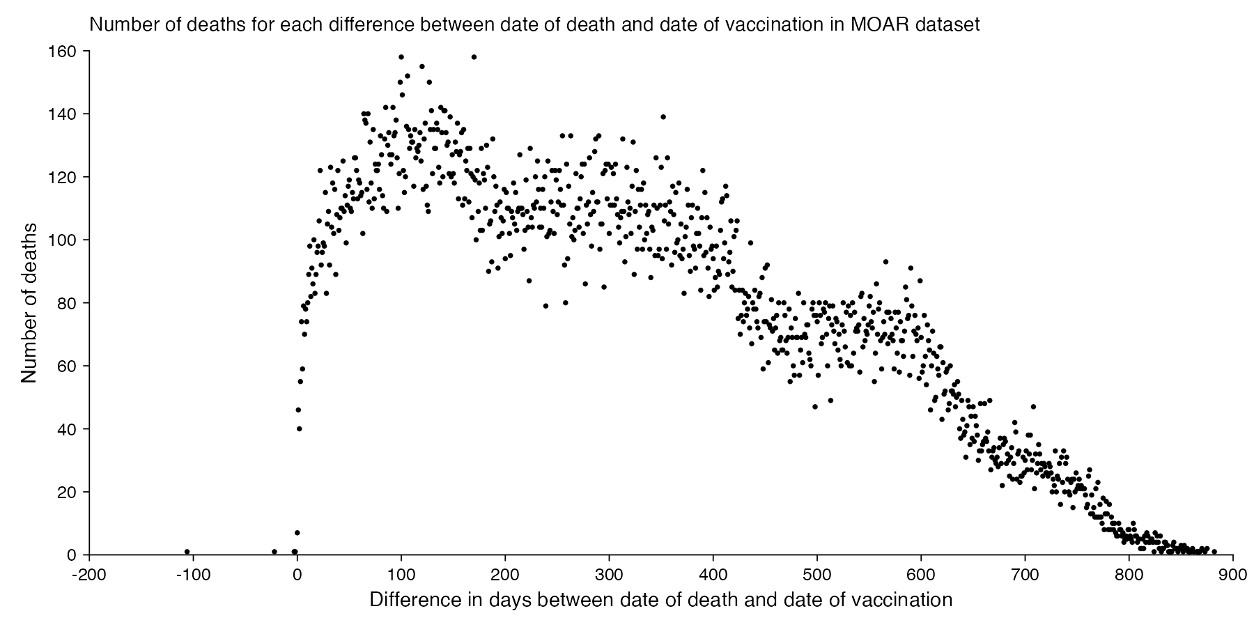
It seems unusual that there were only 7 deaths which occurred on the same day as a vaccination. In 2021 to 2023, the average number of deaths per day in New Zealand was about 101, and even if Young's dataset would only include about a third of all vaccination records, a third of 101 would still be about 34. Even though I guess if people got vaccinated during the working day, then the average time of day when people got vaccinated might be after midday, and if someone died at 4 AM then they probably weren't vaccinated the same day. And the dataset is also missing deaths among unvaccinated people.
The earliest date of vaccination in the dataset is on April 18th 2021, and the number of missing vaccination doses is disproportionately high in the first half of 2021. The last date of death is on October 27th 2023. So in the histogram above, the number of deaths tapers off at the end of the x-axis and there is only a small number of deaths that occurred more than 800 days after a vaccination, but that's because the dataset only includes a small number of people who were vaccinated early enough that it was possible for them to die more than 800 days from the vaccination.
R code:
library(ggplot2) t=read. csv( " nz- record- level- data- 4M- records. csv") t2=t[ t$ date_ of_ death! =" ",] ta=table( as. Date( t2$ date_ of_ death, "% m-% d-% Y")- as. Date( t2$ date_ time_ of_ service, "% m-% d-% Y")) xy=data. frame( x=as. numeric( names( ta)), y=as. numeric( ta)) candidates=c( sapply( c( 1, 2, 5),\( x) x* 10^ c(- 10: 10))) xstep=candidates[ which. min( abs( candidates- max( xy$ x)/ 11))] ystep=candidates[ which. min( abs( candidates- max( xy$ y)/ 6))] xstart=xstep* floor( min( xy$ x)/ xstep) xend=xstep* ceiling( max( xy$ x)/ xstep) ystart=ystep* floor( min( xy$ y)/ ystep) yend=ystep* ceiling( max( xy$ y)/ ystep) xbreak=seq( xstart, xend, xstep) ybreak=seq( ystart, yend, ystep) ggplot( xy, aes( x, y))+ geom_ hline( yintercept=ystart, color=" black", linewidth=. 2, lineend=" square")+ geom_ vline( xintercept=xstart, color=" black", linewidth=. 2, lineend=" square")+ geom_ point( size=. 2)+ scale_ x_ continuous( limits=c( xstart, xend), breaks=xbreak, expand=c( 0, 0))+ scale_ y_ continuous( limits=c( ystart, yend), breaks=ybreak, expand=c( 0, 0))+ coord_ cartesian( clip=" off")+ labs( x=" Difference in days between date of death and date of vaccination", y=" Number of deaths", title=" Number of deaths for each difference between date of death and date of vaccination in MOAR dataset")+ theme( axis. text=element_ text( size=6, color=" black"), axis. ticks=element_ line( linewidth=. 2, color=" black"), axis. ticks. length=unit(. 15, " lines"), axis. title=element_ text( size=7), legend. position=" none", panel. background=element_ rect( fill=" white"), panel. grid=element_ blank(), plot. background=element_ rect( fill=" white"), plot. margin=margin(. 4,. 5,. 4,. 5, " lines"), plot. subtitle=element_ text( size=6), plot. title=element_ text( size=6. 8) ) ggsave( " 1. png", width=6, height=3)
The number of deaths peaks at about 100 days after vaccination when all doses are aggregated together, but the number of deaths peaks at about 300 days for the first two doses, and the first two doses are underrepresented in the dataset. The number of deaths peaks at about 100 days for the fifth dose, after which it falls to zero at around 200 days, because there were almost no fifth doses given before March 2023 which is about 200 days before the end of the data, but if the data extended further into the future, then the peak in deaths after the fifth dose might occur later. The fifth dose overrepresented in Young's dataset relative to earlier doses, because the proportion of missing doses is lower for newer doses and higher for earlier doses, but if there would be no missing doses in the dataset, then the peak in deaths for all doses aggregated together might occur more than 100 days after vaccination:
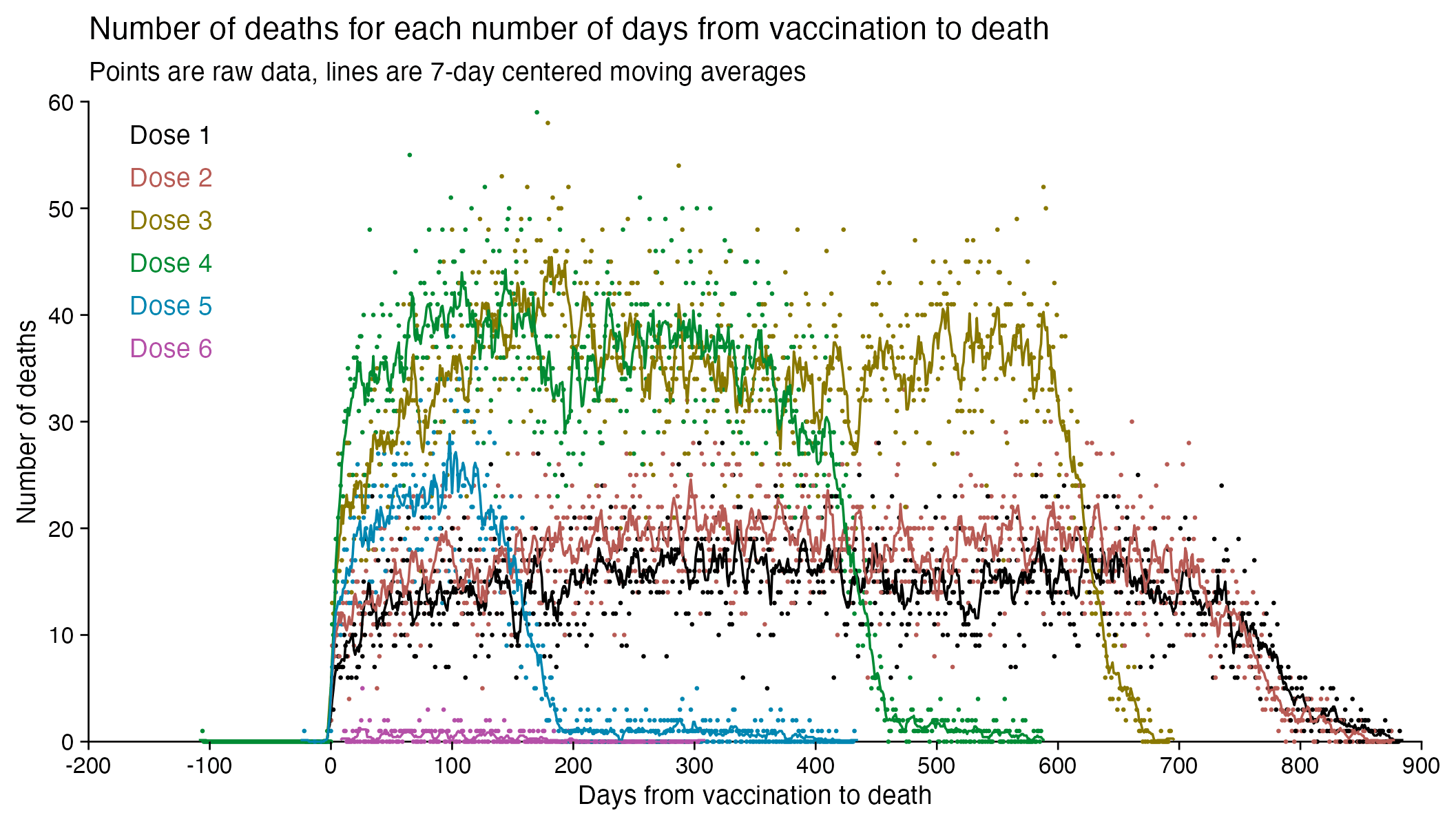
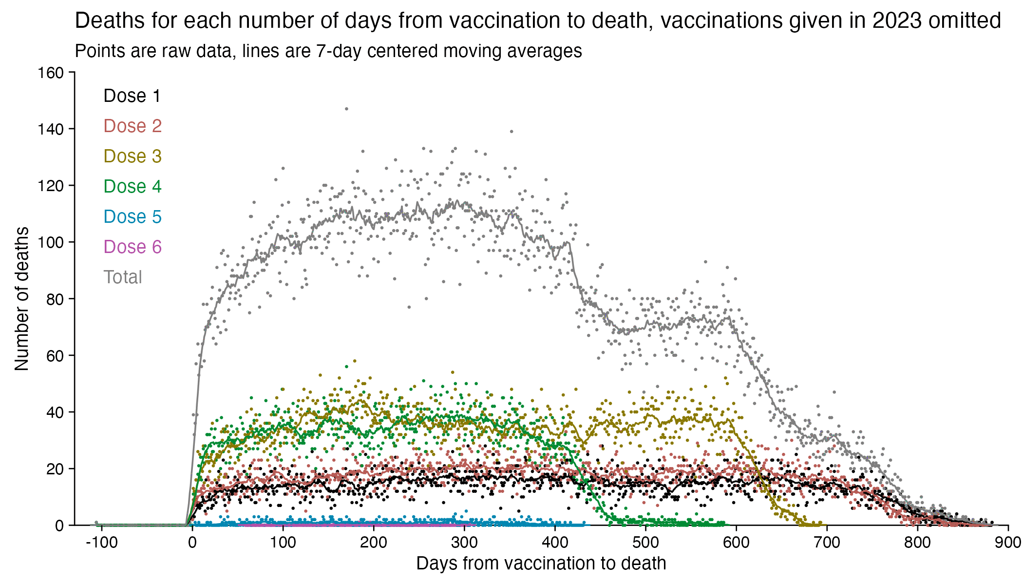
In fact if you simply omit all vaccine doses given in 2023, then almost all fifth doses are omitted, so the peak in deaths for all doses aggregated together is about 300 days after vaccination:
In the plots above I included all doses a person received, but if I would've only included the last dose before death, then the average time from vaccination until death would've been lower.
In the plot below I included vaccinations which were given at least 51 weeks before the last death in the dataset, and I only included deaths that happened within 51 weeks from vaccination, so now the number of deaths no longer tapers off at the end of the x-axis:
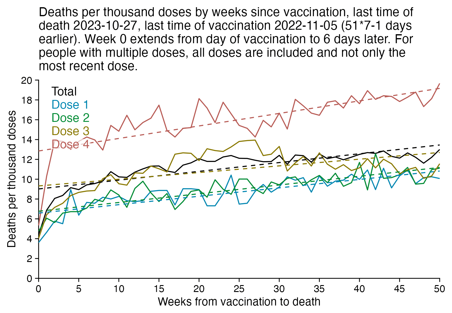
In the plot above there's a period around weeks 15-30 where dose 3 is fairly far above the trend line, which may have been caused by the wave of COVID deaths in 2022, because most third doses were given around November 2021 to March 2022. But afterwards the line for dose 3 goes below the trend line, which might be because of a pull forward effect or because there was a period of low overall mortality in late 2022.
I'm not sure why there the plot above has an increasing trend in deaths over time, but there's a couple of reasons I can think:
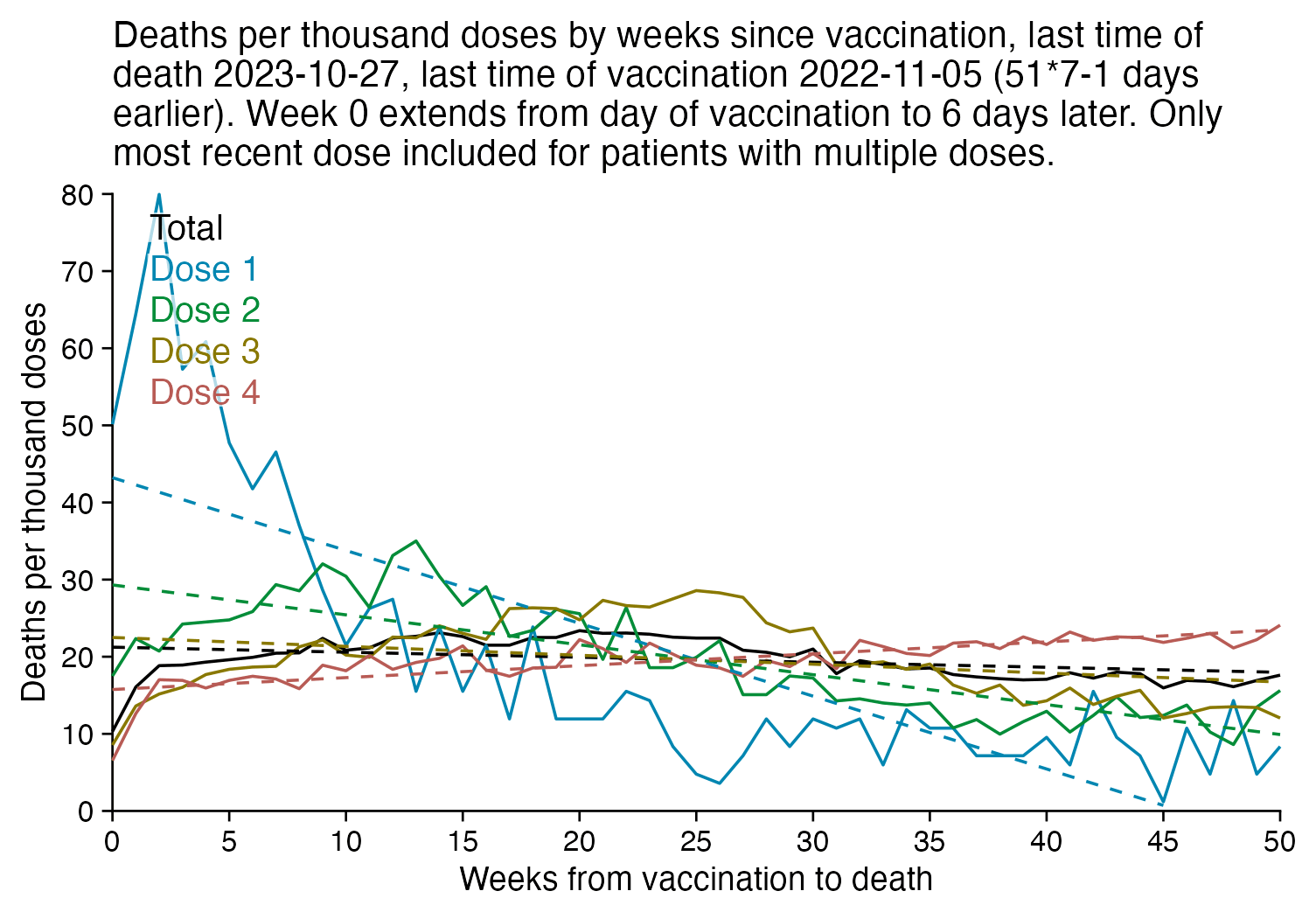
The plot below is otherwise the same as my previous plot but I only included the most recent dose listed for each person. Now dose 1 includes atypical people who didn't get a subsequent dose after the first dose, which is commonly because the people died before they could get further shots, so dose 1 has a large number of deaths for the first few weeks after vaccination:
R code:
library(ggplot2) t=as. data. frame( data. table:: fread( " nz- record- level- data- 4M- records. csv")) # this is faster than `read. for(csv` i in grep( " date", colnames( t))) t[, i] =as. Date( t[, i], "% m-% d-% Y") weeks=51 date1=max( t$ date_ of_ death, na. rm=T) date2=date1- weeks* 7+ 1 t=t[ t$ date_ time_ of_ service< =date2,] t=t[ t$ date_ time_ of_ service< =t$ date_ of_ death,] t=t[ t$ dose_ number< =4,] doses=table( t$ dose_ number) t=t[ t$ date_ of_ death- t$ date_ time_ of_ service< weeks* 7,] # t=t[ #rev( order( t$ date_ time_ of_ service)),] t=t[! t=t[!duplicated( t$ mrn),] is. na( t$ date_ of_ death),] ta=as. data. frame( table( floor(( t$ date_ of_ death- t$ date_ time_ of_ service)/ 7), t$ dose_ number)) xy=data. frame( x=as. numeric( levels( ta$ Var1)), y=c( ta$ Freq/ doses[ ta$ Var2]), z=paste0( " Dose ", ta$ Var2)) tap=tapply( ta$ Freq, ta$ Var1, sum) xy=rbind( data. frame( x=as. numeric( names( tap)), y=tap/ sum( doses), z=" Total"), xy) xy$ y=1e3* xy$ y xy$ z=factor( xy$ z, unique( xy$ z)) xy$ a=split( xy, xy$ z)| > lapply(\( i) lm( y~ x, i)| > predict( i))| > unlist() xstart=0 xend=weeks- 1 xstep=5 candidates=c( sapply( c( 1, 2, 5),\( x) x* 10^ c(- 10: 10))) ystep=candidates[ which. min( abs( candidates- max( xy$ y)/ 6))] ystart=0 yend=ystep* ceiling( max( xy$ y)/ ystep) xbreak=seq( xstart, xend, xstep) ybreak=seq( ystart, yend, ystep) labels=data. frame( x=xstart+. 03*( xend- xstart), y=seq(. 97* yend,,- yend/ 15, nlevels( xy$ z)), label=levels( xy$ z)) color=c( " black", hcl( c( 210, 120, 60, 0, 300)+ 15, 70, 50)) ggplot( xy, aes( x, y))+ geom_ hline( yintercept=ystart, color=" black", linewidth=. 3, lineend=" square")+ geom_ vline( xintercept=xstart, color=" black",