Czech record-level mortality data by vaccination status (part 2) - sars2.net

Links to other parts: czech.html, czech3.html, czech4.html.

Contents

Hospitalizations peaked in 2022 in the youngest age groups

The Czech Ministry of Health has published data for COVID deaths and hospitalizations by age: https://onemocneni-aktualne.mzcr.cz/api/v2/covid-19. The youngest age groups don't have enough COVID deaths to clearly see which wave the deaths were the highest, but there's a much bigger sample size for hospitalizations. In ages 0-11, 12-17, and 18-29, the highest peak in COVID hospitalizations was in January to February 2022, which might be because the youngest age groups were less likely to be vaccinated in 2022 than older age groups (R code: czech.html#Daily_deaths_and_vaccine_doses_by_age_group):

In January 2022 the percentage of vaccinated people was about 3% in ages 0-11 and about 43% in ages 12-15:

> b=fread("http://sars2.net/f/czbucketskeep.csv.gz")[dose<=1]
> agecut=\(x,y)cut(pmax(x,0),c(y,Inf),paste0(y,c(paste0("-",y[-1]-1),"+")),T,F)
> ages=c(0,12,16,18,30,40,60,85)
> d=b[month=="2022-01",.(alive=sum(alive)),.(age=agecut(age,ages),dose)]
> d[,.(vaxpct=round(sum(alive[dose==1])/sum(alive)*100)),age]|>print(r=F)
   age vaxpct
  0-11      3
 12-15     43
 16-17     62
 18-29     68
 30-39     64
 40-59     74
 60-84     85
   85+     82

In the United States the COVID deaths also peaked progressively later in progressively younger age groups, so COVID deaths peaked in December 2020 or January 2021 in the oldest age groups, in August or September 2021 in intermediate age groups, and in January 2022 in the youngest age groups:
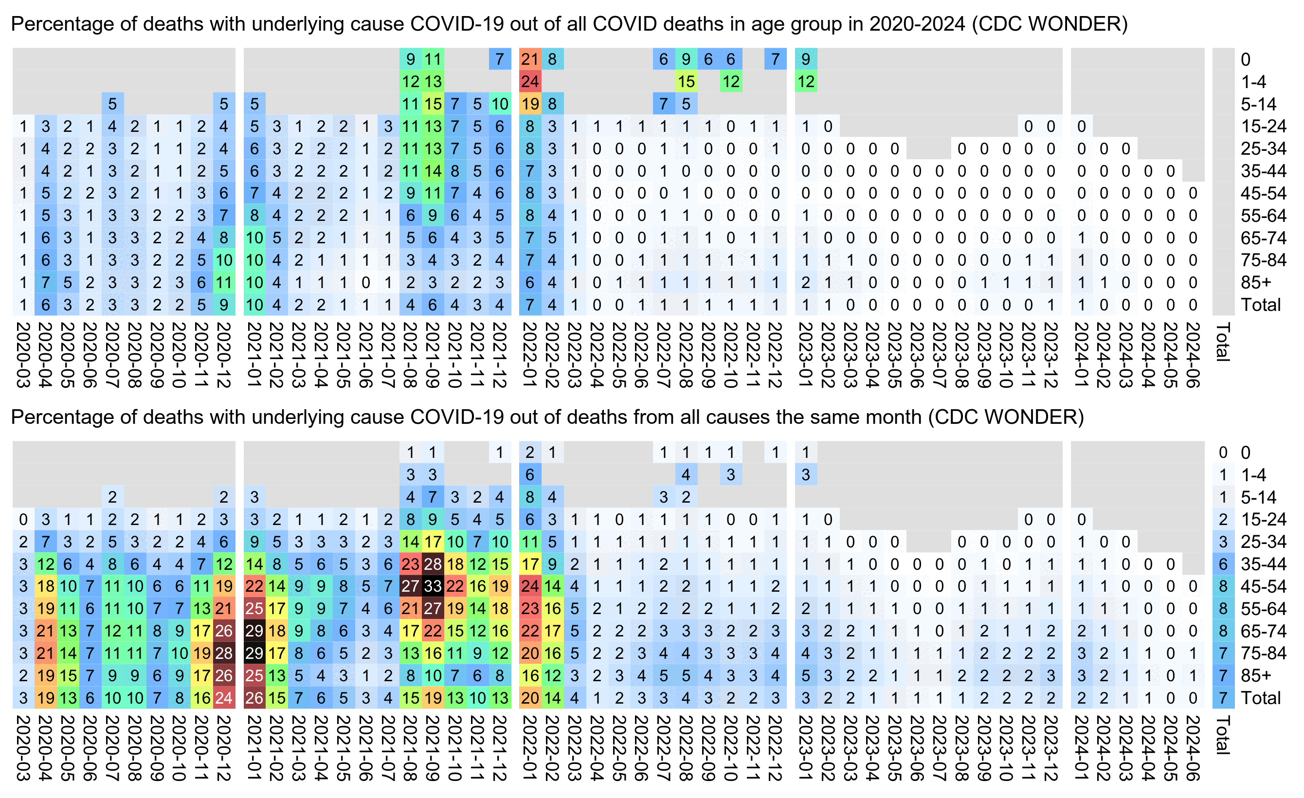
t=fread("http://sars2.net/f/wondercovidvsall.csv")[date>="2020-03"]
t[,age:=factor(age,unique(age)[order(as.numeric(unique(sub("[-+].*","",age))))])]

covidall=c(174,84,218,2375,10270,26510,64828,144336,231546,265489,267028)
t=rbind(t,t[,.(all=sum(all,na.rm=T),date="Total"),age][,covid:=covidall[age]])
#t=rbind(t,t[,.(covid=sum(covid,na.rm=T),all=sum(all,na.rm=T),date="Total"),age])
t=rbind(t,t[,.(covid=sum(covid,na.rm=T),all=sum(all,na.rm=T),age="Total"),date])

m=tapply(t$covid,t[,2:1],c);m=m/m[,ncol(m)]*100;m[,ncol(m)]=NA
m2=tapply(t$covid/t$all*100,t[,2:1],c)

maxcolor=30
pal=hsv(c(210,210,210,160,110,60,30,0,0,0)/360,c(0,.25,rep(.5,8)),c(rep(1,8),.5,0))
gap=c(seq(10,ncol(m),12),ncol(m)-1)

pheatmap::pheatmap(m,filename="i1.png",display_numbers=ifelse(is.na(m),"",round(m)),gaps_col=gap,
  cluster_rows=F,cluster_cols=F,legend=F,cellwidth=11,cellheight=11,fontsize=9,fontsize_number=8,
  border_color=NA,na_col="gray90",
  number_color=ifelse(m>maxcolor*.8&!is.na(m),"white","black"),
  breaks=seq(0,maxcolor,,256),colorRampPalette(pal)(256))

pheatmap::pheatmap(m2,filename="i2.png",display_numbers=ifelse(is.na(m2),"",round(m2)),gaps_col=gap,
  cluster_rows=F,cluster_cols=F,legend=F,cellwidth=11,cellheight=11,fontsize=9,fontsize_number=8,
  border_color=NA,na_col="gray90",
  number_color=ifelse(m2>maxcolor*.8&!is.na(m2),"white","black"),
  breaks=seq(0,maxcolor,,256),colorRampPalette(pal)(256))

system("w=`identify -format %w i1.png`;pad=44;convert -gravity northwest -pointsize 42 -font Arial \\( -splice x24 -size $[w-pad]x caption:'Percentage of deaths with underlying cause COVID-19 out of all COVID deaths in age group in 2020-2024 (CDC WONDER)' -extent $[w-pad]x -gravity center \\) i1.png -gravity northwest \\( -size $[w-40]x caption:'Percentage of deaths with underlying cause COVID-19 out of deaths from all causes the same month (CDC WONDER)' -extent $[w-pad]x -gravity center \\) i2.png -append 1.png")

Moderna-Pfizer ratio in ages 70-79 in the fourth quarter of 2021

When I pointed out to Kirsch that my ratio of Pfizer ASMR to Moderna ASMR fell below 1.0 in people who were vaccinated in October 2021, November 2021, and March 2022, he posted these replies: [https://x.com/stkirsch/status/1812183059405635603]

The problem is you don't have enough data even if you combined Oct, Nov, Dec to make meaningful comparisons:

Here's the chart for Oct - Dec injections. The most reliable datapoints (ages with the most moderna data on doses/deaths) are between age 72 and 80.

How do you explain the fact that the most reliable datapoints in your timeframe are above 1.2?

Among people who got the first dose in 2021Q4, there's a total of 625 deaths for Moderna and deaths 4339 for Pfizer, so I think the sample size is big enough:

> rec=fread("CR_records.csv")
> t=rec[!is.na(DatumUmrti)&Datum_1<=as.Date("2021-12-31")&Datum_1>=as.Date("2021-10-1"),.N,OckovaciLatka_1]
            OckovaciLatka_1    N
1:                Comirnaty 4339
2: COVID-19 Vaccine Janssen 1102
3:                 SPIKEVAX  625
4:                VAXZEVRIA    1

Kirsch has been looking at age-specific mortality rates within age groups, but he can get a bigger sample size if he calculates ASMR for all ages combined together instead, or if he uses the method I demonstrated below which I think is more accurate than ASMR when there's a small sample size (and especially when there's an uneven distribution across age groups).

With ASMR if for example there is one age group that has 1 death and 100 person-days, and the age group makes up 5% of the standard population, the single death increases the total ASMR value by 18,250 deaths per 100,000 person-years (from 1/100*365e5*.05). Sometimes there's a cohort which mostly contains people from older age groups but which contains a handful of people from a younger age group, and if one of the younger people happens to die then it can artificially inflate the total ASMR value. But in the method below I calculate the ratio between actual deaths and expected deaths only after I have added together the deaths for all age groups, so it's a ratio of sums and not an average of ratios like ASMR, so it doesn't have the problem that the total ratio can be artificially inflated if the ratio for a single age group is inflated.

But anyway, for people who got the first dose in the fourth quarter of 2021, the method I used below gave me a Moderna-Pfizer ratio of only about 1.10 in ages 70-79, and the total ratio for all ages was about 1.02:

> b=fread("http://sars2.net/f/czbucketskeep.csv.gz")[dose<=1]
> b[,vaxq:=paste0(substr(vaxmonth,1,4),"Q",(as.numeric(substr(b$vaxmonth,6,7))-1)%/%3+1)]
> b=b[,.(dead=sum(dead),alive=sum(alive)),.(vaxq,month,type,age=pmin(age,100))]
> b=merge(b[type!=""],b[,.(base=sum(dead)/sum(alive)),.(month,age)])[,base:=base*alive]
> b=b[,.(dead=sum(dead),base=sum(base)),.(type,vaxq,age=pmin(age,90)%/%10*10)]
> b=rbind(b,b[,.(dead=sum(dead),base=sum(base),age="Total"),.(vaxq,type)])
> b=rbind(b,b[,.(dead=sum(dead),base=sum(base),vaxq="Total"),.(age,type)])
> a=tapply(b$dead/b$base,b[,1:3],c)
> round(a["Moderna",,]/a["Pfizer",,],2)
        age
vaxq       0   10   20   30   40   50   60   70   80    90 Total
  2020Q4  NA   NA   NA   NA   NA   NA   NA   NA   NA    NA    NA
  2021Q1  NA 0.80 3.41 1.10 1.74 1.55 1.65 1.25 1.34  1.20  1.29
  2021Q2  NA 0.00 0.88 1.63 1.64 1.77 1.57 1.25 1.20  1.10  1.43
  2021Q3  NA 1.03 0.22 0.97 1.73 1.20 1.38 1.39 1.09  1.23  1.32
  2021Q4 NaN 1.79 1.55 0.84 0.65 0.97 0.98 1.10 1.01  0.99  1.02
  2022Q1   0 0.00 0.67 3.02 0.93 0.29 0.63 1.08 1.09  0.77  0.91
  2022Q2  NA  NaN 0.00  NaN 0.00 0.00 0.00 0.00 0.00    NA  0.00
  2022Q3  NA 0.00 0.00  NaN  Inf 0.00 0.00 0.81 0.61  0.83  0.79
  2022Q4  NA  NaN  NaN  NaN 0.00 0.00  NaN 0.00 0.00 24.24  1.76
  Total    0 1.09 1.35 1.39 1.58 1.59 1.57 1.23 1.31  1.18  1.32

Triangle plot of Moderna-Pfizer ratio

In the plot below I calculated mortality relative to the baseline using the same method as in earlier sections of this HTML file, so that for each cell of the heatmap, I multiplied a vector of the number of person-days for each age by a vector of mortality rates the same month among the age in the total population that is included in the record-level data. However this time I didn't just aggregate together ages 100+ into a single age group but also ages 1-4, 5-9, 10-14, 15-19 (even though it made little difference on the results).

But anyway, for example Moderna had 18019 actual deaths and about 19572.7 expected deaths, and Pfizer had 94068 actual deaths and about 134376.0 expected deaths, so I calculated the total Moderna-Pfizer ratio as (18019/19572.7)/(94068/134376.0), which is about 1.32.

The plot below shows that people who were vaccinated in January 2021 had a total Moderna-Pfizer ratio of about 2.3, and their ratio continued to remain high even in late 2022 which was almost two years after vaccination. But if the reason why the total Moderna-Pfizer ratio is above 1 is because Moderna vaccines killed more people like Kirsch is saying, then you'd expect the deaths to be concentrated in the weeks or months following vaccination when vaccine deaths are the most common, so that the ratio would get closer to zero over time and it wouldn't remain at a high level even two years after vaccination.

The plot also shows that people who got vaccinated in the fourth quarter of 2021 had a Moderna-Pfizer ratio close to 1.0, and the ratio continued to remain around the same level even a year later. The Czech data seems to have some confounding factors which cause people who got the first dose in late 2021 to subsequently have much higher excess mortality than people who got the first dose around the rollout peak in May 2021. But in the same way there seem to be some confounding factors which cause the Moderna-Pfizer ratio to shift from about 1.59 in people vaccinated in May 2021 to around 1.02 in people who were vaccinated in the fourth quarter of 2021.

library(data.table)

ua=\(x,y,...){u=unique(x);y(u,...)[match(x,u)]}

kimi=\(x){e=floor(log10(ifelse(x==0,1,abs(x))));e2=pmax(e,0)%/%3+1
  x[]=ifelse(abs(x)<10,round(x),paste0(round(x/1e3^(e2-1),ifelse(e%%3==0,1,0)),c("","k","M","B","T")[e2]));x}

type1="Moderna";type2="Pfizer"

b=fread("http://sars2.net/f/czbucketskeep.csv.gz")[month>="2020-12"&dose<=1][,age:=pmin(age,100)]
t=b[,.(dead=sum(dead),alive=as.numeric(sum(alive))),.(age,month,vaxmonth,type)]
t=merge(t[type!=""],t[,.(base=sum(dead)/sum(alive)),age])[,base:=base*alive]
t=rbind(t,t[,.(dead=sum(dead),alive=sum(alive),base=sum(base),month="Total"),.(age,vaxmonth,type)])
t=rbind(t,t[,.(dead=sum(dead),alive=sum(alive),base=sum(base),vaxmonth="Total"),.(age,month,type)])
t=t[,.(rat=sum(dead)/sum(base),alive=sum(alive)),.(type,vaxmonth,month)]

a=tapply(t$rat,t[,1:3],c)
m1=a[type1,,];m2=a[type2,,]
m=(m1-m2)/ifelse(m1>m2,m2,m1)
disp=m1/m2;disp=ifelse(disp>=10,sprintf("%.1f",disp),sprintf("%.2f",disp))
disp[lower.tri(disp)&row(disp)!=nrow(disp)]=""
exp=.9;m=abs(m)^exp*sign(m)
maxcolor=4^exp;m[is.infinite(m)]=-maxcolor

pheatmap::pheatmap(m,filename="mort.png",display_numbers=disp,
  gaps_col=ncol(m)-1,gaps_row=nrow(m)-1,cluster_rows=F,cluster_cols=F,legend=F,
  cellwidth=19,cellheight=19,fontsize=9,fontsize_number=8,border_color=NA,na_col="white",
  number_color=ifelse(!is.na(m)&abs(m)>.5*maxcolor,"white","black"),
  breaks=seq(-maxcolor,maxcolor,,256),
  colorRampPalette(hsv(rep(c(7/12,0),4:5),c(.9,.75,.6,.3,0,.3,.6,.75,.9),c(.4,.65,1,1,1,1,1,.65,.4)))(256))

rec=fread("CR_records.csv",showProgress=F)
d=rec[,.N,.(month=ua(Datum_1,substr,1,7),type=OckovaciLatka_1)]
name1=unique(d$type);name2=rep("Other",length(name1))
name2[name1==""]=""
name2[grep("comirnaty",ignore.case=T,name1)]="Pfizer"
name2[grep("spikevax",ignore.case=T,name1)]="Moderna"
name2[grep("nuvaxovid",ignore.case=T,name1)]="Novavax"
name2[name1=="COVID-19 Vaccine Janssen"]="Janssen"
name2[name1=="VAXZEVRIA"]="AstraZeneca"
d$type=name2[match(d$type,name1)]

pop=xtabs(N~month+type,d)[,c(type2,type1)]
pop=rbind(pop,Total=colSums(pop))[rownames(m),]

exp2=.6;maxcolor2=max(pop[-nrow(pop),])

pheatmap::pheatmap(pop^exp2,filename="pop.png",display_numbers=kimi(pop),
  gaps_row=nrow(m)-1,cluster_rows=F,cluster_cols=F,legend=F,
  cellwidth=19,cellheight=19,fontsize=9,fontsize_number=8,border_color=NA,na_col="white",
  number_color=ifelse(pop^exp2>maxcolor2^exp2*.45,"white","black"),
  breaks=seq(0,maxcolor2^exp2,,256),sapply(seq(1,0,,256),\(i)rgb(i,i,i)))

system("magick mort.png \\( pop.png -chop 14x -splice x5 \\) +append 0.png;w=`identify -format %w 0.png`;pad=22;magick -pointsize 46 -font Arial-Bold -interline-spacing -2 \\( -size $[w-pad*2]x caption:'Czech record-level data: Moderna-Pfizer mortality ratio from day of first dose until end of 2022' -splice $[pad]x20 \\) \\( -pointsize 42 -font Arial caption:'The y-axis shows the month of vaccination and the x-axis shows the month of death. The two columns on the right show the number of people who got vaccinated each month. Only first doses included.' -splice $[pad]x14 \\) 0.png -append 1.png")

Kirsch later quoted my triangle plot in a Substack post where his caption for the plot said: "Triangle plot. Y is date of shot. x is month of death. For all 110 combinations with sufficient data to be above the noise, Moderna was a disaster." [https://kirschsubstack.com/p/while-working-on-the-czech-republic] However you don't have to look at the Moderna-Pfizer ratio grouped by both month of vaccination and month of death, but you can just look at the ratio by the month of vaccination alone like in the total column in my heatmap. And there's about 103k people who got a first dose from a Moderna or Pfizer vaccine in October 2021, 317k in November, and 141k in December, so I think it's a big enough sample size. And the Moderna-Pfizer ratio was only about 0.93 in people who were vaccinated in October 2021, 1.02 in November, and 1.02 in December:

> library(data.table)
> b=fread("http://sars2.net/f/czbucketskeep.csv.gz")[,age:=pmin(age,100)]
> d=merge(b[dose==1&grepl(2021,vaxmonth)],b[dose<=1,.(base=sum(dead)/sum(alive)),age])[,base:=alive*base]
> a=d[,.(dead=sum(dead),base=sum(base)),.(type,vaxmonth)]
> dcast(a[,ratio:=dead/base*100],vaxmonth~type,value.var="ratio")[,.(vaxmonth,Moderna=round(Moderna),Pfizer=round(Pfizer),ratio=round(Moderna/Pfizer,2))]|>print(r=F)
 vaxmonth Moderna Pfizer ratio
  2021-01     205     88  2.34
  2021-02      94     72  1.31
  2021-03      78     61  1.28
  2021-04      78     63  1.24
  2021-05      91     57  1.59
  2021-06     112     76  1.48
  2021-07     114     84  1.35
  2021-08     109     98  1.12
  2021-09     169    128  1.32
  2021-10     128    137  0.93
  2021-11     128    125  1.02
  2021-12     154    151  1.02

In the output above, the second and third columns show the age-normalized mortality rate as percentage of all people who are included in the record-level data (so for example 78 means -22% excess mortality).

Stacked plot of multiple variables from record-level data and Czech MoH data

The plot below shows that in March 2021 and in November to December 2021, unvaccinated people had two large spikes in ASMR which coincided with spikes in PCR positivity rate, hospitalizations, COVID deaths, and COVID cases. But in vaccinated people the two spikes were in ASMR much smaller, even though in the case of the first spike around March 2021, it's probably at least partially because there were many recently vaccinated people who had a temporarily lowered mortality rate because of the healthy vaccine effect:

# download.file("https://onemocneni-aktualne.mzcr.cz/api/v2/covid-19/nakazeni-hospitalizace-testy.csv","nakazeni-hospitalizace-testy.csv")
# download.file("http://sars2.net/f/czbucketsdaily.csv.gz","czbucketsdaily.csv.gz")
# download.file("https://onemocneni-aktualne.mzcr.cz/api/v2/covid-19/umrti.csv","umrti.csv")
# download.file("https://onemocneni-aktualne.mzcr.cz/api/v2/covid-19/testy-pcr-antigenni.csv","testy-pcr-antigenni.csv")

library(data.table);library(ggplot2)

ma=\(x,b=1,f=b)setNames(rowMeans(embed(c(rep(NA,b),x,rep(NA,f)),f+b+1),na.rm=T),names(x))
ua=\(x,y,...){u=unique(x);y(u,...)[match(x,u)]}
age=\(x,y){x=as.numeric(x);y=as.numeric(y);(y-x-(y-789)%/%1461+(x-789)%/%1461)%/%365}

xstart=as.Date("2020-01-01");xend=as.Date("2023-1-1")
xbreak=seq(xstart,xend,"6 month");xlab=c(rbind("",2020:2022),"")

rec=fread("Czech/data/CR_records.csv",showProgress=F)
p=rec[!is.na(DatumUmrti),.(dead=.N),.(date=DatumUmrti,type=as.numeric(!is.na(Datum_1))+1)]
p=rbind(p,p[,.(dead=sum(dead),type=0),date])
p=dcast(p,date~paste0("dead",type),value.var="dead")

k=grep("Datum_",names(rec))
p=merge(p,data.table(date=as.IDate(unlist(rec[,..k],,F)))[!is.na(date)][,.(vax=.N),date],all=T)

std=fread("http://sars2.net/f/czcensus2021pop.csv")$pop
buck=fread("czbucketsdaily.csv.gz")
buck=rbind(buck,cbind(expand.grid(date=as.IDate(xstart:xend),age=0:100,dose=unique(buck$dose)),alive=0,dead=0))|>unique(by=1:3)
asmrtot=buck[,.(dead=sum(dead),alive=sum(alive),type=0),.(date,age)][alive>=1e3]
asmr=rbind(asmrtot,buck[,.(dead=sum(dead),alive=sum(alive)),.(date,age,type=as.integer(dose>=1)+1)])
asmr=asmr[alive>=1e3,.(asmr=sum(dead/alive*std[pmin(age,100)+1]/sum(std)*365e5)),.(date,type)]
p=merge(p,dcast(asmr,date~paste0("asmr",type),value.var="asmr"))

pop=buck[,.(pop=sum(alive)),.(date,type=as.integer(dose>1)+1)]
pop=rbind(pop,pop[,.(pop=sum(pop),type=0),date])
p=merge(p,dcast(pop,date~paste0("pop",type),value.var="pop"),all=T)

testy=fread("nakazeni-hospitalizace-testy.csv",na.strings="-")
testy=testy[,.(tests=sum(provedene_testy,na.rm=T),cases=sum(potvrzene_pripady,na.rm=T),hosp=sum(nove_hospitalizace,na.rm=T)),.(date=datum)]
p=merge(p,testy[,.(date,hosp,cases)],all=T)

pcr=fread("testy-pcr-antigenni.csv")
p=merge(p,pcr[,.(pcr=(PCR_pozit_sympt+PCR_pozit_asymp)/pocet_PCR_testy*100,date=datum)],all=T)

p=merge(p,fread("umrti.csv")[,.(coviddead=.N),.(date=datum)],all=T)

p=p[date%in%xstart:xend]

p$dead[is.na(p$dead)]=0
p$coviddead[is.na(p$coviddead)&p$date>p$date[!is.na(p$coviddead)][1]]=0
p$vax[is.na(p$vax)&p$date>p$date[!is.na(p$vax)][1]]=0
p$hosp[is.na(p$hosp)&p$date>p$date[!is.na(p$hosp)][1]]=0

var=read.csv(row.names=1,text="group,group2
pop0,Population size of record-level data,All
pop1,Population size of record-level data,Unvaccinated
pop2,Population size of record-level data,Vaccinated
dead0,All-cause deaths,All
dead1,All-cause deaths,Unvaccinated
dead2,All-cause deaths,Vaccinated
asmr0,ASMR,All
asmr1,ASMR,Unvaccinated
asmr2,ASMR,Vaccinated
hosp,Hospitalizations,All
coviddead,COVID deaths,All
cases,COVID cases,All
pcr,PCR positivity percent,All
vax,New vaccine doses,All")
var$group=factor(var$group,unique(var$group))
var$group2=factor(var$group2,unique(var$group2))

keep=c("dead0","dead1","dead2","asmr0","asmr1","asmr2","vax","coviddead","hosp","cases","pcr")
long=cbind(p[,1:2],y=unlist(p[,..keep],,F),z=factor(rep(keep,each=nrow(p)),keep))
long[,mav:=ma(y,10),z]
long[,group:=var[levels(z)[z],]$group]
long[,group2:=var[levels(z)[z],]$group2]
max=long[,.(max=max(mav,na.rm=T)),group]
long=merge(long,max)

color=c("black",hsv(c(7,0)/12,1,.8))

ggplot(long,aes(x=date))+
facet_wrap(~group,ncol=1,strip.position="top")+
geom_vline(xintercept=seq(xstart,xend,"month"),linewidth=.2,color="gray90")+
geom_vline(xintercept=seq(xstart,xend,"3 month"),linewidth=.25,color="gray70")+
geom_vline(xintercept=seq(xstart,xend,"year"),linewidth=.25,lineend="square")+
geom_hline(yintercept=0:1,linewidth=.25,lineend="square")+
geom_line(aes(y=mav/max,color=group2),linewidth=.35)+
geom_label(data=max,aes(label=sprintf("\n   %s (%.0f)  \n",group,max)),x=xstart,y=1,lineheight=.5,hjust=0,vjust=1,size=2.3,fill=alpha("white",.85),label.r=unit(0,"lines"),label.padding=unit(0,"lines"),label.size=.25)+
labs(x=NULL,y=NULL,title="Czech record-level data and MoH data: Daily moving averages",subtitle="Displayed as percentage of the maximum value which is shown in parentheses, ±10-day moving averages."|>stringr::str_wrap(70))+
scale_x_date(limits=c(xstart,xend),breaks=xbreak,labels=xlab)+
scale_y_continuous(limits=0:1)+
scale_color_manual(values=color)+
coord_cartesian(clip="off",expand=F)+
guides(color=guide_legend(nrow=1,byrow=F))+
theme(axis.text=element_text(size=7,color="black"),
  axis.text.y=element_blank(),
  axis.ticks=element_blank(),
  axis.ticks.x=element_line(color=alpha("black",c(1,0)),linewidth=.25),
  axis.ticks.length=unit(0,"lines"),
  axis.ticks.length.x=unit(.15,"lines"),
  legend.background=element_blank(),
  legend.box.spacing=unit(0,"pt"),
  legend.direction="horizontal",
  legend.justification=c(1,.5),
  legend.key.height=unit(.7,"lines"),
  legend.key.width=unit(1.1,"lines"),
  legend.key=element_rect(fill=alpha("white",0)),
  legend.margin=margin(.15,0,0,0,"lines"),
  legend.position="bottom",
  legend.spacing.x=unit(.1,"lines"),
  legend.text=element_text(size=7,vjust=.5),
  legend.title=element_blank(),
  panel.spacing=unit(0,"lines"),
  panel.background=element_rect(fill="white"),
  panel.grid=element_blank(),
  plot.margin=margin(.3,.3,.3,.3,"lines"),
  plot.subtitle=element_text(size=6.7,margin=margin(0,0,.6,0,"lines")),
  plot.title=element_text(size=7.1,face="bold",margin=margin(.1,0,.5,0,"lines")),
  strip.background=element_blank(),
  strip.text=element_blank())
ggsave("1.png",width=3.3,height=4.7,dpi=450)

Correlation between variables from record-level data and Czech MoH data

The plot below shows a daily correlation of the ±10-day moving averages for different daily variables in 2021 to 2022. The correlation between new vaccine doses and deaths is around zero. But the correlation between COVID hospitalizations and all-cause deaths is about 0.94. So if a large part of the excess deaths were caused by vaccines, then why were the deaths concentrated during distinct periods of time that also had a high number of hospitalizations for COVID?

In the plot above PCR positivity rate gets an unusually poor correlation with all-cause deaths, but it's because half of the data is from 2022, and in 2022 there was high PCR positivity but low mortality (which is the typical pattern in the Omicron era all over the world). However the correlation between PCR positivity and total deaths increased from about 0.30 to about 0.45 when I looked at data from 2020-2022 instead, and it further increased to about 0.94 when I looked at data from 2020-2021:

download.file("https://onemocneni-aktualne.mzcr.cz/api/v2/covid-19/nakazeni-hospitalizace-testy.csv","nakazeni-hospitalizace-testy.csv")
download.file("https://onemocneni-aktualne.mzcr.cz/api/v2/covid-19/umrti.csv","umrti.csv")
download.file("https://onemocneni-aktualne.mzcr.cz/api/v2/covid-19/testy-pcr-antigenni.csv","testy-pcr-antigenni.csv")
download.file("http://sars2.net/f/czbucketsdaily.csv.gz","czbucketsdaily.csv.gz")
download.file("http://sars2.net/f/czcensus2021pop.csv","czcensus2021pop.csv")

library(data.table);library(ggplot2)

ma=\(x,b=1,f=b){x[]=rowMeans(embed(c(rep(NA,b),x,rep(NA,f)),f+b+1),na.rm=T);x}
ua=\(x,y,...){u=unique(x);y(u,...)[match(x,u)]}
age=\(x,y){class(x)=class(y)=NULL;(y-x-(y-789)%/%1461+(x-789)%/%1461)%/%365}

xstart=as.Date("2021-01-01");xend=as.Date("2022-12-31")

rec=fread("Czech/data/CR_records.csv",showProgress=F)
p=rec[!is.na(DatumUmrti),.(dead=.N),.(date=DatumUmrti,type=as.numeric(!is.na(Datum_1))+1)]
p=rbind(p,p[,.(dead=sum(dead),type=0),date])
p=dcast(p,date~paste0("dead",type),value.var="dead")

k=grep("Datum_",names(rec))
p=merge(p,data.table(date=as.IDate(unlist(rec[,..k],,F)))[!is.na(date)][,.(vax=.N),date],all=T)

std=fread("czcensus2021pop.csv")$pop
buck=fread("czbucketsdaily.csv.gz")
buck=rbind(buck,cbind(expand.grid(date=as.IDate(xstart:xend),age=0:100,dose=unique(buck$dose)),alive=0,dead=0))|>unique(by=1:3)
asmrtot=buck[,.(dead=sum(dead),alive=sum(alive),type=0),.(date,age)][alive>=1e3]
asmr=rbind(asmrtot,buck[,.(dead=sum(dead),alive=sum(alive)),.(date,age,type=as.integer(dose>=1)+1)])
asmr=asmr[alive>=1e3,.(asmr=sum(dead/alive*std[pmin(age,100)+1]/sum(std)*365e5)),.(date,type)]
p=merge(p,dcast(asmr,date~paste0("asmr",type),value.var="asmr"))

testy=fread("nakazeni-hospitalizace-testy.csv",na.strings="-")
testy=testy[,.(tests=sum(provedene_testy,na.rm=T),cases=sum(potvrzene_pripady,na.rm=T),hosp=sum(nove_hospitalizace,na.rm=T)),.(date=datum)]
p=merge(p,testy[,.(date,hosp,cases)],all=T)

pcr=fread("testy-pcr-antigenni.csv")
p=merge(p,pcr[,.(pcr=(PCR_pozit_sympt+PCR_pozit_asymp)/pocet_PCR_testy*100,date=datum)],all=T)

p=merge(p,fread("umrti.csv")[,.(coviddead=.N),.(date=datum)],all=T)

p=p[date%in%xstart:xend]
p[is.na(p)]=0

var=read.csv(text="id,name
asmr0,Total ASMR (record-level)
asmr1,Unvaccinated ASMR (record-level)
asmr2,Vaccinated ASMR (record-level)
dead0,Total deaths (record-level)
hosp,Hospitalizations (MoH)
coviddead,COVID deaths (MoH)
cases,COVID cases (MoH)
pcr,PCR positivity percent (MoH)
vax,New vaccine doses (record-level)")

pick=strsplit("asmr0,asmr1,asmr2,hosp,coviddead,cases,pcr,vax,dead0",",")[[1]]

m=cor(apply(`colnames<-`(p[,..pick],var$name[match(pick,var$id)]),2,ma,10))
disp=m;disp[]=sprintf("%.2f",m)
diag(m)=NA;diag(disp)=""

hc=as.hclust(reorder(as.dendrogram(hclust(dist(m))),cmdscale(dist(m),1)))

pheatmap::pheatmap(m,filename="1.png",display_numbers=disp,clustering_callback=\(...)hc,
  legend=F,cellwidth=19,cellheight=19,fontsize=9,fontsize_number=8,
  border_color=NA,na_col="white",
  number_color=ifelse((abs(m)>.55)&!is.na(m),"white","black")[hc$order,hc$order],
  breaks=seq(-1,1,,256),
  colorRampPalette(hsv(rep(c(7/12,0),5:4),c(.9,.75,.6,.3,0,.3,.6,.75,.9),c(.4,.65,1,1,1,1,1,.65,.4)))(256))

Excess mortality by weeks after vaccination

Here I used the same method to calculate excess mortality as in earlier sections, where I calculated the expected number of deaths for each week by multiplying the person-days of each combination of age and ongoing month by the mortality rate of all people included in the record-level data for the same combination of age and ongoing month. (Except this time I calculated the baseline by 5-year age groups and not by single year of age, but it didn't make much difference in the excess mortality figures.)

The period after vaccination when there is a clear reduction in mortality because of the temporal healthy vaccinee effect seems to last around 15 weeks. The reduction in mortality seems to be greater for dose 3 and 4 than doses 1 and 2, which might be because people who got doses 3 and 4 were older on average and the temporal HVE seems to be weaker in young age groups:

After the period with the greatest temporal HVE has passed around weeks 15 to 20, the excess mortality Moderna vaccines seems to rise up more over time than the excess mortality of Pfizer vaccines: Kirsch will probably use it as another argument for why Moderna vaccines are more deadly, since in his earlier analysis of the Medicare data and New Zealand data, his main argument for why the vaccines were unsafe was that the mortality rate went up over time when weeks after vaccination increased:

library(data.table);library(ggplot2)

b=fread("http://sars2.net/f/czbucketskeep.csv.gz")[,age:=pmin(age,95)%/%5*5]

# first plot
d=merge(b[dose%in%1:4],b[dose<=1,.(base=sum(dead)/sum(alive)),.(month,age)])[,base:=base*alive]
p=d[,.(y=(sum(dead)/sum(base)-1)*100,pop=sum(alive)),.(x=week,z=paste0("Dose ",dose))]

# # second plot
# d=merge(b[type%in%c("Pfizer","Moderna")],b[dose<=1,.(base=sum(dead)/sum(alive)),.(month,age)])[,base:=base*alive]
# p=d[,.(y=(sum(dead)/sum(base)-1)*100,pop=sum(alive)),.(x=week,z=factor(type,names(sort(table(type),T))))]

hidelim=1e4;p[pop<hidelim,y:=NA]

xstart=0;xend=105;xstep=5;ystart=-100;yend=50;ystep=25

color=hsv(c(12,21,24,30)/36,seq(.5,.8,,4),c(.9,.85,.7,.6))

sub=paste0("      ","For each combination of 5-year age group and ongoing month, the person-days were multiplied by the mortality rate among all people included in the record-level data for the same combination of age group and ongoing month, and the results were added together to get the baseline number of deaths."|>stringr::str_wrap(90))
sub=paste0(sub,"\n      ",paste0("People are kept under earlier doses after a new dose. The excess mortality percent is not shown on weeks with less than ",formatC(hidelim,digits=0,format="f",big.mark=",")," person-days. Week 0 consists of the day of vaccination and the next 6 days.")|>stringr::str_wrap(90))

ggplot(p,aes(x,y))+
geom_hline(yintercept=c(ystart,0,yend),linewidth=.3,lineend="square")+
geom_vline(xintercept=c(xstart,xend),linewidth=.3,lineend="square")+
geom_line(aes(color=z),linewidth=.4)+
labs(title="Czech record-level data: Excess mortality by weeks after vaccination and dose",subtitle=sub,x=NULL,y=NULL)+
scale_x_continuous(limits=c(xstart,xend),breaks=seq(xstart,xend,xstep))+
scale_y_continuous(limits=c(ystart,yend),breaks=seq(ystart,yend,ystep),labels=\(x)paste0(x,"%"))+
scale_color_manual(values=color)+
coord_cartesian(clip="off",expand=F)+
theme(axis.text=element_text(size=7,color="black"),
  axis.ticks=element_line(linewidth=.3),
  axis.ticks.length=unit(3,"pt"),
  legend.background=element_rect(fill="white",color="black",linewidth=.3),
  legend.justification=c(0,1),
  legend.key.height=unit(11,"pt"),
  legend.key.width=unit(15,"pt"),
  legend.key=element_rect(fill="white"),
  legend.margin=margin(-2,7,3,6),
  legend.position=c(0,1),
  legend.spacing.x=unit(2,"pt"),
  legend.text=element_text(size=7),
  legend.title=element_blank(),
  panel.grid.major=element_line(linewidth=.3,color="gray90"),
  panel.background=element_rect(fill="white"),
  plot.margin=margin(4,10,4,4),
  plot.subtitle=element_text(size=7,margin=margin(0,0,4,0)),
  plot.title=element_text(size=7.5,face="bold",margin=margin(2,0,4,0)))
ggsave("0.png",width=4.5,height=3.2,dpi=400*4)
system("convert 0.png -filter lanczos2 -resize 25% 1.png")

Excess CMR percent in vaccinated people relative to unvaccinated people

In the plot below you can see that during the COVID wave in November to December 2021, there was a temporary dent in unvaccinated CMR divided by vaccinated CMR, so that it fell below -70% in many age groups.

In ages 60-89 in February 2021 to July 2021, there is a diagonally shifting pattern where the period with the lowest ratio is earlier in older age groups and later in younger age groups, but that's because older age groups got vaccinated earlier so the period when they were subject to the greatest temporal HVE passed earlier. And before the main rollout to younger age groups had started, the people in younger age groups who had been vaccinated early included vulnerable and immunocompromised people who had an elevated mortality risk.

I don't know why ages 95-99 and 100+ get such huge percentages here. I got them even if I did this calculation by single year of age. It might be if for example people in long-term care were more likely to be vaccinated than people who were not in long-term care.

agecut=\(x,y)cut(x,c(y,Inf),paste0(y,c(paste0("-",y[-1]-1),"+")),T,F)

b=fread("http://sars2.net/f/czbucketskeep.csv.gz")[dose<=1&month>="2020-12"]
b=b[,.(dead=sum(dead),alive=sum(alive)),.(dose,age=agecut(age,seq(0,100,5)),month)]
b=rbind(b,b[,.(dead=sum(dead),alive=sum(alive),month="Total"),.(dose,age)])
a=tapply(b$dead/b$alive,b[,1:3],c)
m1=a[2,,];m2=a[1,,]

disp=round((m1/m2)*100)
m=(m1-m2)/ifelse(m1>m2,m2,m1)*100
exp=.8;m=abs(m)^exp*sign(m);maxcolor=300^exp

pheatmap::pheatmap(m,filename="0.png",display_numbers=disp,
  gaps_col=ncol(m)-1,
  cluster_rows=F,cluster_cols=F,legend=F,cellwidth=17,cellheight=17,fontsize=9,fontsize_number=8,
  number_color=ifelse((abs(m)>.55*maxcolor)&!is.na(m),"white","black"),border_color=NA,na_col="gray90",
  breaks=seq(-maxcolor,maxcolor,,256),
  colorRampPalette(hsv(rep(c(7/12,0),5:4),c(.9,.75,.6,.3,0,.3,.6,.75,.9),c(.4,.65,1,1,1,1,1,.65,.4)))(256))

system("w=`identify -format %w 0.png`;pad=48;convert \\( -pointsize 44 -font Arial-Bold -size $[w-pad]x caption:'Czech record-level data: CMR in vaccinated people as percentage of CMR in unvaccinated people' \\) \\( -gravity north 0.png -shave x6 \\) -append -gravity north -splice x20 1.png")

Statistics by batch

This code generates a buckets file with an additional column for batch ID:

library(data.table)

ua=\(x,y,...){u=unique(x);y(u,...)[match(x,u)]}
age=\(x,y){class(x)=class(y)=NULL;(y-x-(y-789)%/%1461+(x-789)%/%1461)%/%365}

mindate=as.Date("2020-1-1");maxdate=as.Date("2022-12-31")

rec=fread("Czech/data/CR_records.csv")
t=rec[,.(id=1:.N,death=DatumUmrti)]
set.seed(0);t$birth=ua(paste0(rec$Rok_narozeni,"-1-1"),as.Date)+sample(0:364,nrow(t),T)
t=t[rep(1:nrow(t),8),]
t$dose=rep(0:7,each=nrow(rec))

t$date=c(rep(mindate,nrow(rec)),rec[,`class<-`(unlist(.SD,,F),"Date"),.SDcols=patterns("Datum_")])
t$type=c(rep("",nrow(rec)),rec[,unlist(.SD,,F),.SDcols=patterns("Latka_")])
t$batch=c(rep("",nrow(rec)),rec[,unlist(.SD,,F),.SDcols=patterns("Sarze_")])

t=t[!is.na(date)][date<=maxdate][order(-date)]
t$vaxmonth=ua(t$date,substr,1,7)

name1=unique(t$type);name2=rep("Other",length(name1))
name2[name1==""]=""
name2[grep("comirnaty",ignore.case=T,name1)]="Pfizer"
name2[grep("spikevax",ignore.case=T,name1)]="Moderna"
name2[grep("nuvaxovid",ignore.case=T,name1)]="Novavax"
name2[name1=="COVID-19 Vaccine Janssen"]="Janssen"
name2[name1=="VAXZEVRIA"]="AstraZeneca"
t$type=name2[match(t$type,name1)]

# some batch names have extra spaces at the end or they're in lowercase instead of uppercase
t$batch=ua(ua(t$batch,trimws),toupper)

# use "Other" as batch ID for mistyped and rare batch IDs to reduce the size of the buckets file
t[!batch%in%batch[rowid(batch)==100],batch:="Other"]

# if for example a Moderna batch ID has AstraZeneca as type, replace the type with Moderna
mostcommon=t[,.N,.(batch,type)][order(-N)][rowid(batch)==1,setNames(type,batch)]
t[batch!="",type:=mostcommon[batch]]

rm(rec)

buck=data.table()
for(day in as.list(seq(mindate,maxdate,1))){
  cat(as.character(day),"\n")
  buck=rbind(buck,t[date<=day&(is.na(death)|day<=death)&day>=birth][!(dose==0&id%in%id[dose>0])][,.(
    month=substr(day,1,7),vaxmonth,week=ifelse(type=="",0,as.numeric(day-date)%/%7),
    age=age(birth,day),dose,type,batch,alive=1,dead=death==day)])[,.(
    alive=sum(alive),dead=sum(dead,na.rm=T)),by=.(month,vaxmonth,week,age,dose,type,batch)]
}

setorder(buck,month,vaxmonth,week,age,dose,type,batch)
fwrite(buck,"czbucketsbatchkeep.csv",quote=F)

I uploaded the output here: f/czbucketsbatchkeep.csv.xz (about 38 MiB). In the output people are kept under earlier doses even after a new dose. Batches with less than 100 doses are shown under the batch name "Other". Vaccines from manufacturers with less than 1,000 total doses are shown under the type "Other". In the earlier buckets files I classified Pfizer's Omicron vaccines under the "Other" type but now I'm classifying them under the Pfizer type instead.

The plot below shows statistics for people who got a first dose from a Pfizer vaccine. Generally batches that have a later mean day of vaccination seem to have higher excess mortality. On the row for the mean date of vaccination, January 1st 2021 is day zero. The only batch with a negative mean date is EJ6796, which has a mean date of -3 which means December 29th 2020 (but that batch also has fairly high excess deaths of about 24%, which might be if vulnerable groups of people were priorized to be vaccinated earliest). There's 15 batches that have more than 100,000 doses given but all of the batches got below -10% excess mortality:

In the plot above when I calculated ASMR by single year of age, the batch FA7082 got an ASMR of about 18,000 deaths per 100,000 person-years. However that's because the age 89 had one death but only 4 person-days in the batch, and age 89 made up about 0.19% of my standard population, so the single death contributed about 18,000 units to the total ASMR value (from 1/4*.0019*365e5):

> std=fread("http://sars2.net/f/czcensus2021pop.csv")[,pop/sum(pop)]
> system("curl -LsO sars2.net/f/czbucketsbatchkeep.csv.xz")
> b=fread("xz -dc czbucketsbatchkeep.csv.xz")[dose==1]
> d=b[batch=="FA7082",.(dead=sum(dead),alive=sum(alive)),.(age=pmin(age,100))][,asmr:=dead/alive*std[age+1]*365e5]
> print(d[dead>0],r=F) # show all ages with nonzero deaths
 age dead alive        asmr
  44    1 26242    24.08040
  63    1  9983    46.04660
  67    1  7239    63.44008
  71    1  5326    80.26433
  77    1  4457    69.38750
  79    1  2326   101.98112
  82    1  2407    67.61925
  83    1  1701    84.76822
  86    1  1685    62.20545
  89    1     4 17790.17285

But when I calculated the ASMR by 5-year age groups instead, ages 85-89 now had 2 deaths and 5,000 person-days, so ages 85-89 contributed only about 188 units to the total ASMR value:

> agecut=\(x,y)cut(x,c(y,Inf),paste0(y,c(paste0("-",y[-1]-1),"+")),T,F)
> ages=0:19*5
> std2=tapply(std,agecut(0:100,ages),sum)
> d2=b[batch=="FA7082",.(dead=sum(dead),alive=sum(alive)),.(age=agecut(age,ages))][,asmr:=dead/alive*std2[age]*365e5]
> print(d2[dead>0],r=F) # show all ages with nonzero deaths
   age dead  alive      asmr
 40-44    1 108333  27.46563
 60-64    1  42891  49.85952
 65-69    1  30224  76.66238
 70-74    1  25299  84.80707
 75-79    2  20774 140.02652
 80-84    2  11081 152.34513
 85-89    2   5000 187.71468

However even if you calculate ASMR using 5-year age groups instead of single year of age, there can still occasionally be one age group which has nonzero deaths and a tiny population size, which can artificially inflate the total ASMR value. ASMR is suitable for populations where all age groups always have a large number of people, like the total population of an entire nation. But in cases like these batch statistics where some age groups can have a small population size, the method I used to calculate the excess percentage of deaths in my plot above is often more reliable than ASMR.

For Moderna vaccines, the batches with a later mean day of vaccination also got a higher percentage of excess deaths than the batches with an earlier mean day of vaccination, and the biggest batches generally got a low percentage of excess deaths. But the batch with the very lowest mean date of vaccination was 30042698 which got 106% excess deaths:

In the next plot I only included first doses like in the two previous plots. It also shows that batches with a later mean date of vaccination have much higher excess mortality than batches with an earlier mean date of vaccination:

In the plot above the batch with the highest excess deaths is FM7533, which has about 80% excess deaths. The average date of first doses in the batch is in December 2021, so the batch includes many late vaccinees who got the first dose late. However in the plot below where I included all doses instead of only first doses, the same batch now got about -14% excess deaths. The batch has over 20 times as many third doses as first doses, so the small number of late vaccinees who got the first dose late from the batch don't have that much impact on the total mortality of the batch:

Here I used the same method to calculate excess mortality for the batch FM7533 as in the two plots above, so I got the same result of about 80% excess mortality for the first dose but about -14% excess mortality for all doses:

> buck=fread("curl -Ls sars2.net/f/czbucketsbatchkeep.csv.xz|xz -dc")[,age:=pmin(age,95)]
> me=merge(buck[batch=="FM7533"],buck[dose<=1,.(base=sum(dead)/sum(alive)),.(age,month)])[,base:=base*alive]
> a=me[,.(alive=sum(alive),dead=sum(dead),base=sum(base)),dose]
> a=rbind(a,a[,lapply(.SD,sum)][,dose:="Total"])
> a[,.(excess=(sum(dead)/sum(base)-1)*100,persondays=sum(alive)),dose]|>print(r=F)
  dose     excess persondays
     1   79.62555   11972333
     2   54.63342   22580427
     3  -21.07481  248860907
     4  -24.48992    3037335
     5  258.23700      11337
     6 -100.00000        966
 Total  -14.04048  286463305

When I made the heatmap below which included all doses for Pfizer vaccines instead of only first doses, now only 5 out of 68 batches got positive excess mortality, and 3 of them were among the batches with the earliest mean date of vaccination:

Here's code for making the heatmaps:

library(data.table)

ua=\(x,y,...){u=unique(x);y(u,...)[match(x,u)]}

kimi=\(x){e=floor(log10(ifelse(x==0,1,abs(x))));e2=pmax(e,0)%/%3+1;x[]=ifelse(abs(x)<1e3,round(x),
  paste0(sprintf(paste0("%.",ifelse(e%%3==0,1,0),"f"),x/1e3^(e2-1)),c("","k","M","B","T")[e2]));x}

std=fread("czcensus2021pop.csv")[,.(pop=sum(pop)),pmin(age,95)][,pop/sum(pop)]

buck=fread("czbucketsbatchkeep.csv")[,age:=pmin(age,95)]
# buck=buck[dose==1] # keep only first doses
me=merge(buck[type=="Pfizer"&batch!=""],buck[dose<=1,.(base=sum(dead)/sum(alive)),.(age,month)])[,base:=base*alive]
a=me[,.(alive=sum(alive),dead=sum(dead),base=sum(base)),.(batch,age)]

a=rbind(a,a[,.(alive=sum(alive),dead=sum(dead),base=sum(base),batch="Total"),age])

o=a[,.(excess=(sum(dead)/sum(base)-1)*100,asmr=sum(dead/alive*std[age+1]*365e5),
  pop=sum(alive)/365,dead=sum(dead),age=weighted.mean(age,alive)),batch]

asmr2=a[,age2:=pmin(age,95)%/%5*5][,.(dead=sum(dead),alive=sum(alive)),.(batch,age2)]
std2=tapply(std,0:95%/%5*5,sum)
o=merge(o,asmr2[,.(asmr2=sum(dead/alive*std2[age2/5+1]*365e5)),batch])

# rec=fread("CR_records.csv")
batches=data.table(dose=rep(1:7,each=nrow(rec)),
  date=rec[,unlist(.SD,,F),.SDcols=patterns("Datum_")]-as.double(as.Date(("2021-1-1"))),
  type=rec[,unlist(.SD,,F),.SDcols=patterns("Latka_")],
  batch=rec[,unlist(.SD,,F),.SDcols=patterns("Sarze_")])

batch=batches[,.(doses=.N,date=mean(date)),.(batch=ua(ua(batch,toupper),trimws))][batch%in%o$batch]
# batch=batch[dose==1] # keep only first doses
batch=rbind(batch,batch[,.(batch="Total",doses=sum(doses),date=weighted.mean(date,doses))])
o=merge(o,batch)[doses>=1e4]

o=data.frame(rbind(o[batch!="Total"][order(excess)],o[batch=="Total"]),row.names=1)

disp0=kimi(as.matrix(o))
max=apply(head(o,-1),2,max)

# max["asmr"]=max["asmr2"]=7e3

var=read.csv(text="id,name
excess,Excess percentage of deaths
asmr,ASMR by single year of age
asmr2,ASMR by five-year age groups
dead,Deaths
doses,Doses given
age,Mean age
date,Mean day of vaccination")

m0=o/max[col(o)]
m0=m0[,var$id];disp0=disp0[,var$id];colnames(m0)=var$name

floors=2;ncol=ceiling(nrow(m0)/floors)
for(i in 1:floors){
  ran=((i-1)*ncol+1):min(nrow(m0),i*ncol)
  m=t(m0[ran,]);disp=t(disp0[ran,])

  pheatmap::pheatmap(m,filename=paste0("i",i,".png"),display_numbers=disp,
    cluster_rows=F,cluster_cols=F,legend=F,cellwidth=19,cellheight=19,fontsize=9,fontsize_number=8,
    number_color=ifelse((abs(m)>.55)&!is.na(m),"white","black"),border_color=NA,na_col="gray90",
    breaks=seq(-1,1,,256),
    colorRampPalette(hsv(rep(c(7/12,0),5:4),c(.9,.75,.6,.3,0,.3,.6,.75,.9),c(.4,.65,1,1,1,1,1,.65,.4)))(256))
}

system(paste0("convert ",paste0("i",1:floors,".png",collapse=" ")," -shave x6 -gravity east -append 0.png"))

sub="\u00a0     Only batches with at least 10,000 doses are included. This plot only includes all doses and not only first doses, and people remain included under earlier doses even after subsequent doses. This plot doesn't include only vaccines with the type string \"Comirnaty\" like some of my earlier plots, but it also includes Pfizer's Omicron vaccines and pediatric vaccines.
      On the row for the average day of vaccination, day zero is January 1st 2021.
      On the row for the excess percentage of deaths, the baseline number of deaths was derived by multiplying the number of person-days for each combination of age and month with the mortality rate for the same combination of age and month among all people who are included in the record-level data."
system(paste0("w=`identify -format %w 0.png`;pad=50;convert \\( -pointsize 45 -font Arial-Bold -size $[w-pad]x caption:'Czech record-level data: Batch statistics for all doses of Pfizer vaccines' \\( -gravity northwest -splice x12 -pointsize 42 -font Arial -interline-spacing -2 caption:'",gsub("'","'\\\\''",sub),"' \\) -extent $[w-pad]x -gravity center \\) \\( -gravity north 0.png -splice 0x6 \\) -append -gravity north -splice x20 1.png"))

And here's code for the scatterplot:

library(ggplot2);library(data.table)

buck=fread("curl -Ls sars2.net/f/czbucketsbatchkeep.csv.xz|xz -dc")[,age:=pmin(age,95)]
me=merge(buck[dose>0&batch!=""&type!=""&type!="Other"],buck[dose<=1,.(base=sum(dead)/sum(alive)),.(age,month)])[,base:=base*alive]

# me=me[dose==1] # keep only first doses

a=me[,.(alive=sum(alive),dead=sum(dead),base=sum(base)),.(batch,age,type)]

mostcommon=a[,max(alive),.(batch,type)][order(-V1)][rowid(batch)==1][,setNames(type,batch)]
a=a[mostcommon[batch]==type]

p=a[,.(excess=(sum(dead)/sum(base)-1)*100),.(batch,type)]

rec=fread("Czech/data/CR_records.csv")
batches=data.table(dose=rep(1:7,each=nrow(rec)),
  date=rec[,unlist(.SD,,F),.SDcols=patterns("Datum_")],
  type=rec[,unlist(.SD,,F),.SDcols=patterns("Latka_")],
  batch=rec[,unlist(.SD,,F),.SDcols=patterns("Sarze_")])

# batches=batches[dose==1] # keep only first doses
p=merge(p,batches[,dose:=NULL][,.(doses=.N,date=`class<-`(round(mean(date)),"Date")),batch])[doses>=1e4]

xstart=as.Date("2021-1-1");xend=as.Date("2023-1-1")
xbreak=seq(xstart,xend,"1 month")
xlab=c(rbind("",format(head(xbreak,-1),"%b\n%y")),"")
xbreak=sort(c(xbreak,(xbreak-15)[-1]))

cand=c(sapply(c(1,2,5),\(x)x*10^c(-10:10)))
ystep=cand[which.min(abs(cand-(max(p$excess)-min(p$excess))/6))]
ystart=ystep*floor(min(p$excess)/ystep)
yend=ystep*ceiling(max(p$excess)/ystep)
ybreak=seq(ystart,yend,ystep)

p$type=factor(p$type,me[,sum(as.double(alive)),type][order(-V1)]$type)
color=hsv(c(240,355,330,204,36)/360,c(.94,.75,.8,.67,.64),c(.76,.82,.5,.87,.95))

pointsize=c(1e4,3e4,1e5,3e5)

sub="All doses included and not only first doses. Only batches with at least 10,000 doses are included. The excess mortality is calculated from the day of vaccination up to the end of 2022, so that people are kept included under earlier batches even after a dose from a new batch. The expected number of deaths for each batch was calculated so that the number of person-days for each combination of age and month was multiplied by the mortality rate of all people in the record-level data for the same combination of age and month."|>stringr::str_wrap(128)

ggplot(p,aes(x=date,y=excess))+
geom_vline(xintercept=seq(xstart,xend,"month"),color="gray90",linewidth=.23,lineend="square")+
geom_vline(xintercept=seq(xstart,xend,"3 month"),color="gray70",linewidth=.3,lineend="square")+
geom_vline(xintercept=c(xstart,xend),linewidth=.3,lineend="square")+
geom_hline(yintercept=c(ystart,0,yend),linewidth=.3,lineend="square")+
geom_point(aes(color=type,size=doses),stroke=0)+
# geom_text(aes(label=batch,color=type),size=2.3,vjust=-.6,show.legend=F)+
ggrepel::geom_text_repel(aes(label=batch,color=type),size=2.3,show.legend=F,max.overlaps=Inf,segment.size=.2,min.segment.length=.2,force=10,force_pull=2,box.padding=.1)+
labs(title="All doses in Czech record-level data: Excess mortality by batch",x="Mean date of vaccination",y="Excess mortality",subtitle=sub)+
scale_x_date(limits=c(xstart,xend),breaks=xbreak,labels=xlab)+
scale_y_continuous(limits=c(ystart,yend),breaks=ybreak,labels=\(x)paste0(x,"%"))+
scale_color_manual(values=color,name="Type")+
scale_size_continuous(range=c(.7,2.7),limits=range(pointsize),breaks=pointsize,labels=paste0(pointsize/1e3,"k+"),name="Doses")+
coord_cartesian(clip="off",expand=F)+
guides(color=guide_legend(order=1),size=guide_legend(order=2))+
theme(axis.text=element_text(size=8,color="black"),
  # axis.text.x=element_text(angle=90,vjust=.5,hjust=1),
  axis.ticks=element_line(linewidth=.3),
  axis.ticks.x=element_line(color=alpha("black",c(1,0))),
  axis.ticks.length=unit(3,"pt"),
  axis.title=element_text(size=8,face="bold"),
  axis.title.x=element_text(margin=margin(4,0,0,0)),
  axis.title.y=element_text(margin=margin(0,2,0,1)),
  legend.background=element_rect(fill="white",color="black",linewidth=.3),
  legend.key.height=unit(8,"pt"),
  legend.key.width=unit(6,"pt"),
  legend.key=element_rect(fill="white"),
  legend.margin=margin(6,8,6,8),
  legend.justification=c(1,1),
  legend.position=c(1,1),
  legend.direction="horizontal",
  legend.box="vertical",
  legend.box.just="right",
  legend.box.margin=margin(0,0,0,0),
  legend.box.spacing=unit(0,"pt"),
  legend.spacing=unit(0,"pt"),
  legend.text=element_text(size=8),
  legend.title=element_text(size=8,face="bold",margin=margin(0,2,0,0)),
  panel.background=element_rect(fill="white"),
  panel.grid=element_blank(),
  plot.margin=margin(5,6,5,5),
  plot.subtitle=element_text(size=8,margin=margin(0,0,4,0)),
  plot.title=element_text(size=9,face="bold",margin=margin(2,,5,0)))
ggsave("1.png",width=7,height=4.8,dpi=340)

Excess mortality normalized by month of vaccination and dose number

I thought that maybe the reason why Janssen vaccines had such high excess mortality could've been if for example it was common for people in long-term care to receive Janssen vaccines, so then Janssen vaccines might have had high excess mortality only in elderly age groups but not in younger age groups. However that wasn't the case, because Janssen vaccines also got high excess mortality in younger age groups:

> download.file("http://sars2.net/f/bucketsbatchkeep.csv.xz","bucketsbatchkeep.csv.xz")
> buck=fread("xz -dc czbucketsbatchkeep.csv.xz")
> b=buck[,age:=pmin(age,95)]
> me=merge(b[type!=""&type!="Other"],b[,.(base=sum(dead)/sum(alive)),.(month,age)])[,base:=base*alive]
> a=me[,.(dead=sum(dead),base=sum(base)),.(age=age%/%10*10,type)]
> a=rbind(a,a[,.(dead=sum(dead),base=sum(base),type="Total"),age])
> a=rbind(a,a[,.(dead=sum(dead),base=sum(base),age="Total"),type])
> a[,tapply(round((dead/base-1)*100),a[,1:2],c)]
       type
age     AstraZeneca Janssen Moderna Novavax Pfizer Total
  0              NA      NA    -100      NA    -52   -52
  10            768    -100       3    -100    -19   -18
  20             15      -4       9     205    -18   -15
  30             45      39      -4    -100    -25   -20
  40             39      44      11     -59    -26   -20
  50             31      41      10      -6    -25   -19
  60             11      44      14      10    -22   -15
  70              1      42       3     -60    -16   -11
  80              5      38      11     -18    -14    -9
  90              6      22       9     -32     -6    -3
  Total           4      38       8     -26    -16   -10

However earlier on this page I pointed out that first doses from Janssen vaccines were given much later on average than first doses from Moderna and Pfizer vaccines, but the late vaccinees who were late to get the first dose also had high excess mortality for Moderna and Pfizer vaccines.

So now I tried to calculate excess mortality relative to the mortality rate of people who got the same dose number the same month, and not relative to the mortality rate during the ongoing month. So for each combination of the three variables of vaccination month, dose number, and 5-year age group, I calculated the expected deaths for the group by multiplying the person-days of the group with the mortality rate among all people in the record-level data who had the same combination of the three variables.

For example people who got vaccinated in May 2021 generally spent a similar amount of time during different months up to the end of 2022, because only a small percentage of people in the dataset died. So adjusting for the month of vaccination already adjusts for seasonal variation in mortality, so don't think it's necessary to perform any additional adjustment for seasonality.

I used 5-year age groups instead of single years of age to calculate the baseline mortality rate, because for example there were only a small number of people who got the first dose in January 2022, so using single-year age groups would've resulted in large fluctuations in the baseline mortality rate for people who got the first dose in January 2022 (even though actually that is also a problem with the 5-year age groups).

However now with my new method of adjusting the baseline for the month of vaccination, Janssen vaccines actually got a lower total percentage of excess deaths than Moderna vaccines:

> b=buck[,age:=pmin(age%/%5*5,95)]
> me=merge(b[type!=""&type!="Other"],b[,.(base=sum(dead)/sum(alive)),.(vaxmonth,dose,age)])[,base:=base*alive]
> a=me[,.(dead=sum(dead),base=sum(base)),.(age=age%/%10*10,type)]
> a=rbind(a,a[,.(dead=sum(dead),base=sum(base),type="Total"),age])
> a=rbind(a,a[,.(dead=sum(dead),base=sum(base),age="Total"),type])
> a[,tapply(round((dead/base-1)*100),a[,1:2],c)]
       type
age     AstraZeneca Janssen Moderna Novavax Pfizer Total
  0              NA      NA    -100      NA      0     0
  10             54    -100     -12    -100      1     0
  20            -22      18      18      83     -2     0
  30             20      44      14    -100     -4     0
  40             51      22      33     -80     -6     0
  50             47      14      27     -40     -6     0
  60             27      19      27     -23     -7     0
  70             13       9      17     -80     -6     0
  80              6       6      21     -58     -4     0
  90              3       0      13     -37     -3     0
  Total          10      11      19     -57     -5     0

ASMR by month and vaccine type

I figured out one way to estimate the efficacy of different vaccine types, which is to look at how big the spike in ASMR is during the COVID wave in November to December 2021. However the spike seems to be more flat for people whose first dose was Pfizer or Moderna, but the spike is more pronounced for people whose first dose was AstraZeneca or Janssen. And in particular the spike seems to be the flattest for Moderna vaccines, even though Kirsch is making it seem like Moderna vaccines were the deadliest:

In the plot there's large differences in the background ASMR between vaccine types that remain in place even in late 2022, but I think the differences in the background ASMR are mostly explained by confounders. Therefore I made the next plot which shows the ASMR as percentage of the ASMR in the second half of 2022, which emphasizes how Moderna has little increase in ASMR during the COVID wave in November to December 2022:

The plot above have a sharp increase in deaths in December 2022, but it occurs in both vaccinated and unvaccinated people, and it's probably because of an influenza wave that occured in many European countries around December 2022.

library(data.table);library(ggplot2)

std=fread("http://sars2.net/f/czcensus2021pop.csv")[,.(pop=sum(pop)),.(age=pmin(age,95)%/%5*5)][,pop/sum(pop)]

b=fread("http://sars2.net/f/czbucketskeep.csv.gz")[dose<=1&type!="Other"][,age:=pmin(age,95)%/%5*5]
b[dose==0,type:="Unvaccinated"]
a=b[,.(dead=sum(dead),alive=sum(as.double(alive))),.(type,month,age)]
a=rbind(a,a[,.(dead=sum(dead),alive=sum(alive),type="All people"),.(month,age)])
p=a[,.(pop=sum(alive),asmr=sum(dead/alive*std[age/5+1]*365e5)),.(month,type)]

p[,month:=as.Date(paste0(month,"-1-15"))]
xstart=as.Date("2020-1-1");xend=as.Date("2023-1-1")
xbreak=seq(xstart,xend,"2 month")

p$type=factor(p$type,c("All people","Unvaccinated","Pfizer","Moderna","AstraZeneca","Janssen","Novavax"))
hidelim=1e2;p[pop<hidelim*365,asmr:=NA]

cand=c(sapply(c(1,2,5),\(x)x*10^c(-10:10)))
ymax=max(p$asmr,na.rm=T)
ystep=cand[which.min(abs(cand-ymax/6))]
yend=ystep*ceiling(ymax/ystep)
yend=max(p$asmr,na.rm=T)
ystart=0;ybreak=seq(ystart,yend,ystep)

color=c("gray50","black",hsv(c(240,355,330,204,36)/360,c(.94,.75,.8,.67,.64),c(.76,.82,.5,.87,.95)))

ggplot(p,aes(x=month+15,y=asmr))+
geom_vline(xintercept=seq(xstart,xend,"3 month"),color="gray85",linewidth=.3,lineend="square")+
geom_vline(xintercept=seq(xstart,xend,"year"),color="gray65",linewidth=.3,lineend="square")+
geom_vline(xintercept=c(xstart,xend),linewidth=.3,lineend="square")+
geom_hline(yintercept=c(ystart,0,yend),linewidth=.3,lineend="square")+
geom_line(aes(color=type),linewidth=.4)+
geom_point(data=p[type!="All people"],aes(color=type),stroke=0,size=1,show.legend=F)+
labs(title="Czech record-level data: ASMR by month and type of first vaccine dose",subtitle=paste0("People are kept included under the first dose after subsequent doses. The standard population is the estimated resident population in the 2021 census by 5-year age groups.")|>stringr::str_wrap(90),x=NULL,y=NULL)+
scale_x_date(limits=c(xstart,xend),breaks=seq(xstart,xend,"6 month"),labels=c(rbind("",2020:2022),""))+
scale_y_continuous(limits=c(ystart,yend),breaks=seq(ystart,yend,ystep),labels=\(x)ifelse(x==0,0,paste0(x/1e3,"k")))+
scale_color_manual(values=color)+
# scale_linetype_manual(values=c(2,rep(1,5)))+
coord_cartesian(clip="off",expand=F)+
theme(axis.text=element_text(size=7,color="black"),
  axis.ticks=element_line(linewidth=.3),
  axis.ticks.x=element_line(color=alpha("black",c(1,0))),
  axis.ticks.length=unit(3,"pt"),
  legend.direction="vertical",
  legend.background=element_rect(fill="white",color="black",linewidth=.3),
  legend.key.height=unit(11,"pt"),
  legend.key.width=unit(18,"pt"),
  legend.key=element_rect(fill="white"),
  legend.margin=margin(-1,6,4,4),
  legend.justification=c(0,1),
  legend.position=c(0,1),
  legend.spacing.x=unit(1.5,"pt"),
  legend.text=element_text(size=7),
  legend.title=element_blank(),
  panel.grid.major=element_blank(),
  panel.background=element_rect(fill="white"),
  plot.margin=margin(4,10,4,4),
  plot.subtitle=element_text(size=7,margin=margin(0,0,4,0)),
  plot.title=element_text(size=7.5,face="bold",margin=margin(2,0,4,0)))
ggsave("1.png",width=4.5,height=2.6,dpi=400)

Does Novavax have lower mortality than Pfizer?

Kirsch wrote:

When Pfizer is compared against Novavax, all illusions of safety go away.

While the Czech Republic had limited use of Novavax, the results are quite stunning in comparison to Pfizer.

Novavax was not administered in 2021 because it wasn't available in the Czech Republic until March 2022. Novavax doesn't appear in the analyses above because nobody would have at least 12 months to die. But we can look at people who got Novavax (CO07 in the original datafile). There were only 6,087 people who got Novavax in total. The month with the most doses was April 2022.

As you can see by looking at the Novavax.xlsx spreadsheet, we can say with 80% confidence that Novavax is likely safer than Pfizer. The ratios are high and consistent, but we need more data to make a more confident assessment. The MRR ratio should be 1 for a safe vaccine.

But these numbers 2.1, 4.7, 2.5, 1.6, and 2.1 are far from safe showing that Novavax is highly likely to be significantly safer than Pfizer.

If the Novavax and Pfizer vaccines were equally safe, we'd expect Pfizer to win on half the ratios. But Novavax won on all 5 ratios we had adequate data for.

The change that would happen if both vaccines are safe is just 3% of the time.

Which means it's far more likely than not that Novavax is far safer than Pfizer.

Kirsch posted his analysis of Novavax vaccines here: https://github.com/skirsch/Czech/blob/main/analysis/Novavax.xlsx.

When I looked at first doses only, I got higher excess mortality for Novavax than Pfizer:

> download.file("http://sars2.net/f/czbucketsbatchkeep.csv.xz","czbucketsbatchkeep.csv.xz")
> b=fread("xz -dc czbucketsbatchkeep.csv.xz")
> d=b[,age:=pmin(age,95)][dose==0,type:="Unvaccinated"]
> d=merge(d[type!="Other"],d[dose<=1,.(base=sum(dead)/sum(alive)),by=.(age,month)])[,base:=base*alive]
> d[dose==1,.(excesspct=round((sum(dead)/sum(base)-1)*100),personyears=round(sum(alive)/365)),type][order(-excesspct)]|>print(r=F)
        type excesspct personyears
     Janssen        20      539457
     Moderna        -1      825149
 AstraZeneca        -9      764170
     Novavax       -18        3648
      Pfizer       -25     8676836
       Other      -100         557

However the first Novavax vaccine in the Czech data was only given in March 2022, so the ultra-late vaccinees who only got the first dose in 2022 might have high excess mortality. And when I looked at all doses instead of only first doses, Novavax now got lower total excess mortality than Pfizer (even though about half of all doses were first doses):

> d[,.(excesspct=round((sum(dead)/sum(base)-1)*100),personyears=round(sum(alive)/365)),type][order(-excesspct)]|>print(r=F)
         type excesspct personyears
      Janssen        20      543186
 Unvaccinated        16    21235372
      Moderna        -5     2169497
  AstraZeneca        -9     1423411
       Pfizer       -27    20665331
      Novavax       -34        7049

However it might also be that since all people got a Novavax vaccine less than 10 months before the end of 2022 when my analysis ends, people with a Novavax vaccine were affected by the temporal healthy vaccinee effect for a large percentage of their follow-up time, since the period after vaccination that has clearly reduced mortality seems to last about 2-3 months in the Czech data.

The plot below shows that the excess mortality of Novavax vaccines rose above Pfizer vaccines after about 20 weeks, even though the sample size is so small that the confidence intervals are huge. And also on weeks 0-4 after vaccination which is when a large percentage of vaccine deaths would presumably occur, Novavax had higher excess mortality than Pfizer:

In my two previous code blocks I calculated excess an mortality percentage that was normalized only for age and vaccination month, but in the code below I also normalized the excess mortality for weeks after vaccination. It meant that I couldn't include unvaccinated people in my baseline since they don't have weeks since vaccination, so it increased the excess mortality percentages of vaccinated people. But anyway, I was expecting Novavax to now get a higher excess mortality percentage than Pfizer, but for some reason Novavax still got the lowest percentage:

> d=b[,age:=pmin(age%/%5*5,95)]
> d=merge(d[dose>0&type!="Other"],d[dose>0,.(base=sum(dead)/sum(alive)),.(age,month,week)])[,base:=base*alive]
> d[,.(excesspct=round((sum(dead)/sum(base)-1)*100),personyears=round(sum(alive)/365)),type][order(-excesspct)]|>print(r=F)
        type excesspct personyears
     Janssen        47      543186
     Moderna        19     2169497
 AstraZeneca        11     1423411
      Pfizer        -6    20665331
     Novavax       -24        7049

In the code above I included all doses and not only first doses, and I kept people included under earlier doses after a new dose. However when I removed people under earlier doses after a new dose instead, Novavax now got the highest excess mortality when I didn't normalize the baseline depending on weeks after vaccination, but Novavax got the lowest excess mortality when I also normalized the baseline depending on weeks after vaccination:

> b=fread("http://sars2.net/f/czbuckets.csv.gz")
> d=b[,age:=pmin(age,95)][dose==0,type:="Unvaccinated"]
> d1=merge(d[type!="Other"],d[dose<=1,.(base=sum(dead)/sum(alive)),by=.(age,month)])[,base:=base*alive]
> d1[dose==1,.(excesspct=round((sum(dead)/sum(base)-1)*100),personyears=round(sum(alive)/365)),type][order(-excesspct)]|>print(r=F)
        type excesspct personyears
     Novavax       -14         564
     Moderna       -21       56953
     Janssen       -28      381299
      Pfizer       -34      607429
 AstraZeneca       -39      100597
> d2=merge(d[dose>0&type!="Other"],d[dose>0,.(base=sum(dead)/sum(alive)),.(age,month,week)])[,base:=base*alive]
> d2[,.(excesspct=round((sum(dead)/sum(base)-1)*100),personyears=round(sum(alive)/365)),type][order(-excesspct)]|>print(r=F)
        type excesspct personyears
     Janssen        26      383782
     Moderna        14     1026266
 AstraZeneca         9      381751
      Pfizer        -4     9013832
     Novavax       -15        3866

Here's code for making the line plot:

library(data.table);library(ggplot2)

bin=5

download.file("http://sars2.net/f/czbucketsbatchkeep.csv.xz","czbucketsbatchkeep.csv.xz")
b=fread("xz -dc czbucketsbatchkeep.csv.xz")[,age:=pmin(age,95)]
d=merge(b[type!=""&type!="Other"],b[dose<=1,.(base=sum(dead)/sum(alive)),.(month,age)])[,base:=base*alive]
p=d[,.(y=(sum(dead)/sum(base)-1)*100,pop=sum(alive)),.(x=week%/%bin,z=factor(type,names(sort(table(type),T))))]

hidelim=200;p[pop<hidelim*365,y:=NA]

xend=max(p$x)
cand=c(sapply(c(1,2,5),\(x)x*10^c(-10:10)))
ystep=cand[which.min(abs(cand-(max(p$y,na.rm=T)-min(p$y,na.rm=T))/6))]
yend=ceiling(max(p$y,na.rm=T)/ystep)*ystep

color=hsv(c(240,355,330,204,36)/360,c(.94,.75,.8,.67,.64),c(.76,.82,.5,.87,.95))

xlab=c(rbind("",paste0(0:xend*bin,"-",0:xend*bin+bin-1)),"")

ggplot(p,aes(x,y,group=z))+
geom_hline(yintercept=c(ystart,0,yend),linewidth=.3,lineend="square")+
geom_vline(xintercept=c(-.5,xend+.5),linewidth=.3,lineend="square")+
geom_line(aes(color=z),linewidth=.4)+
labs(title="Czech record-level data: Excess mortality by weeks after vaccination",subtitle=paste0("All doses are included, and people remain included under earlier doses after a new dose, so deaths in people with multiple doses are counted multiple times. The excess mortality percent is not shown for week bins with less than ",formatC(hidelim,digits=0,format="f",big.mark=",")," person-years. Weeks 0-4 consist of the day of vaccination and the next 34 days.")|>stringr::str_wrap(90),x=NULL,y=NULL)+
scale_x_continuous(limits=c(-.5,xend+.5),breaks=seq(-.5,xend+.5,.5),labels=xlab)+
scale_y_continuous(limits=c(ystart,yend),breaks=seq(ystart,yend,ystep),labels=\(x)paste0(x,"%"))+
scale_color_manual(values=color)+
coord_cartesian(clip="off",expand=F)+
theme(axis.text=element_text(size=7,color="black"),
  axis.text.x=element_text(angle=90,vjust=.5,hjust=1),
  axis.ticks.x=element_line(color=alpha("black",c(1,0))),
  axis.ticks=element_line(linewidth=.3),
  axis.ticks.length=unit(3,"pt"),
  legend.direction="horizontal",
  legend.background=element_rect(fill="white",color="black",linewidth=.3),
  legend.key.height=unit(11,"pt"),
  legend.key.width=unit(15,"pt"),
  legend.key=element_rect(fill="white"),
  legend.margin=margin(3,5,3,3.5),
  legend.justification=c(0,1),
  legend.position=c(0,1),
  legend.spacing.x=unit(1.5,"pt"),
  legend.text=element_text(size=7),
  legend.title=element_blank(),
  panel.grid.major=element_blank(),
  panel.background=element_rect(fill="white"),
  plot.margin=margin(4,4,4,4),
  plot.subtitle=element_text(size=7,margin=margin(0,0,4,0)),
  plot.title=element_text(size=7.5,face="bold",margin=margin(2,0,4,0)))
ggsave("0.png",width=4.4,height=3,dpi=350*4)
system("convert 0.png -filter lanczos2 -resize 25% 1.png")

Monthly CMR by age group relative to baseline CMR during the same month of the year in 2015-2019

Jeffrey Morris posted this tweet: [https://x.com/jsm2334/status/1813568488931246543]

If one computes the death rates for unvaccinated vs. ever vaccinated for each 5 year age group, the ever vaccinated death rate is consistently lower, and both are decently close to the actuarial death rate for Czech republic for the age group by averaging 2015-2019 numbers.

Here are the death rates and the raw summary date of follow up time (in person-years) and death counts for each age group for unvaccinated (follow up time starting 1/1/20 until death, first vaccine dose, or 12/31/22) or ever vaccinated (follow up starting date of 1st dose until death or 12/31/22).

Not sure how one can make a credible argument these data prove vaccines kill large numbers of people when the death rates of ever vaccinated are lower than unvaccinated, and both are reasonably close to the background death rate from 2015-2019.

However I don't know if the age-specific mortality rates of unvaccinated people are reasonably close to the 2015-2019 averages like Morris said. Here unvaccinated people got about 200% excess mortality during the COVID wave in December 2021, and even the total excess mortality in 2021 was about 73% in unvaccinated people:

Jikkyleaks pointed out that in Morris's table unvaccinated people have more person-years than vaccinated people even in elderly age groups, because Morris started the observation period for unvaccinated people from the beginning of 2020. [https://x.com/Jikkyleaks/status/1813707647524438520] However when I modified the plot above so that I counted unvaccinated person-years from the start of 2021 instead of 2020, it increased the total excess mortality of unvaccinated people from about 31% to about 68%. But part of the difference can probably be blamed on the HVE.

In order to make my calculation more similar to the calculation by Morris, I used the total CMR for each age group in 2015 to 2019 as the baseline. But it caused my baseline to be too high especially towards the later part of the observation period, because the Czech Republic has a decreasing trend in CMR within age groups. In the code below when I switched my baseline from a 2015-2019 total for each age group to a 2015-2019 linear trend, my total excess deaths in 2020 to 2022 increased from about 9% to about 13%:

> t=fread("http://sars2.net/f/czpopdead.csv")[,age:=age%/%5*5]
> a=t[year>2019,.(dead=sum(dead),pop=sum(pop)),age]
> a=merge(a,t[year%in%2015:2019,.(base=sum(dead)/sum(pop)),age])
> a=merge(a,t[year%in%2015:2019,.(year=2020:2022,base2=predict(lm(dead/pop~year,.SD),.(year=2020:2022))),age])
> a[,base:=base*pop][,base2:=base2*pop]
> a=rbind(a,a[,.(dead=sum(dead),pop=sum(pop),base=sum(base),base2=sum(base2),age="Total"),year])
> a[,.(total=round((sum(dead)/sum(base)-1)*100),linear=round((sum(dead)/sum(base2)-1)*100)),age]|>print(r=F)
   age total linear
     0     -18    -15
     5      -1    -13
    10      -2     15
    15      -6    -19
    20      -2     -7
    25      -3      0
    30      15      7
    35      19     18
    40       9     18
    45       5     10
    50       9     14
    55       8     11
    60       6     14
    65       7     16
    70       9     15
    75      14     15
    80      11     18
    85       6     11
    90       9      9
    95       4     -8
   100      48     68
 Total       9     13
   age average linear

Here's also the code for making the heatmap:

library(data.table)

agecut=\(x,y)cut(x,c(y,Inf),paste0(y,c(paste0("-",y[-1]-1),"+")),T,F)

proj=fread("http://sars2.net/f/czdeadproj.csv")[year(date)%in%2015:2019]

b=fread("http://sars2.net/f/czbucketskeep.csv.gz")[dose<=1]

d=b[,.(dead=sum(dead),alive=sum(as.double(alive))),.(dose,month,month2=substr(month,6,7),age=pmin(age,90)%/%5*5)]
d=merge(d,proj[,.(base=sum(dead)/sum(pop)),.(month2=substr(date,6,7),age)])[,base:=base*alive]
d=d[,.(dead=sum(dead),base=sum(base)),.(dose,age=agecut(age,0:9*10),month)]
d=rbind(d,d[,.(dead=sum(dead),base=sum(base),age="Total"),.(dose,month)])
d[,month:=factor(month,c(sort(unique(month)),2020:2022,"Total"))]
d=rbind(d,d[,.(dead=sum(dead),base=sum(base)),.(dose,age,month=substr(month,1,4))])
d=rbind(d,d[,.(dead=sum(dead),base=sum(base),month="Total"),.(dose,age)])

m0=d[,tapply(((dead-base)/ifelse(dead>base,base,dead)*100),d[,1:3],c)]
disp0=tapply((d$dead/d$base-1)*100,d[,1:3],round)

for(i in 1:2){
  m=m0[i,,];disp=disp0[i,,]
  exp=.8;m=abs(m)^exp*sign(m)
  maxcolor=300^exp;m[is.infinite(m)]=-maxcolor;m[is.nan(m)]=-maxcolor

  pheatmap::pheatmap(m,filename=paste0("i",i,".png"),display_numbers=disp,legend=F,cluster_rows=F,cluster_cols=F,
    gaps_row=nrow(m)-1,gaps_col=ncol(m)-c(1,4),
    cellwidth=16,cellheight=16,fontsize=9,fontsize_number=8,border_color=NA,na_col="white",
    number_color=ifelse(!is.na(m)&abs(m)>.5*maxcolor,"white","black"),breaks=seq(-maxcolor,maxcolor,,256),
    colorRampPalette(hsv(rep(c(7/12,0),5:4),c(.9,.75,.6,.3,0,.3,.6,.75,.9),c(.4,.65,1,1,1,1,1,.65,.4)))(256))
}

tit="Excess percentage of deaths relative to population size multiplied by total CMR on corresponding months of 2015-2019"
cap="Weekly deaths by five-year age groups were interpolated to daily deaths, and yearly population estimates by single year of age were interpolated to daily population estimates, and for each combination of 12 months and 19 5-year age groups, the baseline mortality rate was calculated by dividing total deaths in 2015-2019 with the total person-days in 2015-2019. Then for each cell of the heatmap, the expected number of deaths was derived by multiplying the number of person-days in the cell with the baseline mortality rate for the month and age group of the cell. For example the row for ages 70-79 actually consists of ages 70-74 and 75-79 added together."

system(paste0("w=`identify -format %w i1.png`;pad=48;convert -gravity northwest -pointsize 42 -font Arial-Bold \\( -splice x24 -size $[w-pad]x caption:'Unvaccinated: ",tit,"' -extent $[w-pad]x -gravity center \\) i1.png -gravity northwest \\( -size $[w-40]x caption:'Vaccinated: ",tit,"' -extent $[w-pad]x -gravity center \\) i2.png \\( -font Arial -interline-spacing -2 -gravity west -size $[w-pad]x caption:'",cap,"' -extent $[w-pad]x -gravity south -splice 0x20 \\) -append 1.png"))

Number of vaccine doses by type in record-level data compared to MoH data

The first file under "Očkování" here has the number of vaccines given by day, dose number, age group, region, and vaccine type: https://onemocneni-aktualne.mzcr.cz/api/v2/covid-19. The number of doses given in the CSV file seems to be almost identical to the record-level data, and the CSV file even uses the same names for the vaccine types. For example here's the number of first doses given by vaccine type up to the end of 2023:

> download.file("https://onemocneni-aktualne.mzcr.cz/api/v2/covid-19/ockovani.csv","ockovani.csv")
> t=fread("ockovani.csv")
> moh=t[datum<="2023-12-31",.(moh=sum(prvnich_davek)),.(type=vakcina)]
> rec=fread("CR_records.csv")
> merge(rec[Datum_1<="2023-12-31",.(recordlevel=.N),.(type=OckovaciLatka_1)],moh,all=T)|>print(r=F)
                                      type recordlevel     moh
            COMIRNATY OMICRON XBB.1.5 6m-4          11      11
                                   COVAXIN           5       5
                  COVID-19 Vaccine Janssen      412312  412318
                                 Comirnaty     5586978 5586776
                            Comirnaty 6m-4         111     111
                Comirnaty Omicron XBB.1.5.        1744    1745
           Comirnaty Omicron XBB.1.5. 5-11          73      73
           Comirnaty Original/Omicron BA.1         289     290
      Comirnaty Original/Omicron BA.4/BA.5         661     663
                                Covishield         115     116
                                   Covovax          29      29
                                 Nuvaxovid        5425    5424
                         Nuvaxovid XBB 1.5          NA       0
                                  SPIKEVAX      526452  526447
 SPIKEVAX BIVALENT ORIGINAL/OMICRON BA.4-5           4       4
                                 Sinopharm          38      38
                                   Sinovac         180     181
   Spikevax bivalent Original/Omicron BA.1          15      15
                                 Sputnik V          10      10
                                 VAXZEVRIA      447450  447428
                                   Valneva           2       2
                                      type recordlevel     moh

Moderna and Pfizer doses given by region

You can download regional vaccination data here from the first CSV file under "Očkování": https://onemocneni-aktualne.mzcr.cz/api/v2/covid-19. It shows that the ratio of Pfizer first doses to Moderna first doses ranged from about 8 to 13 depending on the region:

system("wget onemocneni-aktualne.mzcr.cz/api/v2/covid-19/umrti.csv
wget onemocneni-aktualne.mzcr.cz/api/v2/covid-19/ockovani.csv
wget csu.gov.cz/docs/107508/a53bbc83-5e04-5a74-36f9-549a090a806e/130142-24data051724.zip
unzip 130142-24data051724.zip
wget sars2.net/f/{czicd.csv.gz,czcensus2021pop.csv,cznuts.csv}")

vax=fread("ockovani.csv")
d=vax[,.(doses=sum(prvnich_davek)),.(region=kraj_nazev,type=vakcina)]
d1=d[grep("comirnaty",ignore.case=T,type),.(Pfizer=sum(doses)),region]
d2=d[grep("spikevax",ignore.case=T,type),.(Moderna=sum(doses)),region]
rat=merge(d1,d2)[,ratio:=Pfizer/Moderna][order(ratio)]
rat[,ratio:=round(ratio,1)][]|>print(r=F)
               region  Pfizer Moderna ratio
        Kraj Vysočina  242228   29168   8.3
       Olomoucký kraj  283836   34131   8.3
      Pardubický kraj  241427   27257   8.9
         Zlínský kraj  272423   30752   8.9
 Královéhradecký kraj  282321   29809   9.5
 Moravskoslezský kraj  563177   56852   9.9
       Liberecký kraj  223807   22292  10.0
     Středočeský kraj  577675   53262  10.8
     Karlovarský kraj  136853   11834  11.6
    Jihomoravský kraj  630695   54459  11.6
   Hlavní město Praha 1078626   92880  11.6
       Jihočeský kraj  342569   28338  12.1
         Ústecký kraj  404658   32337  12.5
        Plzeňský kraj  309676   23097  13.4

I checked if the regions that had a higher proportion of Pfizer first doses to Moderna first doses would've had lower COVID ASMR, but actually it was the reverse so the correlation between COVID ASMR and the dose ratio was positive on average depending on the year:

coviddead=fread("umrti.csv")[,.(dead=.N),.(year=year(datum),age=pmin(vek,95)%/%5*5,nuts=kraj_nuts_kod)]
coviddead=merge(coviddead,fread("cznuts.csv")[,.(nuts,region=name)])

pop=fread("OD_DEM02_vse_2024051613085948.CSV")[uzemi_typ=="kraj"&vek_txt!=""&pohlavi_txt=="",.(
  age=as.numeric(sub("^(Od )?([^ ]+) .*","\\2",vek_txt)),year=year(casref_do),region=vuzemi_txt,pop=hodnota)]

std=fread("czcensus2021pop.csv")[,sum(pop),pmin(age,95)%/%5][,V1/sum(V1)]

asmr=merge(pop,coviddead)[,.(asmr=sum(dead/pop*std[age/5+1]*1e5)),.(region,year)]

merge(rat,asmr)[,.(cor=round(cor(ratio,asmr),2)),year][order(year)]|>print(r=F)
 year   cor
 2020  0.01
 2021  0.42
 2022  0.34
 2023 -0.13
 2024  0.12

This shows the COVID ASMR in 2020 as an example:

> merge(rat,asmr)[year==2020][order(ratio)]|>mutate_if(is.double,round,1)|>print(r=F)
               region  Pfizer Moderna ratio year  asmr
        Kraj Vysočina  242228   29168   8.3 2020 128.0
       Olomoucký kraj  283836   34131   8.3 2020 117.2
      Pardubický kraj  241427   27257   8.9 2020  89.4
         Zlínský kraj  272423   30752   8.9 2020 132.2
 Královéhradecký kraj  282321   29809   9.5 2020 107.5
 Moravskoslezský kraj  563177   56852   9.9 2020 126.7
       Liberecký kraj  223807   22292  10.0 2020 103.7
     Středočeský kraj  577675   53262  10.8 2020  98.9
     Karlovarský kraj  136853   11834  11.6 2020 151.7
    Jihomoravský kraj  630695   54459  11.6 2020 121.1
   Hlavní město Praha 1078626   92880  11.6 2020  83.2
       Jihočeský kraj  342569   28338  12.1 2020 129.0
         Ústecký kraj  404658   32337  12.5 2020 131.7
        Plzeňský kraj  309676   23097  13.4 2020 100.4

When I looked at all-cause ASMR instead of COVID ASMR, I still got a positive correlation:

> acm=merge(pop,fread("czicd.csv.gz")[,.(dead=sum(dead)),.(year,region,age)])
> acm=merge(rat,acm[,.(asmr=sum(dead/pop*std[age/5+1]*1e5)),.(region,year)])
> acm[,.(cor=round(cor(ratio,asmr),2)),year]|>print(r=F)
 year cor
 2013 0.21
 2014 0.28
 2015 0.35
 2016 0.36
 2017 0.27
 2018 0.29
 2019 0.23
 2020 0.08
 2021 0.25
 2022 0.18

Were Pfizer and Moderna vaccines distributed at the same time to all age groups?

Kirsch wrote that "Pfizer and Moderna were distributed at the same time in the Czech Republic to all age groups." [https://x.com/stkirsch/status/1813756548885401781]

However that's not true, because the ratio of Pfizer vaccines given to Moderna vaccines given changed dramatically depending on the month of vaccination and the decade of birth:

rec=fread("CR_records.csv")

t=rec[,.(dose=rep(1:7,each=.N),decade=rep(Rok_narozeni%/%10*10,7))]
t$month=rec[,ua(`class<-`(unlist(.SD,,F),"Date"),substr,1,7),.SDcols=patterns("Datum_")]
t$type=rec[,unlist(.SD,,F),.SDcols=patterns("OckovaciLatka_")]
t=t[!is.na(month)]

t$type[grep("comirnaty",ignore.case=T,t$type)]="Pfizer"
t$type[grep("spikevax",ignore.case=T,t$type)]="Moderna"

d=t[,.N,.(type,month,decade)]
d=rbind(d,d[,.(N=sum(N),month="Total"),.(type,decade)])
d=rbind(d,d[,.(N=sum(N),decade="Total"),.(type,month)])
a=tapply(d$N,d[,1:3],c)
round(a["Pfizer",,]/a["Moderna",,])
         decade
month     1910 1920 1930 1940 1950 1960 1970 1980 1990 2000 2010 2020 Total
  2020-12   NA   NA   NA   NA   NA   NA   NA   NA   NA   NA   NA   NA    NA
  2021-01    8   17   36   20   31   34   48   56   67   24   NA   NA    35
  2021-02    4    6   10    9   10   12   13   16   16    9   NA   NA    11
  2021-03    2    3    6    6    5    6    5    5    5    6   NA   NA     6
  2021-04    3    3    3    5   10    8    7    7    7    8   NA   NA     7
  2021-05    4    2    3    5    8   16   18   11    7    7   NA   NA    11
  2021-06    4    3    3    5   11   13   12   13   11   16   NA   NA    11
  2021-07    4    2    3    4    5    8   16   16   12   29   NA   NA    13
  2021-08   NA    7    8   11   14   15   17   20   25   77   NA   NA    25
  2021-09    2    8    6    8    8    8    9   10   12   20   NA   NA    12
  2021-10    5   10   14   12   11   11   10   10   12   14   NA   NA    12
  2021-11   11    5    7    6    6    7    8   10   13   23   NA   NA     8
  2021-12   12    4    5    5    7    7    6    6    8   19   NA   NA     7
  2022-01   10    5    5    5    6    6    7    6    6   12 5170   NA     7
  2022-02   NA    5    6    6    6    6    7    7    7   19 1913   NA     8
  2022-03   NA    5    6    7    7    6    6    6    6   15  824   NA     8
  2022-04   NA   34   13   10    9    7    8    8    7   16  158   NA     9
  2022-05   NA   25   15   11    9    8    8    7    8   21  161   NA    10
  2022-06   NA   14   15   12    9    8    8    7    9   20  175   NA    10
  2022-07    1   27   16   12   11    9    8    8    8   20  163   NA    11
  2022-08    4   10   11   10   11   10    9    8    8   15  194   NA    10
  2022-09   NA   25   24   21   23   21   18   15   15   19   NA   NA    21
  2022-10   NA  105   62   43   53   51   37   27   24   39  194   NA    45
  2022-11   NA  138   79   54   67   58   44   33   28   49  434   NA    56
  2022-12   NA   98  119   71   71   69   39   33   22   41   NA   NA    59
  2023-01   NA   NA   74   67   47   34   20   17   16   23   NA   NA    31
  2023-02   NA   NA  106   75   49   34   20   16   17   17  141   NA    29
  2023-03   NA   NA   54   77   38   19   21   18   24   34  116   NA    28
  2023-04   NA   NA   49   26   26   20   16   15   18   27   31   NA    20
  2023-05   NA   NA   24   26   32   24   14   25   51   66   NA   NA    29
  2023-06   NA   NA   NA   16   NA   67    9   11   41   15   NA   NA    21
  2023-07   NA   NA   NA   13   NA   NA   26   18   NA   NA   NA   NA    42
  2023-08   NA   NA   NA   NA   NA   20   45   NA   15   32   NA   NA    57
  2023-09   NA   NA  477  568  443  633  423  239   68   53   NA   NA   394
  2023-10   NA  525 1281 1013  858  830 1934  759   NA  846   NA   NA   974
  2023-11    1  246  328  585 1042  874 1245 1059   NA   NA   NA   NA   702
  2023-12   NA   NA   NA 1916 1591 4573   NA   NA   NA   NA   NA   NA  2518
  2024-01   NA   NA   NA   NA   NA 2325 1533  497   NA   NA   NA   NA  4323
  2024-02   NA   NA   NA   NA   NA  356   NA  196   NA   NA   NA   NA  1252
  2024-03   NA   NA   NA   NA   NA   NA   NA   NA   NA   NA   NA   NA    NA
  Total      5    6    8    7    9   10   11   11   10   23 1136   NA    10

Deaths by ICD code, region, age group, and year

I didn't find any pregenerated CSV file that showed all-cause deaths in the Czech Republic by both region and age, but this page had a series of Excel files that showed deaths grouped by ICD code, region, age, and year: https://csu.gov.cz/produkty/zemreli-podle-seznamu-pricin-smrti-pohlavi-a-veku-v-cr-krajich-a-okresech-fgjmtyk2qr.

I combined the Excel files into this CSV file: f/czicd.csv.gz.

system("wget https://csu.gov.cz/docs/107508/d49104c8-ca61-8137-ce6e-0e720a304206/13006523_data.zip
unzip 13006523_data.zip")

r=do.call(rbind,lapply(1:150,\(i){
  x=openxlsx::read.xlsx(sprintf("%s%03d%s","13006523_data/13006523a",i,".xlsx"),colNames=F,na.strings="- ")
  data.frame(year=as.numeric(sub(".* ","",x[2,3])),
    region=sub(" -.*","",x[1,3]),
    icd=gsub("\r\n","",x[-(1:4),1]),
    age=rep(c(0,1,1:19*5),each=nrow(x)-4),
    dead=as.numeric(unlist(x[-(1:4),-(1:3)],,F)))}))

r$dead[is.na(r$dead)]=0
r=r[r$region!="Česko",] # rows for Czech totals were redundant because they were the same as the sum of all regions
r=r[grep("\\d$",r$icd),] # remove rows for total deaths by ICD chapter

nuts=read.csv("http://sars2.net/f/cznuts.csv") # add the NUTS3 code for each kraj
r$nuts=nuts$nuts[match(r$region,nuts$name)]
r=r[,c(1,2,6,3,4,5)]

con=gzfile("czicd.csv.gz","w",compression=9)
write.csv(r,con,quote=F,row.names=F,na="")
close(con)

I didn't include rows for totals by ICD code, age, or region, because the totals were redundant because they were identical to the sums of deaths under individual variables. So the Excel files had no deaths that are missing an age or region, and deaths with an unknown cause were listed under ICD codes for unknown causes.

Hungarian study which analyzed all-cause mortality by vaccine manufacturer

Jeffrey Morris linked to this study where all-cause mortality was performed for approximately 80% of the total population of Hungary: https://www.ncbi.nlm.nih.gov/pmc/articles/PMC9319484/. The authors performed a multivariate regression where the variables included age, location, and presence of chronic diseases.

The observation period of the study ended in August 2021, so people were simply assigned to a vaccine type based on the manufacturer of their primary course doses.

The study was divided into an epidemic period which lasted from April 1st 2021 until June 20th, and to a nonepidemic period which lasted from June 21st 2021 until August 15th 2021. Hungary also had a low number of COVID deaths in summmer 2021 like the Czech Republic.

When the regression analysis was performed during the epidemic period and nonepidemic period combined, people with a Pfizer vaccine actually ended up having a lower mortality risk than people with a Moderna vaccine:

In order to adjust for the healthy vaccinee effect and other confounding variables which were not included in the regression model, the authors calculated an adjusted HR during the epidemic period relative to a baseline of the HR in the nonepidemic period. However after the adjustment, people with a Moderna vaccine ended up getting a lower mortality risk than people with a Pfizer vaccine. The authors wrote: "Because the HRs for the epidemic-free period represented the difference in survival due to healthy vaccinee effect, the epidemic HRs corrected with nonepidemic HRs were used to describe the effectiveness of vaccines in preventing all-cause mortality. Our results demonstrated that each vaccine improved the survival probabilities. In this respect, the Pfizer vaccine (VE: 0.513, 95% CI 0.487–0.539) showed a weaker protective effect than the other vaccines (Janssen VE: 0.246, 95% CI 0.162–0.372; AstraZeneca VE: 0.408, 95% CI 0.345–0.482; Moderna VE: 0.427, 95% CI 0.385–0.474; Sputnik VE: 0.443, 95% CI 0.386–0.507; Sinopharm VE: 0.470, 95% CI 0.439–0.504) (Table 2)."

The supplementary PDF includes this table which shows that different vaccine types had different profiles of risk factors and socioeconomic variables: [https://www.ncbi.nlm.nih.gov/pmc/articles/PMC9319484/bin/vaccines-10-01009-s001.zip]

The authors also wrote: "The structural indicators of GMPs showed no consequent association with survival, but significant geographical variability could be observed for each vaccine group, and the relative education of people belonging to a GMP proved to be a significant protective factor for the Moderna, Pfizer, and Sinopharm cohorts (Table S5)."

And the discussion section of the paper also said: "It cannot be excluded that the observed variability in mortality reduction is attributable to the variability of uncontrolled confounding factors in the vaccine cohorts. For example, it was shown by our investigation that the Sputnik and Janssen vaccines were preferred among younger adults with advantageous social status, while Pfizer was preferred among older adults with chronic diseases. Therefore, it is also highly probable that Pfizer was preferred among patients with diseases not controlled for in our investigation, and adults with better social status were less exposed to chronic diseases not controlled for in our investigation."

ASMR during a COVID period divided by ASMR outside of a COVID period

In the Hungarian study I linked above, the authors calculated a normalized hazard ratio for different vaccine types by adjusting the HR during a COVID period with the HR in summer 2021 when there was a low number of COVID deaths. The adjustment caused Moderna vaccines to get a lower HR than Pfizer, even though without the adjustment Pfizer got a lower HR than Moderna.

Similarly in the Czech data when I divided the ASMR in December 2021 when there was a high number of COVID deaths with the ASMR in July 2021 when there were almost no COVID deaths, the ratio was lower for people who got a Moderna vaccine for the first dose than people who got a Pfizer vaccine for the first dose:

> std=fread("http://sars2.net/f/czcensus2021pop.csv")
> std=std[,.(pop=sum(pop)),.(age=pmin(age,95)%/%5*5)][,pop/sum(pop)]
> b=fread("http://sars2.net/f/czbucketskeep.csv.gz")
> b=b[dose<=1&type!="Other"][,age:=pmin(age,95)%/%5*5][dose==0,type:="Unvaccinated"]
> d=b[,.(dead=sum(dead),alive=sum(alive)),.(type,month,age)]
> d=d[,.(asmr=sum(dead/alive*std[age/5+1]*365e5)),.(month,type)]
> d[,.(ratio=asmr[month=="2021-12"]/asmr[month=="2021-07"]),type][order(ratio)]|>print(r=F)
         type ratio
      Moderna 1.312
       Pfizer 1.544
  AstraZeneca 1.742
 Unvaccinated 1.905
      Janssen 2.231

In the code above Janssen got a huge ratio because Janssen vaccines have a much later average date of vaccination than the other types, so in July 2021 many people had still recently received a Janssen vaccine so they were subject to the temporal healthy vaccinee effect.

So next I tried using the ASMR from May to December 2022 as the baseline instead, and I compared it to the combined ASMR in November and December 2021. And now Janssen expectedly got a much lower ratio. But Moderna still had a lower ratio than Pfizer:

> d2=b[,period:=ifelse(month%in%c("2021-11","2021-12"),1,ifelse(month>="2022-05",2,NA))]
> d2=d2[,.(dead=sum(dead),alive=sum(alive)),.(type,period,age)]
> d2=d2[,.(asmr=sum(dead/alive*std[age/5+1]*365e5)),.(period,type)]
> d2[!is.na(period),.(ratio=asmr[period==1]/asmr[period==2]),type][order(ratio)]|>print(r=F)
         type ratio
      Moderna 1.027
       Pfizer 1.144
  AstraZeneca 1.243
      Janssen 1.306
 Unvaccinated 2.053

Percentage of first doses given to males by vaccine type

Another confounding factor between different vaccine types is that some types had more doses given to males (and of course males have higher mortality rates within age groups and males are more likely to die of COVID). However the percentage of first doses given to males was about 48.0% for the type "Comirnaty" (Pfizer) but about 47.0% for the type "SPIKEVAX" (Moderna), so it cannot explain why Moderna got higher ASMR than Pfizer. However Janssen vaccines were given to 57% males which might partially explain why Janssen vaccines got such high ASMR:

> rec=fread("CR_records.csv")
> d=rec[,.N,.(type=OckovaciLatka_1,sex=Pohlavikod)][,dcast(.SD,type~sex,value.var="N")]
> d[,.(type,malepct=M/(F+M)*100,doses=F+M)][order(-doses)]|>print(r=F)
                                      type malepct   doses
                                 Comirnaty   48.04 5579925
                                             51.29 4046233
                                  SPIKEVAX   47.01  526000
                                 VAXZEVRIA   44.16  447300
                  COVID-19 Vaccine Janssen   56.89  410057
                                 Nuvaxovid   46.08    5421
                Comirnaty Omicron XBB.1.5.   47.91    1916
      Comirnaty Original/Omicron BA.4/BA.5   50.08     661
           Comirnaty Original/Omicron BA.1   45.21     292
                                   Sinovac   34.08     179
                            Comirnaty 6m-4   55.86     111
                                Covishield   57.66     111
           Comirnaty Omicron XBB.1.5. 5-11   46.32      95
                                 Sinopharm   51.43      35
                                   Covovax   27.59      29
            COMIRNATY OMICRON XBB.1.5 6m-4   38.46      26
   Spikevax bivalent Original/Omicron BA.1   46.67      15
                                 Sputnik V   60.00      10
                                   COVAXIN   20.00       5
                         Nuvaxovid XBB 1.5   33.33       3
                                   Valneva   50.00       2
 SPIKEVAX BIVALENT ORIGINAL/OMICRON BA.4-5      NA      NA
                                      type malepct   doses

The 4th file from here has COVID deaths grouped by single year of age, sex, and region: https://onemocneni-aktualne.mzcr.cz/api/v2/covid-19. Only one person in the file was missing an age and none were missing the sex or region. But anyway in the file males account for about 56% of all COVID deaths, and the percentage of male COVID deaths rises up to about 68% in ages 60-69:

> dead=fread("umrti.csv")
> d=dead[,.N,.(sex=pohlavi,age=factor(vek%/%10*10))]
> d=rbind(d,d[,.(N=sum(N),age="Total"),sex])
> d=d[,.(male=N[sex=="M"],female=N[sex=="Z"]),age][order(age)]
> d[,.(malepct=round(male/(male+female)*100)),age][!is.na(age)]|>print(r=F)
   age malepct
     0      25
    10      71
    20      58
    30      65
    40      63
    50      66
    60      68
    70      62
    80      51
    90      39
   100      22
 Total      56

Monthly ASMR by vaccine type and dose number

Kirsch sent this message to me:

so I loved your acm chart that truther used. It shows the mortality of the unvaxxed got lower in 2023 (low point was lower) but the low points for moderna and pfizer were higher in 2023 vs. 2022.

How do you explain that???? How can one go down and the other go up if the vaccines are lowering mortality?

I guess he meant higher in 2022 vs 2021. But the simple answer to his question is that in 2021 people were still subject to the temporal HVE after their first dose.

Similarly in early 2022 people with three doses had low ASMR because they were subject to the temporal HVE:

This GIF file also shows that in you remove under earlier doses after a new dose, it results in a huge increase in the ASMR of people with one dose:

library(data.table);library(ggplot2)

download.file("http:/sars2.net/f/czbucketskeep.csv.gz","czbucketskeep.csv.gz")

b=fread("czbucketskeep.csv.gz")
std=fread("czcensus2021pop.csv")[,sum(pop),pmin(age,95)%/%5][,V1/sum(V1)]
d=b[!(dose>0&type%in%c("","Other","Novavax"))]
d=d[dose==0,type:="Unvaccinated"]
d[,dose:=ifelse(dose==0,"Unvaccinated",paste0("Dose ",pmin(dose,4),"+"))]
d$dose=factor(d$dose,c("Unvaccinated",paste0("Dose ",1:4,"+")))
d=d[,.(dead=sum(dead),alive=sum(as.double(alive))),.(age=pmin(age,95)%/%5*5,type,dose,month)]
p=d[,.(asmr=sum(dead/alive*std[age/5+1]*365e5),alive=sum(alive)),.(type,dose,month)]

p$type=factor(p$type,p[,sum(alive),type][order(-V1)]$type)
p$month=as.Date(paste0(p$month,"-1"))
setorder(p,type,dose,month)
p$asmr[p$alive<3e4]=NA

xstart=as.Date("2020-1-1");xend=as.Date("2023-1-1")
xbreak=seq(xstart,xend,"6 month");xlab=c(rbind("",2020:2022),"")
ymax=max(p$asmr,na.rm=T);ystep=1000
ystart=0;yend=max(p$asmr,na.rm=T);ybreak=seq(ystart,yend,ystep)
ylab=c("",paste0(ybreak[-1]/1e3,"k"))

color=c("black",hsv(c(12,23,26,31)/36,c(.4,.6,.8,.8),c(.9,1,.8,.5)))

ggplot(p,aes(x=month+15))+
facet_wrap(~type,scales="free_y",ncol=1,strip.position="top")+
geom_hline(yintercept=ybreak,linewidth=.25,color="gray85")+
geom_vline(xintercept=seq(xstart,xend,"3 month"),linewidth=.25,color="gray85")+
geom_vline(xintercept=seq(xstart,xend,"year"),linewidth=.25,lineend="square")+
geom_hline(yintercept=c(ystart,yend),linewidth=.25,lineend="square")+
geom_line(aes(y=asmr,color=dose),linewidth=.35)+
geom_point(aes(y=asmr,color=dose),size=.5)+
geom_label(data=unique(p,by="type"),aes(label=paste0("\n    ",type,"    \n")),x=xstart,y=yend,lineheight=.6,hjust=0,vjust=1,size=2.3,fill="white",label.r=unit(0,"lines"),label.padding=unit(0,"lines"),label.size=.25)+
labs(x=NULL,y=NULL,title="Czech record-level data: Monthly ASMR by vaccine type and dose",subtitle="The ASMR is not displayed on months with less than 30,000 person-days.\nThe standard population is the 2021 census population by 5-year age groups.")+
scale_x_date(limits=c(xstart,xend),breaks=xbreak,labels=xlab)+
scale_y_continuous(limits=c(ystart,yend),breaks=ybreak,labels=ylab)+
scale_color_manual(values=color)+
scale_fill_manual(values=color)+
coord_cartesian(clip="off",expand=F)+
guides(color=guide_legend(nrow=1,byrow=F))+
theme(axis.text=element_text(size=7,color="black"),
  axis.ticks=element_line(linewidth=.25),
  axis.ticks.x=element_line(color=alpha("black",c(1,0))),
  axis.ticks.y=element_line(color=alpha("black",c(0,rep(1,length(ybreak)-1)))),
  axis.ticks.length=unit(2,"pt"),
  legend.background=element_blank(),
  legend.box.spacing=unit(0,"pt"),
  legend.direction="horizontal",
  legend.justification=c(1,.5),
  legend.key.height=unit(10,"pt"),
  legend.key.width=unit(13,"pt"),
  legend.key=element_rect(fill=alpha("white",0)),
  legend.margin=margin(2),
  legend.position="bottom",
  legend.spacing.x=unit(2,"pt"),
  legend.text=element_text(size=7,vjust=.5),
  legend.title=element_blank(),
  panel.spacing=unit(0,"lines"),
  panel.background=element_rect(fill="white"),
  panel.grid=element_blank(),
  plot.margin=margin(4,5,4,4),
  plot.subtitle=element_text(size=6.5,margin=margin(0,0,3,0)),
  plot.title=element_text(size=7,face="bold",margin=margin(1,0,4,0)),
  strip.background=element_blank(),
  strip.text=element_blank())
ggsave("1.png",width=3.4,height=4.7,dpi=450)

Triangle plots for excess mortality by vaccine type

The plot below shows an excess mortality percent calculated the same way as in earlier. The x-axis shows the quarter of vaccination and the y-axis shows the quarter of death. The plot only includes first doses and people remain included under the first dose after a second dose.

The x-axis shows in the first two quarters all vaccine types had low mortality, because people were still subject to the temporal healthy vaccinee effect after the first dose.

However the y-axis shows that there was a sudden increase in mortality in people who were vaccinated in the third quarter of 2021 or later. For people who were vaccinated in the fourth quarter of 2021, Pfizer had about 42% excess mortality but Moderna had 45% excess mortality, so the ratio between Moderna and Pfizer was close to 1, but during the next three quarters the ratio fell below 1 because Moderna had lower excess mortality than Pfizer:

The next plot is otherwise the same except I included all doses instead of only first doses, and I also removed people under earlier doses after a new dose. Now AstraZeneca has a massive increase in excess mortality in the first quarter of 2022, which is because almost no people got a booster dose from an AstraZeneca vaccine, so the healthy vaccinees moved under another vaccine brand in the first quarter of 2022. Now the y-axis shows the month of most recent vaccination, so in the first quarter of 2022 there's a huge increase in the excess mortality of people whose most recent vaccine was in the first three quarters of 2021:

library(data.table)

system("wget sars2.net/f/czbuckets{,keep}.csv.gz")

# first plot
b=fread("czbucketskeep.csv.gz")[,age:=pmin(age,95)]
d=merge(b[dose==1&month>=2021&vaxmonth>=2021],b[dose<=1,.(base=sum(dead)/sum(alive)),.(age,month)])[,base:=alive*base]

# # second plot
# b=fread("czbuckets.csv.gz")[,age:=pmin(age,95)]
# d=merge(b[dose>0&month>=2021&vaxmonth>=2021],b[,.(base=sum(dead)/sum(alive)),.(age,month)])[,base:=alive*base]

quar=\(x){u=unique(x);paste0(substr(u,1,4),"Q",(as.numeric(substr(u,6,7))-1)%/%3+1)[match(x,u)]}

d=d[,.(dead=sum(dead),alive=sum(as.double(alive)),base=sum(base)),
  .(month=factor(quar(month)),vaxmonth=factor(quar(vaxmonth)),type)]

d=rbind(d,d[,.(dead=sum(dead),alive=sum(alive),base=sum(base),month="Total"),.(vaxmonth,type)])
d=rbind(d,d[,.(dead=sum(dead),alive=sum(alive),base=sum(base),vaxmonth="Total"),.(month,type)])

types=c("Pfizer","Moderna","AstraZeneca","Janssen")
maxcolor=300;exp=.8

for(i in 1:length(types)){
  disp=d[type==types[i],tapply((dead/base-1)*100,list(vaxmonth,month),round)]
  m=d[type==types[i],tapply((dead-base)*100/ifelse(dead>base,base,dead),list(vaxmonth,month),c)]
  disp[lower.tri(disp)&row(disp)!=nrow(disp)]=""
  m[is.infinite(m)]=-maxcolor

  pheatmap::pheatmap(abs(m)^exp*sign(m),filename=paste0("i",i,".png"),display_numbers=disp,
    gaps_col=ncol(m)-1,gaps_row=nrow(m)-1,main=types[i],
    cluster_rows=F,cluster_cols=F,legend=F,
    cellwidth=18,cellheight=18,fontsize=9,fontsize_number=8,border_color=NA,na_col="white",
    number_color=ifelse(!is.na(m)&abs(m)^exp>.5*maxcolor^exp,"white","black"),
    breaks=seq(-maxcolor^exp,maxcolor^exp,,256),
    colorRampPalette(hsv(rep(c(7/12,0),4:5),c(.9,.75,.6,.3,0,.3,.6,.75,.9),c(.4,.65,1,1,1,1,1,.65,.4)))(256))
}

system("montage -tile 2x i[1-4].png -geometry +0+10 0.png;convert 0.png -trim -bordercolor white -border 32 1.png")