Links to other parts: czech2.html, czech3.html, czech4.html.
In March 2024 Stanislav Veselý received a FOI response of vaccination data from the Institute of Health Information and Statistics of the Czech Republic: https://www.skirsch.com/covid/CzechFOIA.pdf. The dataset includes rows for about 11 million people, who have columns for the year of birth, date of death, dates of vaccination for doses 1-7, and the type and batch number of each dose.
The data was already uploaded to GitHub in March 2024, but it was almost completely overlooked until Steve Kirsch published his analysis of the data in July 2024: https://kirschsubstack.com/p/breaking-record-level-data-from-czech, https://github.com/skirsch/Czech.
Full record-level data:
Bucket files:
czbuckets.csv but people are kept under earlier
doses after a new dose.czbucketskeep.csv but with an additional
column for batch identifier.Population and deaths:
COVID data published by the Czech Ministry of Health:
Other:
In an earlier version of the GitHub repository about the Czech data, Kirsch wrote: "Vaccines were randomly distributed for those wishing to get vaxxed. [...] People were not allowed to select which vaccines they got. [...] The randomization of which vaccine someone got created a perfect real-world randomized clinical trial where we could compute the mortality rates for 1 year after Dose 2 for the two most popular vaccines." [https://github.com/skirsch/Czech/blob/5725ac1b64ede7124e00b72af68892f31736b349/README.md]
However I didn't find any source which said that the vaccines were actually allocated randomly in the Czech Republic.
In the FOIA record-level the average year of birth is about 1973 for people whose vaccine type for the second dose was "Comirnaty" (Pfizer) but about 1966 for "SPIKEVAX" (Moderna), which indicates that the vaccine types were not allocated randomly. And there's also about 6 million people whose second vaccine type was Comirnaty but only about 500,000 people whose second vaccine type was Spikevax:
> system("curl -Ls https://github.com/skirsch/Czech/raw/main/data/CR_records.csv.xz|xz -dc>CR_records.csv")
> rec=data.table::fread("CR_records.csv")
> rec[,.(year=mean(Rok_narozeni),.N),.(type=OckovaciLatka_2)][order(year)]|>print(r=F)
                                      type     year       N
                                 VAXZEVRIA 1952.506  439705 # AstraZeneca
                                   Valneva 1953.500       2
                Comirnaty Omicron XBB.1.5. 1960.761      67
                         Nuvaxovid XBB 1.5 1964.500       2
                                  SPIKEVAX 1965.842  517783 # Moderna
                  COVID-19 Vaccine Janssen 1969.026     271
                                   Covovax 1971.517      29
                                 Comirnaty 1972.682 5519975 # Pfizer
      Comirnaty Original/Omicron BA.4/BA.5 1973.527     300
                                   Sinovac 1974.657     178
           Comirnaty Original/Omicron BA.1 1976.048     230
                                 Sinopharm 1979.538      39
                                 Nuvaxovid 1980.135    5098
                                 Sputnik V 1981.300      10
   Spikevax bivalent Original/Omicron BA.1 1981.375      16
                                Covishield 1984.713      94
                                           1989.098 4544448 # people with no second dose listed
                                   COVAXIN 1990.500       4
 SPIKEVAX BIVALENT ORIGINAL/OMICRON BA.4-5 1992.000       2
           Comirnaty Omicron XBB.1.5. 5-11 2017.000       2
                            Comirnaty 6m-4 2019.902      92
            COMIRNATY OMICRON XBB.1.5 6m-4 2020.840      25
                                      type     year       N
Kirsch included these comments in the file
Pfizer v. Moderna mortality by age.xlsx:
A Simpson's paradox example here that really surprised us
There is a really interesting simpson's paradox due to ratios. For each individual age, the MRR (mortality rate ratio) rarely go above 2.25. Yet when you divide the CMR for Moderna/Pfizer, you get 2.25.
You can see this in the calculation on the Combined but skip tab at the bottom.
But of course our result isn't a simpson's paradox because we computed the CMR ratios by single digit age groups and five year brackets and plotted it.
However people who received a Moderna vaccine were older on average than people who received a Pfizer vaccine, which explains why Kirsch's ratio is higher for all ages aggregated together than for individual age groups.
Added later: Kirsch later edited the README file at GitHub and he told me: "i've changed randomly to non-systematically in the github. sorry for the error."
The following code generates a file for deaths and person-days grouped by ongoing month, month of vaccination, weeks since vaccination, single year of age, dose number, and vaccine type.
The record-level data only has a year of birth for each person but not a date of birth, so here I generated a random date of birth for each person.
library(data.table)

# unique apply (faster for long vectors with many repeated values)
ua=\(x,y,...){u=unique(x);y(u,...)[match(x,u)]}

# fast way to get a floored number of years between dates after 1900 and before 2100
age=\(x,y){class(x)=class(y)=NULL;(y-x-(y-789)%/%1461+(x-789)%/%1461)%/%365}

mindate=as.Date("2020-1-1");maxdate=as.Date("2022-12-31")

rec=fread("Czech/data/CR_records.csv")
t=rec[,.(id=1:.N,death=DatumUmrti)]
set.seed(0);t$birth=ua(paste0(rec$Rok_narozeni,"-1-1"),as.Date)+sample(0:364,nrow(t),T)
t=t[rep(1:nrow(t),8),]
t$dose=rep(0:7,each=nrow(rec))
t$date=c(rep(mindate,nrow(rec)),rec[,`class<-`(unlist(.SD,,F),"Date"),.SDcols=paste0("Datum_",1:7)])
t$type=c(rep("",nrow(rec)),rec[,unlist(.SD,,F),.SDcols=paste0("OckovaciLatka_",1:7)])
t=t[!is.na(date)][date<=maxdate][order(-date)]
t$vaxmonth=ua(t$date,substr,1,7)

name1=unique(t$type);name2=rep("Other",length(name1))
name2[name1==""]=""
name2[grep("comirnaty",ignore.case=T,name1)]="Pfizer"
name2[grep("spikevax",ignore.case=T,name1)]="Moderna"
name2[grep("nuvaxovid",ignore.case=T,name1)]="Novavax"
name2[name1=="COVID-19 Vaccine Janssen"]="Janssen"
name2[name1=="VAXZEVRIA"]="AstraZeneca"
t$type=name2[match(t$type,name1)]

rm(rec) # free up memory so the script won't have to use swap

buck=data.table()
for(day in as.list(seq(mindate,maxdate,1))){
  cat(as.character(day),"\n")
  buck=rbind(buck,unique(t[date<=day&(is.na(death)|day<=death)&day>=birth],by="id")[,.( # remove under earlier doses
  # buck=rbind(buck,t[date<=day&(is.na(death)|day<=death)&day>=birth][!(dose==0&id%in%id[dose>0])][,.( # keep under earlier doses
    month=substr(day,1,7),vaxmonth,week=ifelse(type=="",0,as.numeric(day-date)%/%7),
    age=age(birth,day),dose,type,alive=1,dead=death==day)])[,.(
      alive=sum(alive),dead=sum(dead,na.rm=T)),by=.(month,vaxmonth,week,age,dose,type)]
}

setorder(buck,month,vaxmonth,week,age,dose,type)
fwrite(buck,"czbuckets.csv",quote=F)
Here's different versions of the output produced by the script:
czbuckets.csv.gz but people are kept under earlier
doses after a new dose.czbucketskeep.csv but with an additional
column for batch identifier.My code is similar to the buckets.py script provided by
Kirsch except my code accounts for the aging of people over time
correctly. In buckets.py each person has a constant age
that is either the age on the day of death for people who died or the
age on the day when the script was ran for people who didn't die (and in
both cases the age is calculated incorrectly as a floored division of
the age in days by 365).
[https://github.com/skirsch/Czech/blob/main/code/buckets.py]
So if for example the buckets.py script is ran in July
2024, the age of someone who was born in January 1950 and who didn't die
is treated as 74 even during 2020.
Eurostat has yearly deaths and population estimates for Czech Republic by single year of age: https://ec.europa.eu/eurostat/data/database. The following code combines the two datasets into a more conveniently formatted single CSV file:
api="https://ec.europa.eu/eurostat/api/dissemination/sdmx/2.1/data/"

pop=read.table(paste0(api,"demo_pjan?format=TSV"),sep="\t",header=T,check.names=F,na.strings=":")
pop=pop[grep("^A,NR,(?!(TOTAL|UNK)).*,T,CZ",pop[,1],perl=T),]
age=c(as.numeric(head(sub(".*,Y(.*?),.*","\\1",pop[,1]),-2)),0,100)
flat=as.numeric(sub(":? *\\w?$","",unlist(pop[,-1])))
d1=data.frame(year=rep(as.numeric(colnames(pop)[-1]),each=nrow(pop)),age,pop=flat)

dead=read.table(paste0(api,"demo_magec?format=TSV"),sep="\t",header=T,check.names=F,na.strings=":")
dead=dead[grep(",T,(?!(TOTAL|UNK)).*,CZ",dead[,1],perl=T),]
age=c(as.numeric(head(sub(".*,Y(.*?),.*","\\1",dead[,1]),-2)),0,100)
flat=as.numeric(unlist(dead[,-1]))
d2=data.frame(year=rep(as.numeric(colnames(dead)[-1]),each=nrow(dead)),age,dead=flat)

me=merge(d1,d2,all=T)
me=me[order(me$year,me$age),]
write.csv(me,"czpopdead.csv",quote=F,row.names=F,na="")
The output looks like this: [f/czpopdead.csv]
$ curl -Ls sars2.net/f/czpopdead.csv|sed 3q
year,age,pop,dead
1960,0,126977,2581
1960,1,139022,222
In my CSV file age 100 means ages 100 and above. The population estimates are for January 1st and not mid-year estimates.
This dataset has resident population estimates on December 31st 2022 by age group, region, and sex: https://data.gov.cz/datová-sada?iri=https%3A%2F%2Fdata.gov.cz%2Fzdroj%2Fdatové-sady%2F00025593%2Fa129a5408e8e5fd99497e9a22c39775e. The total population size in the dataset is identical to Eurostat's population estimate for January 1st 2023:
> system("wget csu.gov.cz/docs/107508/a53bbc83-5e04-5a74-36f9-549a090a806e/130142-24data051724.zip;unzip 130142-24data051724.zip")
> pop=fread("130181-23data2022.csv")
> pop[uzemi_typ=="stát"&is.na(vek_txt)&pohlavi_txt=="",hodnota] # region type is whole country, age is empty (all ages), and sex is empty (both males and females)
[1] 10827529
> fread("http://sars2.net/f/czpopdead.csv")[year==2023,sum(pop)]
[1] 10827529
The Czech Statistical Office has published Excel files which show the yearly number of deaths by ICD code, age group, and region: https://csu.gov.cz/produkty/zemreli-podle-seznamu-pricin-smrti-pohlavi-a-veku-v-cr-krajich-a-okresech-fgjmtyk2qr. In the years 2020 to 2022, the yearly number of deaths in the Excel files is identical to the data published by Eurostat, and both are otherwise identical to the record-level data except the record-level data is missing a single death in 2021:
> rec=fread("curl -Ls github.com/skirsch/Czech/raw/main/data/CR_records.csv.xz|xz -dc")
> reclev=rec[,.(reclev=.N),.(year=year(DatumUmrti))]
> eurostat=fread("http://sars2.net/f/czpopdead.csv")[,.(eurostat=sum(dead)),year]
> icd=fread("http://sars2.net/f/czicd.csv.gz")[,.(icd=sum(dead)),year]
> merge(icd,merge(reclev,eurostat))|>print(r=F)
year    icd reclev eurostat
2020 129289 129289   129289
2021 139891 139890   139891
2022 120219 120219   120219
When I used Eurostat's data to calculate the yearly ASMR among the total population of the Czech Republic, it was about 1343 for 2021 and 1143 for 2022. My standard population was Eurostat's Czech population estimates for January 1st 2022:
> pop=read.csv("http://sars2.net/f/czpopdead.csv")
> std=pop$pop[pop$year==2022]
> asmr=tapply(pop$dead/pop$pop*std[pop$age+1]/sum(std)*1e5,pop$year,sum)
> round(tail(asmr))
2017 2018 2019 2020 2021 2022
1143 1134 1104 1244 1343 1143
In the record-level data unvaccinated people had an ASMR of about 2064 in 2021 and 1865 in 2022, but it might partially be because of the healthy vaccinee effect because people with 1 or 2 doses also had high ASMR in 2022:
> buck=fread("http://sars2.net/f/czbuckets.csv.gz")
> a=aggregate(buck[,4:5],list(year=substr(buck$month,1,4),dose=buck$dose,age=buck$age),sum)
> m=tapply(a$dead/a$alive*std[pmin(a$age,100)+1]/sum(std)*365e5,a[,1:2],sum,na.rm=T)
> round(m)
      dose
year      0    1    2   3    4    5  6  7
  2020 1245    0    0  NA   NA   NA NA NA
  2021 2078 1068  885 610 4837    0  0 NA
  2022 1875 2099 1773 889  866 2206  0  0
This shows the excess ASMR as percentage of ASMR the same year among the total Czech population:
> round((m/c(tail(asmr,4))-1)*100)
      dose
year    0    1    2   3   4    5    6    7
  2020 13 -100 -100  NA  NA   NA   NA   NA
  2021 67   -3  -23 -55 289 -100 -100   NA
  2022 40   69   60 -22 -36   77 -100 -100
In the code below I used a simplified but somewhat inaccurate method to calculate ASMR within the first 365 days from the first dose, so that I treated the age of each person as their year of birth subtracted from 2021, and I didn't remove people from the population size after they died. I only included people who got the first dose before 2022 so all people had at least 365 days of follow-up time to die after vaccination, since the record-level data only includes deaths up to the end of 2022.
I got about 32% higher ASMR for Moderna than Pfizer, but they were still both far below the ASMR of the total Czech population in 2021 and 2022:
> std=fread("http://sars2.net/f/czpopdead.csv")[year==2022,pop]
> system("curl -Ls https://github.com/skirsch/Czech/raw/main/data/CR_records.csv.xz|xz -dc>CR_records.csv")
> rec=fread("CR_records.csv")
> cmr=rec[Datum_1<as.Date("2022-1-1"),.(cmr=mean(!is.na(DatumUmrti)&DatumUmrti<Datum_1+365),.N),.(age=pmin(100,2021-Rok_narozeni),type=OckovaciLatka_1)]
> cmr[,.(asmr=sum(cmr*std[age+1]/sum(std)*1e5),N=sum(N)),type][order(-N)]
                        type      asmr       N
 1:                Comirnaty  787.3562 5461526 # Pfizer
 2:                 SPIKEVAX 1028.3506  516562 # Moderna
 3:                VAXZEVRIA  978.4670  447437 # AstraZeneca
 4: COVID-19 Vaccine Janssen 1325.4320  404824
 5:                  Sinovac    0.0000     178
 6:               Covishield    0.0000     115
 7:                Sinopharm    0.0000      36
 8:                  Covovax    0.0000      28
 9:                Sputnik V    0.0000       9
10:                  COVAXIN    0.0000       5
The output above shows that there's almost as many people whose first dose was Janssen as people whose first dose was Moderna, but I got a much higher ASMR for Janssen than Moderna.
Almost all people got the second vaccine from the same type as the first vaccine, except the schedule for the Janssen vaccine only included a single dose:
> rec[,.(type1=OckovaciLatka_1,type2=OckovaciLatka_2)][,.N,.(type1,type2)][order(-N)][1:16]
                                   type1     type2       N
 1:                            Comirnaty Comirnaty 5517414 # Pfizer
 2:                                                4046219 # unvaccinated
 3:                             SPIKEVAX  SPIKEVAX  517152 # Moderna
 4:                            VAXZEVRIA VAXZEVRIA  439653 # AstraZeneca
 5:             COVID-19 Vaccine Janssen            412314
 6:                            Comirnaty             68726
 7:                             SPIKEVAX              8467
 8:                            VAXZEVRIA              5524
 9:                            Nuvaxovid Nuvaxovid    5090
10:           Comirnaty Omicron XBB.1.5.              1924
11:                            VAXZEVRIA Comirnaty    1801
12:                             SPIKEVAX Comirnaty     736
13: Comirnaty Original/Omicron BA.4/BA.5               665
14:                            VAXZEVRIA  SPIKEVAX     329
15:                            Nuvaxovid               323
16:                            Comirnaty  SPIKEVAX     300
Ther's many people who got a Janssen vaccine for the first dose but who later got a booster from another vaccine type, but their field for the second dose is blank and the booster is listed as the third dose:
> rec[,.(type1=OckovaciLatka_1,type2=OckovaciLatka_2,type3=OckovaciLatka_3)][grep("Jans",type1),.N,.(type1,type2,type3)][order(-N)]
                       type1 type2                                     type3      N
 1: COVID-19 Vaccine Janssen                                                 243484
 2: COVID-19 Vaccine Janssen                                       Comirnaty 123603
 3: COVID-19 Vaccine Janssen                                        SPIKEVAX  40641
 4: COVID-19 Vaccine Janssen            Comirnaty Original/Omicron BA.4/BA.5   1877
 5: COVID-19 Vaccine Janssen                        COVID-19 Vaccine Janssen   1518
 6: COVID-19 Vaccine Janssen                 Comirnaty Original/Omicron BA.1    599
 7: COVID-19 Vaccine Janssen                      Comirnaty Omicron XBB.1.5.    436
 8: COVID-19 Vaccine Janssen         Spikevax bivalent Original/Omicron BA.1     70
 9: COVID-19 Vaccine Janssen                                       Nuvaxovid     66
10: COVID-19 Vaccine Janssen                                       VAXZEVRIA      9
11: COVID-19 Vaccine Janssen                 Comirnaty Omicron XBB.1.5. 5-11      6
12: COVID-19 Vaccine Janssen       SPIKEVAX BIVALENT ORIGINAL/OMICRON BA.4-5      4
13: COVID-19 Vaccine Janssen                               Nuvaxovid XBB 1.5      1
However the average date of first vaccination was much later for Janssen vaccines than for the other three most popular vaccine types:
> rec[,.(date=rec$Datum_1,type=rec$OckovaciLatka_1)][type!=""&type%in%type[rowid(type)==1e4]][,.(date=mean(date),.N),type][order(date)]
                       type       date       N
1:                VAXZEVRIA 2021-04-02  447450 # AstraZeneca
2:                 SPIKEVAX 2021-05-29  526453 # Moderna
3:                Comirnaty 2021-06-08 5586979 # Pfizer
4: COVID-19 Vaccine Janssen 2021-09-05  412314
And this shows that people who got a Pfizer or Moderna vaccine in late 2021 subsequently also had high ASMR over the next 365 days:
rec=fread("CR_records.csv")
std=fread("http://sars2.net/f/czpopdead.csv")[year==2022,pop]

rec2=rec[Datum_1<as.Date("2022-1-1")]
d=rec2[,.(dead=!is.na(DatumUmrti)&DatumUmrti<Datum_1+365,type=OckovaciLatka_1)]
d$age=pmin(100,2021-rec2$Rok_narozeni)

ua=\(x,fun,...){u=unique(x);fun(u,...)[match(x,u)]}
d$vaxmonth=ua(rec2$Datum_1,substr,1,7)

name1=c("Comirnaty","SPIKEVAX","VAXZEVRIA","COVID-19 Vaccine Janssen")
name2=c("Pfizer","Moderna","AstraZeneca","Janssen")
d$type=ifelse(d$type%in%name1,name2[match(d$type,name1)],"Other")
d$type=factor(d$type,names(sort(table(d$type),T)))

rate=d[,.(rate=mean(dead)),.(age=age,type=type,vaxmonth=vaxmonth)]
round(tapply(rate$rate*std[rate$age+1]/sum(std)*1e5,rate[,2:3],sum))
             vaxmonth
type          2020-12 2021-01 2021-02 2021-03 2021-04 2021-05 2021-06
  Pfizer         1461    1402    1369     740     868     823    1029
  Moderna          NA    3369    1952     975     927    1089    1231
  AstraZeneca      NA      NA    1628     904    1061    1184    1676
  Janssen          NA      NA      NA       0     918    1089    1402
  Other            NA       0       0       0       0       0       0
             vaxmonth
type          2021-07 2021-08 2021-09 2021-10 2021-11 2021-12
  Pfizer         1067    1241    1639    1757    1499    1782
  Moderna        1134    1204    1995    1647    1552    1882
  AstraZeneca    1992    1985     470      96       0       0
  Janssen        1340    1410    1569    1352    1422    1862
  Other             0       0       0       0       0       0
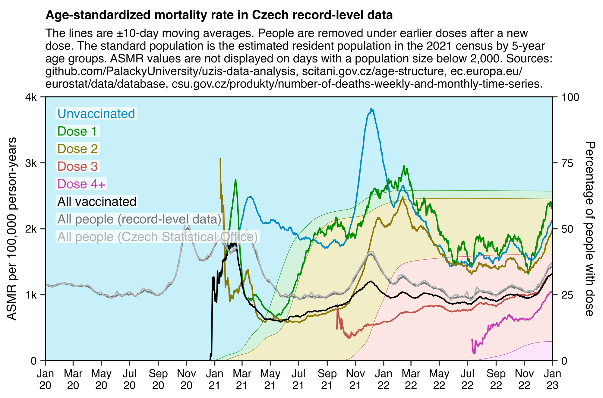
In the plot below the ASMR of people with one dose shoots up when the second dose is rolled out, and the ASMR of people with two doses shoots up when the third dose is rolled out. Martin Neil and Norman Fenton speculated that a similar phenomenon in the English ONS data was explained by the so-called cheap trick, where people were categorized under the previous vaccine dose for a certain number of weeks after a new vaccine dose, so that for example a death that occured soon after the second dose would've been classified under the first dose. Jeffrey Morris said that the phenomenon was explained by the healthy vaccinee effect instead, because the healthy vaccinees who move under the nth dose have low mortality, it means that the so-called unhealthy stragglers who remain under dose n-1 will have increased mortality. However the same kind of a phenomenon can also be seen in the Czech data even though it doesn't employ the cheap trick, which makes it seem more likely that Morris was right and Neil and Fenton were wrong. And the New Zealand data released by Barry Young doesn't employ the cheap trick either but the same phenomenon can also be seen in Barry's data.
From the plot below you can also see that during a COVID wave in December 2021, unvaccinated people have a big spike in mortality but there is essentially no spike in mortality in people with 3 doses, and there is only a small spike in the black line which shows the mortality among all vaccinated people. People with 2 doses do have a big increase in mortality in November to December 2021, but it's probably not only because of COVID but also because a lot of people got the third dose so the unhealthy stragglers were left under the second dose:

In the plot above the dark gray line shows the mortality rate among both vaccinated and unvaccinated people in the record-level data, and the light gray line shows the mortality rate based on the weekly number of deaths in 5-year age groups reported by the Czech Statistical Office combined with population estimates from Eurostat. [https://csu.gov.cz/produkty/number-of-deaths-weekly-and-monthly-time-series, https://ec.europa.eu/eurostat/data/database] The discrepancy between the lines might partially be because I used 5-year age groups up to 95+ for the dark gray line but 90+ for the light gray line.
library(data.table);library(ggplot2)

isoweek=\(year,week,weekday=1){d=as.Date(paste0(year,"-1-4"));d-(as.integer(format(d,"%w"))+6)%%7-1+7*(week-1)+weekday}
ma=\(x,b=1,f=b){x[]=rowMeans(embed(c(rep(NA,b),x,rep(NA,f)),f+b+1),na.rm=T);x}

xstart=as.Date("2020-1-1");xend=as.Date("2023-1-1");dates=seq(xstart,xend,1)

std=fread("http://sars2.net/f/czcensus2021pop.csv")[,.(pop=sum(pop)),.(age=pmin(age,95)%/%5*5)][,.(std=pop/sum(pop),age)]

b=fread("http://sars2.net/f/czbucketsdaily.csv.gz")
b=b[,.(alive=sum(alive),dead=sum(dead)),.(date,age=pmin(age,95)%/%5*5,dose=ifelse(dose==0,"Unvaccinated",paste0("Dose ",ifelse(dose>=4,"4+",dose))))]
b=unique(rbind(b,cbind(expand.grid(lapply(b[,1:3],unique)),alive=0,dead=0)),by=1:3)[order(date)]

b=rbind(b,b[,.(alive=sum(alive),dead=sum(dead),dose="All people (record-level data)"),.(age,date)])
b=rbind(b,b[grep("Dose",dose),.(alive=sum(alive),dead=sum(dead),dose="All vaccinated"),.(age,date)])

p=b[,.(date,alive=ma(alive,10),dead=ma(dead,10)),.(age,dose)]
p=merge(p,std)[,.(y=sum(dead/alive*std*365e5,na.rm=T),pop=sum(alive)),.(x=date,z=dose)]

dead=fread("http://sars2.net/f/czweeklydead.csv")
dead=dead[,approx(isoweek(year,week,4),dead/7,dates,rule=2),age][,.(x,dead=y,age)]
pop=fread("http://sars2.net/f/czpopdead.csv")[year>=2010]
pop=pop[,.(pop=sum(pop)),.(age=pmin(90,age%/%5*5),year)]
pop=pop[,spline(as.Date(paste0(year,"-1-1")),pop,xout=dates),age][,.(x,pop=y,age)]
std2=std[,.(std=sum(std)),.(age=pmin(age,90))]
p=rbind(p,merge(std2,merge(dead,pop))[,.(y=sum(dead/pop*std*365e5),pop=NA,z="All people (Czech Statistical Office)"),.(x=as.IDate(x))])

p[,z:=factor(z,unique(z))]
p[pop<2e3,y:=NA]

yend=4e3;ystep=1e3;yend2=100;ystep2=25;secmult=yend/yend2

color=c(hcl(c(210,120,60,0,300)+15,90,50),"black","gray45","gray70")
fill=c(hcl(c(210,120,60,0,300)+15,80,70),"black","gray45","gray70")

label=data.frame(x=xstart+.02*(xend-xstart),y=seq(yend,,-yend/15,nlevels(p$z))-yend/16,label=levels(p$z))

sub="The lines are ±10-day moving averages. People are removed under earlier doses after a new
dose. The standard population is the estimated resident population in the 2021 census by 5-year
age groups. ASMR values are not displayed on days with a population size below 2,000. Sources:
github.com/PalackyUniversity/uzis-data-analysis, scitani.gov.cz/age-structure, ec.europa.eu/
eurostat/data/database, csu.gov.cz/produkty/number-of-deaths-weekly-and-monthly-time-series."

p2=p[grep("Unvaccinated|Dose",z)]
p2=merge(p2,p2[,.(popsum=sum(pop)),x])

ggplot(p2,aes(x,y))+
geom_area(aes(color=z,fill=z,y=pop/popsum*99.999*secmult),linewidth=.1,alpha=.22)+
geom_line(aes(color=z),linewidth=.4)+
geom_line(data=p[grep("All vaccinated",z)],color=color[6],linewidth=.4)+
geom_line(data=p[grep("record-level",z)],color=color[7],linewidth=.4)+
geom_line(data=p[grep("Office",z)],color=color[8],linewidth=.4)+
geom_hline(yintercept=c(0,yend),linewidth=.3,lineend="square")+
geom_vline(xintercept=c(xstart,xend),linewidth=.3,lineend="square")+
geom_label(data=label,aes(x=x,y=y,label=label),fill=alpha("white",.7),label.r=unit(0,"pt"),label.padding=unit(1,"pt"),label.size=0,color=color[1:nrow(label)],size=2.7,hjust=0)+
labs(title="Age-standardized mortality rate in Czech record-level data",subtitle=sub,x=NULL,y="ASMR per 100,000 person-years")+
scale_x_date(limits=c(xstart,xend),breaks=seq(xstart,xend,"2 month"),date_labels="%b\n%y")+
scale_y_continuous(limits=c(0,yend),breaks=seq(0,yend,ystep),labels=\(x)ifelse(x==0,x,paste0(x/1e3,"k")),sec.axis=sec_axis(trans=~./secmult,breaks=seq(0,yend2,ystep2),name="Percentage of people with dose"))+
scale_color_manual(values=color)+
scale_fill_manual(values=fill)+
coord_cartesian(clip="off",expand=F)+
theme(axis.text=element_text(size=6.5,color="black"),
  axis.ticks=element_line(linewidth=.3),
  axis.title.y.left=element_text(margin=margin(0,4,0,0)),
  axis.title.y.right=element_text(margin=margin(0,-1,0,4)),
  axis.ticks.length=unit(3,"pt"),
  axis.title=element_text(size=7.5),
  legend.position="none",
  panel.background=element_rect(fill="white"),
  plot.margin=margin(4,4,4,4),
  plot.subtitle=element_text(size=7,margin=margin(0,0,4,0)),
  plot.title=element_text(size=7.5,face="bold",margin=margin(2,0,4,0)))
ggsave("0.png",width=5,height=3.3,dpi=400*4)
system("magick 0.png -resize 25% 1.png")
Kirsch included this comment in the file
CR time series analysis.xlsx: "MR
peaking 35 weeks after the shots #2 for male and female is hard for them
to explain. It can't be HVE because HVE doesn't 'peak'."
For example in this plot the mortality rate peaks on week 30 after the second dose:
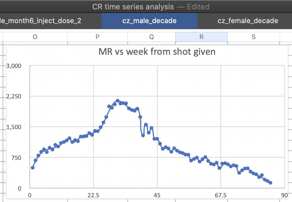
However it's because the mortality rate of people who remained under the second dose shot up when the third dose was rolled out, and people got the third dose about 30 weeks after the second dose on average:
> rec=fread("CR_records.csv")
> mean(rec$Datum_3-rec$Datum_2,na.rm=T)/7
[1] 29.6133
The average date of third doses is only about 26 weeks later than the average date of second doses:
> as.Date(mean(rec$Datum_2,na.rm=T))
[1] "2021-07-09"
> as.Date(mean(rec$Datum_3,na.rm=T))
[1] "2022-01-04"
> (mean(rec$Datum_3,na.rm=T)-mean(rec$Datum_2,na.rm=T))/7
[1] 25.57143
However people who got both the second and third dose got the second dose much earlier on average than people who only got the second dose (because younger people got vaccinated later and younger people were less likely to get a booster):
> as.Date(mean(rec$Datum_2[!is.na(rec$Datum_3)],na.rm=T))
[1] "2021-06-10" # average date of second dose for people who also got a third dose
> as.Date(mean(rec$Datum_2[is.na(rec$Datum_3)],na.rm=T))
[1] "2021-08-31"" # average date of second dose for people who didn't get a third dose
Here for each combination of month and dose number, I derived the expected number of deaths by multiplying the number of person-days for each single year of age by the mortality rate that month of the same age among all people who are included in the dataset, and I added together the expected deaths for each age to get the baseline number of deaths among all ages.
For example in January 2021 the mortality rate of all people aged 70
in the dataset was about 9.734e-5 deaths per person-days, so the
expected number of deaths was about 2.606 (from
9.734e-5*26871). So the excess mortality percent was about
(2/2.606-1)*100 which is about -23%. When I repeated the
same calculation for all ages, the expected number of deaths for all
ages added together was about 523.6. But the actual number of deaths was
326, so the total excess mortality percent was about
(326/523.6-1)*100 which is about -38%.
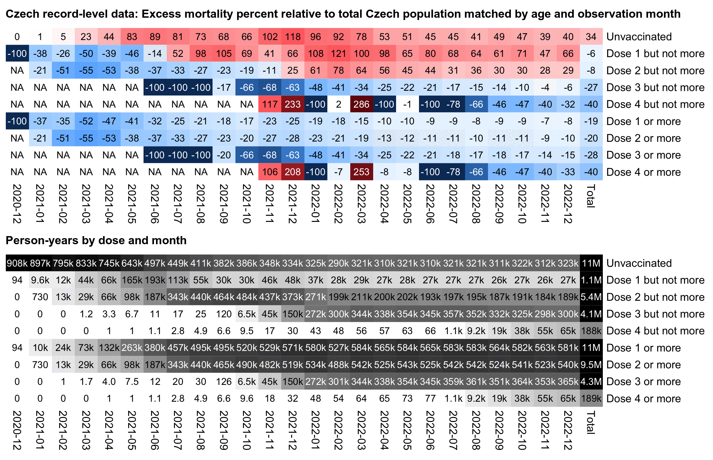
In the plot above the excess mortality of unvaccinated people peaks in December 2021 when there was a COVID wave. And conversely in December 2021 the excess mortality of the "All vaccinated" group is also lower than in the surrounding months.
In the plot above I used a different baseline for each month, so the excess mortality rates were adjusted for seasonal variation in mortality and the effect of COVID waves. But in the next plot I'm using the total mortality rate in 2021-2022 as the baseline throughout the plot, which increases the excess mortality percentages during the COVID wave in December 2021:
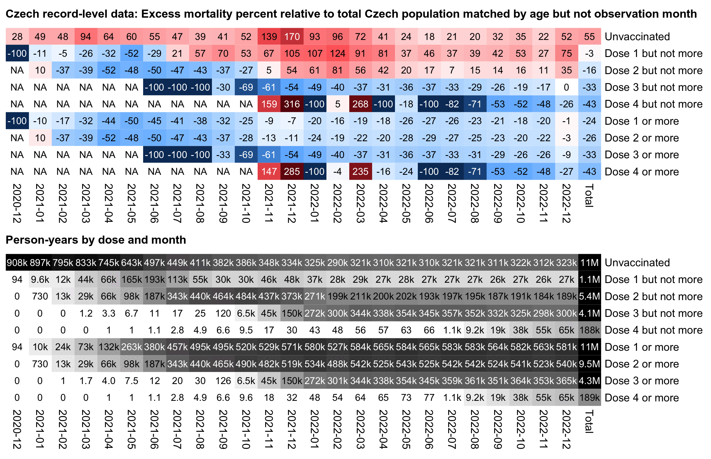
In the plot above unvaccinated people have 174% excess mortality in
December 2021 but 43% in September 2021, so it's an approximately
1.92-fold increase in mortality (from
(173.53+100)/(42.68+100)). But vaccinated people only have
an approximately 1.54-fold increase in mortality when December 2021 is
compared to September 2021 (from (5.46+100)/(-31.64+100)).
In the US Medicare data that Kirsch published in 2023, the spikes in
deaths during COVID waves were also bigger in unvaccinated people than
vaccinated people.
library(data.table)

b=fread("http://sars2.net/f/czbuckets.csv.gz")[dose<=4]
b[,dose:=ifelse(dose==0,"Unvaccinated",paste("Dose",dose,"but not more"))]
b2=fread("http://sars2.net/f/czbucketskeep.csv.gz")[dose%in%1:4][,dose:=paste0("Dose ",dose," or more")]
b=rbind(b,b2)[month>="2020-12"]

me=merge(b,b[dose%like%"Unvaccinated|1 or more",.(base=sum(dead)/sum(alive)),.(age,month)])
# me=merge(b,b[dose%like%"Unvaccinated|1 or more",.(base=sum(dead)/sum(alive)),age]) # use 2021-2022 total as baseline for each month

a=me[,base:=base*alive][,.(alive=sum(alive),dead=sum(dead),base=sum(base)),.(month,dose)]
a=rbind(a,a[,.(dead=sum(dead),alive=sum(alive),base=sum(base),month="Total"),dose])

a$dose=factor(a$dose,c("Unvaccinated",paste("Dose",1:4,"but not more"),paste("Dose",1:4,"or more")))

mpop=xtabs(alive~dose+month,a)/365
m=tapply(with(a,(dead-base)/ifelse(dead>base,base,dead)*100),a[,2:1],c)
disp=tapply(100*(a$dead/a$base-1),a[,2:1],round)
hide=mpop<10;m[hide]=disp[hide]=NA
exp=.8;m=abs(m)^exp*sign(m)
maxcolor=300^exp;m[is.infinite(m)]=-maxcolor

pheatmap::pheatmap(m,filename="i1.png",display_numbers=disp,
  cluster_rows=F,cluster_cols=F,legend=F,cellwidth=19,cellheight=14,fontsize=9,fontsize_number=8,
  border_color=NA,na_col="white",
  number_color=ifelse((abs(m)>.55*maxcolor)&!is.na(m),"white","black"),
  breaks=seq(-maxcolor,maxcolor,,256),
  colorRampPalette(hsv(rep(c(7/12,0),5:4),c(.9,.75,.6,.3,0,.3,.6,.75,.9),c(.4,.65,1,1,1,1,1,.65,.4)))(256))

disp2=kimi(mpop);disp2[mpop<.5]=0
exp2=.6;mpop=mpop^exp2;maxcolor2=max(mpop[-nrow(m),-ncol(m)])

kimi=\(x){e=floor(log10(ifelse(x==0,1,abs(x))));e2=pmax(e,0)%/%3+1;p=!is.na(x)
  x[p]=paste0(sprintf(paste0("%.",ifelse(e[p]%%3==0,1,0),"f"),x[p]/1e3^(e2[p]-1)),c("","k","M","B","T")[e2[p]]);x}

pheatmap::pheatmap(mpop,filename="i2.png",display_numbers=disp2,
  cluster_rows=F,cluster_cols=F,legend=F,cellwidth=19,cellheight=14,fontsize=9,fontsize_number=8,
  border_color=NA,na_col="white",
  number_color=ifelse(mpop>maxcolor2*.45,"white","black"),
  breaks=seq(0,maxcolor2,,256),
  sapply(seq(1,0,,256),\(i)rgb(i,i,i)))

system("w=`identify -format %w i1.png`;pad=38;convert -gravity northwest -pointsize 40 -font Arial-Bold \\( -splice x24 -size $[w-pad]x caption:'Czech record-level data: Excess mortality percent relative to total Czech population matched by age and observation month' -extent $[w-pad]x -gravity center \\) i1.png -gravity northwest \\( -size $[w-40]x caption:'Person-years by dose and month' -extent $[w-pad]x -gravity center \\) i2.png -append 1.png")
In the New Zealand data released by Barry Young, I noticed an effect where people who got vacinated during the early part of the main vaccine rollout subsequently had lower excess mortality than people who got vaccinated later on, which I called the "early vaccinee effect". I later also noticed a similar effect in a May 2024 FOI response to Clare Craig, which showed the number of deaths in England by week of vaccination, month of death, and age group: statistic.html#Clare_Craig_May_2024_UKHSA_FOI_response_for_deaths_in_vaccinated_people.
A similar early vaccinee effect is also visible in the Czech data. The monthly number of first doses given peaked in May 2021, so people who got the first vaccine dose during February to May 2021 subsequently had the lowest excess mortality, but people who got vaccinated in June 2021 already had close to 0% excess mortality, and the excess mortality gradually increased to over 100% in people who waited until 2022 to get the first dose:
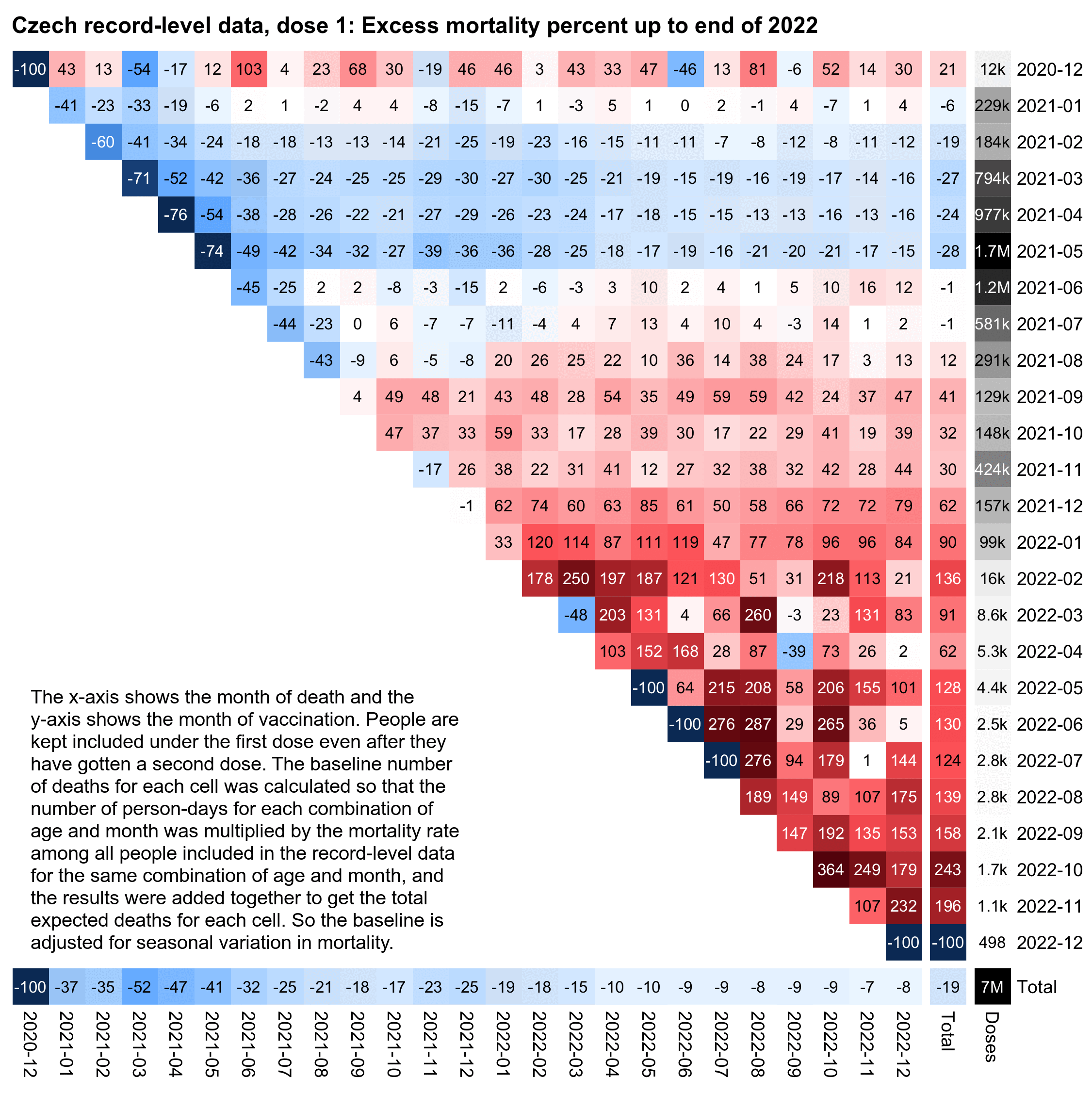
library(data.table)

b=fread("http://sars2.net/f/czbucketskeep.csv.gz")[,age:=pmin(age,95)]
d=merge(b[dose==1],b[dose<=1,.(base=sum(dead)/sum(alive)),.(age,month)])[,base:=alive*base]
d=d[,.(dead=sum(dead),alive=sum(as.double(alive)),base=sum(base)),.(month,vaxmonth)]
d=rbind(d,d[,.(dead=sum(dead),alive=sum(alive),base=sum(base),month="Total"),vaxmonth])
d=rbind(d,d[,.(dead=sum(dead),alive=sum(alive),base=sum(base),vaxmonth="Total"),month])

mpop=xtabs(alive~vaxmonth+month,d)/365
disp=d[,tapply((dead/base-1)*100,list(vaxmonth,month),round)]
m=d[,tapply((dead-base)*100/ifelse(dead>base,base,dead),list(vaxmonth,month),c)]

hide=mpop<10;m[hide]=disp[hide]=NA
disp[lower.tri(disp)&row(disp)!=nrow(disp)]=""
exp=.8;m=abs(m)^exp*sign(m)
maxcolor=300^exp;m[is.infinite(m)]=-maxcolor

pheatmap::pheatmap(m,filename="mort.png",display_numbers=disp,
  gaps_col=ncol(m)-1,gaps_row=nrow(m)-1,
  cluster_rows=F,cluster_cols=F,legend=F,
  cellwidth=17,cellheight=17,fontsize=9,fontsize_number=8,border_color=NA,na_col="white",
  number_color=ifelse(!is.na(m)&abs(m)>.5*maxcolor,"white","black"),
  breaks=seq(-maxcolor,maxcolor,,256),
  colorRampPalette(hsv(rep(c(7/12,0),4:5),c(.9,.75,.6,.3,0,.3,.6,.75,.9),c(.4,.65,1,1,1,1,1,.65,.4)))(256))

ua=\(x,y,...){u=unique(x);y(u,...)[match(x,u)]}

kimi=\(x){e=floor(log10(ifelse(x==0,1,abs(x))));e2=pmax(e,0)%/%3+1
  x[]=ifelse(abs(x)<10,round(x),paste0(round(x/1e3^(e2-1),ifelse(e%%3==0,1,0)),c("","k","M","B","T")[e2]));x}

rec=fread("CR_records.csv")
vaxn=table(ua(rec$Datum_1,substr,1,7))
vaxn["Total"]=sum(vaxn)
pop=as.matrix(vaxn[rownames(m)]);colnames(pop)="New doses"
exp2=.6;maxcolor2=max(head(pop,-1))

pheatmap::pheatmap(pop^exp2,filename="pop.png",display_numbers=kimi(pop),
  gaps_row=nrow(m)-1,cluster_rows=F,cluster_cols=F,legend=F,
  cellwidth=21,cellheight=17,fontsize=9,fontsize_number=8,border_color=NA,na_col="white",
  number_color=ifelse(pop^exp2>maxcolor2^exp2*.4,"white","black"),
  breaks=seq(0,maxcolor2^exp2,,256),sapply(seq(1,0,,256),\(i)rgb(i,i,i)))

system("convert mort.png -crop -177 \\( -gravity northwest pop.png -shave 16x0 -splice 0x5 -gravity west \\) -gravity north +append 00.png;w=`identify -format %w 00.png`;pad=48;convert \\( -pointsize 46 -font Arial-Bold -size $[w-pad]x caption:'Czech record-level data, dose 1: Excess mortality percent up to end of 2022' -gravity north -splice x26 \\) 00.png -append 0.png")
system("convert 0.png -fill black -gravity southwest -size 900x700 -pointsize 40 -font Arial caption:'The x-axis shows the month of death and the y-axis shows the month of vaccination. People are kept included under the first dose even after they have gotten a second dose. The baseline number of deaths for each cell was calculated so that the number of person-days for each combination of age and month was multiplied by the mortality rate among all people included in the record-level data for the same combination of age and month, and the results were added together to get the total expected deaths for each cell. So the baseline is adjusted for seasonal variation in mortality.' -gravity southwest -geometry +60+330 -composite 1.png")
The plot below shows excess mortality by the type of the first vaccine. People with two or more doses almost always got the second dose from the same vaccine type as the first dose, except Janssen vaccines only had a single dose so people who got a Janssen vaccine for the first dose often got a different type of vaccine for the booster.
The plot below shows that even in late 2022, people got a Moderna vaccine for the first dose had much higher excess mortality than people who got a Pfizer vaccine for the first dose. If the difference in mortality would be because of vaccine deaths like Kirsch says, you'd expect the difference to be greatest in the first few weeks or months after vaccination and get weaker over time. But because the difference remains in place more than a year after vaccination, it rather seems to be caused by some confounding factors which I didn't adjust for here:
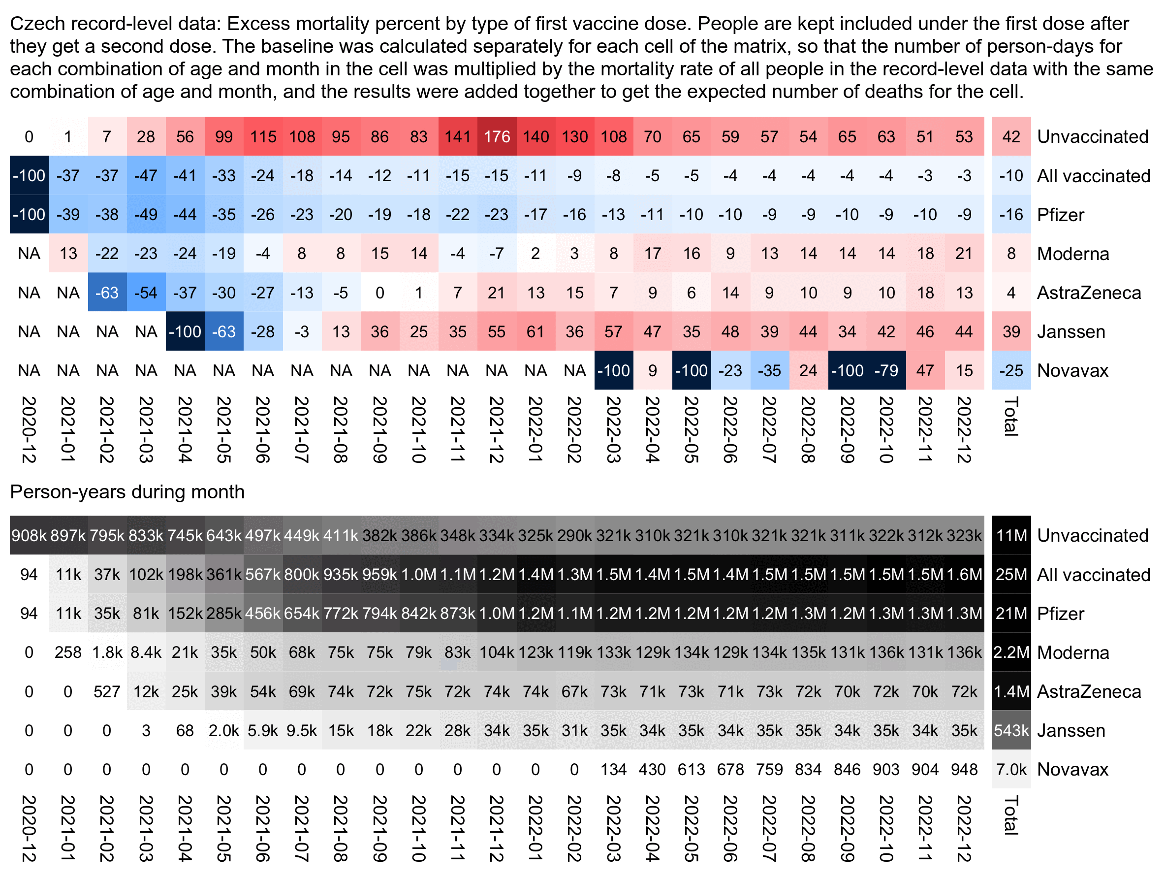
In the plot above Janssen vaccines get by far the highest excess mortality percentage, but it's probably because the average date of first vaccination is much later for Janssen vaccines than for the other three vaccine types, so the "late vaccinees" who got vaccinated in the second half of 2021 are overrepresented among the people who got a Janssen vaccine.
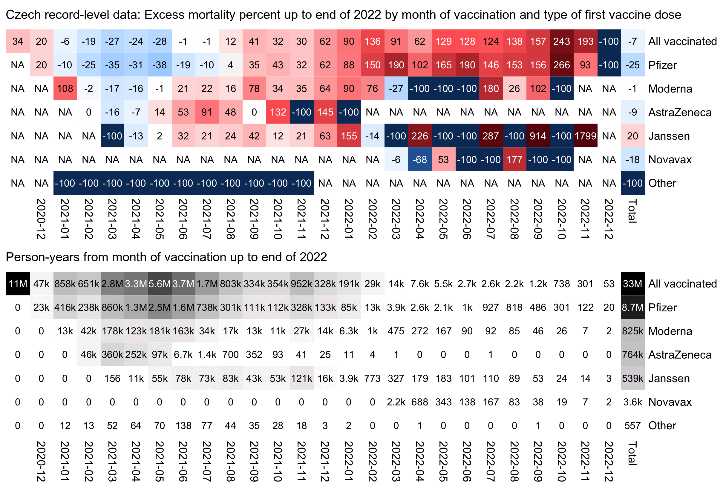
In the next plot the x-axis shows the month of vaccination and not the month of death, and the number in each cell is the excess mortality up to the end of 2022 and not the excess mortality on the month that is shown on the x-axis. The plot shows that people who got a Pfizer vaccine in late 2021 subsequently also had much higher excess mortality than people who got a Pfizer vaccine in the first half of 2021:
library(data.table)

b=fread("http://sars2.net/f/czbucketskeep.csv.gz")[dose<=1][dose==0,type:="Unvaccinated"][,age:=pmin(age,95)]

# first plot
d=merge(b[month>="2020-12"&type!="Other"],b[,.(base=sum(dead)/sum(alive)),.(age,month)])[,base:=base*alive]
d=d[,.(dead=sum(dead),alive=sum(as.double(alive)),base=sum(base)),.(type,month)]
d=rbind(d,d[,.(dead=sum(dead),alive=sum(alive),base=sum(base),month="Total"),type])
d=rbind(d,d[type!="Unvaccinated",.(dead=sum(dead),alive=sum(alive),base=sum(base),type="All vaccinated"),month])
d[,type:=factor(type,unique(c("Unvaccinated","All vaccinated",d[,sum(alive),type][order(-V1)]$type)))]

# # second plot
# d=merge(b[type!="Other"&dose>0],b[,.(base=sum(dead)/sum(alive)),.(age,month)])[,base:=base*alive]
# d=d[,.(dead=sum(dead),alive=sum(as.double(alive)),base=sum(base)),.(type,vaxmonth)]
# d=rbind(d,d[,.(dead=sum(dead),alive=sum(alive),base=sum(base),vaxmonth="Total"),type])
# d=rbind(d,d[,.(dead=sum(dead),alive=sum(alive),base=sum(base),type="All vaccinated"),vaxmonth])
# d[,type:=factor(type,unique(d[,sum(alive),type][order(-V1)]$type))]

mpop=xtabs(d$alive~d[[1]]+d[[2]])/365
m=with(d,tapply((dead-base)/ifelse(dead>base,base,dead)*100,d[,1:2],c))
disp=tapply(100*(d$dead/d$base-1),d[,1:2],round)
m[mpop<10]=disp[mpop<10]=NA
exp=.8;m=abs(m)^exp*sign(m)
maxcolor=300^exp;m[is.infinite(m)]=-maxcolor

pheatmap::pheatmap(m,filename="i1.png",display_numbers=disp,
  gaps_col=ncol(m)-1,
  cluster_rows=F,cluster_cols=F,legend=F,cellwidth=19,cellheight=19,fontsize=9,fontsize_number=8,
  border_color=NA,na_col="white",
  number_color=ifelse((abs(m)>.55*maxcolor)&!is.na(m),"white","black"),
  breaks=seq(-maxcolor,maxcolor,,256),
  colorRampPalette(hsv(rep(c(7/12,0),5:4),c(1,.8,.6,.3,0,.3,.6,.8,1),c(.3,.65,rep(1,5),.65,.3)))(256))

kimi=\(x){e=floor(log10(ifelse(x==0,1,abs(x))));e2=pmax(e,0)%/%3+1;x[]=ifelse(abs(x)<1e3,round(x),
  paste0(sprintf(paste0("%.",ifelse(e%%3==0,1,0),"f"),x/1e3^(e2-1)),c("","k","M","B","T")[e2]));x}

exp2=.6;maxcolor2=max(mpop[-nrow(m),-ncol(m)])

pheatmap::pheatmap(mpop^exp2,filename="i2.png",display_numbers=kimi(mpop),
  gaps_col=ncol(m)-1,
  cluster_rows=F,cluster_cols=F,legend=F,cellwidth=19,cellheight=19,fontsize=9,fontsize_number=8,
  border_color=NA,na_col="white",
  number_color=ifelse(mpop^exp2>maxcolor2^exp2*.45,"white","black"),
  breaks=seq(0,maxcolor2^exp2,,256),
  sapply(seq(1,0,,256),\(i)rgb(i,i,i)))
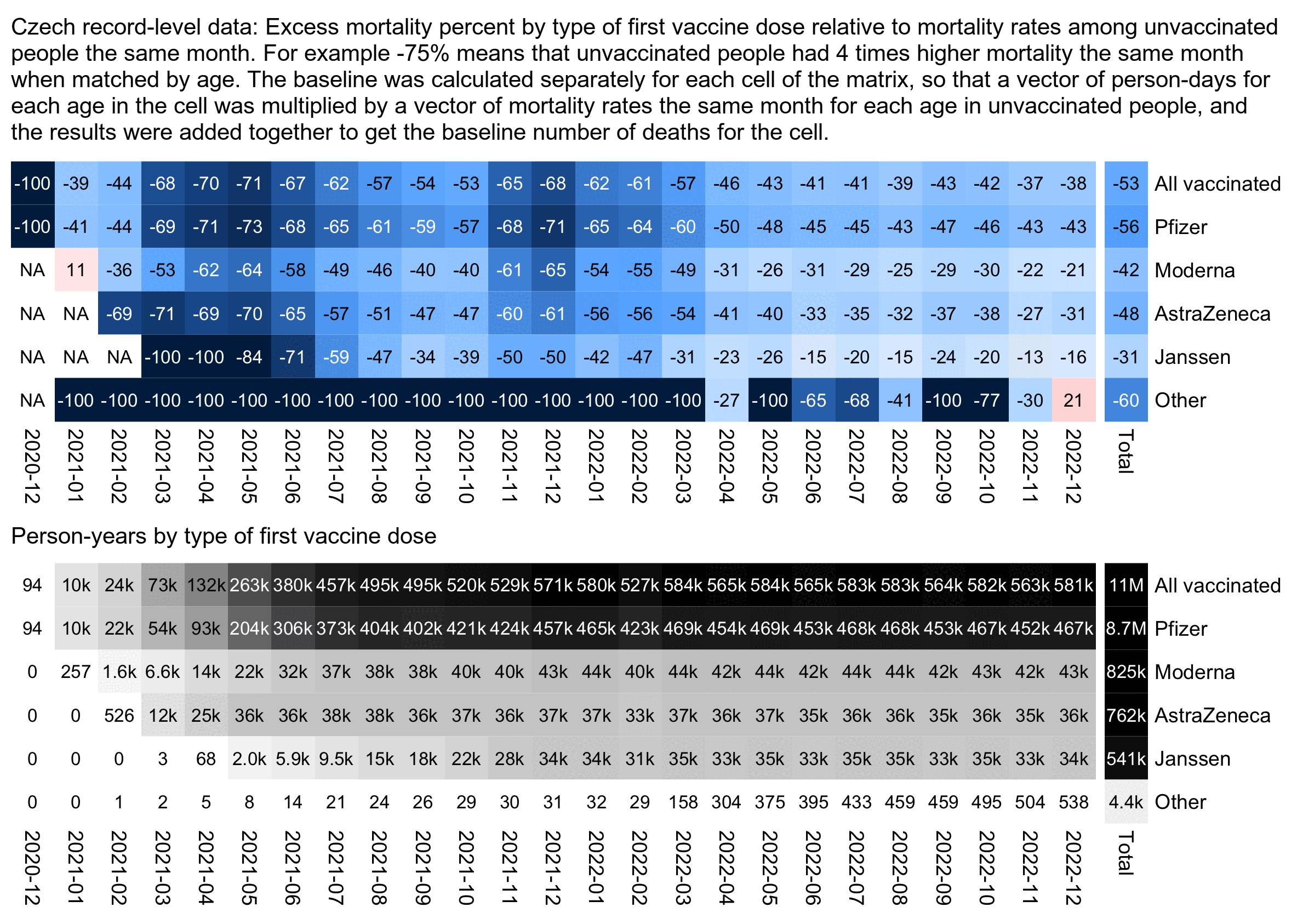
The plot below is otherwise similar to the first plot except the baseline is the mortality among only unvaccinated people instead of both unvaccinated and vaccinated people. It shows that during the COVID wave in December 2021, people with a first dose from a Moderna vaccine had about 65% lower deaths than unvaccinated people matched by age (even though Kirsch was making it seem like people with a Moderna vaccine were dropping like flies):
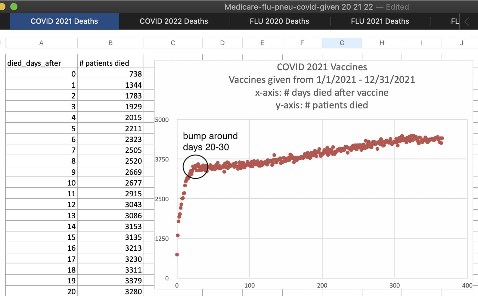
In 2023 Kirsch published a table of data from Medicare which showed the number of deaths by days since the first COVID vaccine given in 2021 that was listed in the database, which was generally the first dose of each person. The table seems to have a bump in deaths about 20-30 days after vaccination, which I speculated might have been because of people who died soon after the second dose, because the second dose was often given about 3-4 weeks after the first dose: [https://kirschsubstack.com/p/game-over-medicare-data-shows-the#%C2%A7the-medicare-data-that-i-received]
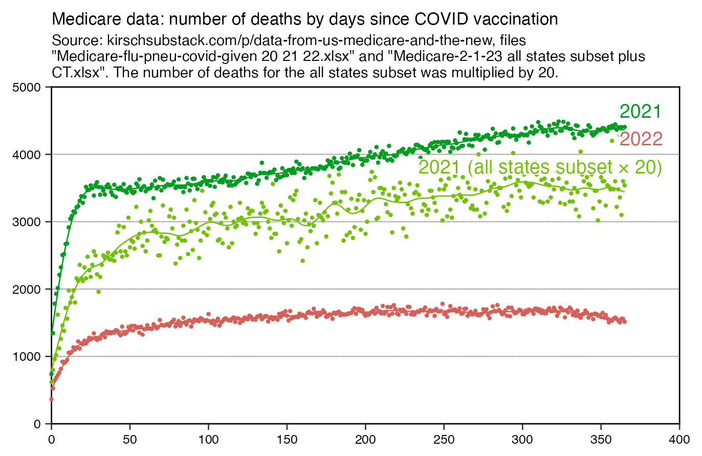
In the plot below the dark green points show the same data for deaths in 2021 as the screenshot above. The spline that I fitted to the dark green points seems to have a bump where it's temporarily elevated around day 25 from vaccination, but the red line for deaths in the year 2022 has a more smooth curve with no clear increase around day 25. I though it might have been because most of the doses given in 2022 were booster doses, and people didn't get a second booster dose right after the first booster, so in the scenario where the bump in the dark green line was caused by people dying from the second dose, the bump could've been missing from the red line because people didn't get the second booster soon after the first booster:
I noticed that the Czech data also seems to be a bump in deaths around weeks 2-4 after vaccination (where week 0 consists of the day of vaccination and the next 6 days):
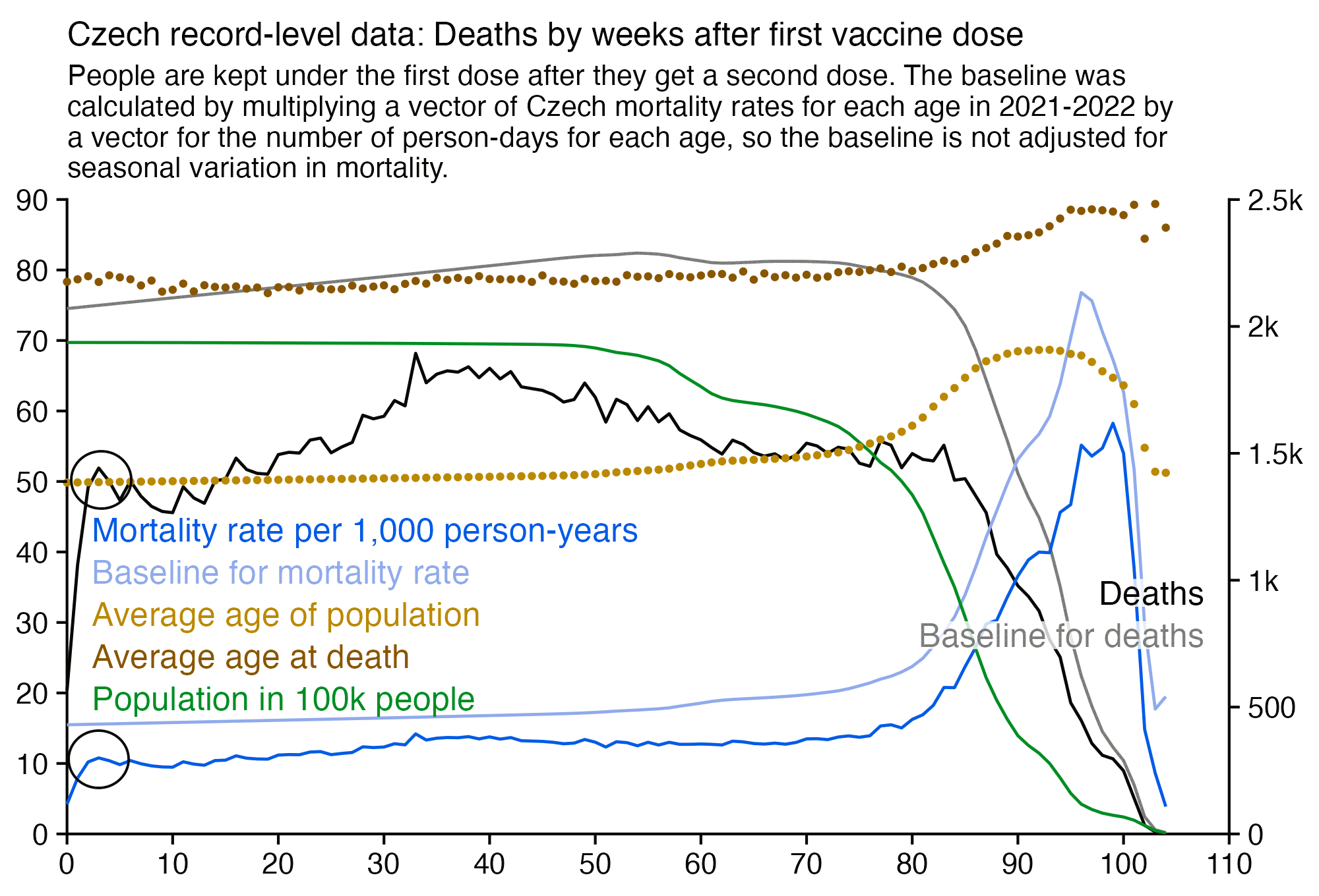
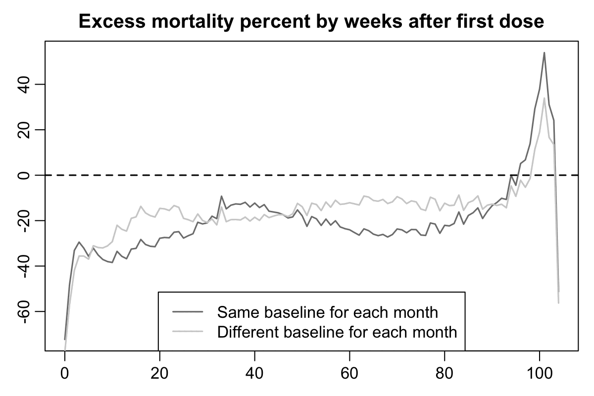
However in the plot above my baseline was not adjusted for seasonal variation in mortality, because I calculated the baseline based on the total mortality rates for each age in 2021-2022. In the plot below the dark gray baseline was calculated the same way as in the plot above. But if you look at the light gray baseline which is adjusted for seasonal variation in mortality and for the impact of COVID waves, there's a big fall in the baseline during the first 10 weeks after vaccination, because many people got vaccinated during a period of time from March to May 2021 when COVID deaths fell from the highest point during the pandemic to near zero:
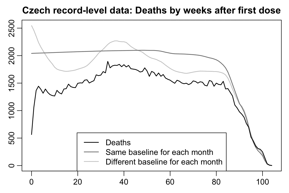
In the plot above if you compare the black line for deaths against the dark gray baseline that is not adjusted for seasonality, the period after vaccination that has clearly reduced mortality seems to last only about 2 weeks, which is surprisingly short compared to other datasets like Barry Young's data from New Zealand. But the period with reduced mortality is actually longer if you compare the black line against the light gray line instead, as you can see from this plot which shows the excess percentage of deaths relative to the baseline:
So I suspect the reason why the US Medicare data had a spike in deaths around days 20-30 might similarly be because many people received the first dose in January to February 2021 when there was a sharp spike in excess mortality in the United States, but by March 2021 the excess mortality had fallen down close to zero.
Here's code for making the two previous plots:
buck=fread("http://sars2.net/f/czbucketskeep.csv.gz")[dose<=1]
buck=buck[,.(dead=sum(dead),alive=sum(alive)),by=.(month,age,type,week)]

rate1=buck[,.(rate1=sum(dead)/sum(alive)),by=age]
rate2=buck[,.(rate2=sum(dead)/sum(alive)),by=.(month,age)]
me=merge(merge(buck,rate1),rate2,by=c("age","month"))[type!=""]
xy=me[,.(excess1=(sum(dead)/sum(rate1*alive)-1)*100,excess2=(sum(dead)/sum(rate2*alive)-1)*100),by=week]

xy=me[,.(dead=sum(dead),base1=sum(rate1*alive),base2=sum(rate2*alive)),by=week][order(week)]

png("1.png",1200,800,res=198)
par(mar=c(2.3,2.3,2.1,.8),mgp=c(0,.6,0))
tit="Czech record-level data: Deaths by weeks after first dose"
leg=c("Deaths","Same baseline for each month","Different baseline for each month")
col=c("black","gray50","gray80")
plot(xy$week,xy$base2,type="l",col=col[3],main=tit,xlab=NA,ylab=NA,lwd=1.5)
lines(xy$week,xy$base1,type="l",col=col[2],lwd=1.5)
lines(xy$week,xy$dead,type="l",col=col[1],lwd=1.5)
legend("bottom",legend=leg,col=col,lty=1,lwd=1.5)
dev.off()
And here's code for the plot before them:
library(ggplot2);library(data.table)

ua=\(x,y,...){u=unique(x);y(u,...)[match(x,u)]}

bin=7;maxdate=as.Date("2022-12-31")

rec=fread("CR_records.csv",showProgress=F)

t=rec[,.(id=1:.N,death=DatumUmrti,date=Datum_1,type=OckovaciLatka_1,birth=Rok_narozeni)][!is.na(date)]
set.seed(0);t$birth=ua(ua(t$birth,paste0,"-1-1"),as.Date)+sample(0:364,nrow(t),T)

name1=c("Comirnaty","SPIKEVAX","VAXZEVRIA","COVID-19 Vaccine Janssen")
name2=c("Pfizer","Moderna","AstraZeneca","Janssen")
t=t[!is.na(date)&type%in%name1][,type:=name2[match(type,name1)]]

age=as.numeric(t$date-t$birth)/365.25
dead=t[!is.na(t$death)]
deadbin=(as.numeric(dead$death)-as.numeric(dead$date))%/%bin
endbin=(as.numeric(maxdate)-as.numeric(t$date))%/%bin

cmr=fread("http://sars2.net/f/czpopdead.csv")[year%in%2021:2022,.(sum(dead)/sum(pop)*1e5),age][[2]]

bins=0:max(endbin)
pop=rev(cumsum(rev(table(factor(endbin,bins)))))*bin
baseline=sapply(bins,\(i)mean(cmr[pmin(100,floor(age[i<=endbin]+i*bin/365))+1]))

xy=data.frame(bin=bins,baseline,pop)
xy$dead=as.numeric(table(factor(deadbin,xy$bin)))
xy$cmr=xy$dead/xy$pop*1e5*365
xy$age=sapply(bins,\(i)mean(age[i<=endbin]))+xy$bin*bin/365
deadage=(as.numeric(dead$death)-as.numeric(dead$birth))/365.25
xy$deadage=tapply(deadage,factor(deadbin,xy$bin),mean)+xy$bin*bin/365
xy$deadbase=xy$baseline*xy$pop/1e5/365

xy$cmr[xy$pop<3e4]=NA

lab=read.csv(row.names=1,text="name,title
cmr,\"Mortality rate per 1,000 person-years\"
baseline,Baseline for mortality rate
dead,Deaths
deadbase,Baseline for deaths
age,Average age of population
deadage,Average age at death
pop,Population in 100k people")
lab$color=c(hcl(255,120,40),hcl(255,60,70),"black","gray50",hcl(60,90,60),hcl(60,110,40),hcl(135,80,50))

lab1=strsplit("cmr,baseline,age,deadage,pop",",")[[1]]
lab2=strsplit("dead,deadbase",",")[[1]]

lab$mult=1
lab["pop",]$mult=1/1e5/7
lab["baseline",]$mult=lab["cmr",]$mult=1/100

cand=c(sapply(c(1,2,5),\(x)x*10^c(-10:10)))
ymax=max(t(t(xy[,lab1])*lab[lab1,]$mult),na.rm=T)
ystep=cand[which.min(abs(cand-ymax/6))]
yend=ystep*ceiling(ymax/ystep)
xstep=cand[which.min(abs(cand-max(xy$bin)/9))]
xend=xstep*ceiling(max(xy$bin)/xstep)
xbreak=seq(0,xend,xstep);ybreak=seq(0,yend,ystep)
ymax2=max(t(t(xy[,lab2])*lab[lab2,]$mult),na.rm=T)
ystep2=cand[which.min(abs(cand-ymax2/6))]
yend2=ceiling(ymax2/ystep2)*ystep2
secmult=yend/yend2

legh=.38;legstep=15
legy1=rev(seq(0,,yend/legstep,length(lab1)))+(legh-length(lab1)/legstep/2)*yend
legy2=rev(seq(0,,yend/legstep,length(lab2)))+(legh-length(lab2)/legstep/2)*yend
leg1=data.frame(x=.02*xend,y=legy1,label=lab[lab1,]$title,color=lab[lab1,]$color)
leg2=data.frame(x=.98*xend,y=legy2,label=lab[lab2,]$title,color=lab[lab2,]$color)

lab$mult=lab$mult*ifelse(rownames(lab)%in%lab2,secmult,1)
xy2=as.data.frame(t(t(xy)*c(1,lab[names(xy)[-1],]$mult)))

kimi=\(x)ifelse(abs(x)>=1e6,paste0(x/1e6,"M"),ifelse(abs(x)>=1e3,paste0(x/1e3,"k"),x))

ggplot(xy2,aes(x=bin))+
geom_hline(yintercept=0,linewidth=.35,lineend="square")+
geom_vline(xintercept=c(0,xend),linewidth=.35,lineend="square")+
geom_line(aes(y=dead),linewidth=.4,color=lab["dead",]$color)+
geom_line(aes(y=deadbase),linewidth=.4,color=lab["deadbase",]$color)+
geom_line(aes(y=cmr),linewidth=.4,color=lab["cmr",]$color)+
geom_line(aes(y=baseline),linewidth=.4,color=lab["baseline",]$color)+
geom_line(aes(y=pop),linewidth=.4,color=lab["pop",]$color)+
geom_point(aes(y=age),size=.4,color=lab["age",]$color)+
geom_point(aes(y=deadage),size=.4,color=lab["deadage",]$color)+
geom_label(data=leg1,aes(x=x,y=y,label=label),fill=alpha("white",.8),label.r=unit(0,"lines"),label.padding=unit(.04,"lines"),label.size=0,size=3.2,hjust=0,vjust=.5,color=leg1$color)+
geom_label(data=leg2,aes(x=x,y=y,label=label),fill=alpha("white",.8),label.r=unit(0,"lines"),label.padding=unit(.04,"lines"),label.size=0,size=3.2,hjust=1,vjust=.5,color=leg2$color)+
labs(x=NULL,y="",title="Czech record-level data: Deaths by weeks after first vaccine dose",subtitle="People are kept under the first dose after they get a second dose. The baseline was calculated by multiplying a vector of Czech mortality rates for each age in 2021-2022 by a vector for the number of person-days for each age, so the baseline is not adjusted for seasonal variation in mortality."|>stringr::str_wrap(90))+
coord_cartesian(clip="off",expand=F)+
scale_x_continuous(limits=c(0,xend),breaks=xbreak)+
scale_y_continuous(limits=c(0,yend),breaks=ybreak,label=kimi,sec.axis=sec_axis(trans=~./secmult,breaks=seq(0,yend2,ystep2),label=kimi))+
theme(axis.text=element_text(size=8,color="black"),
  axis.ticks=element_line(linewidth=.35,color="black"),
  axis.ticks.length=unit(.2,"lines"),
  axis.title=element_blank(),
  axis.title.y.right=element_text(margin=margin(0,0,0,5)),
  legend.position="none",
  panel.background=element_rect(fill="white"),
  panel.grid=element_blank(),
  plot.margin=margin(.3,.3,.3,.3,"lines"),
  plot.subtitle=element_text(size=7.8,margin=margin(0,0,.6,0,"lines")),
  plot.title=element_text(size=9,margin=margin(.2,0,.4,0,"lines")))
ggsave("1.png",width=5,height=3.4,dpi=400)
The Czech Statistical Office has published weekly data for deaths by 5-year age groups: https://vdb.czso.cz/vdbvo2/faces/en/index.jsf?page=vystup-objekt-parametry&pvo=DEMD007KR-R2024&sp=A&skupId=3629&katalog=30845&z=T.
The following code calculates daily mortality rates in 2010-2019 by interpolating the weekly deaths to daily deaths, and it interpolates Eurostat's yearly population sizes to daily population sizes. And then it calculates a seasonality-adjusted linear trend of the mortality rate in each 5-year age group and projects the trend to 2020-2022, and then the expected number of deaths is derived by multiplying the population size by the projected mortality rate:
isoweek=\(year,week,weekday=1){d=as.Date(paste0(year,"-1-4"));d-(as.integer(format(d,"%w"))+6)%%7-1+7*(week-1)+weekday}

dates=seq(as.Date("2010-1-1"),as.Date("2022-12-31"),1)

t=read.csv("http://sars2.net/f/czweeklydead.csv")
dead=sapply(split(t,t$age),\(x)predict(smooth.spline(isoweek(x$year,x$week,4),x$dead/7),as.numeric(dates))$y)
pop=read.csv("http://sars2.net/f/czpopdead.csv")|>subset(year>=2009)
pop=sapply(split(pop,pop$age),\(x)predict(smooth.spline(an(as.Date(paste0(x$year,"-1-1"))),x$pop),as.numeric(dates))$y)
pop=t(rowsum(t(pop),pmin(0:100%/%5*5,90)))

seapre=\(x,y,x2=x,spar=.5){ # seasonal prediction
  x=as.Date(x,"1970-1-1");x2=as.Date(x2,"1970-1-1")
  d=data.frame(x,y);lm=lm(y~x,d)
  daily=tapply(y-predict(lm,list(x)),substr(x,6,10),mean)
  daily=daily[names(daily)!="02-29"]
  daily[]=smooth.spline(rep(daily,3),spar=spar)$y[366:730]
  daily["02-29"]=mean(daily[c("02-28","03-01")])
  data.frame(x=x2,y=predict(lm,list(x=x2))+daily[substr(x2,6,10)])
}

d=data.frame(date=dates,age=rep(seq(0,90,5),each=length(dates)),pop=c(pop),dead=c(dead))
d$projdead=c(apply(dead/pop,2,\(x)seapre(dates,x)$y))*d$pop

d$pop=sprintf("%.2f",d$pop)
d$dead=sprintf("%.5f",d$dead)
d$projdead=sprintf("%.5f",d$projdead)
write.csv(d,"czdeadproj.csv",quote=F,row.names=F)
The output looks like this: [f/czdeadproj.csv]
$ curl -Ls sars2.net/f/czdeadproj.csv|sed 3q
date,age,pop,dead,projdead
2010-01-01,0,570301.15,1.15035,1.04195
2010-01-02,0,570360.14,1.15010,1.04254
Jeffrey Morris has coined the term "temporal healthy vaccinee effect" to describe the phenomenon where mortality rate is temporarily reduced for the first weeks or months after vaccination. The plot below shows that the temporal HVE seems to be the strongest around ages 50-79, but it's much weaker in ages 90+ and in younger age groups:
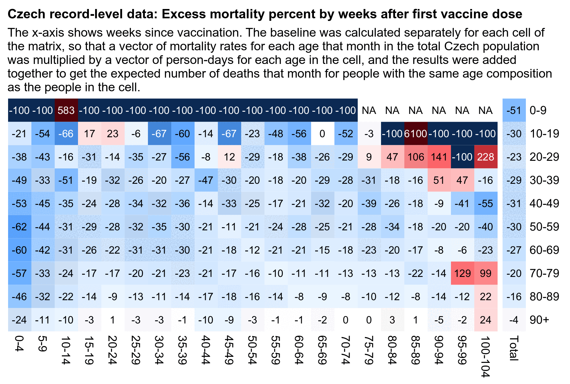
In the plot above my baseline was the total mortality rate among both
vaccinated and unvaccinated people, which results in a bias where age
groups with a higher percentage of vaccinated people tend to have excess
mortality closer to zero. If for example there is one age group where
there's 90% vaccinated people, and vaccinated people have a mortality
rate of 123 and unvaccinated people have a mortality rate of 246, then
it would result in only about -9% excess mortality for vaccinated people
(from 123/(123*.90+246*.1)-1). But if 60% of people are
vaccinated then vaccinated people would be about -29% excess mortality
with the same mortality rates.of 123 and 246.
However the bias doesn't probably explain why ages 90+ don't have as low excess mortality during the first weeks of vaccination as younger age groups, because the Czech data actually has a lower percentage of vaccinated people in ages 90+ than in ages 50-79:
> rec=fread("CR_records.csv")
> rec[!(!is.na(DatumUmrti)&DatumUmrti<"2021-01-01"),.(vaxpct=mean(!is.na(Datum_1))*100),.(age=pmax(0,pmin(90,(2021-Rok_narozeni)%/%10*10)))][order(age)]|>round()|>print(r=F)
 age vaxpct
   0      3
  10     47
  20     68
  30     65
  40     73
  50     76
  60     82
  70     86
  80     84
  90     70
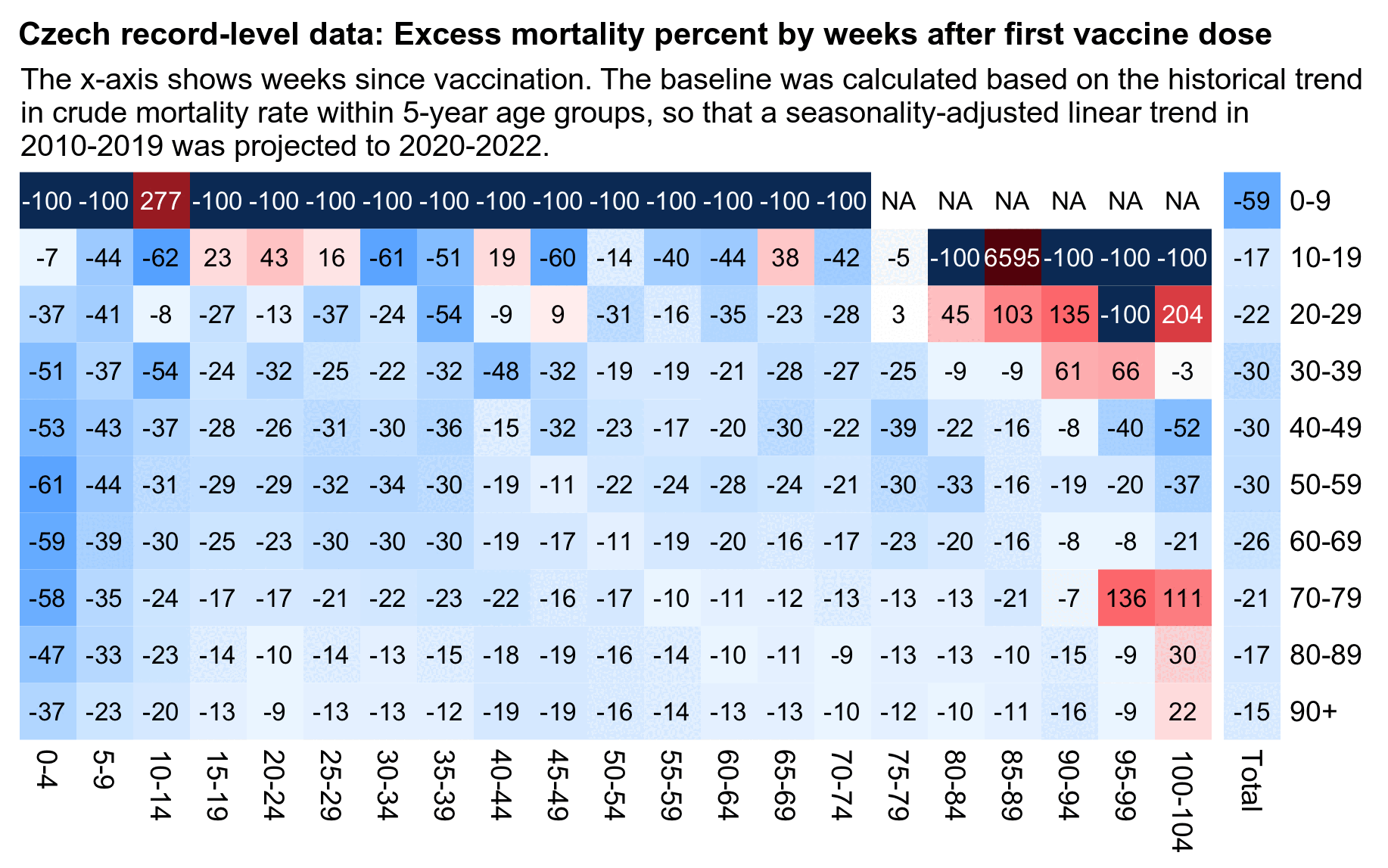
In order to avoid the bias, in the next plot I calculated the baseline, based on the trend in mortality rates within five-year age groups in 2010-2019. However now my excess mortality on weeks 0-4 was about -61% for ages 50-59 but only about -37% for ages 90+, even though later on the difference got smaller, which might indicate that the temporal healthy vaccinee effect might in fact be less strong in the oldest age groups:
library(data.table)

weekbin=5;agebin=10;maxage=90

t=fread("http://sars2.net/f/czbucketskeep.csv.gz")[dose<=1][,.(dead=sum(dead),alive=sum(alive)),.(month,age,type,week,dose)]

# first plot
t=merge(t[dose>0],t[,.(rate=sum(dead)/sum(alive)),by=.(month,age)])

# # second plot
# proj=fread("http://sars2.net/f/czdeadproj.csv")[,.(dead=sum(dead),pop=sum(pop)),.(month=substr(date,1,7),age)]
# t=merge(t[type!=""][,age:=pmin(90,age%/%5*5)],proj[,.(month,age,rate=dead/pop)])

t=t[,.(dead=sum(dead),alive=sum(alive),base=sum(rate*alive)),.(week%/%weekbin*weekbin,age=pmin(90,age%/%agebin*agebin))][order(week)]

t$age=`levels<-`(factor(t$age),paste0(seq(0,maxage,agebin),c(paste0("-",seq(agebin-1,maxage,agebin)),"+")))
t$week=`levels<-`(factor(t$week),sapply(sort(unique(t$week)),\(i)paste0(i,"-",i+weekbin-1)))
t=rbind(t,t[,.(dead=sum(dead),alive=sum(alive),base=sum(base),week="Total"),by=age])

m=tapply(with(t,(dead-base)/ifelse(dead>base,base,dead)*100),t[,2:1],c)
disp=round(tapply((t$dead/t$base-1)*100,t[,2:1],c))
disp[is.nan(disp)]=-100
mpop=xtabs(alive~age+week,t)

# m[mpop<100]=disp[mpop<100]=NA
exp=.8;m=abs(m)^exp*sign(m)
maxcolor=400^exp;m[is.infinite(m)]=-maxcolor;m[is.nan(m)]=-maxcolor

pal=hsv(rep(c(7/12,0),5:4),c(.9,.75,.6,.3,0,.3,.6,.75,.9),c(.4,.65,1,1,1,1,1,.65,.4))

pheatmap::pheatmap(m,filename="0.png",display_numbers=disp,
  gaps_col=ncol(m)-1,
  cluster_rows=F,cluster_cols=F,legend=F,
  cellwidth=18,cellheight=18,fontsize=9,fontsize_number=8,border_color=NA,na_col="white",
  number_color=ifelse(!is.na(m)&abs(m)>.5*maxcolor,"white","black"),
  breaks=seq(-maxcolor,maxcolor,,256),colorRampPalette(pal)(256))
Kirsch included these comments in the file
Full analysis - All vaccines.xlsx:
This is the pivot table analysis for Study #1 which enrolled any who got their first COVID shot anytime in 2021.
Note that if you didn't get a second shot, it's highly likely that it is because you died.
However the mortality rate ratio (MRR) which is MR(Moderna)/MR(Pfizer) is also high for those people when it should be 1 if both vaccines are safe.
See the Detail 1 tab which shows that the MRR ratio is >1 for each and every 5 year age group examined which eliminates the Simpson's paradox.
Additional note
Those who mixed vaccines between dose 1 vs. dose 2 had the highest increase in ACM.
The high MR line items for the second vaccine being None is likely because those people died before their second vaccine so this should not be misinterpreted as you must get two vaccines or you'll die.
Note that if you Moderna then Pfizer vs. Pfizer and then Moderna, the MRS were nearly identical around 2175) so the order of shots did not matter!!!
However, the MR of a mixed dose did NOT give you an MR between the two pure vaccines. It was higher than pure Pfizer or pure Moderna.
Note that MOST people did not mix brands between dose 1 and dose 2.
In the code below I calculated ASMR during the first year from the first dose using the same simple but inaccurate method as earlier, where I treated the age of each person as their year of birth subtracted from 2021. However I actually got very low ASMR for people who got Pfizer for the first dose and Moderna for the second dose (even though they consisted of only 279 people so the confidence interval is huge):
retype=\(x){name1=c("","Comirnaty","SPIKEVAX","VAXZEVRIA","COVID-19 Vaccine Janssen");name2=c("None","Pfizer","Moderna","AstraZeneca","Janssen");ifelse(x%in%name1,name2[match(x,name1)],"Other")}

std=fread("http://sars2.net/f/czpopdead.csv")[year==2022,pop]
rec=fread("CR_records.csv")

t=rec[Datum_1<as.Date("2022-1-1"),.(dead=sum(!is.na(DatumUmrti)&DatumUmrti<Datum_1+365),pop=.N),.(age=pmin(100,2021-Rok_narozeni),type1=retype(OckovaciLatka_1),type2=retype(OckovaciLatka_2))]
t[,.(asmr=round(sum(dead/pop*std[age+1]/sum(std)*1e5)),dead=sum(dead),pop=sum(pop),meanage=round(weighted.mean(age,pop))),.(type1,type2)][order(-pop)]|>print(r=F)
       type1       type2  asmr  dead     pop meanage
      Pfizer      Pfizer   705 45595 5411522      49
     Moderna     Moderna   918  8778  509704      55
 AstraZeneca AstraZeneca   781 10639  439648      68
     Janssen        None  1325  4418  404824      46
      Pfizer        None 11599  5914   49445      43
     Moderna        None 11274  1200    6224      52
 AstraZeneca        None 17457  3091    5522      75
 AstraZeneca      Pfizer   938    46    1795      61
     Moderna      Pfizer  1507    13     569      48
       Other       Other     0     0     348      43
 AstraZeneca     Moderna   973    10     329      62
      Pfizer     Moderna   421     6     279      50
      Pfizer       Other     0     0     130      49
      Pfizer     Janssen   253     1     126      43
 AstraZeneca     Janssen  1653     7     109      64
 AstraZeneca       Other     0     0      34      72
     Moderna     Janssen   989     2      33      47
     Moderna       Other     0     0      25      62
      Pfizer AstraZeneca     0     0      24      51
       Other AstraZeneca     0     0      21      48
     Moderna AstraZeneca   630     1       7      59
       Other        None     0     0       1      47
       Other      Pfizer     0     0       1      80
       type1       type2  asmr  dead     pop meanage
But actually ASMR is unreliable in cases like this where there's only a small number of people and the people can be unevenly distributed across age groups. In the following code I calculated the expected number of deaths by multiplying the Czech mortality rate for each age in 2021-2022 with the number of people for each age. I looked at all 6 pairs of crossovers between Pfizer, Moderna, and AstraZeneca vaccines, but the total excess mortality between them was only about -18%:
retype=\(x){name1=c("","Comirnaty","SPIKEVAX","VAXZEVRIA","COVID-19 Vaccine Janssen");name2=c("None","Pfizer","Moderna","AstraZeneca","Janssen");ifelse(x%in%name1,name2[match(x,name1)],"Other")}

base=fread("http://sars2.net/f/czpopdead.csv")[year%in%2021:2022,.(sum(dead)/sum(pop)),age][[2]]
rec=fread("CR_records.csv")

t=rec[Datum_1<as.Date("2022-1-1"),.(dead=sum(!is.na(DatumUmrti)&DatumUmrti<Datum_1+365),pop=.N),.(age=pmin(100,2021-Rok_narozeni),type1=retype(OckovaciLatka_1),type2=retype(OckovaciLatka_2))]
pick=c("Pfizer","Moderna","AstraZeneca")
t=t[type1%in%pick&type2%in%pick&type1!=type2]

t=rbind(t,t[,.(dead=sum(dead),pop=sum(pop),type1="Total"),.(age,type2)])
t=rbind(t,t[,.(dead=sum(dead),pop=sum(pop),type2="Total"),.(age,type1)])

t[,.(excesspct=round((sum(dead)/sum(pop*base[pmin(age,100)+1])-1)*100),dead=sum(dead),pop=sum(pop),meanage=round(weighted.mean(age,pop))),.(type1,type2)][order(type1,type2)]|>print(r=F)
       type1       type2 excesspct dead  pop meanage
 AstraZeneca     Moderna       -20   10  329      62
 AstraZeneca      Pfizer       -24   46 1795      61
 AstraZeneca       Total       -23   56 2124      62
     Moderna AstraZeneca       982    1    7      59
     Moderna      Pfizer         6   13  569      48
     Moderna       Total        13   14  576      48
      Pfizer AstraZeneca      -100    0   24      51
      Pfizer     Moderna       -11    6  279      50
      Pfizer       Total       -18    6  303      50
       Total AstraZeneca        51    1   31      53
       Total     Moderna       -17   16  608      56
       Total      Pfizer       -19   59 2364      58
       Total       Total       -18   76 3003      58
In the output above Pfizer-Moderna has a similar excess mortality percent as Moderna-Pfizer, even though in the block of output before it Moderna-Pfizer got over 3 times higher ASMR than Pfizer-Moderna. However that's because the Moderna-Pfizer group had one death in ages 10-19 and one death in ages 40-49, which together added over 500 units to the total ASMR value. With ASMR, the mortality rates of younger age groups that make up a large percent of the standard population are given more weight than the mortality rates of the oldest age groups that make up a small percent of the standard population:
std=fread("http://sars2.net/f/czpopdead.csv")[year==2022,pop]
t[type1=="Moderna"&type2=="Pfizer",.(asmr=sum(dead/pop*std[age+1]/sum(std)*1e5),dead=sum(dead),pop=sum(pop),stdpoppct=100*sum(std[age+1]/sum(std))),.(agegroup=age%/%10*10)][order(agegroup)]|>transform(asmrperdead=asmr/dead)|>mutate_if(is.double,round)|>print(r=F)
 agegroup asmr dead pop stdpoppct asmrperdead
       10  282    1  33         8         282
       20    0    0 107        10         NaN
       30    0    0 105        13         NaN
       40  258    1  73        16         258
       50    0    0  67        13         NaN
       60    0    0  64        12         NaN
       70  671    4  72        10         168
       80  179    3  33         3          60
       90  117    4  15         0          29 # for ages 90-99 the contribution to ASMR per death was about one tenth of the contribution in ages 10-19
In the Czech Republic spikes in excess mortality coincide with spikes in PCR positivity like in other countries, except that after Omicron there seems to be high PCR positivity coupled with low excess mortality, which is also similiar to many other countries. In winter 2020-2021 there's a weird three-hump pattern where there's three different spikes in excess deaths, but each of them also coincides with a spike in PCR positivity. And around mid-2021 when the number of new vaccine doses given peaked, there was low excess mortality.
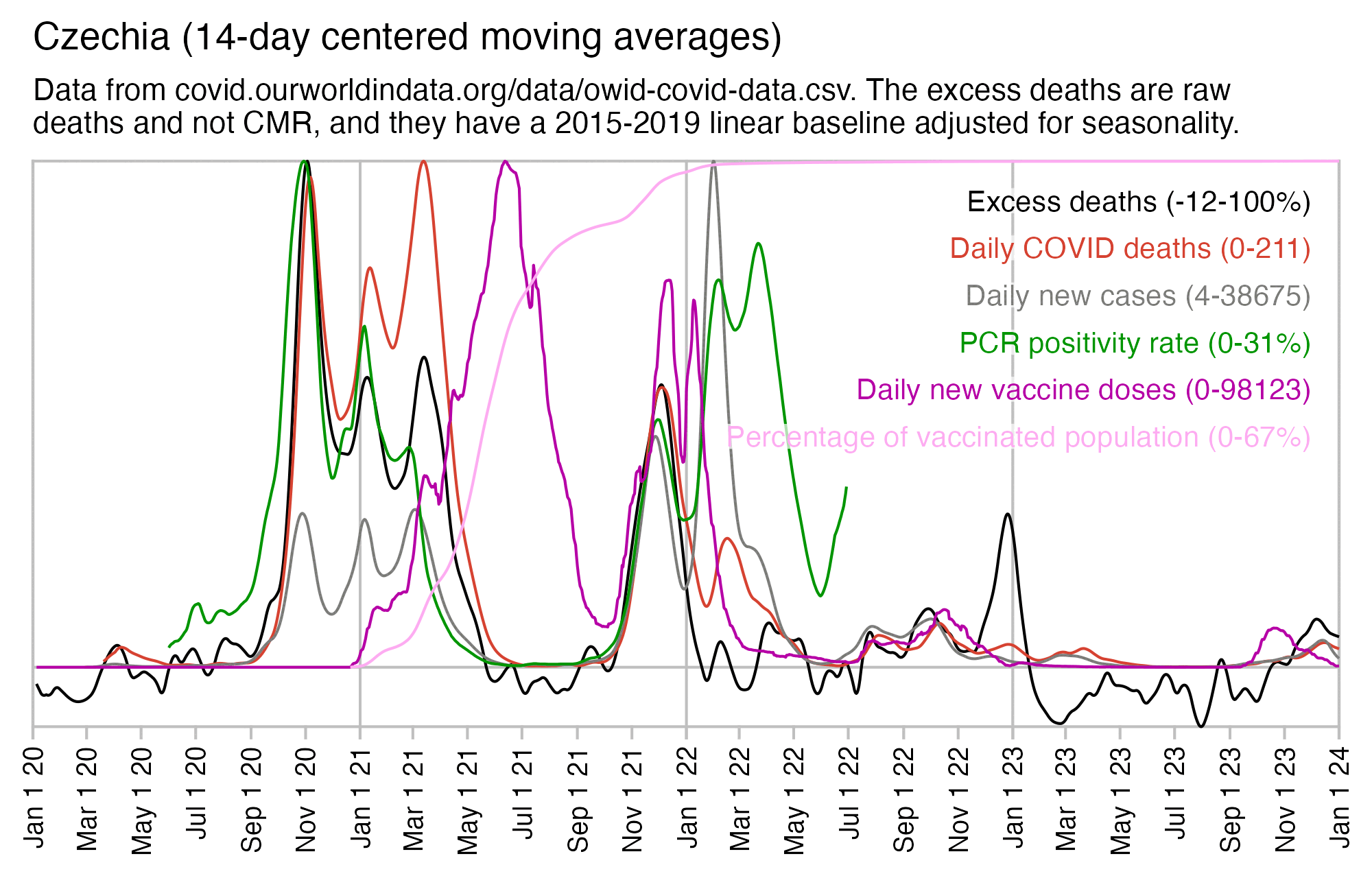
At OWID weekly excess deaths peaked at about 104% in November 2020 and 58% in December 2021:
$ wget covid.ourworldindata.org/data/owid-covid-data.csv
$ sed '1n;/Czechia/!d' owid-covid-data.csv|csvtk cut -flocation,date,excess_mortality|awk -F, '$3>50'
location,date,excess_mortality
Czechia,2020-10-25,71.85
Czechia,2020-11-01,101.35
Czechia,2020-11-08,103.79
Czechia,2020-11-15,80.85
Czechia,2020-11-22,60.63
Czechia,2021-01-03,53.57
Czechia,2021-01-10,58.77
Czechia,2021-01-17,56.32
Czechia,2021-03-07,55.34
Czechia,2021-03-14,63.21
Czechia,2021-03-21,60.61
Czechia,2021-04-04,50.22
Czechia,2021-11-28,50.76
Czechia,2021-12-05,57.82
Czechia,2021-12-12,54.9
After mid-2021 when new vaccine doses peaked, there were only two relatively brief periods when the mortality was clearly elevated above the baseline. The first was during the COVID spike around December 2021. The second was around December 2022 when many European countries had a spike in all-cause deaths but not COVID deaths, which was probably caused by influenza A since it coincided with a peak in the number of positive tests for influenza A: [https://app.powerbi.com/view?r=eyJrIjoiYWU4YjUyN2YtMDBkOC00MGI1LTlhN2UtZGE5NThjY2E1ZThhIiwidCI6ImY2MTBjMGI3LWJkMjQtNGIzOS04MTBiLTNkYzI4MGFmYjU5MCIsImMiOjh9]

Germany also had a sharp spike in excess deaths in December 2022, which coincided with a high incidence of influenza-like illness and acute respiratory illness reported by the Robert Koch Institute's GrippeWeb service, but at the same time there was a low number of COVID deaths compared to the two previous winters: [https://github.com/robert-koch-institut/GrippeWeb_Daten_des_Wochenberichts]
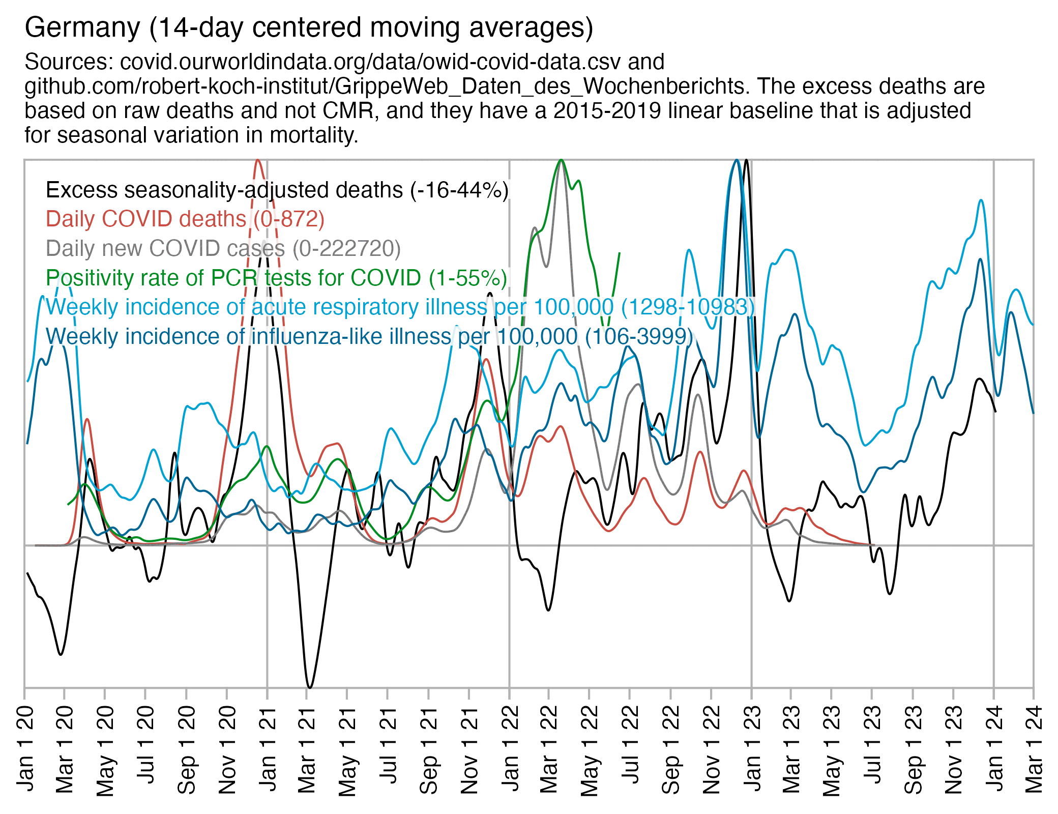
Kirsch seems to suggest that a large part of the Czech excess mortality after vaccination can be attributed to the vaccines, and he also says that the vaccines don't necessarily kill people soon after vaccination but they result in a chronic increase in mortality, because his plots show that the number of deaths by weeks since vaccination goes up over time, and he has attributed the increase in his plots to deaths caused by vaccines. But then from mid-2021 onwards after most people had been vaccinated, why were the excess deaths concentrated into two relatively sharp spikes around December 2021 and December 2022? And if vaccines killed a particularly high number of people in December 2021, then why was the ratio of unvaccinated to vaccinated ASMR elevated in December 2021?
The resident population estimates at Eurostat are for January 1st of each year. In the record-level data you can get the age on each person on December 31st 2020 if you subtract the year of birth from 2020, so it's only one day off from the date of the population estimates at Eurostat.
The resident population estimates in the 2021 Czech census are for March 26th 2021: https://scitani.gov.cz/age-structure#skupina-282345.
In most 10-year age groups the record-level data contains about 98-104% of the people in the 2021 census, but in ages 90-99 it's about 107% and in ages 100+ it's about 209%:
rec=fread("CR_records.csv")
t=rec[Rok_narozeni<2021&!(!is.na(DatumUmrti)&DatumUmrti<"2021-01-01"),list(recordlevel=.N),.(age=pmin(2020-Rok_narozeni,100)%/%10*10)][order(age)]
t=merge(t,fread("http://sars2.net/f/czcensus2021pop.csv")[,.(census2021=sum(pop)),.(age=age%/%10*10)])
t=merge(t,fread("http://sars2.net/f/czpopdead.csv")[year==2021,.(eurostat=sum(pop)),.(age=age%/%10*10)])

t=rbind(t,t[,lapply(.SD,sum)][,age:="Total"])

t[,censuspct:=recordlevel/census2021*100]
t[,eurostatpct:=recordlevel/eurostat*100]
print(mutate_if(t,is.double,round,1),row.names=F)
   age recordlevel census2021 eurostat censuspct eurostatpct
     0     1122110    1110656  1106350     101.0       101.4
    10     1083970    1070940  1064611     101.2       101.8
    20     1091962    1078231  1074387     101.3       101.6
    30     1465653    1409650  1398642     104.0       104.8
    40     1773632    1735533  1731067     102.2       102.5
    50     1361789    1354501  1345943     100.5       101.2
    60     1298397    1284689  1293120     101.1       100.4
    70     1038356    1037997  1035782     100.0       100.2
    80      382614     378684   380997     101.0       100.4
    90       65762      62639    63318     105.0       103.9
   100         957        647      619     147.9       154.6
 Total    10685202   10524167 10494836     101.5       101.8
In the code above I excluded people who were born in 2021 or later or who had died before 2021. But the total population size in the record-level data was still about 1-2% higher than the resident population estimates in the 2021 census and Eurostat. But both of them only included the resident population, so I don't know if the record-level data also includes non-residents.
The Czech Statistical Office has published a dataset for resident population estimates on December 31st 2022 by age group, region, and sex: https://data.gov.cz/datová-sada?iri=https%3A%2F%2Fdata.gov.cz%2Fzdroj%2Fdatové-sady%2F00025593%2Fa129a5408e8e5fd99497e9a22c39775e. However the total population size in the file is identical to Eurostat's population estimate for January 1st 2023:
> fread("http://sars2.net/f/czpopdead.csv")[year==2023,sum(pop)]
[1] 10827529
> system("wget csu.gov.cz/docs/107508/a53bbc83-5e04-5a74-36f9-549a090a806e/130142-24data051724.zip ;unzip 130142-24data051724.zip")
> pop=fread("130181-23data2022.csv")
> pop[uzemi_typ=="stát"&is.na(vek_txt)&pohlavi_txt=="",hodnota]
[1] 10827529 # region type is whole country, age is blank (all ages), and sex is blank (both males and females)
> pop[uzemi_typ=="stát"&!is.na(vek_txt)&pohlavi_txt!="",sum(hodnota)]
[1] 10827529 # individual age groups add up to the total for all age groups, and males and females add up to the total for both males and females
> pop[uzemi_typ=="kraj"&is.na(vek_txt)&pohlavi_txt=="",sum(hodnota)]
[1] 10827529 # individual kraj-level regions add up the total for the whole nation
In October 2021 unvaccinated people had about 2.1 times higher ASMR than vaccinated people, but over the next two months when there was a spike in excess deaths caused by COVID, the ratio increased first to about 2.8 in November and then about 3.1 in December. But by May 2022 when COVID deaths had fallen close to zero, the ratio had fallen back down to about 1.8:
> std=fread("http://sars2.net/f/czcensus2021pop.csv")[,sum(pop),pmin(age,95)][,V1/sum(V1)]
> b=fread("http://sars2.net/f/czbucketskeep.csv.gz")
> d=b[month>="2020-12"&dose<=1]
> d=d[,.(dead=sum(dead),alive=sum(alive)),.(month,vax=dose==1,age=pmin(age,95))]
> d=d[,.(asmr=sum(dead/alive*std[age+1])),.(month,vax)]
> d[,.(ratio=round(asmr[!vax]/asmr[vax],1)),month]|>print(r=F)
   month ratio
 2020-12   Inf
 2021-01   1.2
 2021-02   1.1
 2021-03   2.8
 2021-04   3.2
 2021-05   3.4
 2021-06   3.0
 2021-07   2.6
 2021-08   2.3
 2021-09   2.2
 2021-10   2.1
 2021-11   2.8
 2021-12   3.1
 2022-01   2.6
 2022-02   2.5
 2022-03   2.3
 2022-04   1.8
 2022-05   1.8
 2022-06   1.7
 2022-07   1.7
 2022-08   1.6
 2022-09   1.7
 2022-10   1.7
 2022-11   1.6
 2022-12   1.6
   month ratio
In December 2023 Kirsch published record-level data from the Maldives
which included a complete or nearly complete table of people who died in
the Maldives in 2021-2022 along with their dates of vaccination.
[moar.html#Data_for_deaths_in_2020_2023_in_Maldives]
I used the data to calculate a rough ratio of unvaccinated CMR to
vaccinated CMR so that during for example in May 2021 when about 41.922%
of people were unvaccinated and there were 122 deaths in unvaccinated
people and 81 deaths in vaccinated people, I calculated the ratio as
(122/41.922)/(81/(100-41.922)), which is about 2.1. In May
and June 2021 when Maldives had the most COVID deaths, the ratio of
unvaccinated to vaccinated CMR was about 2.1, but the ratio was much
lower in the surrounding months, which seems to indicate that
unvaccinated people were more likely to die of COVID:
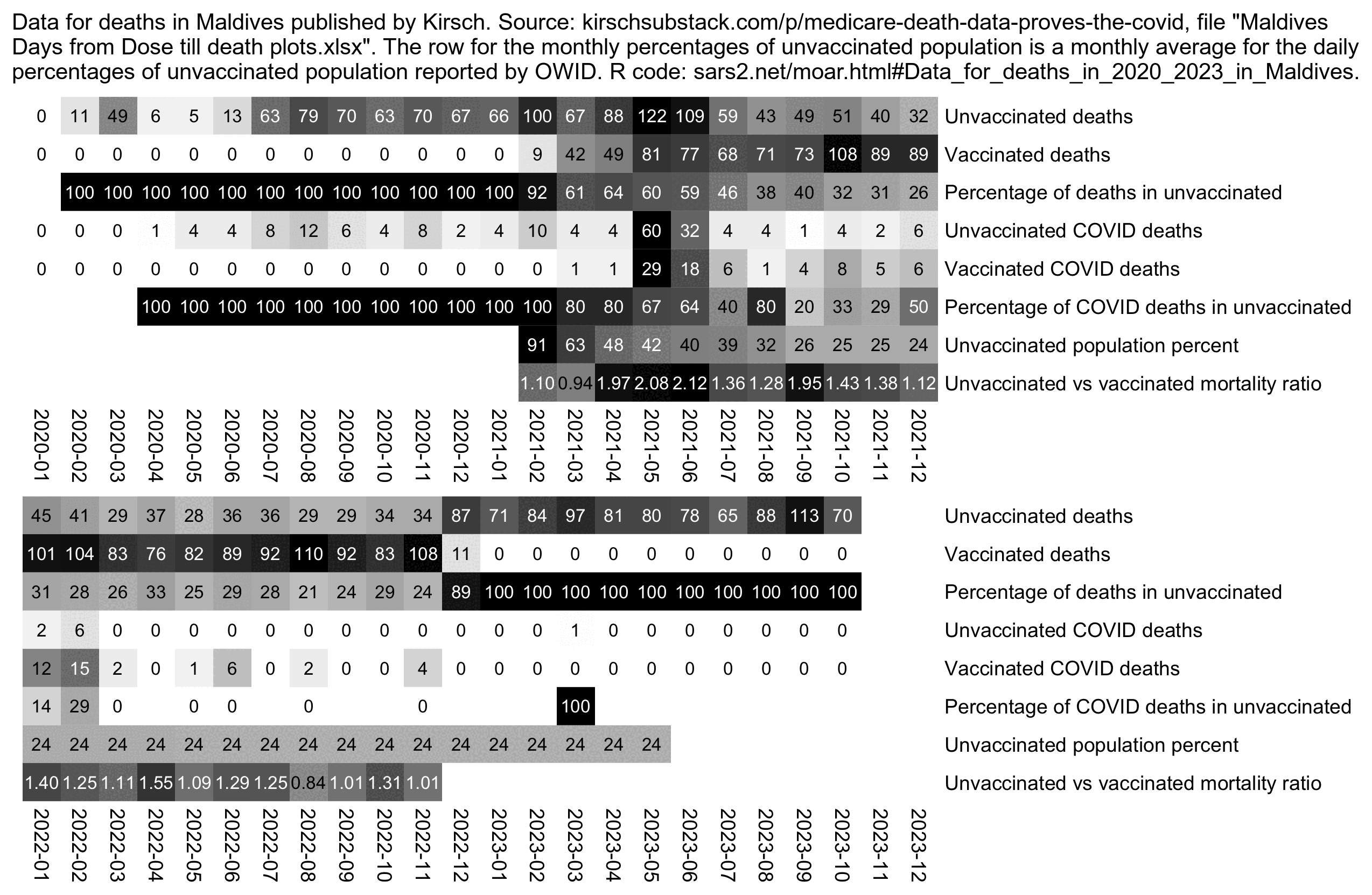
The method I used to calculate the mortality ratios in the Maldives didn't even take into account that vaccinated people were older on average than unvaccinated people, so I would've probably gotten higher ratios if I would've been able to calculate mortality ratios normalized by age.
However now with the Czech data I was able to use a more sophisticated method to calculate a ratio between unvaccinated and vaccinated mortality so that it was adjusted for age, but I still got similar results where the ratio was temporarily elevated during a period of months that had a high number of COVID deaths.
The ratio column below shows the ASMR in people whose first dose was Moderna divided by the ASMR in people whose first dose was Pfizer. The ratio is actually lower than usual during the COVID wave in November to December 2021. It might possibly indicate that Moderna vaccines were more effective in preventing COVID deaths than Pfizer vaccines, even though it might also indicate that there's some confounding factors which caused people who got a Moderna vaccine to be less likely to die from COVID:
> b=fread("http://sars2.net/f/czbucketskeep.csv.gz")[month>="2020-12"&dose<=1][dose==0,type:="Unvaccinated"]
> std=fread("http://sars2.net/f/czcensus2021pop.csv")[,sum(pop),pmin(age,95)%/%5][,V1/sum(V1)]
> d=b[,.(dead=sum(dead),alive=sum(alive)),.(month,type,age=pmin(age,95)%/%5)]
> d=d[,.(asmr=sum(dead/alive*std[age/5+1]*365e5)),.(month,type)]
> o=dcast(d,month~type,value.var="asmr")[,ratio:=Moderna/Pfizer]
> o=o[,.(month,ratio=round(ratio,2),Pfizer,Moderna,Unvaccinated)]
> o[,3:5]=lapply(o[,3:5],round)
> print(o,r=F)
   month ratio Pfizer Moderna Unvaccinated
 2020-12    NA      0      NA         6041
 2021-01  1.29   4449    5740         5809
 2021-02  0.98   4423    4345         5695
 2021-03  1.61   3031    4873         7081
 2021-04  1.29   2671    3453         5888
 2021-05  1.04   2920    3051         5135
 2021-06  1.22   3107    3787         4941
 2021-07  1.25   3096    3865         4817
 2021-08  1.24   2960    3661         4536
 2021-09  1.28   3381    4336         4680
 2021-10  1.26   3720    4690         5106
 2021-11  0.94   4535    4242         8093
 2021-12  1.10   4516    4979         9136
 2022-01  1.22   3737    4575         5833
 2022-02  1.02   4388    4477         6698
 2022-03  1.29   4089    5265         6001
 2022-04  1.31   4216    5527         4848
 2022-05  1.40   3367    4726         4163
 2022-06  1.03   3508    3620         3998
 2022-07  1.24   3608    4483         4032
 2022-08  1.31   3652    4782         4158
 2022-09  1.12   3686    4138         4786
 2022-10  1.16   4155    4836         4999
 2022-11  1.12   4043    4518         4337
 2022-12  1.36   4844    6574         5710
   month ratio Pfizer Moderna Unvaccinated
However when I used a seasonality-adjusted 2010-2019 linear projection as the baseline, the oldest age groups had a relatively low percentage of excess deaths in November to December 2021 compared to ages 55-79:
> proj=fread("http://sars2.net/f/czdeadproj.csv")
> proj[grepl("2021-1[12]",date),.(excess=round(100*(sum(dead)/sum(projdead)-1))),age][,setNames(excess,age)]
  0   5  10  15  20  25  30  35  40  45  50  55  60  65  70  75  80  85  90
 -6   6   8   2  25 -10   8  10  19  11  22  23  27  27  24  25  20  15  16
And Moderna had a higher percentage of people in the oldest age groups than Pfizer:
> t=fread("http://sars2.net/f/czbucketskeep.csv.gz")[dose<=1]
> type=factor(t$type,names(sort(tapply(t$alive,t$type,sum),T)))
> age=pmin(t$age%/%10*10,90)
> m=xtabs(t$alive~age+type)
> round(t(m)/colSums(m)*100,1)
             age
type             0   10   20   30   40   50   60   70   80   90
              15.8 12.3 10.3 14.1 15.6 11.4 10.1  7.3  2.6  0.5
  Pfizer       0.3  7.2  9.9 13.5 19.5 16.4 15.4 12.1  4.9  0.8
  Moderna      0.0  2.1  8.4 11.5 16.4 14.9 16.0 21.8  7.6  1.4
  AstraZeneca  0.0  0.1  1.4  2.9  6.7  9.7 20.8 42.3 14.4  1.9
  Janssen      0.0  2.0 16.4 17.8 20.5 16.6 14.8  9.1  2.3  0.4
  Novavax      0.0  4.2 20.1 26.3 21.0 14.4  8.9  4.3  0.7  0.1
  Other        0.4  1.2 19.6 27.7 17.8  9.6 13.8  7.3  2.6  0.0
Here during the period from October 2020 to April 2021 which had high excess mortality because of COVID, the excess mortality seems to have fallen back down earlier in older age groups, so it first fell close to zero in January in ages 90+, in April in ages 80-89, in May in ages 70-79, and in June in ages 60-69. It might be because older age groups got vaccinated earlier than younger age groups:
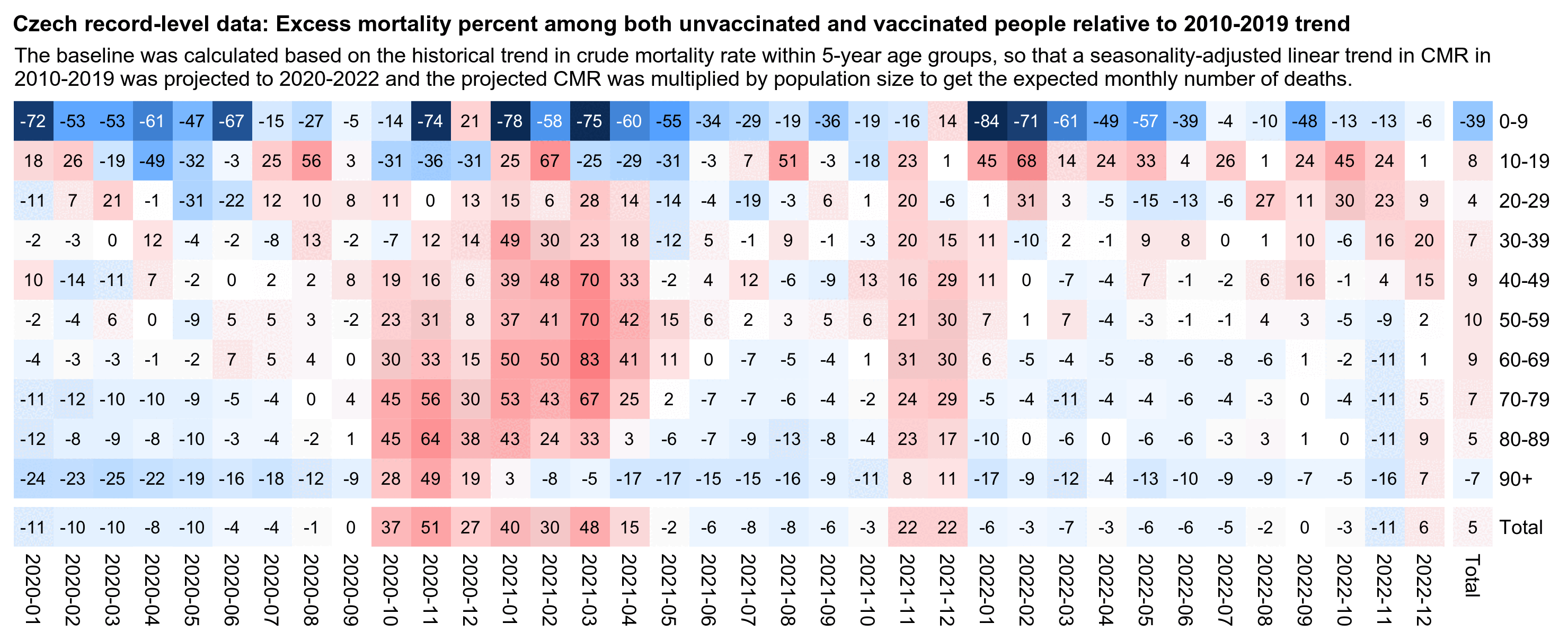
This shows that the percentage of vaccinated person-days out of all person-days first reached above 50% in March in ages 90+ and 80-89, in April in ages 70-79, in May in ages 60-69, and in June in ages 50-59:
> b=fread("http://sars2.net/f/czbucketskeep.csv.gz")[dose<=1]
> b[,.(vaxpct=sum(alive[dose==1])/sum(alive)*100),.(month,age=pmin(age%/%10*10,90))][,round(xtabs(vaxpct~month+age))[12:24,]]
         age
month      0 10 20 30 40 50 60 70 80 90
  2020-12  0  0  0  0  0  0  0  0  0  0
  2021-01  0  0  1  1  1  2  1  1  6  8
  2021-02  0  0  2  2  3  3  2  2 27 32
  2021-03  0  0  3  4  6  7  6 22 58 51
  2021-04  0  0  5  6 10 13 18 56 71 60
  2021-05  0  1  8 11 24 41 59 75 77 65
  2021-06  0  4 21 33 52 61 72 80 81 68
  2021-07  0 15 40 45 59 65 75 82 82 69
  2021-08  0 27 49 50 63 68 78 84 83 70
  2021-09  0 31 52 52 64 70 79 85 84 71
  2021-10  0 33 54 54 65 71 79 85 84 71
  2021-11  0 37 60 58 69 74 81 86 85 72
  2021-12  0 41 65 62 71 76 82 88 86 74
In the plot above I thought that maybe the reason why the excess mortality fell close to 0% earlier in older age groups might have been some kind of an artifact of the method I used to calculate the baseline, because in the dataset for weekly deaths by age group I used to calculate the baseline, ages 90 and above were aggregated together and younger ages were split into 5-year age groups, so it might result in the excess mortality of the oldest age groups in being understated if the upper ends of the age groups were overrepresented in the record-level data relative to the lower ends. And I also projected the baseline for each age group into the future by doing a linear regression of the mortality rate in 2010-2019, which might not be accurate for all age groups.
So therefore I made the plot below where I used a different baseline, where I first calculated the total mortality rates in the record-level data for each single year of age in 2020-2022, except I aggregated together ages 100 and above. And then in order to derive the expected number of deaths for each cell of the heatmap, I multiplied a vector of person-days for each age in the cell by a vector of the total mortality rates for each age in 2020-2022. However it also gave me a similar result, where during the period with high excess deaths that lasted for late 2020 until early 2021, the excess deaths fell back down first in ages 90+, next in ages 80-89, and later in the younger age groups:
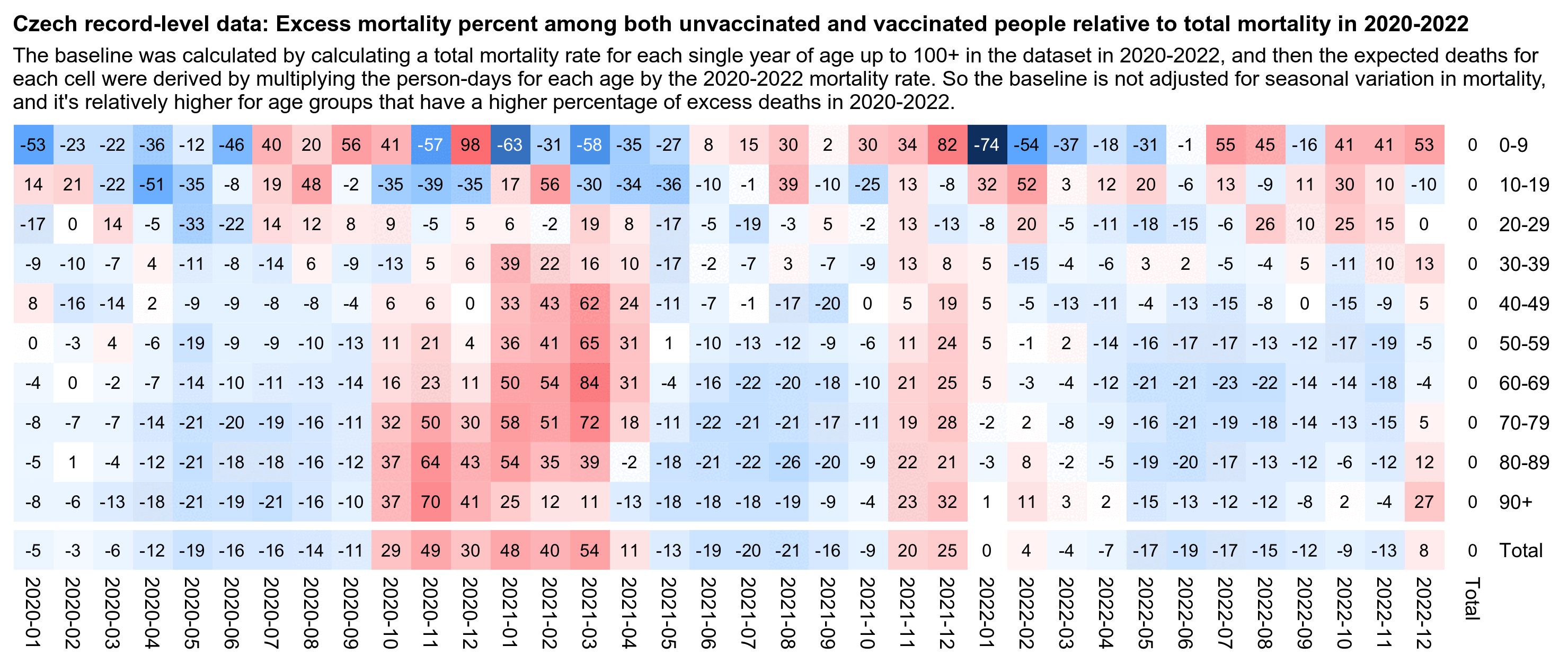
t=data.table::fread("http://sars2.net/f/czbucketskeep.csv.gz")[dose<=1]

# first plot
t=t[,.(dead=sum(dead),alive=sum(alive)),.(month,age=pmin(90,age%/%5*5))]
proj=fread("http://sars2.net/f/czdeadproj.csv")[,.(projdead=sum(projdead),pop=sum(pop)),.(month=substr(date,1,7),age)]
t=merge(t,proj[,.(month,age,rate=projdead/pop)])

# # second plot
# t=t[,.(dead=sum(dead),alive=sum(alive)),.(month,age=pmin(age,100))]
# t=merge(t,t[,.(rate=sum(dead)/sum(alive)),age])

t=t[,.(dead=sum(dead),alive=as.numeric(sum(alive)),base=sum(rate*alive)),.(month,age=pmin(90,age%/%10*10))]

t[,age:=`levels<-`(factor(age),paste0(0:9*10,c(paste0("-",1:9*10-1),"+")))]
t=rbind(t,t[,.(dead=sum(dead),alive=sum(alive),base=sum(base),month="Total"),age])
t=rbind(t,t[,.(dead=sum(dead),alive=sum(alive),base=sum(base),age="Total"),month])

m=tapply(with(t,(dead-base)/ifelse(dead>base,base,dead)*100),t[,2:1],c)
disp=tapply((t$dead/t$base-1)*100,t[,2:1],round)
disp[is.nan(disp)]=-100
mpop=xtabs(alive~age+month,t)
exp=.8;m=abs(m)^exp*sign(m)
maxcolor=300^exp;m[is.infinite(m)]=-maxcolor;m[is.nan(m)]=-maxcolor

pheatmap::pheatmap(m,filename="0.png",display_numbers=disp,legend=F,cluster_rows=F,cluster_cols=F,
  gaps_row=nrow(m)-1,gaps_col=ncol(m)-1,
  cellwidth=18,cellheight=18,fontsize=9,fontsize_number=8,border_color=NA,na_col="white",
  number_color=ifelse(!is.na(m)&abs(m)>.5*maxcolor,"white","black"),breaks=seq(-maxcolor,maxcolor,,256),
  colorRampPalette(hsv(rep(c(7/12,0),5:4),c(.9,.75,.6,.3,0,.3,.6,.75,.9),c(.4,.65,1,1,1,1,1,.65,.4)))(256))
The README file in Kirsch's GitHub repository includes this table:
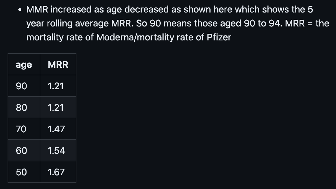
I thought the difference might partially be if people who got vaccinated later had a higher Moderna-Pfizer ratio and younger people got vaccinated later than older people, so I made the heatmap below. I didn't calculate CMR for each age group like Kirsch, but I calculated the ASMR for each single year of age within an age group and then I added together the results to get the total ASMR for the ten-year age groups (where the ASMR for a single age is the CMR of the age multiplied by the fraction of the age in the standard population).
But anyway my heatmap below shows that the Moderna-Pfizer ratio was actually the highest in ages 90+, even though it was fairly low in ages 70-79 and 80-89.
For some reason people who got vaccinated in April 2021 subsequently had a low Moderna-Pfizer ratio of only about 1.1. But ages 70-79 received a large number of first doses in April 2021, which might partially explain their low ratio.
The Moderna-Pfizer ratio seems to have gotten lower starting from around October 2021. Among people who received the first vaccine dose in October 2021, November 2021, or February 2022, Pfizer had higher total ASMR than Moderna, so the Moderna-Pfizer ratio was below 1. So there seem to be some confounding factors which cause the ratio to shift dramatically over time:
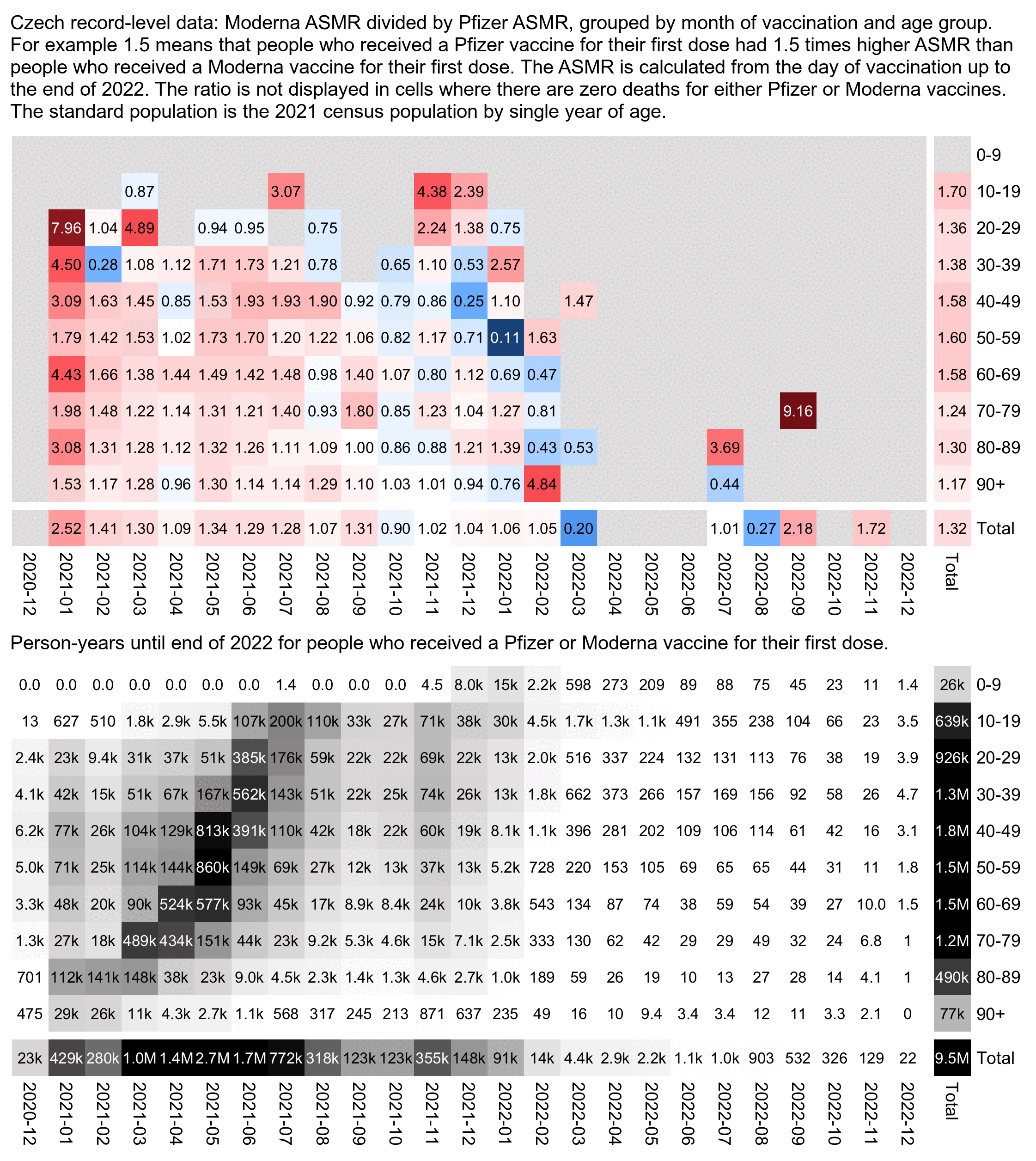
library(data.table)

agecut=\(x,y)cut(x,c(y,Inf),paste0(y,c(paste0("-",y[-1]-1),"+")),T,F)

std=fread("http://sars2.net/f/czcensus2021pop.csv")[,sum(pop),pmin(age,95)%/%5][,V1/sum(V1)]

t=fread("http://sars2.net/f/czbucketskeep.csv.gz")[dose==1]
t=t[,.(dead=sum(dead),alive=sum(as.double(alive))),.(type,vaxmonth,age=pmin(age,95)%/%5*5)]
t=t[,.(dead=sum(dead),alive=sum(alive)),.(type,age,age2=agecut(age,0:9*10),vaxmonth)]
t=rbind(t,t[,.(dead=sum(dead),alive=sum(alive),vaxmonth="Total"),.(age,type,age2)])
t=rbind(t,t[,.(dead=sum(dead),alive=sum(alive),age2="Total"),.(age,vaxmonth,type)])
t=t[,.(alive=sum(alive),asmr=sum(dead/alive*std[age/5+1])*365e5),.(type,age2,vaxmonth)]

a=tapply(t$asmr,t[,1:3],sum,na.rm=T)
m1=a["Moderna",,];m2=a["Pfizer",,]
m=(m1-m2)/ifelse(m1>m2,m2,m1)

pop=t[type%in%c("Moderna","Pfizer"),xtabs(alive~age2+vaxmonth)]/365
disp=matrix(sprintf(ifelse(m1/m2>10,"%.1f","%.2f"),m1/m2),nrow(m))
hide=pmin(m1,m2)==0;m[hide]=NA;disp[is.na(m)]=""
exp=.7;m=abs(m)^exp*sign(m);maxcolor=10^exp

pheatmap::pheatmap(m,filename="i1.png",display_numbers=disp,
  gaps_row=nrow(m)-1,gaps_col=ncol(m)-1,
  cluster_rows=F,cluster_cols=F,legend=F,cellwidth=19,cellheight=19,fontsize=9,fontsize_number=8,
  border_color=NA,na_col="gray90",
  number_color=ifelse((abs(m)>.55*maxcolor)&!is.na(m),"white","black"),
  breaks=seq(-maxcolor,maxcolor,,256),
  colorRampPalette(hsv(rep(c(7/12,0),5:4),c(.9,.75,.6,.3,0,.3,.6,.75,.9),c(.4,.65,1,1,1,1,1,.65,.4)))(256))

kimi=\(x){e=floor(log10(ifelse(x==0,1,abs(x))));e2=pmax(e,0)%/%3+1;p=!is.na(x)
  x[p]=paste0(sprintf(paste0("%.",ifelse(e[p]%%3==0,1,0),"f"),x[p]/1e3^(e2[p]-1)),c("","k","M","B","T")[e2[p]]);x}

exp2=.6;maxcolor2=max(pop[-nrow(pop),-ncol(pop)])

pheatmap::pheatmap(pop^exp2,filename="i2.png",display_numbers=kimi(ifelse(pop==0,0,pop)),
  gaps_row=nrow(m)-1,gaps_col=ncol(m)-1,
  cluster_rows=F,cluster_cols=F,legend=F,cellwidth=19,cellheight=19,fontsize=9,fontsize_number=8,
  border_color=NA,na_col="white",
  number_color=ifelse(pop^exp2>maxcolor2^exp2*.45,"white","black"),
  breaks=seq(0,maxcolor2^exp2,,256),
  sapply(seq(1,0,,256),\(i)rgb(i,i,i)))

cap="Czech record-level data: Moderna ASMR divided by Pfizer ASMR, grouped by month of vaccination and age group. For example 1.5 means that people who received a Pfizer vaccine for their first dose had 1.5 times higher ASMR than people who received a Moderna vaccine for their first dose. The ASMR is calculated from the day of vaccination up to the end of 2022. The ratio is not displayed in cells where there are zero deaths for either Pfizer or Moderna vaccines. The standard population is the 2021 census population by single year of age."
system(paste0("w=`identify -format %w i1.png`;pad=44;convert -gravity northwest -pointsize 42 -font Arial \\( -splice x24 -size $[w-pad]x caption:'",cap,"' -extent $[w-pad]x -gravity center \\) i1.png -gravity northwest \\( -size $[w-40]x caption:'Person-years until end of 2022 for people who received a Pfizer or Moderna vaccine for their first dose.' -extent $[w-pad]x -gravity center \\) i2.png -append 1.png"))
The total Moderna-Pfizer ratio was about 1.00 for people who got the first dose in October 2021 or later:
> t=fread("http://sars2.net/f/czbucketskeep.csv.gz")[dose==1]
> t=t[vaxmonth>="2021-10",.(dead=sum(dead),alive=sum(as.double(alive))),.(type,age=pmin(age,95)%/%5*5)]
> t=t[,.(dead=sum(dead),alive=sum(alive)),.(type,age,age2=age%/%10*10)]
> t=rbind(t,t[,.(dead=sum(dead),alive=sum(alive),age2="Total"),.(type,age)])
> t=t[,.(alive=sum(alive),asmr=sum(dead/alive*std[age/5+1])*365e5),.(type,age2)]
> t[,.(ratio=asmr[type=="Moderna"]/asmr[type=="Pfizer"]),.(age=age2)][order(age)]|>print(r=F)
   age     ratio
     0 0.0000000
    10 2.4172339
    20 1.2744856
    30 1.0276323
    40 0.7548193
    50 0.8654081
    60 0.9301195
    70 1.0902050
    80 1.0001228
    90 0.9487740
 Total 1.0002985
I also tried calculating a weighted average of ASMR for each vaccine type by month of vaccination, where the weight was the number of vaccine doses of any type that were given that month, but Moderna still got a much higher ASMR than Pfizer:
> buck=fread("http://sars2.net/f/czbucketskeep.csv.gz")
> std=fread("http://sars2.net/f/czcensus2021pop.csv")[,sum(pop),pmin(age,95)%/%5][,V1/sum(V1)]
> t=buck[vaxmonth<="2022-08"&dose==1,.(dead=sum(dead),alive=sum(alive)),.(type,age=pmin(age,95)%/%5*5,vaxmonth)]
> t=t[,.(alive=as.double(sum(alive)),asmr=sum(dead/alive*std[age/5+1]*365e5)),.(type,vaxmonth)]
> t[,.(weightedasmr=weighted.mean(asmr,tapply(alive,vaxmonth,sum)[vaxmonth])),type][order(weightedasmr)]|>print(r=F)
        type weightedasmr
       Other        0.000
     Novavax     1011.801
      Pfizer     1054.668
 AstraZeneca     1117.712
     Moderna     1299.177
     Janssen     1407.315
(In the code above I only included vaccines given up to August 2022, because after that many people started getting Pfizer's Omicron vaccines which are listed under the "Other" type in my buckets file.)
Czech Republic had a period of high excess deaths that lasted from roughly the fourth quarter of 2020 until the second quarter of 2021, which had an unusual pattern where there were three distinct humps in the deaths. In ages 40-59 and 60-79 the first hump was the lowest and the third hump was the highest. But in ages 80+ the first jump was the highest and the third hump was the lowest, which might be because ages 80+ got vaccinated the earliest so many people in ages 80+ had already been vaccinated by the time of the third hump, and some people had even been vaccinated by the time of the second hump:
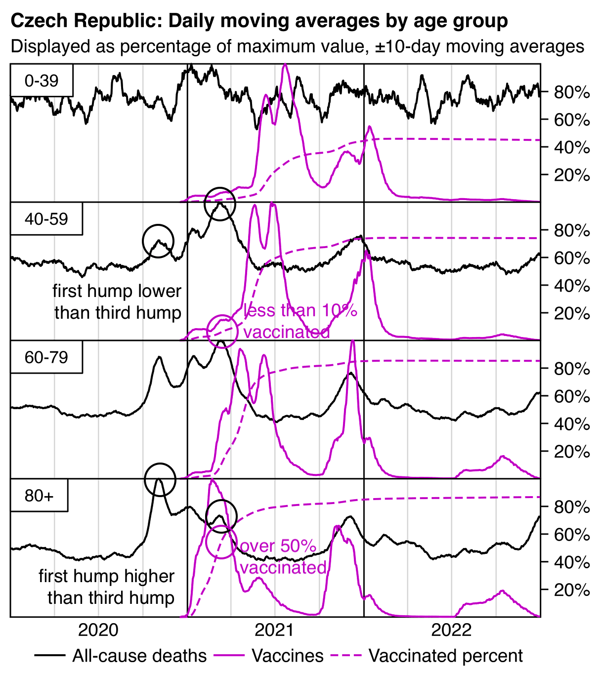
The plot above shows that there was a spike in deaths around December 2021, which a lot of people will probably blame on deaths caused by the first booster which was rolled out around the same time. In the plot above the spike in December 2021 is difficult to see or nonexistent in ages 0-19 and 20-39. However in the case of ages 40-59, 60-79, and 80+, the peak in deaths occurs in December in each of the age groups, even though the peak in new vaccine doses occurs earlier in older age groups and later in younger age groups, so that vaccine doses peak in November in ages 80+, in December in ages 60-79, and in January in ages 40-59.
In Denis Rancourt's paper about southern-hemisphere and equatorial countries, he included the plots for Peru that are shown in the GIF file below, and he argued that the spike of deaths in early 2021 was caused by the vaccines because the spike roughly coincided with the rollout of the first two doses in the oldest age groups. [https://correlation-canada.org/covid-19-vaccine-associated-mortality-in-the-southern-hemisphere/] However a major weakness of his argument is that the spike in deaths also occurred around the same time in younger age groups even though younger age groups got vaccinated much later than older age groups:
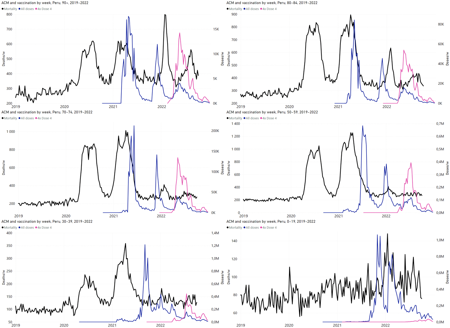
From the next plot which shows ASMR instead of the raw number of deaths, you can see that the third hump is higher than the first hump in unvaccinated people in ages 80+. But in ages 80+ about half of people had already been vaccinated by the time of the third hump, so the total height of the third hump among both vaccinated and unvaccinated people is relatively low. But in ages 40-59 less than 10% of people had been vaccinated by the time of the third hump, so the height of the hump is similar among all people and unvaccinated people:
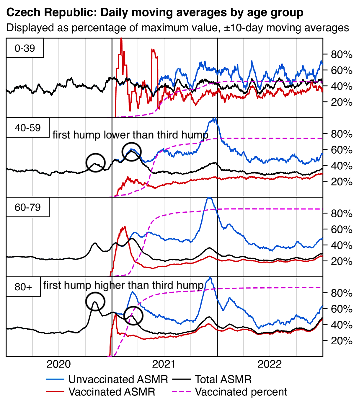
The Czech Ministry of Health has published CSV files for COVID deaths and hospitalizations by age: https://onemocneni-aktualne.mzcr.cz/api/v2/covid-19. Both COVID deaths and hospitalizations also have similar three-hump pattern as all-cause deaths, and in ages 80+ the first hump is the highest and the third hump is the lowest, but in ages 60-79 and 40-59 the third hump is higher than the first hump:
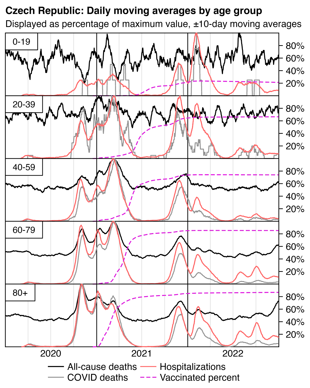
download.file("https://onemocneni-aktualne.mzcr.cz/api/v2/covid-19/nakazeni-hospitalizace-testy.csv","nakazeni-hospitalizace-testy.csv")
download.file("http://sars2.net/f/czbucketsdaily.csv.gz","czbucketsdaily.csv.gz")
download.file("https://onemocneni-aktualne.mzcr.cz/api/v2/covid-19/umrti.csv","umrti.csv")

library(data.table);library(ggplot2)

ma=\(x,b=1,f=b)setNames(rowMeans(embed(c(rep(NA,b),x,rep(NA,f)),f+b+1),na.rm=T),names(x))
ua=\(x,y,...){u=unique(x);y(u,...)[match(x,u)]}
age=\(x,y){x=as.numeric(x);y=as.numeric(y);(y-x-(y-789)%/%1461+(x-789)%/%1461)%/%365}

agecut=\(x,ages=seq(0,90,10))cut(pmax(x,0),c(ages,Inf),paste0(ages,c(paste0("-",ages[-1]-1),"+")),T,F)
ages=c(0,40,60,80)
agelev=agecut(0:120,ages)

xstart=as.Date("2020-01-01");xend=as.Date("2023-1-1")

rec=fread("Czech/data/CR_records.csv",showProgress=F)
set.seed(0);rec$birth=ua(paste0(rec$Rok_narozeni,"-1-1"),as.Date)+sample(0:364,nrow(rec),T)
p=rec[!is.na(DatumUmrti),.(y=.N,z="dead"),.(x=DatumUmrti,age=agelev[pmax(0,age(birth,DatumUmrti))+1])]
dt=rec[,.(x=as.IDate(unlist(.SD,,F)),birth),.SDcols=patterns("Datum_")][!is.na(x)]
p=rbind(p,dt[,.(y=.N,z="vax"),.(x,age=agelev[pmax(0,age(birth,x))+1])])

agegroups=c(0,1,20,30,seq(40,95,5))
b=fread("http://sars2.net/f/czbucketsdaily.csv.gz")
b=b[,.(dead=sum(dead),alive=sum(alive)),.(age=agecut(age,agegroups),age2=agecut(age,ages),date,dose=pmin(dose,1)+1)]
b=rbind(b,cbind(expand.grid(lapply(b[,1:4],unique)),alive=0,dead=0))|>unique(by=1:4)
b=rbind(b,b[,.(dead=sum(dead),alive=sum(alive),dose=0),.(age,age2,date)])
b=merge(fread("http://sars2.net/f/czcensus2021pop.csv")[,.(std=sum(pop)),.(age=agecut(age,agegroups))][,std:=std/sum(std)],b)
b=b[,.(pop=sum(alive),y=sum(dead/alive*std*365e5,na.rm=T)),.(x=date,z=paste0("asmr",dose),age=age2)]
p=rbind(p,b[,pop:=NULL])

b=fread("http://sars2.net/f/czbucketsdaily.csv.gz")
b=b[,.(pop=sum(as.double(alive))),.(age=agecut(age,ages),dose=pmin(dose,1),date)]
p=rbind(p,merge(b[dose==1],b[,.(total=sum(pop)),.(age,date)])[,.(y=pop/total,age,x=date,z="vaxpct")])

testy=fread("nakazeni-hospitalizace-testy.csv",na.strings="-")
testy=testy[,.(tests=sum(provedene_testy,na.rm=T),cases=sum(potvrzene_pripady,na.rm=T),hosp=sum(nove_hospitalizace,na.rm=T)),.(date=datum,age=agelev[as.numeric(sub("[-+].*","",vekova_kategorie))+1])][!is.na(age)]
p=rbind(p,testy[,.(x=date,age,y=hosp,z="hosp")])

p=rbind(p,fread("umrti.csv")[,.(y=.N,z="coviddead"),.(x=datum,age=agecut(vek,ages))])

p=p[x%in%xstart:(xend-1)]
p=p[!is.na(age)]

xbreak=seq(xstart,xend,"6 month");xlab=c(rbind("",2020:2022),"")

var=read.csv(row.names=1,text="name,group,linetype
dead,All-cause deaths,1,solid
vax,Vaccines,2,solid
asmr0,Total ASMR,3,solid
asmr1,Unvaccinated ASMR,3,solid
asmr2,Vaccinated ASMR,3,solid
hosp,Hospitalizations,4,solid
pcr,PCR positivity,5,solid
coviddead,COVID deaths,6,solid
vaxpct,Vaccinated percent,7,42")
var$color=c("black","#cc00cc","black",hsv(7/12,1,.8),hsv(0,1,.8),hsv(0,.8,.8),hsv(1/3,1,.7),"gray50",hsv(10/12,.8,.8))

p=unique(rbind(p,cbind(expand.grid(lapply(p[,-3],unique)),y=0)),by=c("x","age","z"))[order(z,age,x)]

keep=c("dead","coviddead","hosp","vaxpct")

p=p[z%in%keep][,z:=factor(z,keep)]
color=var[keep,]$color
linetype=var[keep,]$linetype
p=p[order(x)]
p[,mav:=ztrim(ma(y,10)),.(age,z)]
p[,group:=var[levels(z)[z],]$group]
p=merge(p,p[,.(max=max(mav,na.rm=T)),.(group,age)])
p[z=="vaxpct",max:=1]
levels(p$z)=var[levels(p$z),]$name

ggplot(p,aes(x))+
facet_wrap(~age,ncol=1,strip.position="top")+
geom_vline(xintercept=seq(xstart,xend,"3 month"),linewidth=.25,color="gray85")+
geom_vline(xintercept=seq(xstart,xend,"year"),linewidth=.25,lineend="square")+
geom_hline(yintercept=0:1,linewidth=.25,lineend="square")+
geom_line(aes(y=mav/max,color=z,linetype=z),linewidth=.35)+
geom_label(data=data.frame(age=levels(p$age)),aes(label=paste0("\n   ",age,"   \n")),x=xstart,y=1,lineheight=.5,hjust=0,vjust=1,size=2.3,fill=alpha("white",1),label.r=unit(0,"lines"),label.padding=unit(0,"lines"),label.size=.25)+
labs(x=NULL,y=NULL,title="Czech Republic: Daily moving averages by age group",subtitle="Displayed as percentage of maximum value, ±10-day moving averages"|>stringr::str_wrap(70))+
scale_x_date(limits=c(xstart,xend),breaks=xbreak,labels=xlab)+
scale_y_continuous(limits=0:1,breaks=seq(.2,.8,.2),labels=\(x)paste0(x*100,"%"),position="right")+
scale_color_manual(values=color)+
scale_linetype_manual(values=linetype)+
coord_cartesian(clip="off",expand=F)+
guides(color=guide_legend(nrow=1,byrow=F))+
theme(axis.text=element_text(size=7,color="black"),
  axis.ticks=element_line(color="black",linewidth=.25),
  axis.ticks.length.x=unit(0,"pt"),
  axis.ticks.length.y=unit(3,"pt"),
  legend.background=element_blank(),
  legend.box.spacing=unit(0,"pt"),
  legend.direction="horizontal",
  legend.justification=c(.5,.5),
  legend.key.height=unit(8,"pt"),
  legend.key.width=unit(15,"pt"),
  legend.key=element_blank(),
  legend.margin=margin(2),
  legend.position="bottom",
  legend.spacing.x=unit(1,"pt"),
  legend.text=element_text(size=7,vjust=.5),
  legend.title=element_blank(),
  panel.background=element_blank(),
  panel.grid=element_blank(),
  panel.spacing=unit(0,"pt"),
  plot.margin=margin(4,4,4,4),
  plot.subtitle=element_text(size=7,margin=margin(,,3)),
  plot.title=element_text(size=7.5,face="bold",margin=margin(1,,3)),
  strip.background=element_blank(),
  strip.text=element_blank())
ggsave("1.png",width=3.2,height=3.6,dpi=380*4)
system("magick 1.png -resize 25% PNG8:1.png")
In Sweden people who lived in care homes had a very low number of COVID deaths around March 2021 which corresponds to the third hump in the Czech Republic: [https://x.com/dobssi/status/1863790895662878745]
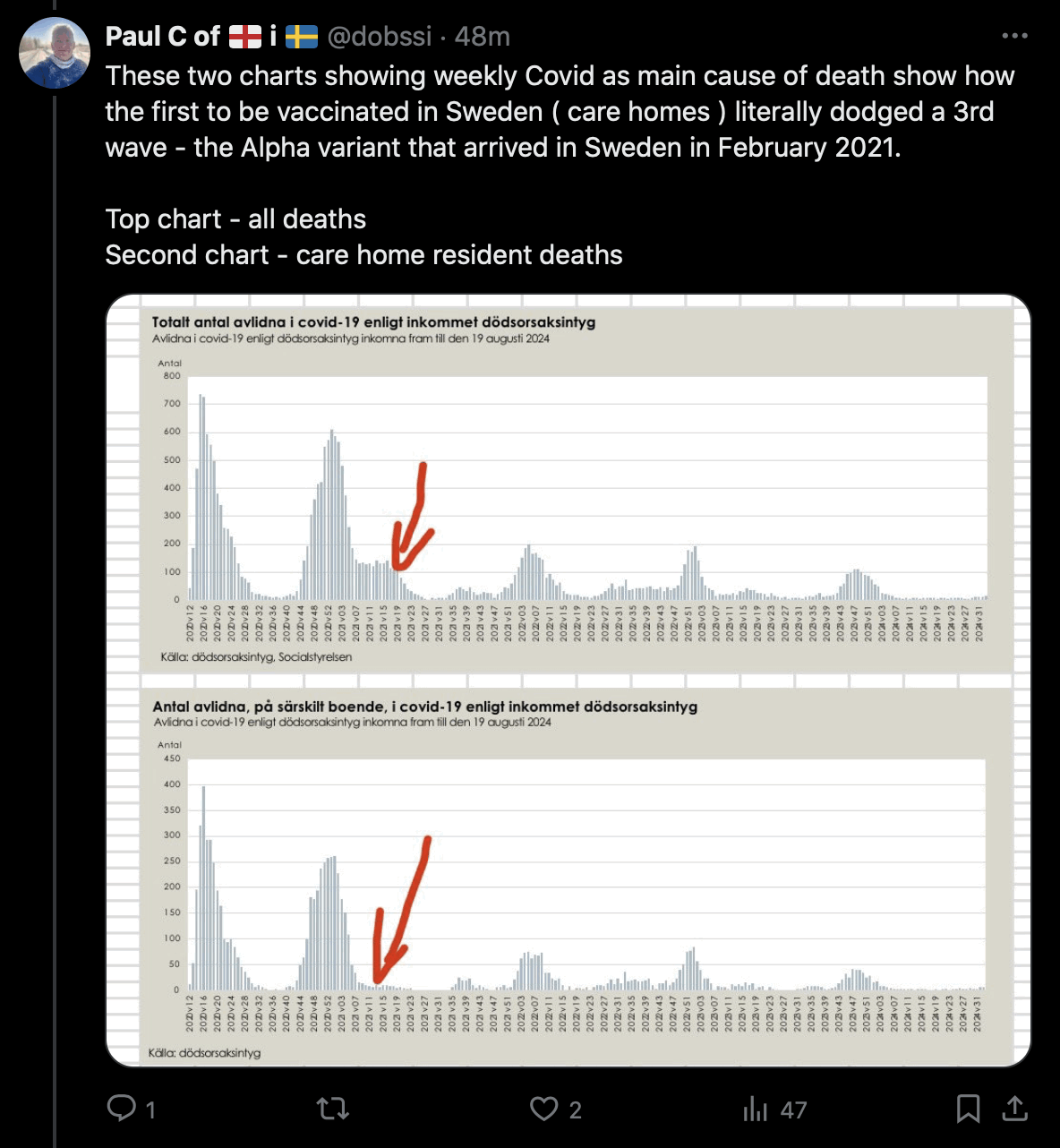
This plot also shows that care homes had a low number of cases around week 14 of 2021 when there was a peak in cases among the whole Swedish population: [https://x.com/dobssi/status/1863866821163508132]
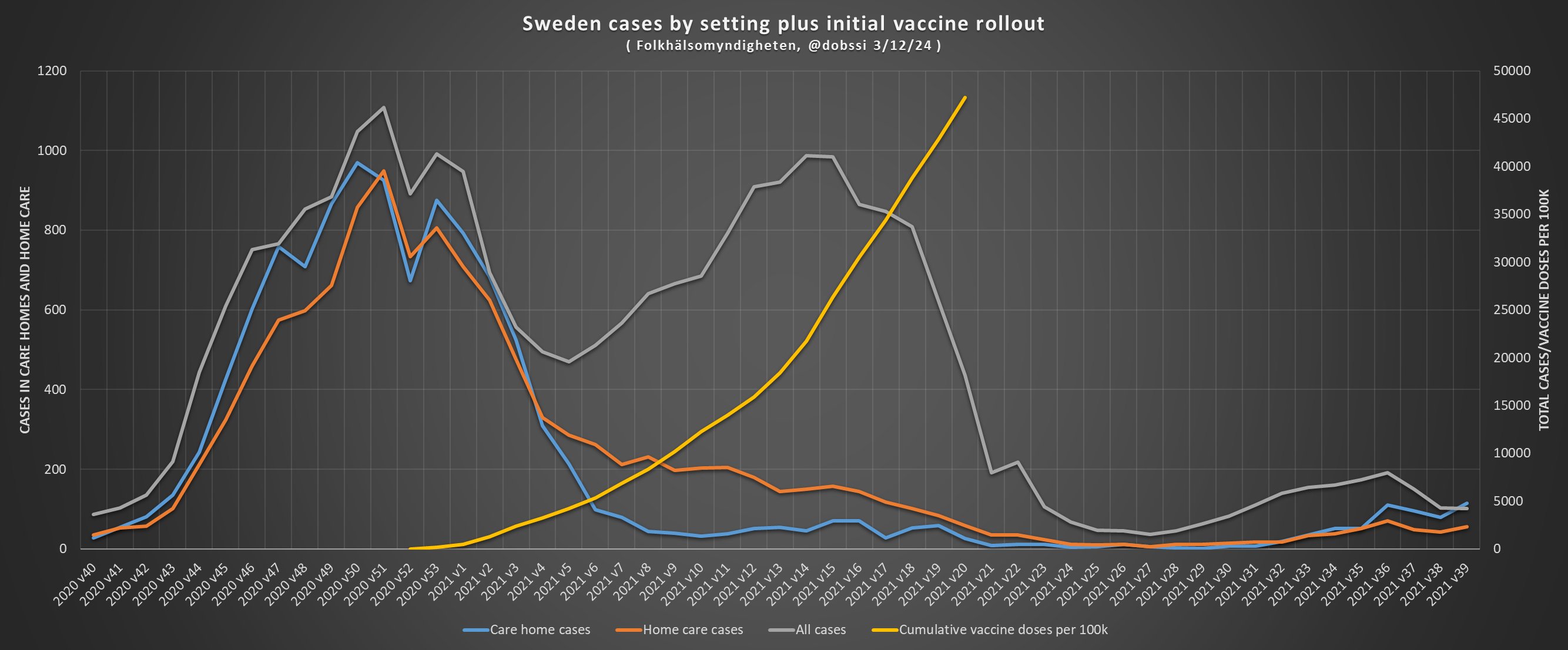
The CSV file for the record-level data was committed to GitHub by Tadeáš Fryčák, but he was also one of the authors of a paper published in May 2024 titled "Does the healthy vaccinee bias rule them all? Association of COVID-19 vaccination status and all-cause mortality from an analysis of data from 2.2 million individual health records": https://www.sciencedirect.com/science/article/pii/S1201971224000468. The authors of the paper described two sets of record-level data which only included about 2 million people in total, and not over 11 million people like the new dataset:
Using a Freedom of Information request, we obtained data from two health insurance houses (in the Czech Republic, health insurance is compulsory and multiple health insurance houses provide the service). Each line in the dataset corresponded to a unique individual and included their sex, age, dates and types of all COVID vaccines, and (if applicable), the date of death. When trying to find out whether there is a difference between the baseline frailty of the groups, ACM is the most telling parameter as it is not burdened with any possible misclassification on the cause of death. For this reason, only ACM will be considered in this study.
Each cooperating insurance company decided to blur the data slightly to exclude the possibility of identification of any individual. The first dataset provided by the Czech Business Insurance Company (CPZP) comprises 1,362,924 individuals, i.e., approx. 13% of the Czech population. It is by no means a fully representative sample of the Czech population because the clients of CPZP tend to be younger than average. However, the size of the cohort allows interesting analyses. The time data were blurred to week and year. The other dataset provided by the Professional Insurance Company (OZP) comprises 827,475 individuals, representing another 8% of the Czech population, the time data were blurred to month and year of events. The OZP dataset will serve for validation of the results obtained from the larger CPZP dataset. In all, we have complete data on mortality and vaccination of more than 2 million individuals over the entire period of 2021 and 2022. Both the datasets are available at https://github.com/PalackyUniversity/hve.
The authors observed the phenomenon where the mortality rate of people with 2 doses shot up when the third dose was rolled out, but they attributed it to the healthy vaccinee effect. Martin Neil and Norman Fenton have hypothesized that the same phenomenon might be explained by a classification delay which they call the "cheap trick", where deaths that occured within a certain number of weeks after the third dose would've been classified under the second dose. But because the authors of the Czech paper had access to the record-level data which showed the dates of vaccination and death of individual people, the authors could know for sure that the cheap trick was not being used in the data. They included the following comments about the plot shown below:
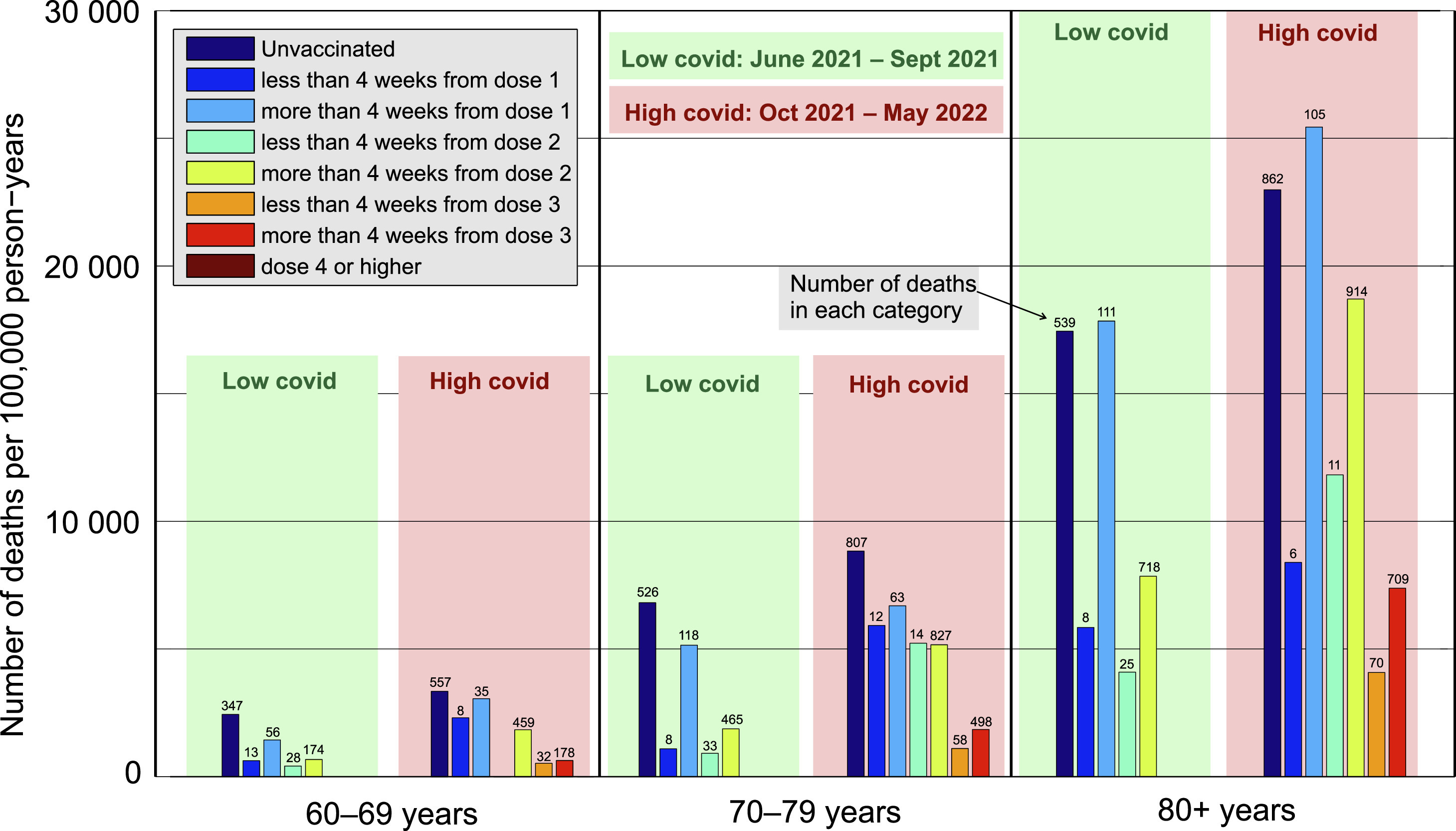
[...]
Now, let us focus on the red panels, covering the "high-COVID" period of October 2021-May 2022. In that period, the Czech Republic recorded almost 10,000 COVID-related deaths, which translates into an average of 40 deaths with/from COVID-19 per day. The vaccine effectiveness in preventing COVID-related deaths should lead to an increase in the ratio of unvaccinated:vaccinated ACM. However, the exact opposite happened. In all age groups, the ACM in the cohort with completed primary course (yellow bars) more than doubled compared to the low-COVID period, while the ACM of the unvaccinated cohort rose only by a third. A sanity check with the same analysis performed for the other dataset (OZP insurance company) yielded consistent results (see Supplement S6). This paradoxical observation can be caused by the fact that in the high-COVID period, vaccination by the third dose was underway, which, again, led to a subselection of the healthier group for booster dose vaccination, while infirm individuals concentrated in the group "primary course for more than 2 months."
More than two thirds of all vaccines had the type "Comirnaty" (Pfizer) each month until September 2022, when many people started getting Pfizer's Omicron vaccines ("Comirnaty Original/Omicron BA.1" and "Comirnaty Original/Omicron BA.4/BA.5"). In the table below only vaccines with the type "Comirnaty" are included under Pfizer.
Most Janssen vaccines were given between August 2021 and November 2021. Most AstraZeneca vaccines were given between February 2021 and July 2021, and there were almost no AstraZeneca vaccines given after November 2021.
> ua=\(x,y,...){u=unique(x);y(u,...)[match(x,u)]}
> rec=fread("CR_records.csv")
> date=rec[,`class<-`(unlist(.SD,,F),"Date"),.SDcols=paste0("Datum_",1:7)]|>ua(substr,1,7)
> type=rec[,unlist(.SD,,F),.SDcols=paste0("OckovaciLatka_",1:7)]
> name1=c("Comirnaty","SPIKEVAX","VAXZEVRIA","COVID-19 Vaccine Janssen","")
> name2=c("Pfizer","Moderna","AstraZeneca","Janssen","")
> type=ifelse(type%in%name1,name2[match(type,name1)],"Other")
> m=data.table(date,type)[type!="",.N,.(date,type)][,xtabs(N~date+type)]
> round(m/rowSums(m)*100,1)
         type
date      AstraZeneca Janssen Moderna Other Pfizer
  2020-12         0.0     0.0     0.0   0.0  100.0
  2021-01         0.0     0.0     2.8   0.0   97.2
  2021-02         6.7     0.0     8.0   0.0   85.3
  2021-03        19.2     0.0    12.2   0.0   68.5
  2021-04        10.5     0.4    11.3   0.0   77.8
  2021-05         7.3     1.6     7.8   0.0   83.4
  2021-06         7.0     1.8     7.4   0.0   83.8
  2021-07         5.2     2.4     6.8   0.0   85.5
  2021-08         2.2     5.4     3.5   0.0   88.9
  2021-09         0.5    10.4     7.0   0.0   82.1
  2021-10         0.2    10.1     7.1   0.0   82.6
  2021-11         0.0     8.6    10.3   0.0   81.1
  2021-12         0.0     0.8    12.9   0.0   86.3
  2022-01         0.0     0.3    12.9   0.0   86.8
  2022-02         0.0     0.3    10.9   0.0   88.8
  2022-03         0.0     0.4    11.3   3.3   85.0
  2022-04         0.0     0.4     9.5   4.2   86.0
  2022-05         0.0     0.5     9.0   2.3   88.2
  2022-06         0.0     0.5     8.5   2.0   88.9
  2022-07         0.0     0.3     8.3   0.8   90.6
  2022-08         0.0     0.2     8.9   0.5   90.5
  2022-09         0.0     0.1     4.3  46.8   48.7
  2022-10         0.0     0.0     0.7  85.9   13.3
  2022-11         0.0     0.1     0.5  88.6   10.8
  2022-12         0.0     0.2     0.4  87.6   11.9
  2023-01         0.0     1.0     1.4  84.6   13.1
  2023-02         0.0     1.6     1.7  79.5   17.2
  2023-03         0.0     2.2     1.0  75.5   21.4
  2023-04         0.0     4.6     1.3  73.9   20.3
  2023-05         0.0     2.5     0.7  72.5   24.2
  2023-06         0.0     1.5     0.8  69.5   28.2
  2023-07         0.0     1.7     1.1  86.9   10.3
  2023-08         0.0     1.1     0.0  85.6   13.3
  2023-09         0.0     0.0     0.1  93.0    7.0
  2023-10         0.0     0.0     0.1  94.7    5.3
  2023-11         0.0     0.0     0.1  95.6    4.3
  2023-12         0.0     0.0     0.0  96.5    3.5
  2024-01         0.0     0.0     0.0  97.5    2.5
  2024-02         0.0     0.0     0.0  96.6    3.4
  2024-03         0.0     0.0     0.0  98.9    1.1
Kirsch included this comment in the file
Full analysis - All vaccines.xlsx:
>>> def dp(r, mrr):
...     return (r-1)/(r-mrr)
...
>>> dp(3, 1.5)
1.3333333333333333
>
I think that's probably the most conservative estimate: that Moderna has an excess mortality ratio (EMR, which is R in the function above) of 3, and an absolute MRR of 1.5 per the Czech data.
This would mean that Pfizer has an MR vs a saline shot of 1.33, or a 33% increase in all cause mortality.
So if MRP = 1.3, then MRm=1.3*1.5=1.95
And if half the public got Pfizer and half got Moderna, we have an excess ACM of 62%.
If Moderna is 1/4 of the doses given and has a 3X EMR, then Moderna death numbers = Pfizer death numbers.
But only 75% of people are vaccinated so that there would be an overall 46% increase in ACM in the group affected the most.
This corresponds of what the insurance data says.
In the code below I calculated a linear trend in mortality rate in 2013-2019 for each single year of age, I projected the trend to 2021-2022, and I multiplied the projected mortality rates by the population estimates for each age in 2021 and 2022 to get the expected number of deaths. But it gave me a total excess mortality of only about 17% in 2021-2022, which is less than half of Kirsch's 46% increase:
> t=fread("http://sars2.net/f/czpopdead.csv")
> t$base=t$pop*c(t(sapply(split(t,t$age),\(x)predict(lm(dead/pop~year,x[year%in%2013:2019]),x))))
> t=t[year%in%2021:2022,.(dead=sum(dead),base=sum(base)),.(year,age=pmin(80,age%/%20*20))]
> t=rbind(t,t[,.(dead=sum(dead),base=sum(base),age="Total"),year])
> t=rbind(t,t[,.(dead=sum(dead),base=sum(base),year="Total"),age])
> xtabs(round((dead/base-1)*100)~year+age,t)
       age
year      0  20  40  60  80 Total
  2021  -11  17  30  30  20    25
  2022   -9  13  10   6  11     8
  Total -10  15  20  18  16    17
Kirsch said that 75% of people were vaccinated, but I don't know if his figure is supposed to have included all ages or if it didn't include children in the ages that generally didn't get vaccinated. Because if you include all ages, then the total percentage of vaccinated people in the record-level data is only about 64-65% in 2022 (which is similar to OWID's figure of about 66% vaccinated people in 2022):
> t=fread("http://sars2.net/f/czbucketskeep.csv.gz")[dose<=1&month>="2020-12"]
> t=t[,.(alive=sum(as.double(alive)),dead=sum(dead)),.(dose,month,age=factor(pmin(100,age%/%10*10)))]
> t=rbind(t,t[,.(alive=sum(alive),dead=sum(dead),month="Total"),.(age,dose)])
> t=rbind(t,t[,.(alive=sum(alive),dead=sum(dead),age="Total"),.(month,dose)])
> t[,.(vaxpct=sum(alive[dose==1])/sum(alive)*100),.(month,age)][,round(xtabs(vaxpct~month+age))]
         age
month      0 10 20 30 40 50 60 70 80 90 100 Total
  2020-12  0  0  0  0  0  0  0  0  0  0   0     0
  2021-01  0  0  1  1  1  2  1  1  6  8   7     1
  2021-02  0  0  2  2  3  3  2  2 27 32  19     3
  2021-03  0  0  3  4  6  7  6 22 58 51  28     8
  2021-04  0  0  5  6 10 13 18 56 71 60  32    15
  2021-05  0  1  8 11 24 41 59 75 77 65  34    29
  2021-06  0  4 21 33 52 61 72 80 81 68  35    43
  2021-07  0 15 40 45 59 65 75 82 82 69  35    50
  2021-08  0 27 49 50 63 68 78 84 83 70  35    55
  2021-09  0 31 52 52 64 70 79 85 84 71  35    56
  2021-10  0 33 54 54 65 71 79 85 84 72  35    57
  2021-11  0 37 60 58 69 74 81 86 85 73  35    60
  2021-12  0 41 65 62 71 76 82 88 86 75  36    63
  2022-01  2 44 67 64 72 76 83 88 87 76  36    64
  2022-02  3 45 68 64 72 77 83 88 87 76  37    65
  2022-03  3 45 68 64 72 77 83 88 88 76  37    65
  2022-04  3 44 68 64 72 77 83 88 88 77  37    65
  2022-05  3 44 69 64 72 77 83 88 88 77  37    65
  2022-06  2 43 69 64 72 77 83 88 88 77  37    65
  2022-07  2 43 69 64 72 77 83 88 88 77  37    64
  2022-08  2 43 69 64 72 77 83 88 88 78  37    64
  2022-09  2 42 69 64 72 77 83 88 88 78  37    64
  2022-10  2 42 69 64 72 77 83 88 88 78  36    64
  2022-11  2 41 69 64 72 77 83 88 88 78  36    64
  2022-12  2 41 69 64 72 77 83 88 88 78  36    64
  Total    1 28 47 46 54 59 65 73 75 66  33    49