
Other parts: rootclaim2.
Kirsch posted his initial arguments here:
https://
Kirsch wrote: "And then there is miscategorization bias. Engler (2024) points out that every single study with the words (covid, vaccine, efficacy, safety) that Neil and Fenton (2024) could locate had one or more types of miscategorization errors."
I wrote about Neil and Fenton's paper here:
uk.
Neil and Fenton's cheap trick paper was recently demolished by Peter
Hegarty, who is a professor of mathematics at the University of
Gothenburg. [https://
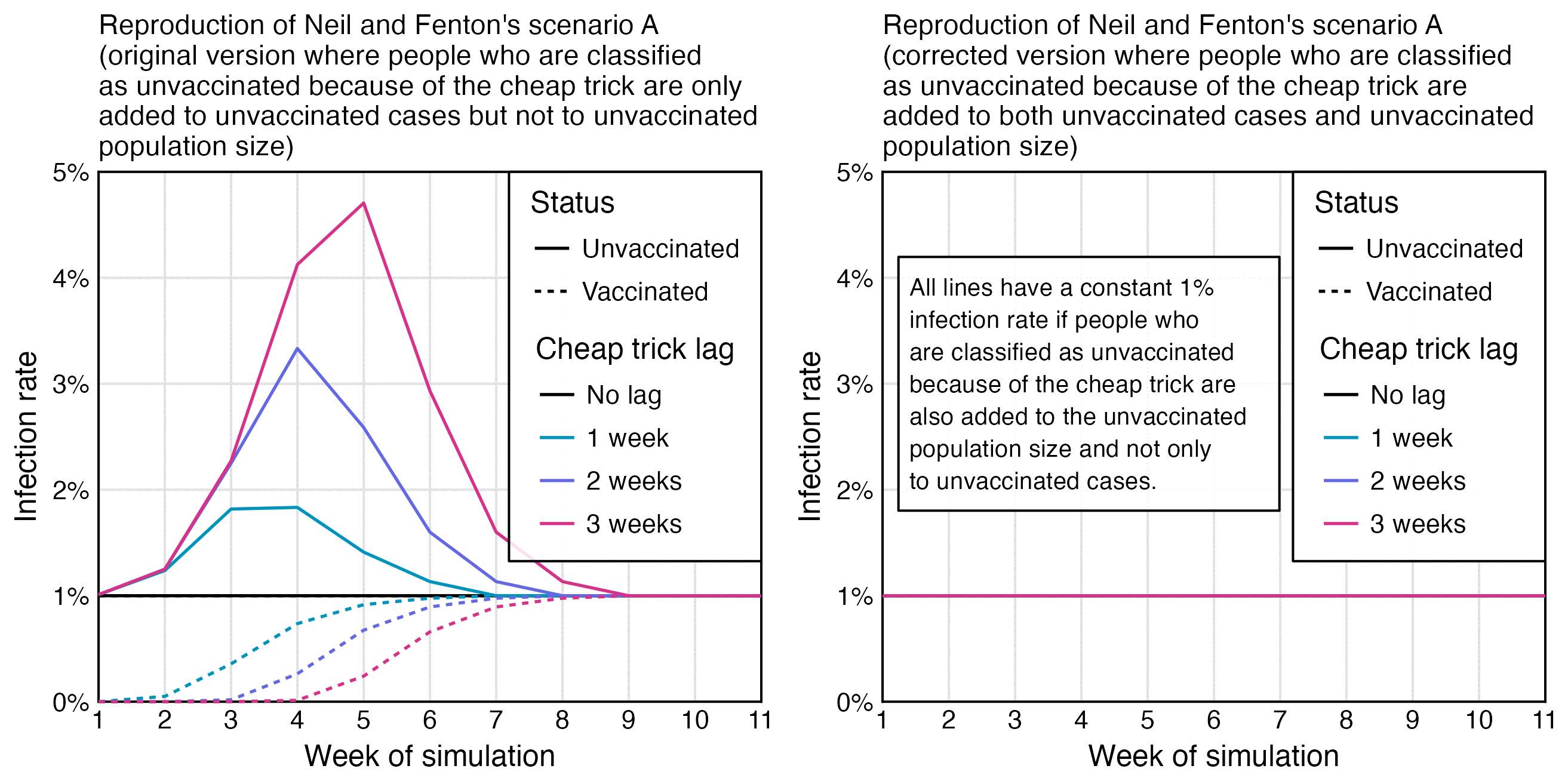
The abstract of Neil and Fenton's paper said: "Simulation demonstrates that this miscategorisation bias artificially boosts vaccine efficacy and infection rates even when a vaccine has zero or negative efficacy." But in their simulation the 1-to-3-week classification delay was only applied to the numerator for cases but not to the denominator for the population size:
When I modified their simulation so that I also applied the classification delay to the numerator, unvaccinated and vaccinated people got an identical infection rate:
Earlier when Fenton and Neil posted a similar simulation on Substack, even people in their Substack comments were saying that their simulation was wrong:

I have asked Neil and Fenton to cite a single study where the classification delay was only applied to the numerator but not to the denominator, and I have also asked it from Mathew Crawford and James Lyons-Weiler who have supported Neil and Fenton's approach of applying the delay only to the numerator, but none of them has been able to cite a single study.
Neil and Fenton's paper was highly misleading because they conflated their simulation where the classification delay was only applied to the numerator with real studies where the delay was also applied to the denominator, but they didn't even make it clear in their paper that they only applied the delay to the numerator in their simulation. I had to read their old Substack post to understand how their simulation worked because it was not described properly in their paper.
Kirsch also wrote: "Fenton, Neil, McLachlan and Craig also managed to successfully demonstrate to the UK Office of the Statistics Regulator that these miscategorisation processes meant official statistics in the UK could not be relied upon when used to support arguments of Covid-19 vaccine effectiveness (link)".
He linked to a response by the UK Office for Statistics Regulation which said: "In your paper you also state that the number of deaths reported within the first 21 days of receiving the first dose of the Covid-19 vaccination is below that which could be expected in the general population, and that this difference is evidence of systematic undercounting of deaths by ONS. Our view of this question starts with the consideration that the population included is not representative of the general population, and it is therefore likely that any pattern you observe is attributable to the 'healthy vaccinee' effect. This happens when people who are ill (either due to COVID-19 or another relevant illness) are likely to delay vaccination. The result of this effect is a lower-than-average mortality rate within the first 21 days of receiving a vaccination. This effect is described by ONS in their Deaths by Vaccination Status publication."
So basically the response said that the misclassification hypothesis by Fenton et al. was likely wrong, because the low number of deaths in the first few weeks after vaccination can be explained by the HVE instead. Other countries also have a very low number of deaths in the first few weeks after vaccination if you trust the record-level datasets from New Zealand, the United States, and the Czech Republic. It's why I have been saying that the record-level datasets are the Achilles' heel of the Cheap Tricksters called Fenton and Neil.
The letter by Craig, Neil, Fenton, and McLachlan related to a
hypothesis presented in their preprint from March 2022 titled "Official mortality data for England reveal systematic
undercounting of deaths occurring within first two weeks of Covid-19
vaccination". [https://
However Craig et al. didn't take into account that the temporal healthy vaccinee effect actually lasts longer than 2 weeks, but if you plot deaths by weeks since the first dose in England, the increasing trend in mortality caused by the waning out of the temporal HVE is counteracted by the decreasing trend in the background mortality rate, because many first doses in England were given during the first three months of 2021 when the mortality rate was falling rapidly because the COVID wave in the winter of 2020-2021 was passing by.
A similar effect can also be seen in the next plot of the Czech
record-level data, where the light gray line has a sharp drop during the
first weeks after vaccination, because the light gray line is adjusted
for the background mortality rate among the entire Czech population
during the ongoing month: [connecticut.

And in the next plot if you look at the dark gray line which is not adjusted for the monthly background mortality rate, the temporal HVE only seems to last about 3 weeks because there is a dent in deaths around the 4th week, even though it's because the rising trend in deaths due to waning out of the HVE is counteracted by the falling trend in background mortality rate. But in the light gray line which is adjusted for background mortality rate, the temporal HVE seems to last around 20 weeks instead:

I believe a similar effect explains why the temporal HVE for first
doses only appears to last about 3 weeks in Kirsch's Medicare data even
though it lasts longer in Barry Young's New Zealand data, because in the
US a lot of people got the first dose during the tail end of a COVID
wave in early 2021, but New Zealand was free of COVID in 2021 when most
people got the first dose: [connecticut.

Clare Craig might have later come to the conclusion that the low
number of deaths during the first two weeks after vaccination might be
explained by the HVE, because in 2024 when someone asked her what she
meant by the healthy vaccinee effect, she answered that "Studies show that the first few weeks after vaccination
are outliers because people who are feeling ill postpone." [https://
In 2022 Martin Neil tweeted: "The ONS's December
report claims anomalies we identified are caused by healthy vaccinee
effect. We examined the new ONS data and found NO evidence to support
this claim". [https://
So the old letter by Craig and Neil et al. might no longer represent their current views regarding the HVE. The letter also conflicts with the view of Kirsch, who has said that the HVE explains why his record-level datasets have a low number of deaths in the first few weeks after vaccination, but he has not claimed that his record-level datasets would suffer from the kind of miscategorization bias that was hypothesized by Clare Craig, Martin Neil, and Norman Fenton.
In the ONS dataset for deaths by vaccination status, the ASMR of
people with n-1 doses shoots up when the nth dose is rolled out. Fenton
and Neil hypothesized it was because people who died soon after
receiving the nth dose were misclassified under dose n-1. But the next
plot demonstrates three major problems with their hypothesis: [uk.

Kirsch wrote:
This just-published study done by the CDC shows in Table 2 that the Pfizer vaccine given to COVID-naive kids increases the risk of symptomatic COVID infection: HR 3.57 (1.10, 11.63). Since, by the CDC's own study, the vaccine increases the odds of a symptomatic COVID infection by an estimated 3.57 in healthy kids under 4, what do you think it will do to the elderly? It is highly unlikely for a vaccine to simultaneously increase the risk of infection in one age group (e.g., children under 4) while reducing it in another age group (e.g., adults). There are NO well-documented examples where a vaccine increased infection risk in one demographic while reducing it in another. Show me the counterexample if you think I'm wrong. Otherwise, we're done with this category. Since even the CDC admits they were wrong (i.e., their own paper shows vaccines increased risk).
The paper he linked is behind a paywall and not at Sci-Hub or
Researchgate so I wasn't able to read it:
https://
The results of the paper seem to match this CDC dataset where the
rate of COVID cases per person-weeks is similar in unvaccinated and
vaccinated people in ages 0-4, even though in older age groups the ratio
gradually gets much higher in unvaccinated people: [https://

library(data. table); library( ggplot2) t=fread( " Rates_ of_ COVID- 19_ Cases_ or_ Deaths_ by_ Age_ Group_ and_ Updated__ Bivalent__ Booster_ Status_ 20241231. csv") p=t[ outcome==" case" & age_ group! =" all_ ages" & vaccination_ status==" vaccinated"] p[, x: =isoweek( mmwr_ week%/% 100, mmwr_ week%% 100, 4)] p[, vaxpct: =vaccinated_ population/( vaccinated_ population+ unvaccinated_ population)* 100] lab=c( " Unvaccinated", " Fully vaccinated", " Vaccinated percent (panel top is 100%) ") p=p[,.( x, y=c( c( crude_ unvax_ ir, crude_ vax_ ir)/ 7* 365, vaxpct), z=factor( rep( lab, each=. N), lab), group=age_ group)] age=unique( p$ group); p[, group: =factor( group, age[ order( as. integer( sub( "[-+].* ", " ", age)))])] p=merge( p, p[ z! =levels( z)[ 3],.( maxy=max( y)), group]) p[ z==levels( z)[ 3], y: =y/ 100* maxy] xstart=as. Date( " 2021- 7- 1"); xend=as. Date( " 2023- 7- 1") xbreak=as. Date( c( " 2021- 10- 1", " 2022- 7- 1", " 2023- 4- 1")); xlab=year( xbreak) ggplot( p, aes( x, y))+ facet_ wrap(~ group, ncol=2, dir=" v", scales=" free_ y")+ geom_ vline( xintercept=seq( as. Date( " 2022- 1- 1"), xend, " year"), color=" gray80", linewidth=. 5)+ geom_ line( aes( color=z, linetype=z), linewidth=. 6)+ geom_ text( data=p[, max( y), group], aes( y=V1, label=group, x=xstart+ 20), fontface=2, size=3. 6, vjust=1. 9, hjust=0)+ labs( title=" CDC: COVID cases per 100, 000 person- years by vaccination status and age", subtitle=paste0( " Source: CDC dataset \" Rates of COVID- 19 Cases or Deaths by Age Group and Updated (Bivalent) Booster Status\ ". The fully vaccinated group consists of people who have completed the primary series doses at least 14 days ago. Partially vaccinated people are excluded. ")| > stringr:: str_ wrap( 76), x=NULL, y=NULL)+ scale_ x_ continuous( limits=c( xstart-. 5, xend+. 5), breaks=xbreak, labels=xlab)+ scale_ y_ continuous( limits=c( 0, NA), breaks=\( x){ y=pretty( x, 4); y[ y< max( x)*. 9]},