Other parts: rootclaim.html, rootclaim2.html, rootclaim3.html, rootclaim4.html, rootclaim5.html.
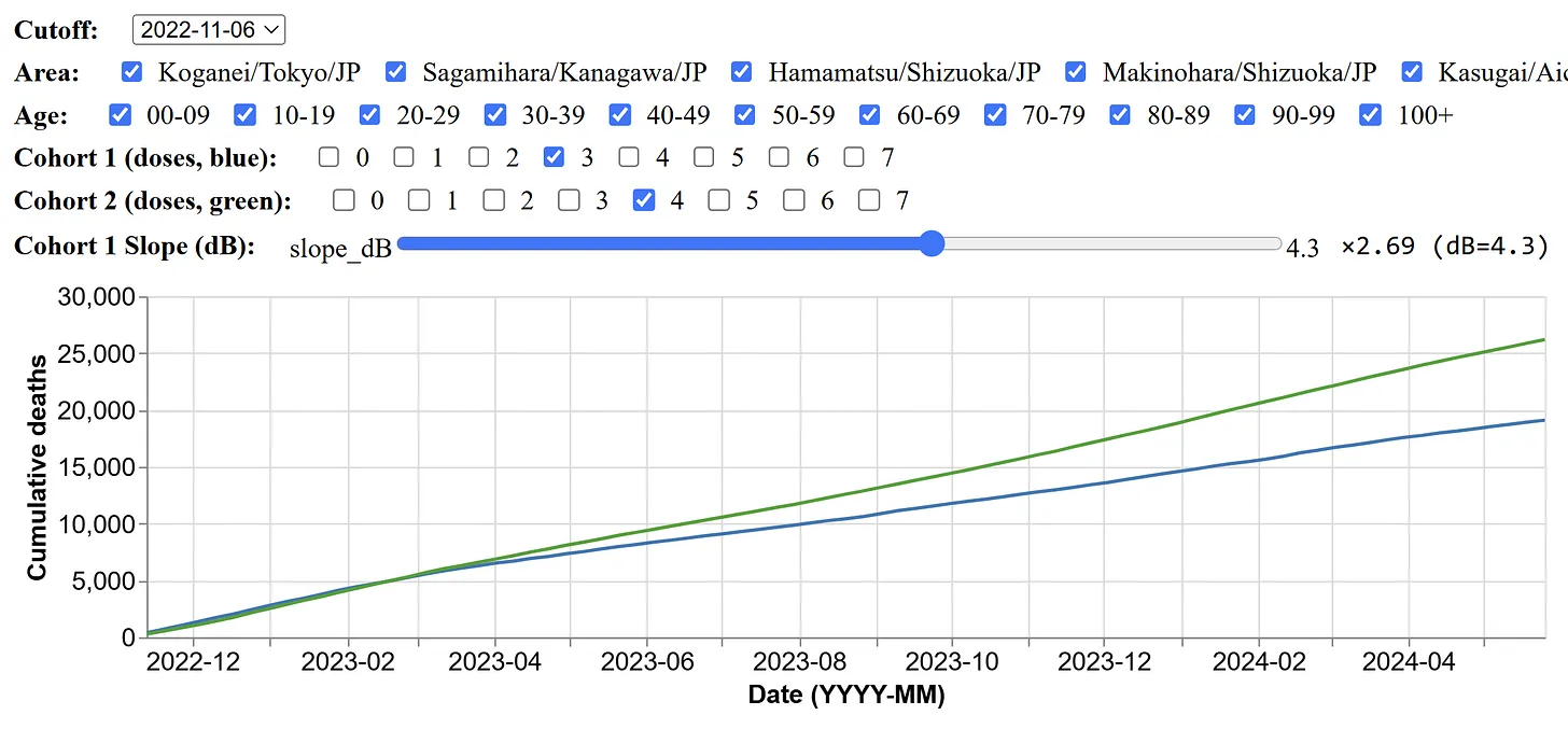
Kirsch posted the plot below and wrote: "Every time you compare the two cohorts, the more vaccinated cohort will have mortality even though they tracked at the start. This is NOT NORMAL. If they track at the start, they should continue to track. If the shots worked, the more vaxxed cohort would exhibit LOWER mortality, not higher mortality." [https://kirschsubstack.com/p/japan-cmrr-data-website-shows-clear]
By "mortality", Kirsch meant the cumulative number of deaths multiplied by a constant factor, where he chose the constant factor so that his two lines were roughly aligned at the start of the x-axis. But if by mortality you mean ASMR instead, then the 4-dose cohort has lower mortality than the 3-dose cohort even at the end of the x-axis.
At the start of the x-axis, people with 4 doses have reduced mortality because of the healthy vaccinee effect, and people with 3 doses have elevated mortality because of the straggler effect. But over time the ASMR of the two cohorts converges.
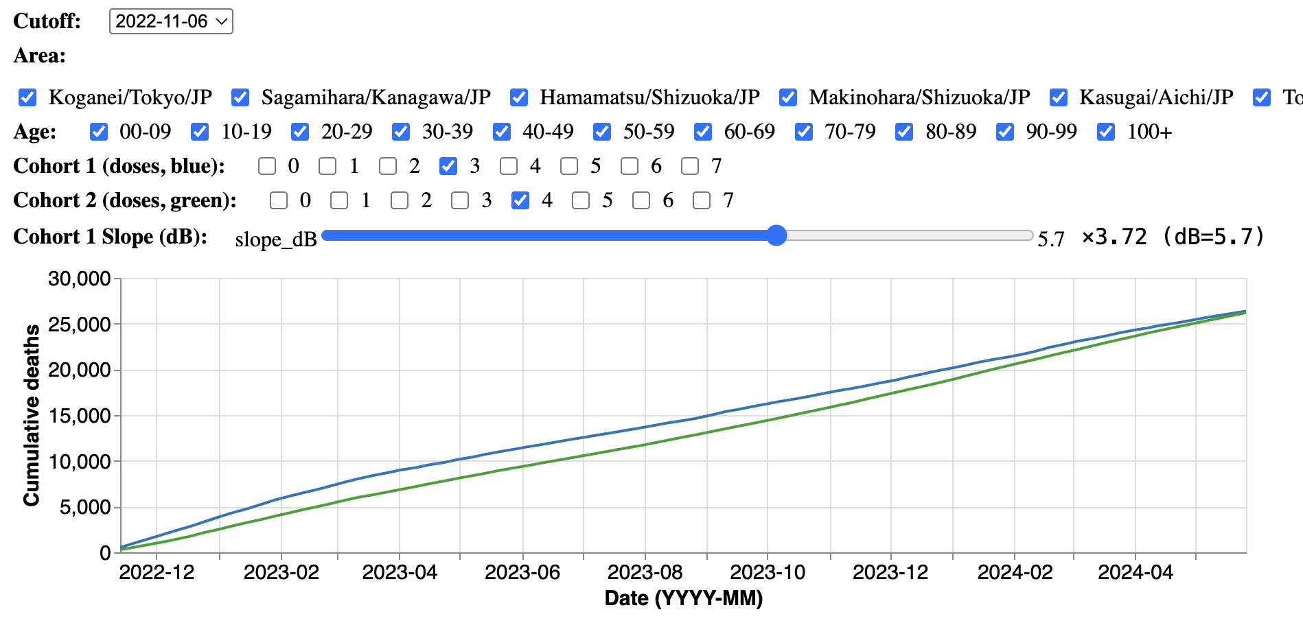
Kirsch aligned the lines so that they matched at the start of the x-axis, but when the line for dose 4 subsequently rose above the line for dose 3, Kirsch attributed the increase to harm caused by vaccines. But if you align the lines so that they match at the end of the x-axis instead, then it rather looks like dose 3 has high mortality at the start of the x-axis relative to dose 4, which can be explained by the straggler effect: [https://medicalfacts.info/kcor.rb]
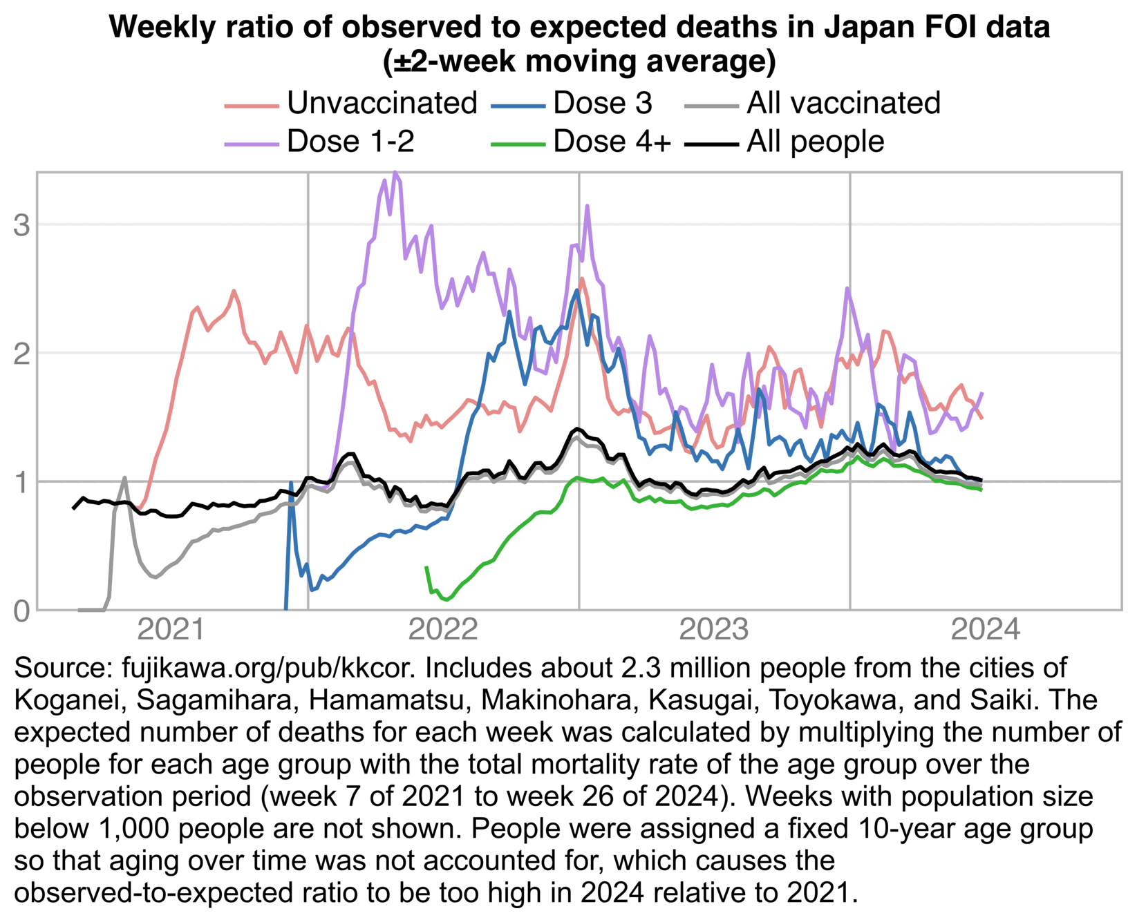
Kenji Fujikawa has now published CSV files of FOI data from 7 cities here: https://fujikawa.org/pub/kkcor/. I used his files to make the next plot, which shows that in late 2022 when the 4th dose is rolled out, the mortality of people with 3 but not more doses shoots up because of the straggler effect. But by late 2023 the straggler effect has weakened, so people with 3 but not more doses have almost as low mortality as people with 4 or more doses:
system("wget -rl1 -np -nd -Acsv fujikawa.org/pub/kkcor")

ma=\(x,b=1,f=b){x[]=rowMeans(embed(c(rep(NA,b),x,rep(NA,f)),f+b+1),na.rm=T);x}

t=do.call(rbind,lapply(Sys.glob("jp*WKA.csv"),fread,fill=T))

date1=as.Date("2021-2-21");date2=as.Date("2024-6-30")

d=t[,.(.I,dead=date_death,age,dose=rep(0:4,each=.N),vax=c(rep(date1,.N),as.IDate(unlist(.SD,,F)))),.SDcols=patterns("date_dose[1-4]")]
d=d[!is.na(vax)]
d=d[dose!=2][dose>2,dose:=dose-1]

e=d[,.(pop=.N),.(date=vax,age,dose)]
e=rbind(e,e[dose>0][,.(pop=-pop,dose=dose-1,date,age)])
dead=d[!is.na(dead)][.N:1][rowid(I)==1,.(dead=.N),.(age,dose,date=dead)]
e=rbind(e,dead[,.(age,dose,date=date+7,pop=-dead)])
e=merge(e,dead,all=T)
e=e[date>=date1&date<=date2]
a=merge(do.call(CJ,lapply(e[,1:3],unique)),e,all=T);a[is.na(a)]=0

a[,pop:=cumsum(pop),.(dose,age)]

a[,`:=`(dead=ma(dead,2),pop=ma(pop,2)),.(dose,age)]

a[,base:=pop*a[,sum(dead)/sum(pop),age]$V1[factor(age)]]

a=rbind(a,a[dose>0][,dose:=4],copy(a)[,dose:=5])
a=a[,.(dead=sum(dead),pop=sum(pop),base=sum(base)),.(dose,age,date)]

p=a[,.(y=ifelse(sum(pop)<1e3,NA_real_,sum(dead)/sum(base))),.(x=date-3,z=dose)]

lab=c("Unvaccinated","Dose 1-2","Dose 3","Dose 4+","All vaccinated","All people")
color=c(hsv(c(0,27/36,21/36,1/3),c(.4,.4,.7,.7),c(.9,.9,.7,.7)),"gray60","black")
p[,z:=factor(z,,lab)]

xstart=as.Date("2021-1-1");xend=as.Date("2025-1-1");xbreak=seq(xstart+182,xend,"year")
ystart=0;yend=max(p$y,na.rm=T);ybreak=0:yend
ylim=p[,.(max=max(y,na.rm=T))]

ggplot(p)+
geom_hline(yintercept=ybreak,color="gray91",linewidth=.4)+
geom_rect(data=ylim,aes(ymax=max),xmin=xstart,xmax=xend,ymin=ystart,lineend="square",linejoin="mitre",fill=NA,color="gray72",linewidth=.4)+
geom_hline(yintercept=1,color="gray72",linewidth=.4)+
geom_vline(xintercept=seq(xstart,xend,"year"),color="gray72",linewidth=.4)+
geom_line(aes(x,y,color=z),linewidth=.65)+
labs(x=NULL,y=NULL,title="Weekly ratio of observed to expected deaths in Japan FOI data\n(±2-week moving average)")+
scale_x_date(limits=c(xstart,xend),breaks=xbreak,labels=year(xbreak))+
scale_y_continuous(limits=c(0,yend),breaks=ybreak)+
scale_color_manual(values=color)+
coord_cartesian(clip="off",expand=F)+
guides(color=guide_legend(row=2,byrow=F))+
theme(axis.text=element_text(size=11,color="gray50"),
  axis.ticks.length=unit(0,"pt"),
  legend.background=element_blank(),
  legend.box.background=element_blank(),
  legend.box.spacing=unit(0,"pt"),
  legend.key=element_blank(),
  legend.key.height=unit(12,"pt"),
  legend.key.spacing.x=unit(2,"pt"),
  legend.key.spacing.y=unit(0,"pt"),
  legend.key.width=unit(24,"pt"),
  legend.margin=margin(,,3),
  legend.position="top",
  legend.spacing.x=unit(2,"pt"),
  legend.spacing.y=unit(0,"pt"),
  legend.text=element_text(size=11,vjust=.5,margin=margin(,,3)),
  legend.title=element_blank(),
  panel.background=element_blank(),
  panel.grid=element_line(),
  plot.title=element_text(size=11,hjust=.5,face=2,margin=margin(,,3)))
ggsave("1.png",width=5.5,height=3.2,dpi=300*4)

system("mogrify -trim 1.png;magick 1.png \\( -size `identify -format %w 1.png`x -font Arial -interline-spacing -3 -pointsize $[42*4] caption:'Source: fujikawa.org/pub/kkcor. Includes about 2.3 million people from the cities of Koganei, Sagamihara, Hamamatsu, Makinohara, Kasugai, Toyokawa, and Saiki. The expected number of deaths for each week was calculated by multiplying the number of people for each age group with the total mortality rate of the age group over the observation period (week 7 of 2021 to week 26 of 2024). Weeks with population size below 1,000 people are not shown. People were assigned a fixed 10-year age group so that aging over time was not accounted for, which causes the observed-to-expected ratio to be too high in 2024 relative to 2021.' -splice x$[16*4] \\) -append -trim -resize 25% -bordercolor white -border 20 -dither none -colors 256 1.png")
The mortality of vaccinated people as a function of time since vaccination roughly follows a constant minus an exponential decay. The mortality of unvaccinated people peaks during the rollout of the first dose, but afterwards it falls following a curve roughly similar to an exponential decay. In October 2025 Kirsch announced he had discovered a third new type of HVE, which explained the drop in unvaccinated mortality. [https://kirschsubstack.com/p/surprise-there-are-actually-3-types]
Kirsch claims the mortality of vaccinated people increases over time because of harm caused by vaccines. I'd expect vaccine harm a function of time since vaccination to follow an exponential decay, so that the curve would go down and not up over time, in the same way that a curve for the number of deaths by time since a car crash would look something like an exponential decay. If vaccination triggered the development of a chronic disease like cancer, where it resulted in a multiplicative increase in illness that in turn resulted in further illness, the curve of deaths over time might look like an exponential increase.
Out of the following options, I'd expect harm caused by vaccines to primarily fall under 2, or possibly to a lesser extent 3, but not 1:
I asked Grok:
In human cohorts, give examples of events that result in the following curves of mortality by time since the event:
- Constant minus exponential decay
- Exponential decay
- Exponential increase
It answered:
An example is starting employment in an occupational cohort, where the healthy worker effect leads to initially lower mortality rates due to health selection at hire, which then gradually increase over time (e.g., 15 - 20 years) and approach the constant level of the general population as the effect wears off.
An example is birth, where infant and early childhood mortality rates are high immediately after birth but decline exponentially with age during the first few years of life.
An example is reaching adulthood (approximately age 30), after which mortality rates increase exponentially with advancing age, following the Gompertz law of mortality.
When I asked Grok to give more examples of a constant minus exponential decay, it replied:
Immigration to a new country, where the healthy migrant effect leads to initially lower mortality rates among migrants compared to the native population due to self-selection of healthier individuals, which then gradually increase and approach or converge with host country rates over time as the effect diminishes.
Becoming a blood donor, where the healthy donor effect results in lower mortality rates initially due to health screening and selection criteria excluding unhealthy individuals, with rates approaching those of the general population over extended periods.
Participating as a volunteer in epidemiological or health studies, where the healthy volunteer effect causes lower initial mortality among participants due to self-selection of healthier individuals, which then rises toward general population levels as the cohort ages and the selection bias fades.
When I asked ChatGPT to list phenomena in various sciences that follow a function of constant minus exponential decay, and to group them under categories like a return to an equilibrium, diminishing returns over time, or an initial population selection effect, ChatGPT produced this list:
1. Relaxation Toward Equilibrium
- Thermal equilibration: An object's temperature rises or falls toward the surrounding temperature after a disturbance.
- Electrical relaxation: The voltage across a capacitor approaches its final value after connection to a circuit.
- Material stress relaxation: A stretched or compressed material gradually settles toward its resting shape.
2. Diminishing Returns or Performance Plateau
- Learning and practice effects: Improvement in skill or accuracy slows as performance nears its upper limit.
- Chemical reaction completion: Product formation slows as reactants are nearly consumed.
- Battery charging: Charge or voltage approaches a final level as current decreases over time.
3. Saturation Under Physical or Transport Limits
- Gas or solute diffusion: Concentration inside a solid or liquid approaches a maximum as diffusion slows.
- Soil infiltration: The rate of water entry declines as the soil nears saturation.
- Oxygen uptake in tissue: The amount absorbed levels off as diffusion gradients diminish.
4. Selective or Attritional Stabilization
- Cohort survival: After early deaths of frail individuals, survival probability rises toward a stable level.
- Reliability testing: Failure rate decreases as weaker devices fail first and only robust ones remain.
- Population health selection: The average fitness of survivors stabilizes after early attrition.
5. Instrumental and Measurement Settling
- Sensor stabilization: A sensor's reading approaches a constant value after power-up.
- Filter or detector response: The output of an instrument following a step input settles toward its final reading.
- Thermal or electronic drift correction: A measurement system gradually reaches a stable baseline after initial fluctuation.
I don't see how harm caused by vaccines could fall under any of the 5 categories listed above.
The healthy vaccinee effect doesn't really fit into any category either, even though it's akin to the inverse of the examples listed under the 4th category of "selective or attritional stabilization". All examples under the 4th category were formulated as a probability of survival after initial attrition, similar to how the survival probability of unvaccinated people increases over time as the straggler effect wears out. But it's not really comparable to HVE, which could rather be characterized as an increasing risk of failure in a population that was initially selected to include members with a low risk of failure, but where over time new members develop a high risk of failure. You pointed out how the Mirror of Erised paper said: "the risk of death from non-COVID causes was up to five times lower among vaccinated individuals during periods with negligible COVID-19 mortality". They referred to Figure 1 and Figure 2, which showed people born in 1940-1949 only. In other age groups the peak ratio between unvaccinated and vaccinated mortality was not as high.
Kirsch wrote that the paper about the Czech FOI data showed that there was an up to 5-fold "static healthy vaccinee effect": [https://kirschsubstack.com/p/the-czech-republic-dataset-provides]

Jeffrey Morris coined the terms "temporal" and "inherent" HVE, which he later renamed to "time-varying" and "time-invariant" HVE. Kirsch seems to employ the terms "dynamic" and "static" HVE as synonyms for the terms coined by Morris. The inherent/time-invariant/static HVE refers to the plateau level of HVE after the initial temporal/time-varying/dynamic HVE has worn off.
However in the Mirror of Erised paper, the ratio between unvaccinated and vaccinated mortality reached close to 5 only temporarily around April to June 2021, when the first dose was rolled out. So the 5-fold difference was attributable to "dynamic HVE" and not "static HVE": [https://bmcpublichealth.biomedcentral.com/articles/10.1186/s12889-025-23619-x/figures/1]

In the heatmap below if you exclude cells that have a wide confidence interval due to a small sample size, the only cell where the ratio between unvaccinated and vaccinated mortality is above 5 is the cell for ages 60-69 in May 2021. And if you look at the bottom row which shows all ages combined, the highest monthly ratio is about 3.2 in May 2021, and the total ratio in 2021-2022 is about 2.1:

t=fread("https://sars2.net/f/czbuckets.csv.gz")

a=t[,.(dead=sum(dead),pop=sum(alive)),.(month,dose=pmin(dose,1),age)]
a=a[!month%like%2020]
a[,base:=a[,sum(dead)/sum(pop),age]$V1[age+1]*pop]
a=a[,.(pop=sum(pop),dead=sum(dead),base=sum(base)),.(month,dose,age=agecut(age,c(0,2:9*10)))]

a=rbind(a,a[,.(pop=sum(pop),dead=sum(dead),base=sum(base),month="Total"),.(dose,age)])
a=rbind(a,a[,.(pop=sum(pop),dead=sum(dead),base=sum(base),age="Total"),.(dose,month)])

p=a[,.(ratio=dead[dose==0]/base[dose==0]/dead[dose==1]*base[dose==1]),.(age,month)]

m=p[,tapply(ratio,.(age,month),c)]
m[m==Inf]=NA
disp=m;disp[]=sprintf("%.1f",disp)
m=ifelse(m>=1,m-1,-1/m+1)

exp=.8;m=abs(m)^exp*sign(m)
maxcolor=5^exp;m[is.infinite(m)]=-maxcolor

pheatmap::pheatmap(m,filename="i1.png",display_numbers=disp,
  gaps_col=ncol(m)-1,gaps_row=nrow(m)-1,
  cluster_rows=F,cluster_cols=F,legend=F,cellwidth=16,cellheight=14,fontsize=9,fontsize_number=8,
  border_color=NA,na_col="gray90",
  number_color=ifelse((abs(m)>.55*maxcolor)&!is.na(m),"white","black"),
  breaks=seq(-maxcolor,maxcolor,,256),
  colorRampPalette(hsv(rep(c(7/12,0),5:4),c(.9,.75,.6,.3,0,.3,.6,.75,.9),c(.4,.65,1,1,1,1,1,.65,.4)))(256))

system("mogrify -trim i1.png;w=`identify -format %w i1.png`;magick \\( -pointsize 45 -font Arial-Bold -size $[w]x caption:'Czech FOI data: Unvaccinated-vaccinated mortality ratio normalized for age' \\) -interline-spacing -3 -pointsize 38 -font Arial \\( -size $[w]x caption:'The shown ratio was calculated as `(unvaccinated_dead / unvaccinated_expected) / (vaccinated_dead / vaccinated_expected)`, where the expected deaths were calculated by multiplying the number of person-days for each single year of age by the total mortality rate for the age in 2021-2022.' -gravity southwest -splice x10 \\) i1.png -append -trim -bordercolor white -border 16 1.png")
Kirsch interprets the results of his Czech KCOR analysis to mean that vaccinated people had sustained high excess mortality since 2021. But about 90% of deaths in the Czech Republic are in ages 60 and above, and based on the FOI data, about 86% of people aged 60 and above were vaccinated at the end of 2022:
t=fread("curl -Ls github.com/skirsch/Czech/raw/refs/heads/main/data/CR_records.csv.xz|xz -dc")
s=t[!(!is.na(DatumUmrti)&DatumUmrti<"2022-12-31")]
t[2022-Rok_narozeni>=60,mean(!is.na(Datum_1))]
# 0.8555016
So if vaccinated people had something like 30% extra deaths like Kirsch claims, the overall Czech population should also have close to 30% extra deaths.
However the next plot shows that the ASMR was clearly lower in 2023 and 2024 than in the years before COVID, and even relative to the 2010-2019 linear trend, there was still close to 0% excess ASMR in 2023, 2024, and 2025:

isoweek=\(year,week,weekday=7){d=as.Date(paste0(year,"-1-4"));d-(as.integer(format(d,"%w"))+6)%%7-1+7*(week-1)+weekday}

download.file("https://ec.europa.eu/eurostat/api/dissemination/sdmx/2.1/data/demo_r_mwk_05?format=TSV","demo_r_mwk_05.tsv")
w=fread("demo_r_mwk_05.tsv")
meta=fread(text=paste0(w[[1]],collapse="\n"),head=F)
d=cbind(meta,melt(w,id=1))[V3=="T"&V5=="CZ"&V2%like%"^Y"]

d=d[,.(week=variable,dead=as.integer(sub(":| .*","",value)),age=V2)]
d[,age:=ifelse(age=="Y_LT5",0,as.integer(sub("\\D*(\\d*).*","\\1",age)))]
d[,year:=as.integer(substr(week,1,4))]
d[,week:=as.integer(substr(week,7,8))]
d[,date:=isoweek(year,week,7)]
d=d[year(date)>=2010]
d=na.omit(d)

pop=fread("https://sars2.net/f/eurostatpopdead.csv.gz")[location=="CZ"][year%in%2000:2024]
pop[,x:=as.Date(paste0(year,"-1-1"))]
pop=pop[,.(pop=sum(pop)),.(age=pmin(age,90)%/%5*5,x)]
pop=pop[,spline(x,pop,xout=unique(d$date)),age]

d=merge(d,pop[,.(age,date=as.IDate(x),pop=y)])

cov=fread("umrti.csv")
cov=cov[,.(covid=.N),.(date=cut(datum,unique(d$date)),age=pmin(90,vek)%/%5*5)]
d=merge(d,na.omit(cov),all=T)

d[,std:=tapply(pop,age,sum)[factor(age)]/sum(pop)]

a=d[,.(y=sum(dead/pop*std/7*365e5),cov=sum((dead-nafill(covid,,0))/pop*std/7*365e5)),.(x=date,year,week)]
a$base=a[year<2020,predict(lm(y~x),a)]
a[,base:=base+a[year<2020,tapply(y-base,week,mean)][week]]
p=a[,.(x,y=c(y,cov,base),z=rep(1:3,each=.N))]

p=rbind(p[,facet:=1],p[,.(x,y=(y/y[z==3]-1)*100,z,facet=2)][z!=3])

p[,z:=factor(z,,c("All causes","Not COVID","2010-2019 linear regression"))]
p[,facet:=factor(facet,,c("ASMR","Excess ASMR percent"))]

xstart=as.Date("2015-1-1");xend=as.Date("2026-1-1");xbreak=seq(xstart+182,xend,"year")

ylim=p[,{x=extendrange(y);.(ymin=x[1],ymax=x[2])},facet]

ggplot(p)+
facet_wrap(~facet,dir="v",ncol=1,scales="free_y")+
geom_vline(xintercept=seq(xstart,xend,"year"),color="gray90",linewidth=.4)+
geom_rect(data=ylim,aes(ymin=ymin,ymax=ymax),xmin=xstart,xmax=xend,lineend="square",linejoin="mitre",fill=NA,color="gray75",linewidth=.4)+
geom_segment(data=ylim[2],y=0,yend=0,x=xstart,xend=xend,linewidth=.4,color="gray75")+
geom_line(aes(x,y,color=z),linewidth=.6)+
geom_line(data=p[z==z[1]],aes(x,y,color=z),linewidth=.6)+
geom_label(data=ylim,aes(xend,ymax,label=facet),hjust=1,vjust=1,fill="white",label.r=unit(0,"pt"),label.padding=unit(4,"pt"),label.size=.4,color="gray75",size=3.87,lineheight=.8)+
geom_label(data=ylim,aes(xend,ymax,label=facet),hjust=1,vjust=1,fill=NA,label.r=unit(0,"pt"),label.padding=unit(4,"pt"),label.size=0,size=3.87,lineheight=.8)+
labs(x=NULL,y=NULL,title="Weekly ASMR per 100,000 years in Czech Republic")+
scale_x_date(limits=c(xstart,xend),breaks=xbreak,labels=\(x)year(x))+
scale_y_continuous(breaks=\(x)pretty(x,7),labels=\(x)if(max(x,na.rm=T)>1e3)x else paste0(x,"%"))+
scale_color_manual(values=c("black","gray60",hsv(2/3,.6,1)))+
coord_cartesian(clip="off",expand=F)+
theme(axis.text=element_text(size=11,color="gray40"),
  axis.text.y=element_text(margin=margin(,1.5)),
  axis.ticks=element_line(linewidth=.4,color="gray75"),
  axis.ticks.length=unit(4,"pt"),
  axis.ticks.length.x=unit(0,"pt"),
  legend.background=element_blank(),
  legend.box.spacing=unit(0,"pt"),
  legend.direction="horizontal",
  legend.key=element_blank(),
  legend.key.height=unit(12,"pt"),
  legend.key.spacing.x=unit(2,"pt"),
  legend.key.width=unit(24,"pt"),
  legend.margin=margin(-2,,4),
  legend.position="top",
  legend.spacing.x=unit(2,"pt"),
  legend.spacing.y=unit(0,"pt"),
  legend.text=element_text(size=11,margin=margin(,,2)),
  legend.title=element_blank(),
  panel.background=element_blank(),
  panel.grid.major=element_blank(),
  panel.spacing=unit(3,"pt"),
  plot.title=element_text(size=11,face=2,margin=margin(,,4),hjust=.5),
  strip.background=element_blank(),
  strip.text=element_blank())
ggsave("1.png",width=5.4,height=4.1,dpi=300*4)

system("mogrify -trim 1.png;magick 1.png \\( -size `identify -format %w 1.png`x -font Arial -interline-spacing -3 -pointsize $[42*4-2] caption:'Source: Eurostat datasets demo_r_mwk_05 and demo_pjan (population estimates on January 1st, spline interpolated to weekly population estimates). The baseline was adjusted for seasonality by adding the average difference between the actual deaths and baseline for each week number to the baseline for the corresponding week number. ASMR was calculated by 5-year age groups up to ages 90+, so that the total person-weeks during the observation period were used as the standard population.' -splice x$[16*4] \\) -append -trim -resize 25% -bordercolor white -border 20 -dither none -colors 256 1.png")
So there is not room for anything like a 30% sustained increase in excess mortality among vaccinated people.
Kirsch published a Substack post where he showed plots of deaths by weeks since vaccination in the Czech data. [https://kirschsubstack.com/p/time-series-analysis-of-the-czech]
He wrote: "AFAIK, this is the first time anyone has done a time series analysis on the Czech data". Kirsch has bastardized the term "time series analysis" to mean an analysis similar to a plot that shows deaths on the y-axis and weeks since vaccination on the x-axis, even though I have told him that a plot that shows calendar date on the x-axis is also a time series plot. So by the normal definition of what a time series plot means, Kirsch has posted many time series plots of the Czech data himself. However even by his bastardized definition of a time series plot, I have made many plots of the Czech data that have shown time since vaccination on the x-axis, and I have shown many of the plots to Kirsch on DM on Twitter, so he should be aware of them.
Kirsch wrote:
Here is just one of the figures.
Czech time series showing Dose 1 and Dose 2 data superimposed. Dose 1 tracks h(t) for anyone getting Dose 1. No censoring. No reassignment. So these curves are time shifted by 3 to 4 weeks from each other so the blue will appear to be a "right shifted" version of the Dose 2 group because we are following the same people, just at different reference times.
The first shot killed people at a higher rate in the first 9 week post shot than the second shot did
See the red box in the graph above? The first shot was a disaster. That spike should not be there. That is a clear sign of harm. No health authority can explain that. So they ignore it. They aren't allowed to admit they killed people. You'll never see any health authority in the world acknowledge this. It's as clear as day.
However among the elderly age groups that account for most deaths, many people got the first dose during the Alpha wave around March 2021, so during the first few weeks from the first dose, the background mortality rate dropped rapidly as the Alpha wave was passing by. But people typically got the second dose within 3-6 weeks of the first dose, so by that time the background mortality rate no longer dropped as sharply, and also there had been sufficient time for an immune response to build up after the first dose, so the risk of death from COVID was reduced: [czech4.html#Plot_for_raw_deaths_by_weeks_after_vaccination]

The reason why Kirsch originally started to claim that the HVE lasted for only 3 weeks is that when he plotted deaths by days after vaccination in his US Medicare data, it took about 3 weeks for the deaths to reach a flat level: [czech.html#Deaths_by_weeks_after_first_dose]
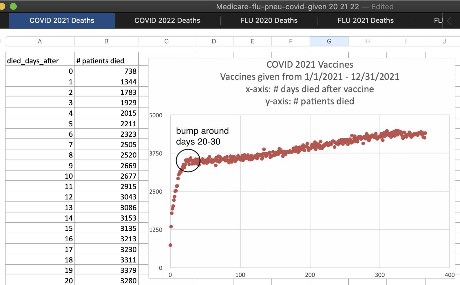
However it's because a lot of people got first doses near the end of the COVID wave in winter 2020-2021, so there was a rapidly falling trend in the background mortality rate during the first few weeks from vaccination. The plot above shows the first known vaccine dose for each person administered in 2021, which was generally but not always the first dose. This plot shows that vaccine doses administered in 2022 take much longer to reach a flat level, and they follow a more smooth curve that is missing the bump in deaths around days 20-30: [ibid.]

But anyway, the main point of Kirsch's post were these plots, where he compared people who got the second dose in February against people who got the second dose in June:
First, all ages, vaccinated in Feb. This is an older mix of people. The vaccine is perfectly safe because elderly have a weak immune system. HVE ends promptly on dot #3 just as I promised it would. There is basically nothing to see here. This is precisely what a safe vaccine should look like.
Dose 2 given in Feb 2021. All ages. Older age mix. Starting at week 3, HVE is long gone and you have baseline mortality.Now, let's time shift 16 week later by looking at the same group (younger mix this time) vaccinated in June instead of Feb.
So we'd expect to see 2 differences:
A much lower y-intercept since our population mix is younger,
the flat portion should last only 15 weeks before rising since we started 16 weeks later.
Population mortality was uniformly flat for all ages since May 17, 2021 until COVID wave starts up on Sep 6, 2021.
Surprise! If you got a COVID shot and were not super old, your mortality was not flat.
Mortality rose by 50% by week 15 when it should have been be flat.
That's huge. What confounder can explain that?
All ages, vaxxed in June 2021 with Dose 2. Here's adj h(t) over time. Your baseline mortality lifted by around 50% in just 15 weeks after the shot. That's hard to explain if the shots were safe, isn't it?
The baseline seems to be roughly halfway between the second and third weeks in the first plot, and halfway between the third and fourth weeks in the second plot, so I don't know why Kirsch didn't determine the baseline the same way in both plots.
But anyway, in the next plot I split people into three groups depending on the month of the first vaccine dose. Week 0 consists of the day of vaccination and the next 6 days. People vaccinated in January or February have a peak in deaths on week 2, and people vaccinated in March or April have a peak in deaths on week 3, but the early peak is missing in people vaccinated in May or June, because at that point there was no longer a decreasing trend in background mortality rate because the COVID wave had already passed by. However the baseline has a much bigger drop during the first 10 weeks for the first two groups and a smaller drop for the third group. So once you plot the deaths as a percentage of the baseline, in all three groups the percentage reaches a plateau around week 20: [rootclaim5.html#Does_short_term_HVE_last_for_3_weeks_in_the_Czech_FOI_data]

Kirsch keeps arbitrarily assuming that the number of deaths 3 weeks after vaccination is the baseline, or sometimes 2.5 weeks or 3.5 weeks or 4 weeks, and any subsequent increase in deaths means that vaccines are killing people.
He should've instead calculated the baseline deaths using the method I employed in the plot above. It's really easy if you use my "buckets" files that show the number of deaths and person-days for each combination of variables like week since vaccination, observation month, and age. [czech.html#Bucket_analysis]
For example this code shows the row from my buckets file for people aged 80, who got a Pfizer vaccine for their first dose in March 2021, and who were 21-26 days from the first dose in April 2021:
t=fread("https://sars2.net/f/czbucketskeep.csv.gz")
t[month=="2021-04"&age==80&vaxmonth=="2021-03"&week==3&dose==1&type=="Pfizer"]
#   month age vaxmonth week dose   type alive dead
# 2021-04  80  2021-03    3    1 Pfizer 57589    5
In my buckets file people are kept under the first dose even after receiving the second dose, so in order to not count people with multiple doses multiple times, you have to exclude people whose dose number is 2 or higher.
The following code calculates the baseline number of deaths per person-days for each combination of age and observation month:
base=t[dose<=1,.(base=sum(dead)/sum(alive)),.(age,month)]
So basically you get a matrix of baseline mortality rates like this, where each combination of age and month has its own baseline of deaths per person-days:
base[month%like%"2021-0[1-6]"&age%in%80:84,round(xtabs(base~age+month),5)]
#     month
# age  2021-01 2021-02 2021-03 2021-04 2021-05 2021-06
#   80 0.00026 0.00023 0.00024 0.00017 0.00014 0.00012
#   81 0.00031 0.00027 0.00030 0.00023 0.00016 0.00016
#   82 0.00034 0.00027 0.00031 0.00023 0.00018 0.00016
#   83 0.00035 0.00034 0.00037 0.00024 0.00022 0.00020
#   84 0.00043 0.00041 0.00042 0.00028 0.00023 0.00021
From the table above you can see that the baseline mortality rates are about twice as high in January 2021 as June 2021.
Then the baseline mortality rate is multiplied by the person-days to get the baseline deaths, and the total baseline deaths for each number of weeks after vaccination are added together:
a=merge(t[dose==1],base)[,.(dead=sum(dead),base=sum(base*alive)),,week]
And finally this code shows the deaths as a percentage of the baseline during the first 30 weeks from the first dose, where you can see that it takes about 15 weeks for the deaths to settle at a level of about 80-90% of baseline deaths:
round(a[,pct:=dead/base*100])[1:30]
# week dead base pct
#    0  565 2545  22
#    1 1060 2460  43
#    2 1367 2353  58
#    3 1443 2240  64
#    4 1389 2157  64
#    5 1316 2087  63
#    6 1392 2019  69
#    7 1331 1953  68
#    8 1291 1899  68
#    9 1273 1848  69
#   10 1266 1789  71
#   11 1368 1754  78
#   12 1324 1738  76
#   13 1303 1728  75
#   14 1392 1718  81
#   15 1399 1713  82
#   16 1481 1716  86
#   17 1436 1722  83
#   18 1421 1729  82
#   19 1418 1738  82
#   20 1496 1752  85
#   21 1504 1766  85
#   22 1502 1778  84
#   23 1554 1794  87
#   24 1560 1817  86
#   25 1502 1854  81
#   26 1525 1897  80
#   27 1544 1941  80
#   28 1650 1989  83
#   29 1636 2043  80
# week dead base pct
I have given Kirsch R code similar to the code above multiple times, but I think he has never yet made use of my code. In 2023 when Kirsch released his analysis of Barry Young's New Zealand data, he hired some guy to write a Python script for him that generated "buckets" files similar to the files I have later generated for the Czech data. However I have never seen Kirsch use my buckets files or generate his own buckets files for the Czech data, even though they would make many types of analysis much easier, like for example calculating a baseline for deaths that is adjusted for age and the background mortality rate.

