Other parts: ethical.
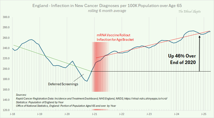
Ethical Skeptic made this plot of cancer incidence in England, where
he employed a hacky method to approximate an age-standardized incidence,
so that he divided the number of cases in all ages with the population
estimate of ages 65 and above: [https://
His plot has a massive drop in the incidence between the start of
2019 and the end of 2019, but in the dataset he cited as his source, the
incidence remains roughly flat throughout 2019: [https://
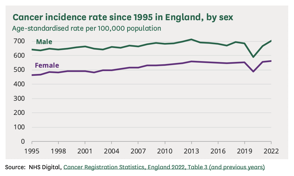
In this plot by NHS, the age-standardized cancer incidence also
remained around the same level in 2018 and 2019: [https://
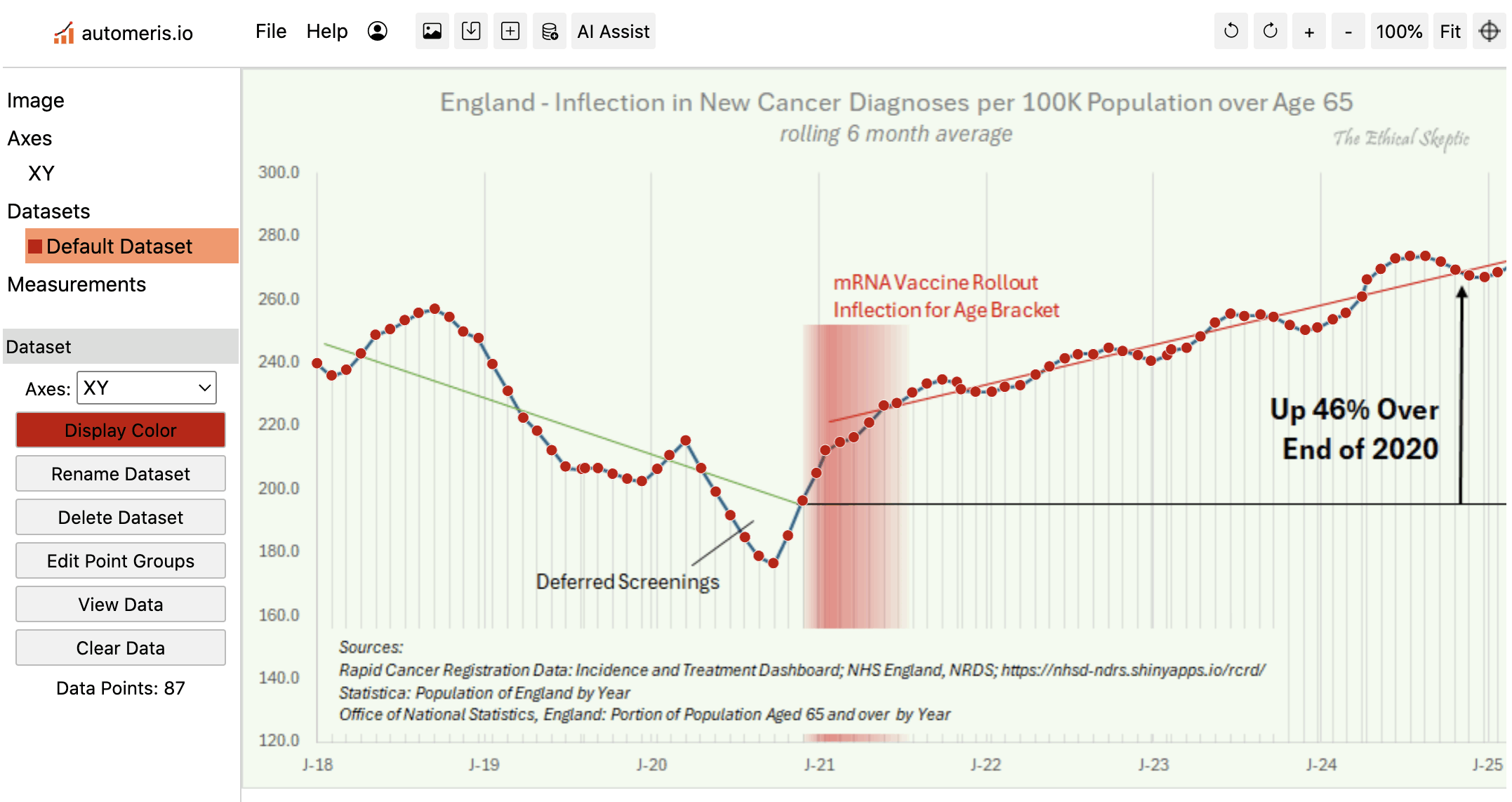
I used WebPlotDigitizer to digitize the data in Ethical Skeptic's
plot. Some points in his plot have irregular horizontal spacing, so I
had to click on each point manually to extract the data correctly: [https://
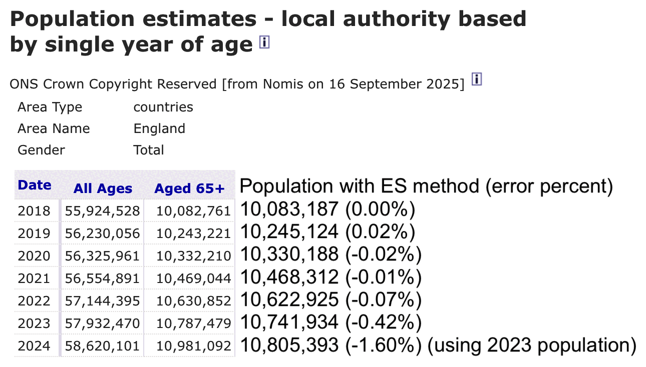
ES seems to have calculated the number of people aged 65 and above through a circuitious method, where he multiplied the yearly population estimates of England with the yearly proportion of people aged 65 and above:

I tried to replicate his methodology, so I took yearly population
estimates from a page at Statista titled "Population
of England from 1971 to 2023":
https://
The result I got was close to the yearly population estimate of ages
65+ at Nomis, apart from the years 2023 and 2024: [https://
Then in order to calculate the yellow line in the next plot, I multiplied the monthly rates in Ethical Skeptic's plot with the yearly number of people aged 65 and above, and I divided the result by 100,000.
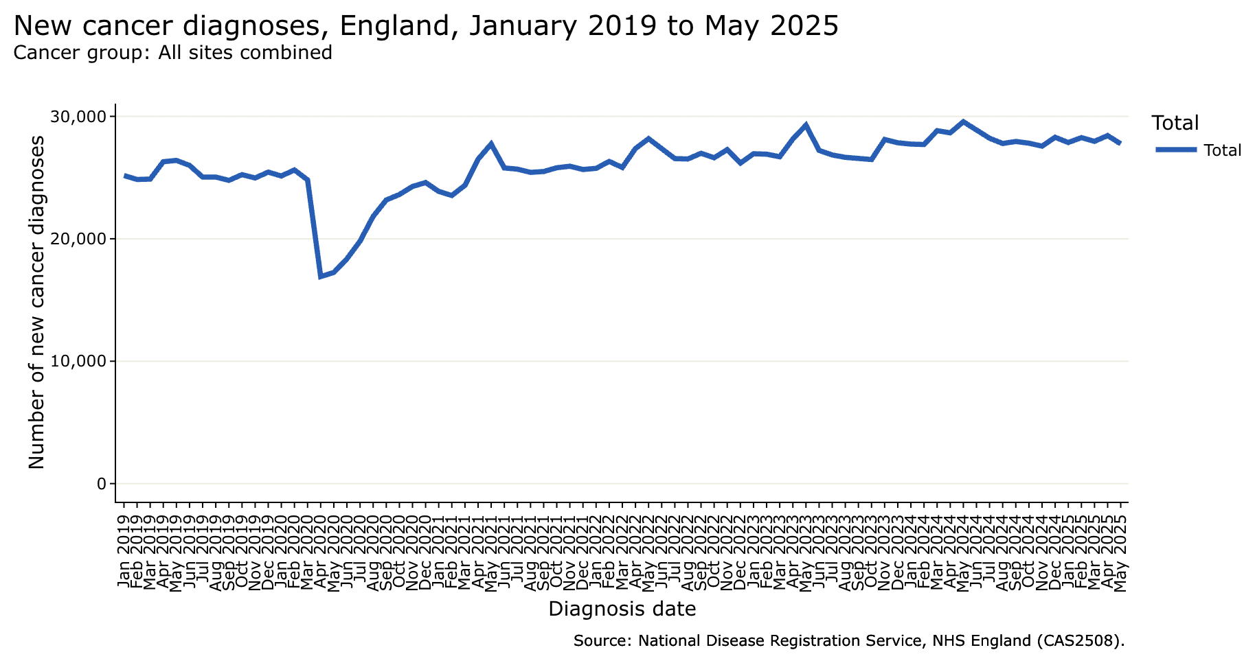
I downloaded the rapid cancer registration data from here:
https://
I was able to replicate the values in Ethical Skeptic's closely in 2018. But he seems to have manually altered the y-axis values so that he shifted them downwards in 2019 to 2022, and he shifted them upwards in 2024 and 2025. His altered data has a particularly large downwards shift in 2019, so that the yearly number of diagnoses drops by about 13% between 2018 and 2019, even though in the real data it increases by about 1%:
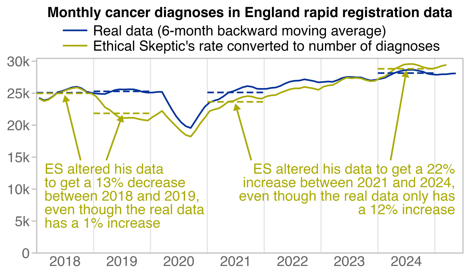
ma=\(x, b=1, f=b){ x[] =rowMeans( embed( c( rep( NA, b), x, rep( NA, f)), f+ b+ 1), na. rm=T); x} rapid=CJ( year=2018: 2025, month=1: 12)[!( year==2025& month> 5)] diagnoses=c( 24265, 23485, 24346, 25994, 27661, 26373, 25833, 25212, 24953, 24540, 24564, 25231, 25169, 24844, 24873, 26294, 26401, 25994, 25037, 25043, 24770, 25236, 24966, 25444, 25128, 25621, 24809, 16910, 17246, 18362, 19806, 21826, 23169, 23614, 24274, 24592, 23870, 23534, 24370, 26499, 27741, 25785, 25686, 25425, 25493, 25801, 25927, 25658, 25752, 26316, 25826, 27370, 28176, 27371, 26549, 26517, 26984, 26615, 27285, 26179, 26944, 26909, 26700, 28151, 29276, 27220, 26845, 26652, 26579, 26473, 28109, 27843, 27733, 27699, 28826, 28654, 29560, 28914, 28213, 27783, 27948, 27807, 27565, 28289, 27863, 28261, 27960, 28428, 27754) # adjusted for number of working days p1=rapid[,.(x=as. Date( paste( year, month, 16, sep="- ")), y=diagnoses)] p1[, y: =ma( y, 5, 0)] p1$ z=" Real data (6- month backward moving average) " es=CJ( year=2018: 2025, month=1: 12)[ 1: 87] es$ rate=c( 239. 6, 235. 7, 237. 5, 242. 7, 248. 6, 250. 4, 253. 2, 255. 5, 256. 8, 254. 2, 249. 6, 247. 5, 239. 3, 230. 8, 222. 3, 218. 2, 212. 1, 206. 9, 206. 1, 206. 4, 206. 4, 204. 6, 203. 1, 202. 3, 206. 1, 210. 5, 215. 1, 206. 4, 198. 9, 191. 5, 184. 5, 178. 6, 176. 3, 185. 1, 196. 1, 204. 9, 212. 1, 214. 6, 216. 2, 220. 8, 226. 2, 227. 0, 230. 3, 233. 1, 234. 4, 233. 7, 231. 3, 230. 6, 230. 6, 232. 1, 232. 6, 236. 0,