Other parts: ethical.
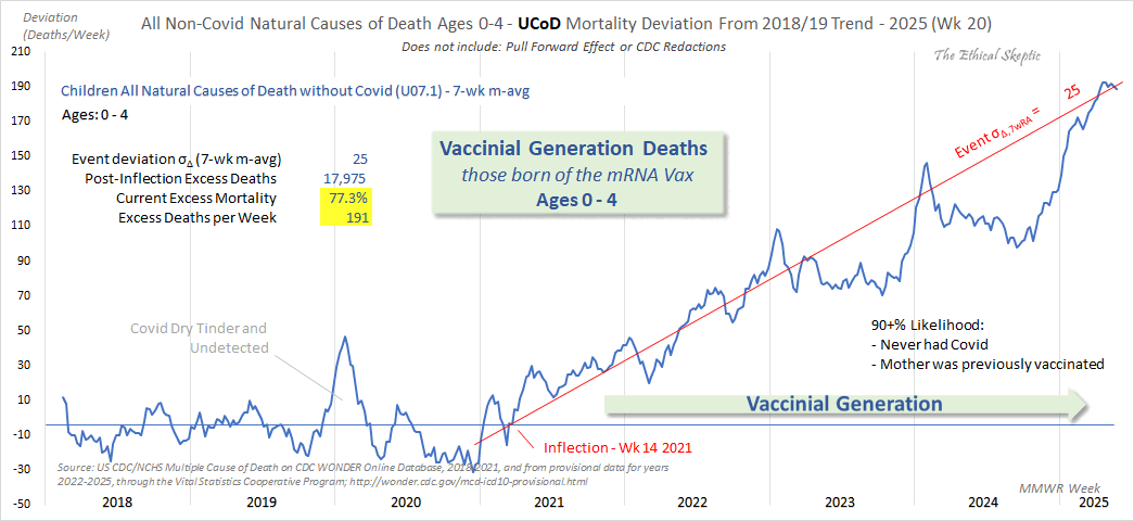
Ethical Skeptic posted this plot of weekly excess deaths in ages 0-4,
where he got about 77% excess deaths on weeks 14 to 20 of 2025: [https://
Despite numerous requests, ES has refused to document how he calculated his baseline, and he hasn't even posted any plot that would have one line for the actual deaths and another line for the baseline, but he has only posted a plot which shows the excess deaths, where it's not even transparent if the excess deaths are going up because the actual deaths are going up, or because the baseline is going down.
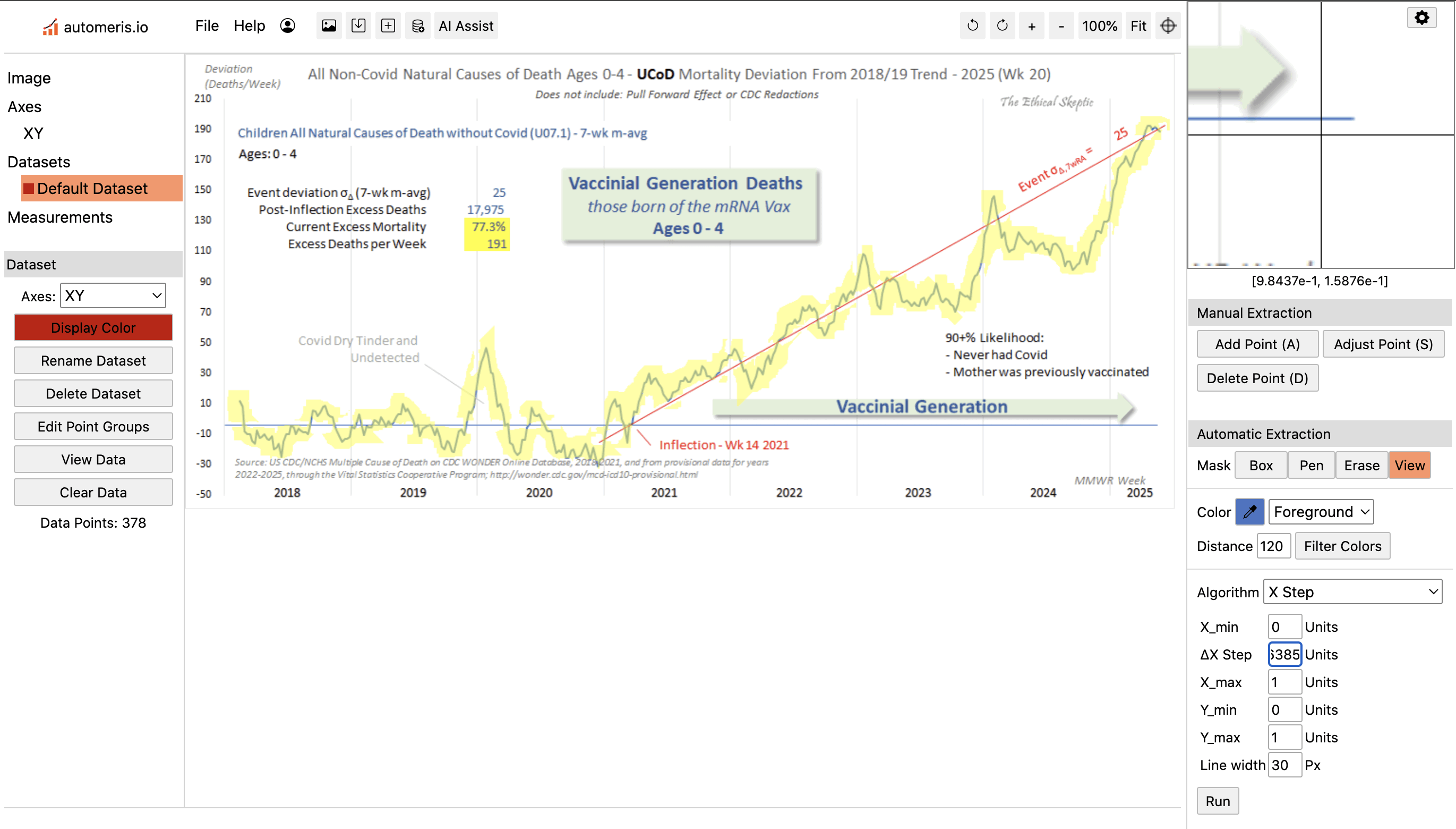
Therefore in order to reverse engineer his baseline, I digitized the excess deaths in his plot, and I subtracted them from the actual weekly deaths that I downloaded from CDC WONDER. ChatGPT and Grok were not successful in digitizing the weekly number of excess deaths, so I used a tool called WebPlotDigitizer instead:
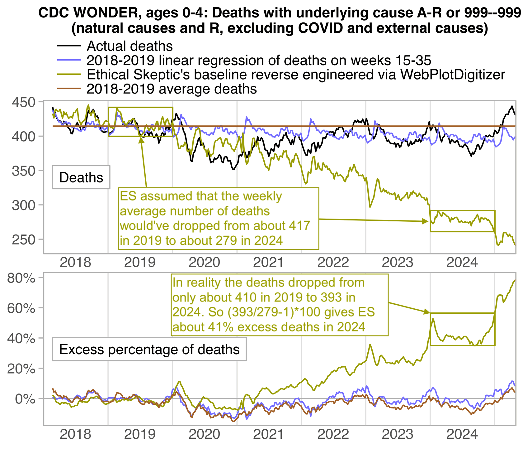
In the next plot, the yellow line shows the baseline that I reverse engineered, where you can see that Ethical Skeptic's baseline has a realistic slope in 2018 and 2019, so that it roughly follows the slope of the actual deaths, but for some reason his baseline takes an extremely steep turn downwards after 2019. So by 2024, ES gets about 41% excess deaths, because he assumed the deaths would've dropped by about 33% between 2019 and 2024, but in reality the deaths only dropped by about 4% between 2019 and 2024:
ma=\(x, b=1, f=b){ x[] =rowMeans( embed( c( rep( NA, b), x, rep( NA, f)), f+ b+ 1), na. rm=T); x} t=fread( " https:// sars2. net/ f/ wondervaccinial0to4. csv") t[, dead: =ma( dead, 3, 2)] t=na. omit( t) t[, date: =MMWRweek:: MMWRweek2Date( year, week, 4)] t=merge( t[ year< 2020,.( base=mean( dead), base2=mean( dead)), week], t) slope=t[ year< 2020, mean( dead), year][, predict( lm( V1~ year),.( year=2018: 2025))] slope2=t[ year< 2020& week% in% 15: 35, mean( dead), year][, predict( lm( V1~ year),.( year=2018: 2025))] t[, base: =base*( slope/ mean( slope[ 1: 2]))[ factor( t$ year)]] t[, base2: =base2*( slope2/ mean( slope2[ 1: 2]))[ factor( t$ year)]] t$ base3=t[ year< 2020, predict( lm( dead~ date), t)] t$ base3=t$ base3+ t[ year< 2020, mean( dead- base3), week]$ V1[ t$ week] t$ ave=t[ year< 2020, mean( dead)] lab=c( " Actual deaths", " 2018- 2019 linear regression of deaths on weeks 15- 35", " Ethical Skeptic' s baseline reverse engineered via WebPlotDigitizer", " 2018- 2019 average deaths") p=t[,.( x=date, y=c( dead, base2, dead- excess, ave), z=factor( rep( lab, each=. N), lab))] p$ facet=" Deaths" p=rbind( p, merge( p[ z! =z[ 1]], p[ z==z[ 1],.( x, actual=y)])[,.( x, y=( actual/ y- 1)* 100, z, facet=" Excess percentage of deaths")]) p[, facet: =factor( facet, unique( facet))] xstart=as. Date( " 2018- 1- 1"); xend=as. Date( " 2025- 5- 1") xbreak=seq( xstart, xend, " 6 month"); xlab=ifelse( month( xbreak) ==7, year( xbreak), " ") ylim=p[,{ x=extendrange( y,,. 03);.( ymin=x[ 1], ymax=x[ 2])}, facet] ggplot( p)+ facet_ wrap(~ facet, dir=" v", scales=" free")+ geom_ vline( xintercept=seq( xstart, xend, " year"), color=" gray90", linewidth=. 4)+ geom_ segment( data=p[. N], x=xstart, xend=xend, y=0, yend=0, linewidth=.