Czech record-level mortality data by vaccination status (part 4) - sars2.net

Links to earlier parts: czech.html, czech2.html, czech3.html.

Contents

Moderna-Pfizer ratio by vaccination quarter and age group

Kirsch told me on Twitter: "You have all failed to explain why in every age group where we have sufficient data. Moderna was significantly more deadly than Pfizer. it wasn't comorbidities because those didn't matter. So why was the death rate higher? Why can't you answer that simple question?" [https://x.com/stkirsch/status/1818053265357160918]

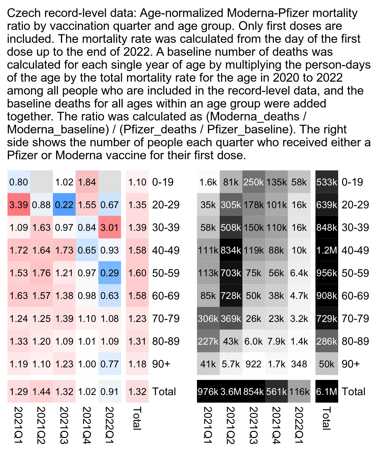
I told him that in the plot below if you look at the age groups 50-59 and above where there's a sufficient sample size of deaths, the Moderna-Pfizer ratio was close to 1.0 among people who got the first dose in the 4th quarter of 2021. So did Moderna vaccines start being less deadly in the 4th quarter?

library(data.table)

agecut=\(x,y)cut(x,c(y,Inf),paste0(y,c(paste0("-",y[-1]-1),"+")),T,F)
quar=\(x){u=unique(x);paste0(substr(u,1,4),"Q",(as.numeric(substr(u,6,7))-1)%/%3+1)[match(x,u)]}

ages=c(0,2:9*10)

t=fread("http://sars2.net/f/czbucketskeep.csv.gz")[dose<=1][,age:=pmin(age,95)]

t=merge(t[dose==1&vaxmonth>="2021-01"&vaxmonth<="2022-03"],t[,.(base=sum(dead)/sum(alive)),age])[,base:=base*alive]

t=t[,.(base=sum(base),dead=sum(dead),alive=sum(as.double(alive))),.(type,vaxmonth=quar(vaxmonth),age=agecut(age,ages))]
t=rbind(t,t[,.(base=sum(base),dead=sum(dead),alive=sum(alive),vaxmonth="Total"),.(age,type)])
t=rbind(t,t[,.(base=sum(base),dead=sum(dead),alive=sum(alive),age="Total"),.(vaxmonth,type)])

a=t[,tapply(dead/base,.(type,age,vaxmonth),c)]
m1=a["Moderna",,];m2=a["Pfizer",,]
m=(m1-m2)/ifelse(m1>m2,m2,m1)

pop=t[type%in%c("Moderna","Pfizer"),xtabs(alive~age+vaxmonth)]/365
disp=matrix(sprintf(ifelse(m1/m2>10,"%.1f","%.2f"),m1/m2),nrow(m))
hide=pmin(m1,m2)==0;m[hide]=NA;disp[is.na(m)]=""
exp=.7;m=abs(m)^exp*sign(m);maxcolor=10^exp

pheatmap::pheatmap(m,filename="i1.png",display_numbers=disp,
  gaps_row=nrow(m)-1,gaps_col=ncol(m)-1,
  cluster_rows=F,cluster_cols=F,legend=F,cellwidth=19,cellheight=19,fontsize=9,fontsize_number=8,
  border_color=NA,na_col="gray90",
  number_color=ifelse((abs(m)>.55*maxcolor)&!is.na(m),"white","black"),
  breaks=seq(-maxcolor,maxcolor,,256),
  colorRampPalette(hsv(rep(c(7/12,0),5:4),c(.9,.75,.6,.3,0,.3,.6,.75,.9),c(.4,.65,1,1,1,1,1,.65,.4)))(256))

rec=fread("Czech/data/CR_records.csv",showProgress=F)
pop=rec[grep("comirnaty|spikevax",ignore.case=T,OckovaciLatka_1),.N,.(age=agecut(2021-Rok_narozeni,ages),vaxq=quar(Datum_1))]
pop=rbind(pop,pop[,.(N=sum(N),age="Total"),vaxq])
pop=rbind(pop,pop[,.(N=sum(N),vaxq="Total"),age])
pop=xtabs(N~age+vaxq,pop)[rownames(m),colnames(m)]

exp2=.6;maxcolor2=max(pop[-nrow(pop),])

kimi=\(x){e=floor(log10(ifelse(x==0,1,abs(x))));e2=pmax(e,0)%/%3+1;p=!is.na(x)
  x[p]=paste0(sprintf(paste0("%.",ifelse(e[p]%%3==0,1,0),"f"),x[p]/1e3^(e2[p]-1)),c("","k","M","B","T")[e2[p]]);x}

exp2=.6;maxcolor2=max(pop[-nrow(pop),-ncol(pop)])

pheatmap::pheatmap(pop^exp2,filename="i2.png",display_numbers=kimi(ifelse(pop==0,0,pop)),
  gaps_row=nrow(m)-1,gaps_col=ncol(m)-1,
  cluster_rows=F,cluster_cols=F,legend=F,cellwidth=19,cellheight=19,fontsize=9,fontsize_number=8,
  border_color=NA,na_col="white",
  number_color=ifelse(pop^exp2>maxcolor2^exp2*.45,"white","black"),
  breaks=seq(0,maxcolor2^exp2,,256),
  sapply(seq(1,0,,256),\(i)rgb(i,i,i)))

cap="Czech record-level data: Age-normalized Moderna-Pfizer mortality ratio by vaccination quarter and age group. Only first doses are included. The mortality rate was calculated from the day of the first dose up to the end of 2022. A baseline number of deaths was calculated for each single year of age by multiplying the person-days of the age by the total mortality rate for the age in 2020 to 2022 among all people who are included in the record-level data, and the baseline deaths for all ages within an age group were added together. The ratio was calculated as (Moderna_deaths / Moderna_baseline) / (Pfizer_deaths / Pfizer_baseline). The right side shows the number of people each quarter who received either a Pfizer or Moderna vaccine for their first dose."
system(paste0("magick i[12].png +append 0.png;w=`identify -format %w 0.png`;pad=24;convert -pointsize 42 -interline-spacing -3 -font Arial \\( -size $[w-pad*2]x caption:'",cap,"' -splice $[pad]x20 \\) 0.png -append 1.png"))

Triangle plots of Moderna-Pfizer ratio for third and fourth doses

Kirsch has been saying that the Moderna-Pfizer ratio is consistently around 1.3 for all months of vaccination that have a sufficiently large sample size of vaccinated people (even though my age-normalized Moderna-Pfizer ratio was about 1.02 for people who got the first dose in November 2021, and there's about about 300,000 people who got a first dose from a Pfizer or Moderna vaccine in November 2021 so I think it's a sufficiently large sample size).

But Kirsch has generally been looking at first doses only. The plot below shows the results for the third dose instead. I used the same R script as in this section: czech2.html#Triangle_plot_of_Moderna_Pfizer_ratio.

The total Moderna-Pfizer ratio is below 1.0 for people who got the third dose during each month from March 2022 to August 2022, but it shouldn't just be random noise because there's a total of about 300,000 people who received a third shot from a Moderna or Pfizer vaccine during those months. So there appears to be a similar effect as with the first dose, where the late vaccinees have a lower Moderna-Pfizer ratio than the early vaccinees:

The monthly number of 4th doses peaked in October 2022. But for people who got a 4th dose in October 2022, the Moderna-Pfizer ratio was about 0.67:

I had forgotten to make these triangle plots for the third and fourth doses, but now I think these plots have become yet another nail in the coffin of Kirsch's theory that his Moderna-Pfizer ratio proved that Moderna vaccines were more deadly. Now of course it's possible that Moderna vaccines were actually more deadly, but I don't think Kirsch's Moderna-Pfizer ratio is the smoking gun piece of evidence that he makes it out to be.

Types of vaccination sites

In the file prehled-ockovacich-mist.csv which has information about vaccination sites, the sites are classified under these 5 types: [https://ockodoc.mzcr.cz/wp-content/uploads/2024/01/231230_manual_crs.pdf]

Abbreviation Translation Czech
OČM standard vaccination site standardní očkovací místo
DOČM vaccination site for children očkovací místo pro děti
VOČM large-capacity vaccination site velkokapacitní očkovací místo
SMPL vaccination site for self-payers očkovací místo pro samoplátce
WALKIN mobile vaccination site mobilní očkovací místo

The file ockovani-profese.csv contains about 19 million rows with one row for each administered dose, but when I tried joining the file with the file for information about vaccination sites, only about 7 million rows could be joined by the vaccinator ID. The joined rows didn't include any row for a large-capacity vaccination site. And I further excluded vaccination sites for children and I excluded vaccines given to ages below 18, because children have little effect on overall mortality but the pediatric vaccination sites distorted the overall percentages of site types. But this shows the distribution of the remaining 3 types of vaccination sites:

dlf=\(x,y,...){if(missing(y))y=sub(".*/","",x);for(i in 1:length(x))download.file(x[i],y[i],quiet=T,...)}
dlf("https://onemocneni-aktualne.mzcr.cz/api/v2/covid-19/ockovani-profese.csv") # about 4 GiB
dlf("https://onemocneni-aktualne.mzcr.cz/api/v2/covid-19/prehled-ockovacich-mist.csv") # about 20 kiB

pro=fread("ockovani-profese.csv")
mist=fread("prehled-ockovacich-mist.csv")

d=pro[,.N,.(vaxtype=vakcina,vaccinator=zarizeni_kod,age=vekova_skupina)]

d=d[!d$age%in%c("0-4","05-11","12-15","16-17")]

name1=unique(d$vaxtype);name2=rep("Other",length(name1))
name2[name1==""]=""
name2[grep("comirnaty",ignore.case=T,name1)]="Pfizer"
name2[grep("spikevax",ignore.case=T,name1)]="Moderna"
name2[grep("nuvaxovid",ignore.case=T,name1)]="Novavax"
name2[name1=="COVID-19 Vaccine Janssen"]="Janssen"
name2[name1=="VAXZEVRIA"]="AstraZeneca"
d$vaxtype=name2[match(d$vaxtype,name1)]

d=merge(unique(mist[,.(sitetype=ockovaci_misto_typ,vaccinator=nrpzs_kod)],by="vaccinator"),d)

m=d[sitetype!="DOČM",xtabs(N~vaxtype+sitetype)]
m=m[order(-rowSums(m)),]

round(m/rowSums(m)*100)
             sitetype
vaxtype       OČM SMPL WALKIN # percentage of site types by manufacturer
  Pfizer       54   37      9
  Moderna      66   20     14
  Janssen      67   29      4
  AstraZeneca  46   42     12
  Novavax      65   32      3
  Other        42   46     11

So Pfizer has a higher percentage of vaccination sites for self-payers than Moderna (SMPL), but Moderna has a higher percentage of standard vaccination sites (OČM) and walk-in sites. Which is yet another line of evidence that there are systematic biases in the distribution of vaccine doses by different manufacturers.

Ratio of deaths per adverse event reports in VAERS calculated by Hans-Joachim Kremer

In this blog post where Hans-Joachim Kremer looked at US VAERS data, he got a higher ratio of deaths per adverse event reports for Pfizer than Moderna vaccines, so he pointed out that it conflicted with Kirsch's analysis of the Czech data: https://tkp.at/2024/08/06/spikevax-gefaehrlicher-als-comirnaty-steve-kirsch-greift-daneben/.

However it could be that Moderna had both a higher number of adverse event reports per dose than Pfizer and a higher number of deaths per dose than Pfizer, but the ratio of deaths per adverse event reports could've still been higher for Pfizer than Moderna. So he could've repeated the calculation so that he would've used doses administered instead of adverse event reports as the denominator.

I took the number of adverse event reports in Czechia per vaccine manufacturer from this spreadsheet: https://github.com/PalackyUniversity/batch-dependent-safety/blob/main/data/SUKL-batches-AE.xlsx. The spreadsheet only included the number of doses released but not the number of doses administered, so I calculated the number of doses administered from the record-level data. I only included doses administered up to July 4th 2023, which was the date when the authors who published the batch data wrote they received the data. But anyway, Moderna got a higher ratio than Pfizer for both deaths per doses administered and adverse event reports per doses administered:

rename=\(x){u=unique(x);o=rep("Other",length(u))
  o[grep("comirnaty|pfizer",u,T)]="Pfizer"
  o[grep("moderna|spikevax",u,T)]="Moderna"
  o[grep("nuvaxovid|novavax",u,T)]="Novavax"
  o[grep("janssen",u,T)]="Janssen"
  o[grep("vaxzevria|astrazeneca",u,T)]="AstraZeneca"
  o[match(x,u)]}

rec=fread("curl -Ls github.com/skirsch/Czech/raw/main/data/CR_records.csv.xz|xz -dc")
k=grep("Datum_",names(rec));k2=k+3
d=data.table(date=`class<-`(unlist(rec[,..k],,F),"Date"),type=rename(unlist(rec[,..k2],,F)))[!is.na(date)]
d=d[date<="2023-7-4",.(doses=.N),type]

f="SUKL-batches-AE.xlsx"
download.file("https://github.com/PalackyUniversity/batch-dependent-safety/raw/main/data/SUKL-batches-AE.xlsx",f)
s2=data.table(readxl::read_excel(f,sheet=2))
s2=s2[,.(reports=sum(no_reports),serious=sum(serious),dead=sum(deaths)),.(type=rename(name))]

o=merge(s2,d)
o[,deadpermildose:=dead/doses*1e6]
o[,reportspermildose:=reports/doses*1e6]
o[,deadpermilreport:=dead/reports*1e6]

dplyr::mutate_if(o[type!="Other"],is.double,round)[order(-doses)]|>print(r=F)
        type reports serious dead    doses deadpermildose reportspermildose deadpermilreport
      Pfizer   10712    5183  134 15680944              9               683            12509
     Moderna    1575     583   26  1643159             16               959            16508
 AstraZeneca    1512     695   44   887601             50              1703            29101
     Janssen     555     241   10   415077             24              1337            18018
     Novavax      14       4    0    11190              0              1251                0

When I used Pfizer as the baseline, Moderna got about 1.9 times higher deaths per dose and about 1.4 times higher adverse event reports per dose, so the ratio of deaths per reports also ended up being higher for Moderna than Pfizer:

> round(o[type=="Moderna",-1]/o[type=="Pfizer",-1],3)
   reports serious  dead doses deadpermildose reportspermildose deadpermilreport
1:   0.147   0.112 0.194 0.105          1.852             1.403             1.32

The spreadsheet didn't include information about age so I wasn't able to look at only specific age groups or normalize my calculation by age. In the record-level data the average age is about 7 years higher for people who got a Moderna vaccine for the first dose than people who got a Pfizer vaccine for the first dose. But earlier I got a correlation of only about 0.18 between the average age of people under a batch and the rate of deaths per batch that had been reported as adverse events: czech3.html#Batch_study_by_authors_from_Palack_University.

But anyway, next I tried looking at US VAERS data: https://vaers.hhs.gov/data/datasets.html. I got the number of doses administered per manufacturer in the United States from this JSON file: https://covid.cdc.gov/covid-data-tracker/COVIDData/getAjaxData?id=vaccination_data. It only included the cumulative number of doses administered up to May 10th 2023 which was when the data stopped being updated, when there were about 367 million doses administered for Pfizer and 232 million for Moderna. But I didn't find any source which showed the number of doses grouped by both vaccine manufacturer and age, so I wasn't able to adjust my calculation for age.

Moderna again got a higher rate of both deaths per dose and reports per dose than Pfizer. But unlike in the case of the Czech data, the Moderna-Pfizer ratio for deaths per dose was now lower than the ratio for reports per dose, so Pfizer got a higher ratio of deaths per reports:

names=read.csv(text="name,vaers,doses
Pfizer,PFIZER\\BIONTECH,366979906
Moderna,MODERNA,232147784
Janssen,JANSSEN,19007537
Novavax,NOVAVAX,89195
Unknown,UNKNOWN MANUFACTURER,890835")

# # this code is not needed because I added the number of doses from the API to the table above
# con=url("https://covid.cdc.gov/covid-data-tracker/COVIDData/getAjaxData?id=vaccination_data")
# j=jsonlite::fromJSON(readLines(con))$vaccination_data;close(con)
# names$doses=j[1,paste0("Administered_",ifelse(names$name=="Unknown","Unk_Manuf",names$name))]

va=do.call(rbind,lapply(2020:2024,\(i)fread(paste0(i,"VAERSDATA.csv"))))
va=merge(va,do.call(rbind,lapply(2020:2024,\(i)fread(paste0(i,"VAERSVAX.csv")))))

o=va[VAX_TYPE=="COVID19",.(reports=.N,dead=sum(DIED=="Y")),.(vaers=VAX_MANU)]
o=merge(o,names)[,.(name,reports,dead,doses)]
o[,deadpermildose:=dead/doses*1e6]
o[,reportspermildose:=reports/doses*1e6]
o[,deadpermilreport:=dead/reports*1e6]
o[order(-doses)]|>dplyr::mutate_if(is.double,round)|>print(r=F)
    name reports  dead     doses deadpermildose reportspermildose deadpermilreport
  Pfizer  481402 10439 366979906             28              1312            21685
 Moderna  469655  9821 232147784             42              2023            20911
 Janssen   73454  1943  19007537            102              3864            26452
 Unknown    7363    82    890835             92              8265            11137
 Novavax     492     5     89195             56              5516            10163

This shows that the Moderna-Pfizer ratio is about 1.53 for reports per dose, 1.39 for deaths per dose, and 0.91 for deaths per report:

> round(o[name=="Moderna",-1]/o[name=="Pfizer",-1],3)
   reports  dead doses deadpermildose reportspermildose deadpermilreport
1:   0.976 0.941 0.633          1.487             1.542            0.964

However ideally I should've adjusted these calculations for age. In VAERS the ratio of deaths per reports seems to approximately double between each 10-year age group from 30-39 up to 90+ (even though the ratio remains similar in ages 10-19, 20-29, and 30-39):

> va=do.call(rbind,lapply(2020:2024,\(i)fread(paste0(i,"VAERSDATA.csv"))))
> va=merge(va,do.call(rbind,lapply(2020:2024,\(i)fread(paste0(i,"VAERSVAX.csv")))))
> agecut=\(x,y)cut(x,c(y,Inf),paste0(y,c(paste0("-",y[-1]-1),"+")),T,F)
> o=va[!is.na(AGE_YRS)&VAX_TYPE=="COVID19",.(dead=sum(DIED=="Y"),reports=.N),.(age=agecut(AGE_YRS,0:9*10))]
> o[order(age)][,deadper10kreport:=round(dead/reports*1e4)][]|>print(r=F)
   age dead reports deadper10kreport
   0-9   20   16389               12
 10-19  107   54171               20
 20-29  201   86426               23
 30-39  362  135659               27
 40-49  672  140188               48
 50-59 1572  155711              101
 60-69 3786  162128              234
 70-79 5910  117297              504
 80-89 5445   48294             1127
   90+ 2446   12197             2005

Kremer divided the VAERS data into only two groups for ages 18-64 and 65+, so I wanted to check if I would get different results for more fine-grained age groups. However when I calculated a Moderna-Pfizer ratio for deaths per reports, the ratio was below 1 in all age 5-year groups above 50-54, and some of the younger age groups where the ratio was above 1 had wide confidence intervals:

> o=va[!is.na(AGE_YRS)&VAX_TYPE=="COVID19",.(dead=sum(DIED=="Y"),reports=.N),.(age=agecut(AGE_YRS,0:19*5),type=VAX_MANU)][order(age)]
> o1=o[type=="MODERNA"];o2=o[type=="PFIZER\\BIONTECH"]
> rate=(o1$dead/o1$reports)/(o2$dead/o2$reports)
> ci=exp(log(rate)+outer(qnorm(.975)*sqrt(1/o1$dead-1/o1$reports+1/o2$dead-1/o2$reports),c(-1,1)))
> o1[,.(age,rate,low=ci[,1],high=ci[,2])]|>mutate_if(is.double,round,2)|>print(r=F)
   age rate  low high
   0-4 1.47 0.40 5.47
   5-9 0.00 0.00  NaN
 10-14 2.31 0.79 6.78
 15-19 0.53 0.32 0.89
 20-24 0.83 0.52 1.35
 25-29 1.22 0.82 1.81
 30-34 0.88 0.61 1.28
 35-39 1.13 0.86 1.48
 40-44 0.87 0.68 1.13
 45-49 0.95 0.77 1.18
 50-54 1.02 0.86 1.22
 55-59 0.88 0.77 1.00
 60-64 0.86 0.77 0.95
 65-69 0.74 0.68 0.80
 70-74 0.72 0.66 0.77
 75-79 0.79 0.73 0.85
 80-84 0.71 0.66 0.76
 85-89 0.78 0.72 0.84
 90-94 0.94 0.86 1.03
   95+ 0.91 0.80 1.02

Kremer's "proportional rate ratio" values were expressed as the ratio for Pfizer divided by the ratio for Moderna, so it's the opposite of the Moderna-Pfizer ratios that have been calculated by me and Kirsch. His PRR value for deaths divided by reports was about 1.014 for ages 18-64 and 1.278 for ages 65+:

At first I got about 27% more deaths in ages 65+ than Kremer but only about 4% more reports. But then I realized it was probably because I counted reports where the DIED column had the value Y as deaths, but Kremer might have only counted reports where one of the symptom fields included death, which also gave me about 18% fewer deaths in ages 65+ for Moderna and Pfizer combined:

> va=do.call(rbind,lapply(2020:2024,\(i)fread(paste0(i,"VAERSDATA.csv"))))
> va=merge(va,do.call(rbind,lapply(2020:2024,\(i)fread(paste0(i,"VAERSVAX.csv")))))
> symp=do.call(rbind,lapply(2020:2024,\(i)fread(paste0(i,"VAERSSYMPTOMS.csv"))))
> va$dead=va$VAERS_ID%in%symp$VAERS_ID[rowSums(symp[,c(1:5*2)]=="Death")==1]
> vae=va[AGE_YRS>=65&VAX_TYPE=="COVID19"&grepl("MOD|PFI",VAX_MANU)]
> vae[DIED=="Y",.N,VAX_MANU] # DIED column is Y
           VAX_MANU    N
1:          MODERNA 7598
2: PFIZER\\BIONTECH 7520
> vae[dead==T,.N,VAX_MANU] # symptom columns include death
           VAX_MANU    N
1:          MODERNA 6285
2: PFIZER\\BIONTECH 6138

I don't know which approach is better, but here when I counted reports where the symptom columns included death, I got similar PRR values as Kremer:

> young=va[AGE_YRS%in%18:64&VAX_TYPE=="COVID19",.(dead=sum(dead),reports=.N),.(type=VAX_MANU)]
> young=young[match(c("PFIZER\\BIONTECH","MODERNA"),type)]
> young
               type dead reports
1: PFIZER\\BIONTECH 1503  283324
2:          MODERNA 1458  273126
> young[1,dead/reports]/young[2,dead/reports]
[1] 0.99376 # PRR for ages 18 to 64 (Pfizer divided by Moderna)
> old=va[AGE_YRS>=65&VAX_TYPE=="COVID19",.(dead=sum(dead),reports=.N),.(type=VAX_MANU)]
> old=old[match(c("PFIZER\\BIONTECH","MODERNA"),type)]
> old
               type dead reports
1: PFIZER\\BIONTECH 6138  105769
2:          MODERNA 6285  142616
> old[1,dead/reports]/old[2,dead/reports]
[1] 1.3168 # PRR for ages 65 and above (Pfizer divided by Moderna)

VAERS also contains reports from European countries, but several fields including the country codes were scrubbed from European reports in November 2022. WelcomeTheEagle posted a version of the VAERS data here that was downloaded before the country codes were removed: https://www.vaersaware.com/post/vaers-nov-11th-downloadable-files. I used the data to calculate an age-normalized rate of adverse event reports in the Czech Republic. I took the number of doses administered in each age group from the record-level data, so that I only included doses administered up to November 11th 2022 which was the date of the old snapshot of VAERS.

In the old VAERS data you can select Czech reports by selecting rows where the first two characters of the SPLTTYPE field are CZ. At first I tried selecting rows where the SYMPTOM_TEXT field matched identifiers like CZ-CZSUKL-21010694, but it missed about 16% of all reports where the SPLTTYPE field started with CZ. There were only two reports where SYMPTOM_TEXT matched \bCZ- but SPLTTYPE didn't start with CZ, but one of them was a Belgian report that was linked to an earlier Czech report of the same patient, and the other report was missing the SPLTTYPE field.

There were only 5,247 rows where the SPLTTYPE column started with CZ and the VAX_TYPE column was COVID19, and about two thirds of the rows were missing the age field. But among the remaining 1,871 rows, the age-standardized rate of adverse event reports per doses administered was about 3.0 times higher for Moderna than Pfizer, and the crude rate that was not adjusted for age was about 2.9 times higher for Moderna than Pfizer:

age=\(x,y){class(x)=class(y)=NULL;(y-x-(y-789)%/%1461+(x-789)%/%1461)%/%365}
ua=\(x,y,...){u=unique(x);y(u,...)[match(x,u)]}

agecut=\(x,y)cut(x,c(y,Inf),paste0(y,c(paste0("-",y[-1]-1),"+")),T,F)
ages=c(0,30,40,50,seq(60,95,5))

rename=\(x){u=unique(x);o=rep("Other",length(u))
  o[grep("comirnaty|pfizer",u,T)]="Pfizer"
  o[grep("moderna|spikevax",u,T)]="Moderna"
  o[grep("nuvaxovid|novavax",u,T)]="Novavax"
  o[grep("janssen",u,T)]="Janssen"
  o[grep("vaxzevria|astrazeneca",u,T)]="AstraZeneca"
  o[match(x,u)]}

va=fread("AllVAERSDataCSVS/NonDomesticVAERSDATA.csv")
va=merge(va,fread("AllVAERSDataCSVS/NonDomesticVAERSVAX.csv"))
vae=va[grepl("^CZ",SPLTTYPE)&VAX_TYPE=="COVID19"]

rec=fread("Czech/data/CR_records.csv")
k=grep("Datum_",names(rec));k2=k+3
set.seed(0);d=rec[,.(birth=rep(ua(paste0(Rok_narozeni,"-1-1"),as.Date)+sample(0:364,.N,T),7))]
d$date=`class<-`(unlist(rec[,..k],,F),"Date")
d$type=rename(unlist(rec[,..k2],,F))
d=d[!is.na(date)&date<="2022-11-11"]
d[,age:=age(birth,date)]
d=d[,.(doses=.N),.(type,age=agecut(pmax(age,0),ages))]

std=fread("http://sars2.net/f/czcensus2021pop.csv")[,.(std=sum(pop)),.(age=agecut(age,ages))][,std:=std/sum(std)]

a=merge(d,vae[!is.na(AGE_YRS),.(reports=.N),.(type=rename(VAX_MANU),age=agecut(AGE_YRS,ages))])
o=merge(std,a)[,.(reports=sum(reports),doses=sum(doses),agestd=sum(reports/doses*std*1e6)),type]
o[,crude:=reports/doses*1e6][order(-doses)]|>print(r=F)
    type reports    doses  agestd    crude
  Pfizer    1369 15508487   86.98    88.27 # Pfizer has about 3.3 times as many reports as Moderna
 Moderna     415  1639762  258.43   253.09
 Janssen      84   397696  205.40   211.22
   Other       2      180 2590.57 11111.11

At first when I tried to select Czech VAERS reports by picking rows where the age field was not missing and the SYMPTOM_TEXT field matched \bCZ-, I got 199 reports for Moderna but 1210 for Pfizer. But now when I picked rows where the SPLTTYPE field started with CZ instead, I got 415 reports for Moderna but 1369 for Pfizer, so it approximately doubled the ratio of Moderna reports to Pfizer reports. It might be because many of the reports for Pfizer vaccines included an identifier like CZ-PFIZER INC-2021285400 in the SYMPTOM_TEXT field, but there wasn't a similar identifier for Moderna vaccines. However it also seems to be a sign that there was somehow a different reporting procedure used for Pfizer vaccines and Moderna vaccines.

In the previous code I only included VAERS reports where the age field was not missing. But now when I also included the reports where the age field was missing, Pfizer got about 9% higher crude rate of reports per dose than Moderna:

> allage=merge(d[,.(doses=sum(doses)),type],va[,.(reports=.N),.(type=rename(VAX_MANU))])
> allage[,crude:=reports/doses*1e6][order(-doses)]|>print(r=F)
    type    doses reports   crude
  Pfizer 15526217    4548   292.9 # Pfizer has about 10.3 times as many reports as Moderna
 Moderna  1639762     441   268.9
 Janssen   414410     244   588.8
   Other      764      14 18324.6

In the output above Pfizer got about 10.3 times as many reports as Moderna but in the block of output before it the ratio was about 3.3. In the spreadsheet from the GitHub account of Palacký University I got an intermediate ratio of about 6.8. The Palacký spreadsheet includes about 2.7 times as many total reports as VAERS, so there might be some kind of a bias for which reports end up being submitted to VAERS:

> s2=data.table(readxl::read_excel("SUKL-batches-AE.xlsx",sheet=2))
> s2[,.(reports=sum(no_reports)),type=rename(name)][order(-reports)]|>print(r=F)
        type reports
      Pfizer   10712 # Pfizer has about 6.8 times as many reports as Moderna
     Moderna    1575
 AstraZeneca    1512
     Janssen     555
       Other      18
     Novavax      14

For some reason in the Czech VAERS data, the percentage of reports that was missing the age field was about 6% for Moderna but 70% for Pfizer (even though in many of the reports where the age field was missing, the age was still mentioned in the SYMPTOM_TEXT field):

> va=fread("AllVAERSDataCSVS/NonDomesticVAERSDATA.csv")
> va=merge(va,fread("AllVAERSDataCSVS/NonDomesticVAERSVAX.csv"))
> vae=va[grepl("^CZ",SPLTTYPE)&VAX_TYPE=="COVID19"]
> vae[,.(reports=.N,missingagepct=mean(is.na(AGE_YRS))*100),VAX_MANU][order(-reports)]|>print(r=F)
             VAX_MANU reports missingagepct
     PFIZER\\BIONTECH    4548        69.899
              MODERNA     441         5.896
              JANSSEN     244        65.574
 UNKNOWN MANUFACTURER      14        78.571

In the whole VAERS data the percentage of reports that was missing the age field was about 8.9% for Moderna but 9.7% for Pfizer (so it's not a major difference, but it might have still introduced a slight bias to Kremer's analysis where he only included reports within a certain age range):

> va=do.call(rbind,lapply(2020:2024,\(i)fread(paste0(i,"VAERSDATA.csv"))))
> va=merge(va,do.call(rbind,lapply(2020:2024,\(i)fread(paste0(i,"VAERSVAX.csv")))))
> va[VAX_TYPE=="COVID19",.(reports=.N,missingagepct=mean(is.na(AGE_YRS))*100),VAX_MANU][order(-reports)]|>print(r=F)
             VAX_MANU reports missingagepct
     PFIZER\\BIONTECH  481402         9.738
              MODERNA  469655         8.871
              JANSSEN   73454        18.101
 UNKNOWN MANUFACTURER    7363        27.774
              NOVAVAX     492         3.862

I also tried downloading the raw EudraVigilance data from here: https://howbad.info (direct link https://www.dropbox.com/scl/fi/mrzkrrg5391kevsrwex0e/eudra-vigilance3.zip?rlkey=eqg628elz9lqufpehh2ni3o9w). I ran this code to get the number of deaths and reports grouped by age, date, and manufacturer:

awk -F\\t '{sub(" .*","",$3);sub("More than 85 Years",85,$7);sub("Not Specified","",$7);sub("[- ].*","",$7);x=""}$12~/SPIKEVAX|MODERNA/{x="Moderna"}$12~/COMIRNATY|TOZINAMERAN/{x="Pfizer"}$12~/COVID-19 VACCINE ASTRAZENECA|VAXZEVRIA/{x="AstraZeneca"}$12~/COVID-19 VACCINE JANSSEN|JCOVDEN/{x="Janssen"}x{k=$3","x","$7;a[k]++;dead[k]+=$11~/Fatal - Results in Death/}END{for(i in a)print i","a[i]","dead[i]}' eudra-vigilance3/*|(echo date,type,age,reports,dead;sort -nk3|sort -sk2,2|sort -sk1,1)>eudra.csv

However in the EudraVigilance data Moderna got a higher rate of deaths per reports than Pfizer in all age groups:

eu=fread("http://sars2.net/f/eudra.csv")

eu=eu[,.(reports=sum(reports),dead=sum(dead)),.(age=ifelse(age<10,0,age),type)][order(age)]
eu=rbind(eu,eu[,.(reports=sum(reports),dead=sum(dead),age="Total"),type])

o=eu[type=="Moderna",.(age,Moderna_dead=dead,Moderna_reports=reports)]
o=cbind(o,eu[type=="Pfizer",.(Pfizer_dead=dead,Pfizer_reports=reports)])
o$Moderna_rate=o[,2]/o[,3]*1e6
o$Pfizer_rate=o[,4]/o[,5]*1e6
o$Moderna_Pfizer_ratio=o[,6]/o[,7]
o
Age Moderna
dead
Moderna
reports
Pfizer
dead
Pfizer
reports
Moderna
rate
Pfizer
rate
Moderna-Pfizer
ratio
0 13 511 74 6436 25440 11498 2.21
12 26 2553 158 30958 10184 5104 2.00
18 1832 292765 3034 920149 6258 3297 1.90
65 3139 53245 5937 152645 58954 38894 1.52
85 1367 6259 4104 26633 218405 154095 1.42
NA 280 16845 1098 74500 16622 14738 1.13
Total 6657 372178 14405 1211321 17887 11892 1.50

The next plot also shows that there's a lot of variance in the "proportional rate ratio" across European countries. Even if you only look at the column which shows the total ratio in all age groups and you look at the countries at the top of the plot which have the highest number of reports, the ratio is far below 1 in Austria and Germany but far above 1 in France, Italy, and Netherlands. The countries are sorted by the total number of reports, which was for some reason the highest in Austria:

library(data.table)

kimi=\(x){na=is.na(x);x[na]=0;e=floor(log10(ifelse(x==0,1,abs(x))));e2=pmax(e,0)%/%3+1;x[]=ifelse(abs(x)<1e3,round(x),paste0(sprintf(paste0("%.",ifelse(e%%3==0,1,0),"f"),x/1e3^(e2-1)),c("","k","M","B","T")[e2]));x[na]="NA";x}

agecut=\(x,y)cut(x,c(y,Inf),paste0(y,c(paste0("-",y[-1]-1),"+")),T,F)

iso2=fread("https://raw.githubusercontent.com/lukes/ISO-3166-Countries-with-Regional-Codes/master/all/all.csv")
iso2=setNames(iso2$name,iso2$`alpha-2`)
iso2["NL"]="Netherlands"

va=fread("AllVAERSDataCSVS/NonDomesticVAERSDATA.csv")
va=merge(va,fread("AllVAERSDataCSVS/NonDomesticVAERSVAX.csv"))
symp=fread("AllVAERSDataCSVS/NonDomesticVAERSSYMPTOMS.csv")

va$dead=va$VAERS_ID%in%symp$VAERS_ID[rowSums(symp[,c(1:5*2)]=="Death")==1]
va[,country:=substr(SPLTTYPE,1,2)]
eea=strsplit("AT BE BG HR CY CZ DK EE FI FR DE GR HU IE IT LV LT LU MT NL PL PT RO SK SI ES SE IS LI NO"," ")[[1]]
va=va[VAX_TYPE=="COVID19"&country%in%eea]

ages=c(0,40,60,80)
vae=va[,.(dead=sum(dead),reports=.N),.(type=VAX_MANU,country=iso2[country],age=agecut(AGE_YRS,ages))]
vae[is.na(age),age:="Missing"]
vae=vae[country%in%vae[,sum(reports),country][V1>=5e3,country]]

vae[,country:=factor(country,vae[,sum(reports),country][order(-V1),country])]
vae[,type:=factor(type,vae[,sum(reports),type][order(-V1),type])]
vae=rbind(vae,vae[,.(dead=sum(dead),reports=sum(reports),age="Total"),.(type,country)])
vae=rbind(vae,vae[,.(dead=sum(dead),reports=sum(reports),country="Total"),.(type,age)])

a=vae[,tapply(dead/reports*1e5,.(type,country,age),c)]

type1="MODERNA";type2="PFIZER\\BIONTECH"
m1=a[type1,,];m2=a[type2,,];m=(m1-m2)/ifelse(m1>m2,m2,m1)
disp=m1/m2;disp[]=sprintf("%.*f",ifelse(!is.na(disp)&disp>=10,1,2),disp);disp[is.na(m)]="NA"
maxcolor=10
zero=m1>0&m2==0;m[zero]=-maxcolor;disp[zero]="0.00"
inf=m1==0&m2>0;m[inf]=maxcolor;disp[inf]="Inf"

pal=hsv(rep(c(7/12,0),4:5),c(.9,.75,.6,.3,0,.3,.6,.75,.9),c(.4,.65,1,1,1,1,1,.65,.4))

pheatmap::pheatmap(m,filename="i1.png",display_numbers=disp,
  gaps_col=ncol(m)-1,gaps_row=nrow(m)-1,cluster_rows=F,cluster_cols=F,legend=F,
  cellwidth=19,cellheight=19,fontsize=9,fontsize_number=8,border_color=NA,na_col="gray90",
  number_color=ifelse(!is.na(m)&abs(m)>.5*maxcolor,"white","black"),
  breaks=seq(-maxcolor,maxcolor,,256),colorRampPalette(pal)(256))

mpop=vae[type%in%c(type1,type2),xtabs(reports~country+age)]
exp2=.6;maxcolor2=max(mpop[-nrow(mpop),-ncol(mpop)])

pheatmap::pheatmap(mpop^exp2,filename="i2.png",display_numbers=kimi(mpop),
  gaps_row=nrow(m)-1,gaps_col=ncol(m)-1,cluster_rows=F,cluster_cols=F,legend=F,
  cellwidth=19,cellheight=19,fontsize=9,fontsize_number=8,border_color=NA,na_col="white",
  number_color=ifelse(mpop^exp2>maxcolor2^exp2*.45,"white","black"),
  breaks=seq(0,maxcolor2^exp2,,256),sapply(seq(1,0,,256),\(i)rgb(i,i,i)))

mdead=vae[type%in%c(type1,type2),xtabs(dead~country+age)]
exp3=.6;maxcolor3=max(mdead[-nrow(mdead),-ncol(mdead)])

pheatmap::pheatmap(mdead^exp3,filename="i3.png",display_numbers=kimi(mdead),
  gaps_row=nrow(m)-1,gaps_col=ncol(m)-1,cluster_rows=F,cluster_cols=F,legend=F,
  cellwidth=19,cellheight=19,fontsize=9,fontsize_number=8,border_color=NA,na_col="white",
  number_color=ifelse(mdead^exp3>maxcolor3^exp3*.45,"white","black"),
  breaks=seq(0,maxcolor3^exp3,,256),sapply(seq(1,0,,256),\(i)rgb(i,i,i)))

cap="VAERS reports in EEA up to November 2022: Ratio of deaths per reports for Moderna divided by Pfizer. For example 2.0 means that the ratio of deaths per reports was twice as high for Moderna as Pfizer. Only countries with at least 5,000 total reports were included. An old snapshot of VAERS data where country codes had not been removed was downloaded from here: vaersaware.com/post/vaers-nov-11th-downloadable-files."
system(paste0("pad=20;pad2=30;w=`identify -format %w i1.png`;magick -font Arial-Bold -pointsize 42 -size $[w-pad*2]x \\( caption:'Moderna-Pfizer ratio' -splice $[pad]x20 i1.png -append \\) \\( caption:'Reports for Pfizer and Moderna' -splice $[pad]x20 i2.png -append \\) \\( caption:'Deaths for Pfizer and Moderna' -splice $[pad]x20 i3.png -append \\) -shave 14x +append -trim -bordercolor white -border $pad2 0.png;w=`identify -format %w 0.png`;magick -pointsize 42 -font Arial -interline-spacing -2 \\( -size $[w-pad2*2]x caption:'",cap,"' -splice $[pad2]x24 \\) 0.png -append 1.png"))

Adverse event reports by country at EudraVigilance

The raw data for EudraVigilance that can be downloaded from howbad.info doesn't show the country of the reports. But you can see the number of reports for each country from EMA's portal for EudraVigilance, if you go here, click "C", scroll to COVID vaccines, open the page for a vaccine brand, and click "Number of Individual Cases by EEA countries": https://www.adrreports.eu/en/search_subst.html. I compiled the data for all vaccine brands into this CSV file on August 8th 2024 UTC: f/eudracountry.csv.

I took the number of doses administered by manufacturer and country from OWID: https://raw.githubusercontent.com/owid/covid-19-data/master/public/data/vaccinations/vaccinations-by-manufacturer.csv. OWID was missing data for Greece and UK, and in the following analysis I also excluded Iceland because it was missing most administered doses at OWID.

In most countries Moderna got a higher rate of reports per dose than Pfizer (with the exception of Italy, Netherlands, Portugal, and a few small countries that have a small sample size):

library(data.table)

kimi=\(x){na=is.na(x);x[na]=0;e=floor(log10(ifelse(x==0,1,abs(x))));e2=pmax(e,0)%/%3+1;x[]=ifelse(abs(x)<1e3,round(x),paste0(sprintf(paste0("%.",ifelse(e%%3==0,1,0),"f"),x/1e3^(e2-1)),c("","k","M","B","T")[e2]));x[na]="NA";x}

owid=fread("https://raw.githubusercontent.com/owid/covid-19-data/master/public/data/vaccinations/vaccinations-by-manufacturer.csv")
owid=unique(owid[order(-date)],by=c("location","vaccine"))
owid=owid[,.(country=location,doses=total_vaccinations,type=vaccine)]

owid$type[owid$type=="Pfizer/BioNTech"]="Pfizer"
owid$type[owid$type=="Oxford/AstraZeneca"]="AstraZeneca"
owid$type[owid$type=="Johnson&Johnson"]="Janssen"

eu=fread("http://sars2.net/f/eudracountry.csv")
eu$country[eu$country=="Czech Republic"]="Czechia"

me=merge(eu,owid)[country!="Iceland"]

me[,country:=factor(country,me[,.(sum(doses)),country][order(-V1),country])]
me[,type:=factor(type,me[,.(sum(doses)),type][order(-V1),type])]

me=rbind(me,me[,.(reports=sum(reports),doses=sum(doses),country="Total"),type])
me=rbind(me,me[,.(reports=sum(reports),doses=sum(doses),type="Total"),country])

m=me[,tapply(reports/doses*1e4,.(country,type),c)]
m[is.infinite(m)]=NA;disp=kimi(m);exp=.7;maxcolor=200
pal=hsv(c(21,21,21,16,11,6,3,0,0,0)/36,c(0,.25,rep(.5,8)),c(rep(1,8),.5,0))

pheatmap::pheatmap(m^exp,filename="i1.png",display_numbers=disp,
  gaps_row=nrow(m)-1,gaps_col=ncol(m)-1,
  cluster_rows=F,cluster_cols=F,legend=F,cellwidth=20,cellheight=20,fontsize=9,fontsize_number=8,
  border_color=NA,na_col="gray90",
  number_color=ifelse(!is.na(m)&m^exp>maxcolor^exp*.8,"white","black"),
  breaks=seq(0,maxcolor^exp,,256),
  colorRampPalette(pal)(256))

m=me[,xtabs(doses~country+type)]
disp=kimi(m);exp=.7;maxcolor=max(m[-nrow(m),-ncol(m)])
pal=sapply(seq(1,0,,256),\(i)rgb(i,i,i))

pheatmap::pheatmap(m^exp,filename="i2.png",display_numbers=disp,
  gaps_row=nrow(m)-1,gaps_col=ncol(m)-1,
  cluster_rows=F,cluster_cols=F,legend=F,cellwidth=20,cellheight=20,fontsize=9,fontsize_number=8,
  border_color=NA,na_col="gray90",
  number_color=ifelse(!is.na(m)&m^exp>maxcolor^exp*.45,"white","black"),
  breaks=seq(0,maxcolor^exp,,256),
  colorRampPalette(pal)(256))

cap="Number of adverse event reports at EudraVigilance per 10,000 doses administered at OWID. The right side shows the number of doses administered. Source: adrreports.eu/en/search_subst.html (letter C, links for COVID vaccines), ourworldindata.org/grapher/covid-vaccine-doses-by-manufacturer (download CSV data)."
system(paste0("magick \\( i1.png -gravity east -chop 10x \\) \\( i2.png -gravity west -chop 10x \\) +append 0.png;w=`identify -format %w 0.png`;pad=20;magick -pointsize 42 -interline-spacing -2 -font Arial \\( -size $[w-pad*2]x caption:'",cap,"' -splice $[pad]x20 \\) 0.png -append 1.png"))

However I was not able to adjust my analysis for differences in the age distribution between vaccine brands. In the VAERS reports that are not missing the age field, most EEA countries have a higher average age for Moderna than Pfizer, even though in most countries the difference isn't as big as in the Czech Republic:

va=fread("AllVAERSDataCSVS/NonDomesticVAERSDATA.csv")
va=merge(va,fread("AllVAERSDataCSVS/NonDomesticVAERSVAX.csv"))

va[,country:=substr(SPLTTYPE,1,2)]
vae=va[VAX_TYPE=="COVID19",.(age=mean(AGE_YRS,na.rm=T),.N),.(type=VAX_MANU,country)]

o=vae[type=="MODERNA",.(country,Moderna_age=age,Moderna_N=N)]
o=merge(o,vae[type=="PFIZER\\BIONTECH",.(country,Pfizer_age=age,Pfizer_N=N)])
o$diff=o[,2]-o[,4]

o=o[country%in%strsplit("AT BE BG HR CY CZ DK EE FI FR DE GR HU IE IT LV LT LU MT NL PL PT RO SK SI ES SE IS LI NO"," ")[[1]]]
o[order(-Pfizer_N)][,c(1,2,4,6,3,5)]|>mutate_if(is.double,round,1)|>print(r=F)
 country Moderna_age Pfizer_age  diff Moderna_N Pfizer_N
      AT        46.8       46.1   0.7      7179    85854
      DE        49.7       49.4   0.3      9772    54896
      FR        51.3       50.2   1.2      6781    41596
      IT        49.2       48.0   1.2      5161    19949
      NL        51.3       47.5   3.8      1743    11278
      SE        49.9       49.7   0.3      2190     9454
      ES        45.3       48.0  -2.7      2232     8977
      BE        42.1       42.6  -0.5      2871     8285
      PT        44.6       44.9  -0.3       885     6337
      NO        44.5       46.3  -1.8      1563     5934
      FI        45.6       47.1  -1.5      1059     5555
      GR        49.6       47.8   1.8       676     5125
      CZ        54.3       48.7   5.6       441     4548
      IE        47.5       42.1   5.4       794     4408
      PL        47.5       44.2   3.3       500     4300
      DK        47.6       51.5  -3.9       861     4250
      RO        46.5       41.2   5.3       180     1978
      EE        55.7       49.4   6.3       104     1143
      HR        47.7       44.7   3.0       178     1118
      HU        61.8       49.2  12.6        93     1064
      IS        41.2       47.6  -6.4        76     1048
      SK        52.8       46.1   6.8       120      857
      LT        53.1       47.8   5.4        63      830
      SI        62.8       50.6  12.2        58      518
      LU        45.7       43.4   2.3       117      457
      LV        53.0       40.8  12.2       149      417
      CY        43.2       45.5  -2.3        26      214
      BG        46.2       46.5  -0.3        33      185
      MT        43.2       50.9  -7.7        23      137
      LI        44.0       72.0 -28.0         2        5
 country Moderna_age Pfizer_age  diff Moderna_N Pfizer_N

ASMR when people are classified as unvaccinated until three weeks from vaccination

In February 2024 the Dutch Central Bureau of Statistics published a dataset for COVID and non-COVID ASMR by vaccination status: https://www.cbs.nl/nl-nl/longread/rapportages/2024/covid-vaccinatiestatus-en-sterfte/3-resultaten. It included one set of data where people were classified as vaccinated immediately after the first dose, and another set of data where people were generally only classified as vaccinated 2 weeks after the second dose (or 4 weeks after the first dose in the case of vaccine brands like Johnson & Johnson which had only one primary course dose).

The classification delay reduced unvaccinated ASMR during the main rollout of the primary course doses from March to July 2021, so it resulted in a big advantage to unvaccinated people. In January and February 2021 the classification delay gave an advantage to vaccinated people because then there was a delay before the vulnerable groups of people were priorized during early rollout were counted as vaccinated, even though there were so few people who had been vaccinated during the first two months of 2021 that they don't have much impact on the total ASMR of vaccinated people:

Similarly in the Czech record-level data when I classified people as unvaccinated until 3 weeks from the first dose, it gave an advantage to unvaccinated people because it reduced the ASMR of unvaccinated people and it increased the ASMR of vaccinated people:

And in the English ONS data when I classified people as unvaccinated until 3 weeks from the first dose, it similarly gave a big advantage to unvaccinated people, because it reduced unvaccinated CMR in early 2021 when the first dose was rolled out (R code):

Here's code for making the plot of the Czech data:

library(data.table);library(ggplot2)

b=fread("http://sars2.net/f/czbucketskeep.csv.gz")[dose<=1]
std=fread("http://sars2.net/f/czcensus2021pop.csv")[,.(std=sum(pop)),.(age=pmin(age,95)%/%5*5)][,std:=std/sum(std)]

p=copy(b)[,dose:=ifelse(dose==1,"Vaccinated","Unvaccinated")]
p=rbind(p,copy(b)[week<3,dose:=0][,dose:=ifelse(dose==1,"Vaccinated at least 21 days ago","Unvaccinated or vaccinated less than 21 days ago")])

p=p[,.(cmr=sum(dead)/sum(alive)*365e5),.(dose,age=pmin(age,95)%/%5*5,month)]
p=merge(std,p)[,.(asmr=sum(cmr*std)),.(dose,month)]
p[,dose:=factor(dose,unique(dose))]

p[,month:=as.Date(paste0(month,"-1"))]
xstart=as.Date("2020-12-1");xend=as.Date("2023-1-1")
p=p[month>=xstart&month<=xend]

xbreak=seq(as.Date("2021-1-1"),xend,"6 month");xlab=c(rbind("",2021:2022),"")
ystep=500;ystart=0;yend=max(p$asmr,na.rm=T);ybreak=seq(ystart,yend,ystep)

color=c(hcl(c(210,0)+15,130,60),hcl(c(210,0)+15,80,40))

label=data.frame(x=xstart+.98*(xend-xstart),y=seq(.94*yend,,yend/-14,nlevels(p$dose)),label=levels(p$dose))

sub="The unit on the y-axis is deaths per 100,000 person-years. The standard population is the 2021 census population by 5-year age groups."|>stringr::str_wrap(90)

ggplot(p,aes(x=month+15,y=asmr))+
geom_hline(yintercept=seq(ystart,yend,ystep),linewidth=.3,color="gray84")+
geom_vline(xintercept=seq(as.Date("2021-1-1"),as.Date("2023-1-1"),"3 month"),linewidth=.3,color="gray84")+
geom_vline(xintercept=seq(as.Date("2021-1-1"),as.Date("2023-1-1"),"year"),linewidth=.3)+
geom_vline(xintercept=c(xstart,xend),linewidth=.3,lineend="square")+
geom_hline(yintercept=c(ystart,yend),linewidth=.3,lineend="square")+
geom_line(aes(color=dose),linewidth=.4)+
geom_point(aes(color=dose),size=.6)+
geom_label(data=label,aes(x=x,y=y,label=label),fill=alpha("white",.85),label.r=unit(0,"lines"),label.padding=unit(.04,"lines"),label.size=0,size=2.75,hjust=1,color=color)+
labs(x=NULL,y=NULL,title="Czech record-level data: All-cause ASMR by vaccination status",subtitle=sub)+
scale_x_date(limits=c(xstart,xend),breaks=xbreak,labels=xlab)+
scale_y_continuous(limits=c(ystart,yend),breaks=ybreak,labels=\(x)ifelse(x<1000,x,paste0(x/1e3,"k")))+
scale_color_manual(values=color)+
coord_cartesian(clip="off",expand=F)+
theme(axis.text=element_text(size=7,color="black"),
  axis.ticks=element_line(linewidth=.3),
  axis.ticks.x=element_line(color=alpha("black",c(1,0))),
  axis.ticks.length=unit(3,"pt"),
  axis.title=element_text(size=8),
  legend.position="none",
  panel.background=element_blank(),
  panel.grid=element_blank(),
  plot.subtitle=element_text(size=6.8,margin=margin(,,5)),
  plot.title=element_text(size=7.5,face="bold",margin=margin(2,,4)),
  plot.margin=margin(4,5,4,4))
ggsave("1.png",width=4.3,height=2.8,dpi=350*4)
system("mogrify -resize 25% 1.png")

Kirsch's resurrected claim that people were not allowed to choose if they got a Moderna or Pfizer vaccine

On August 28th 2024 UTC when Kirsch was on InfoWars, he resurrected his old claim that people were not allowed to choose if they got a Moderna or Pfizer vaccine: "The only difference in the Czech Republic between getting a Pfizer shot and a Moderna shot is just pure luck. It was... you weren't allowed to choose, you were just assigned a brand. So it's effectively like the world's largest randomized trial." [https://x.com/RealAlexJones/status/1828912865107231096, time 45:51]

When Kirsch asked me to show evidence that people were allowed to choose which vaccine type they got, I showed him that there was a dropdown menu for choosing your preferred vaccine type in a form for registering a vaccination appointment: [https://ockodoc.mzcr.cz/wp-content/uploads/2023/07/manual_crs.pdf; translated with Yandex]

However I don't know if people were not initially allowed to choose the vaccine type, because an article dated May 2021 said: "You cannot currently choose which vaccine to get. Odds are you will get the Pfizer/BioNTech vaccine, as that one so far has been the most widely available, accounting for about three-fourths of the deliveries." [https://www.expats.cz/czech-news/article/vaccination-in-the-czech-republic-all-you-need-to-know]

Mortality rate of people born before 1930 calculated by Tomáš Fürst

Tomáš Fürst posted this plot which shows that among people who were born in 1929 or earlier, vaccinated people had higher mortality than unvaccinated people starting from late 2021: [https://smis-lab.cz/2024/08/17/celkova-umrtnost-ceskych-obyvatel-dle-vakcinacniho-statutu-nejstarsi-rocniky/]

In the following code I took data from one of my buckets files where I had assigned a random birthday for each person so I could account for the aging of people over time with a sub-year precision. From the last column which shows the total mortality rate in 2021-2022, you can see that unvaccinated people had higher mortality than vaccinated people up to age 94, but in ages 95 and above vaccinated people had higher mortality:

Elderly people who live in a senior home have higher ASMR than elderly people who live on their own, and I don't know if for example elderly people who live in a senior home are more likely to be vaccinated than age-matched elderly people who live on their own.

The plot above shows that for some reason in ages 104 and 105+ vaccinated people had more than 10 times as high mortality as unvaccinated people. For people who were born in 1917 so they turned 104 in 2022, people who were born near the end of the year were much more likely to be alive in 2022 than people who were born near the beginning of the year, but my code for assigning a random birthday distributed the birthdays evenly across the year which resulted in a fairly large bias in the case of the very oldest age groups. However it shouldn't matter that much here because I'm simply comparing vaccinated mortality rate against unvaccinated mortality rate. So I don't know how to explain the extremely high percentages in ages 104 and 105+.

But in any case Fürst could've mentioned that there was a sharp increase in the ratio of unvaccinated to vaccinated CMR around ages 94 to 95, but in younger ages unvaccinated people had higher mortality.

Here's code for making the heatmap:

b=fread("http://sars2.net/f/czbucketsdaily.csv.gz")

agecut=\(x,y)cut(x,c(y,Inf),paste0(y,c(ifelse(head(y,-1)==y[-1]-1,"",paste0("-",y[-1]-1)),"+")),T,F)
ages=c(0:9*10,91:105)

a=b[date>="2021-1-1",.(alive=sum(alive),dead=sum(dead)),.(dose=pmin(dose,1),age=agecut(age,ages),month=substr(date,1,7))]
a=rbind(a,a[,.(dead=sum(dead),alive=sum(alive),month="Total"),.(dose,age)])
ar=a[,tapply(dead/alive,.(dose,age,month),c)]

m1=ar[1,,];m2=ar[2,,]
m=(m2-m1)/ifelse(m2>m1,m1,m2)*100
disp=round(m2/m1*100)
maxcolor=600;exp=.85

pheatmap::pheatmap(abs(m)^exp*sign(m),filename="0.png",display_numbers=disp,
  gaps_col=ncol(m)-1,gaps_row=9,
  cluster_rows=F,cluster_cols=F,legend=F,cellwidth=19,cellheight=19,fontsize=9,fontsize_number=8,
  border_color=NA,na_col="gray90",
  number_color=ifelse((abs(m)^exp>.55*maxcolor^exp)&!is.na(m),"white","black"),
  breaks=seq(-maxcolor^exp,maxcolor^exp,,256),
  colorRampPalette(hsv(rep(c(7/12,0),5:4),c(.9,.75,.6,.3,0,.3,.6,.75,.9),c(.4,.65,1,1,1,1,1,.65,.4)))(256))

cap="Czech record-level data: Vaccinated CMR as percentage of unvaccinated CMR"
system(paste0("w=`identify -format %w 0.png`;pad=24;convert -pointsize 42 -interline-spacing -3 -font Arial-Bold \\( -size $[w-pad*2]x caption:'",cap,"' -splice $[pad]x20 \\) 0.png -append 1.png"))

Plot for raw deaths by weeks after vaccination

If you look at the raw number of deaths by weeks after vaccination but you don't normalize it for the background mortality rate, dose 1 seems to have a bump in deaths around weeks 2 to 10 that's missing for doses 2 and 3. But that's because during the first weeks after dose 1 the background mortality rate was falling rapidly because the COVID wave in early 2021 was passing by. So here when I calculated a baseline in a way where I accounted for the background mortality rate, the baseline for dose 1 has a much bigger drop during the first 15 weeks after vaccination than the baselines of doses 2 and 3:

In the United States first doses were also given at a time when the COVID wave in early 2021 was passing by, which I think explains why the temporal HVE appears to last only about 3 weeks in Kirsch's Medicare data for 2021. But the temporal HVE seems to last longer in the Medicare data for 2022 which is missing the bump around the third week: [moar.html#US_Medicare_data]

library(data.table);library(ggplot2);library(stringr)

b=fread("http://sars2.net/f/czbucketskeep.csv.gz")[,age:=pmin(age,95)%/%5*5]
d=merge(b[dose%in%1:4],b[dose<=1,.(base=sum(dead)/sum(alive)),.(month,age)])[,base:=base*alive]
p=d[,.(y=sum(dead),base=sum(base),pop=sum(alive)),.(x=week,z=paste0("Dose ",dose))]

xstart=0;xend=105;xstep=5;ystart=0;yend=3000;ystep=500

color=hsv(c(12,21,24,30)/36,c(.4,.6,.8,.8),c(.9,1,.7,.6))

sub=paste0("      ","The dashed line is a baseline which was calculated by multiplying the number of person-days for each combination of 5-year age group and ongoing month with the mortality rate among all people who are included in the record-level data for the same combination of age group and ongoing month."|>str_wrap(90))
sub=paste0(sub,"\n      ","People are kept under earlier doses after a new dose. Week 0 consists of the day of vaccination and the next 6 days."|>str_wrap(90))

ggplot(p,aes(x,y))+
geom_hline(yintercept=c(ystart,0,yend),linewidth=.3,lineend="square")+
geom_vline(xintercept=c(xstart,xend),linewidth=.3,lineend="square")+
geom_line(aes(color=z),linewidth=.4)+
geom_line(aes(y=base,color=z),linetype=2,linewidth=.4)+
labs(title="Czech record-level data: Deaths by weeks after vaccination",subtitle=sub,x=NULL,y=NULL)+
scale_x_continuous(limits=c(xstart,xend),breaks=seq(xstart,xend,xstep))+
scale_y_continuous(limits=c(ystart,yend),breaks=seq(ystart,yend,ystep))+
scale_color_manual(values=color)+
coord_cartesian(clip="off",expand=F)+
theme(axis.text=element_text(size=7,color="black"),
  axis.ticks=element_line(linewidth=.3),
  axis.ticks.length=unit(3,"pt"),
  legend.background=element_rect(fill="white",color="black",linewidth=.3),
  legend.justification=c(1,1),
  legend.key.height=unit(11,"pt"),
  legend.key.width=unit(15,"pt"),
  legend.key=element_rect(fill="white"),
  legend.margin=margin(-2,7,3,6),
  legend.position=c(1,1),
  legend.spacing.x=unit(2,"pt"),
  legend.text=element_text(size=7),
  legend.title=element_blank(),
  panel.grid.major=element_line(linewidth=.3,color="gray90"),
  panel.background=element_rect(fill="white"),
  plot.margin=margin(4,10,4,4),
  plot.subtitle=element_text(size=7,margin=margin(0,0,4,0)),
  plot.title=element_text(size=7.5,face="bold",margin=margin(2,0,4,0)))
ggsave("0.png",width=4.5,height=3.2,dpi=400*4)
system("magick 0.png -filter lanczos2 -resize 25% 1.png")

Kirsch's calculation for mortality rate by batch

Kirsch picked 9 batches that were given to at last 100 people in ages 70 to 74 in February 2021, and he then calculated a mortality rate for each batch during the first year from vaccination: [https://kirschsubstack.com/p/covid-vax-some-batches-increase-your]

Kirsch wrote that "there was >9X variation between the most deadly Moderna vaccine batch and the safest Pfizer vaccine batch". However actually the ratio of the two batches that are shown in red in his table is only about 8.5 (from .10989/.013001). The ratio becomes over 9 if you compare the Moderna vaccines with a missing batch ID against the Pfizer batch with the highest rate (.12/.013001). But I don't think it makes sense to treat the doses with a missing batch ID as a distinct batch.

But anyway, the sample sizes in his table are way too small because he restricted his analysis to only a single age group and a single month of vaccination.

In the code below I calculated a normalized excess mortality percent for each batch up to the end of 2022, so that I multiplied the number of person-days for each combination of 5-year age group and ongoing month with the mortality rate among all people who are included in the record-level data for the same combination of 5-year age group and ongoing month. I kept people included under a batch even after a dose from another batch.

I got about 19% excess mortality for the Moderna batch 300042721 which was Kirsch's batch with the highest mortality rate, and I got about -16% excess mortality for the Pfizer batch EJ6797 which was Kirsch's batch with the lowest mortality rate. So the Pfizer batch had only about 1.39 times higher normalized mortality (from 119.64/86.28):

> library(data.table)
> download.file("http://sars2.net/f/czbucketsbatchkeep.csv.xz","czbucketsbatchkeep.csv.xz")
> b=fread("xz -dc czbucketsbatchkeep.csv.xz")[,age:=pmin(age,95)%/%5*5]
> a=merge(b[dose>0&batch!=""&type!="Other"],b[dose<=1,.(base=sum(dead)/sum(alive)),.(age,month)])[,base:=base*alive]
> a=a[,.(alive=sum(alive),dead=sum(dead),base=sum(base)),.(batch,age,type)]
> p=a[,.(excess=(sum(dead)/sum(base)-1)*100),.(batch,type)]
> print(p[batch%in%c("300042721","EJ6797")][order(-excess)],nrow=Inf)
       batch    type    excess
1: 300042721 Moderna  19.63627
2:    EJ6797  Pfizer -16.28020

I posted code for generating the czbucketsbatchkeep.csv file here: czech2.html#Statistics_by_batch. In the code I assigned a random birthday to each person so that I could model the aging of people with a daily precision.

Kirsch wrote that for people in ages 60 to 64 who got a second dose in June 2021, the Pfizer batch FC2473 got more than 3 times higher mortality rate within a year from vaccination than the Pfizer batch FD0168:

However using the code above my total normalized excess mortality was about -32% for the FC batch and about -39% for the FD batch, so there was not much difference. I included all doses instead of only second doses like Kirsch. I included all age groups and all vaccination months, and I calculated the excess mortality up to the end of 2022 and not during the first year from vaccination.

Kirsch got 48 deaths out of 6238 doses for the FC batch. I believe the 95% confidence interval for the ratio would be about 0.0055 to 0.0099, so the upper bound is about twice as high as the lower bound:

> n=48;total=6238;p_hat=n/total
> zscore=qnorm(.975) # z-score for 95% confidence level
> margin_error=zscore*sqrt((p_hat*(1-p_hat))/n)
> c(-1,1)*margin_error+p_hat
[1] 0.005526301 0.009863247

In the following block of code I picked people who got a second dose from the FC or FD batch in June 2021 and I divided the number of deaths in the 365 days starting from the day of vaccination with the number of doses from the batch. I treated the age of each person as their year of birth subtracted from 2021. I kept people included under a batch even after they got a dose from another batch.

I converted the batch IDs to uppercase and stripped trailing spaces, which is what Kirsch also did. [https://github.com/skirsch/Czech/blob/main/code/vax.py#L59]

When I calculated the ratio of deaths per doses for each 5-year age group, the FD batch actually got a higher mortality rate than the FC batch in each age group from 65-69 to 85-89 (which all had a fairly large sample size of deaths).

rec=fread("CR_records.csv")
d=rec[,.(date=as.IDate(unlist(rec[,.SD,.SDcols=patterns("Datum_")],,F)),dead=DatumUmrti,age=2021-Rok_narozeni)]
d[,batch:=unlist(rec[,.SD,.SDcols=patterns("Sarze_")],,F)][,batch:=toupper(trimws(batch)),batch]
d$dose=rep(1:7,each=nrow(rec))

a=d[dose==2&date>="2021-06-01"&date<"2021-07-01"]
a=a[,.(dead=sum(!is.na(dead)&dead-date<365),doses=.N),.(batch,age=pmin(age,95)%/%5*5)]

a1=a[batch=="FC2473",.(age,dead1=dead,doses1=doses,rate1=dead/doses*1e5)]
a2=a[batch=="FD0168",.(age,dead2=dead,doses2=doses,rate2=dead/doses*1e5)]
o=merge(a1,a2)

o[,rate1vs2:=rate1/rate2]
o[,low:=exp(log(rate1vs2)-qnorm(.975)*sqrt(1/dead1+1/dead2))]
o[,high:=exp(log(rate1vs2)+qnorm(.975)*sqrt(1/dead1+1/dead2))]

print(round(o,2),row.names=F)
     # FC2473              # FD0168              # FC vs FD with 95% CI
 age dead1 doses1    rate1 dead2 doses2    rate2 rate1vs2  low  high
  15     1    179   558.66     1    709   141.04     3.96 0.25 63.32
  20     1    970   103.09     2   2280    87.72     1.18 0.11 12.96
  25     0   1706     0.00     1   3469    28.83     0.00 0.00   NaN
  30     2   2069    96.67     5   4877   102.52     0.94 0.18  4.86
  35     1   2682    37.29     1   6452    15.50     2.41 0.15 38.46
  40     8   4111   194.60    11  11006    99.95     1.95 0.78  4.84
  45    16   4993   320.45    19  19186    99.03     3.24 1.66  6.29
  50    29   4482   647.03    66  28524   231.38     2.80 1.81  4.33
  55    38   5404   703.18   148  65597   225.62     3.12 2.18  4.45
  60    84   8560   981.31   318  75389   421.81     2.33 1.83  2.96
  65   240  31491   762.12   474  58382   811.89     0.94 0.80  1.10 # ratio below 1
  70   203  16682  1216.88   301  17613  1708.96     0.71 0.60  0.85 # ratio below 1
  75   109   3595  3031.99   213   6880  3095.93     0.98 0.78  1.23 # ratio below 1
  80    54    934  5781.58   156   2365  6596.19     0.88 0.64  1.19 # ratio below 1
  85    44    440 10000.00   115   1017 11307.77     0.88 0.62  1.25 # ratio below 1
  90    36    160 22500.00    59    335 17611.94     1.28 0.84  1.93
  95    18     46 39130.43    14     50 28000.00     1.40 0.70  2.81

My ratio in ages 60 to 64 was only about 2.33 and not 3.15 like in Kirsch's table. But I eventually figured out it was because of these three reasons:

  1. Kirsch treated the age of each person as the year of birth subtracted from 2024 and not from 2021 like me. When I ran the code above but I changed 2021 to 2024, my ratio increased to about 3.07. When Kirsch subtracted the year of birth from 2024, he overestimated the age of people by 3 or 4 years on the day of vaccination and by 2 to 4 years during the whole observation period. But when I subtracted the year of birth from 2021, I got the age of each person on December 31st 2021 which was roughly the average age of people during the observation period which lasted from June 2021 until June 2022.
  2. Kirsch looked at deaths during the first 366 days from vaccination if the day of vaccination is included but I only included the first 365 days. However my ratio remained at 3.07 even after I changed the observation period from 365 days to 366 days.
  3. Kirsch's code had a bug where he counted how many people died within a year from the first dose even when he generated the column that showed how many people died within a year from the second dose. It's because this line had df['date_1_'] regardless of the dose number: df['days_until_death'] = (df[dod_col] - df['date_1_']).dt.days.round(0). [https://github.com/skirsch/Czech/blob/eb8406c7c160f3951d798f5cd72a7c84901a60c4/code/vax.py#L117] Kirsch fixed the bug after I pointed it out to him.

Kirsch later added this section to his Substack post:

The plot above is a histogram where the y-axis values are always integers, so it's confusing how the y-axis labels include values like 0.5 and 1.5.

Kirsch wrote that "if the vaccines were safe, the mortality rates of the batches I looked at (given to a given group in a specific time period) must have a normal distribution". But that's not necessarily the case if there's confounding factors that vary across batches even after age and month of vaccination are controlled for.

Kirsch's plot had so few batches that it was difficult to even tell if his plot followed a normal distribution or not. And his sample size of total deaths was also fairly small because he only looked at vaccines given in March 2021, but he could've increased his sample size if he would've included all months of vaccination in his plot.

In the histogram plot below I calculated a normalized mortality rate for each batch the same way as earlier, except I plotted the mortality rate as a percentage of the baseline and not as excess mortality relative to the baseline (so now the values are the same as excess mortality values plus 100). I included only batches with at least 10,000 total person-years. But now in my histogram the distribution of mortality rates looks closer to a normal distribution than in Kirsch's plot (even though in plots like this which show excess mortality as a percentage of a baseline, the distribution is typically skewed because the values below 100% typically have a more narrow spread than the values above 100%):

b=fread("xz -dc czbucketsbatchkeep.csv.xz")[,age:=pmin(age,95)%/%5*5]

a=merge(b[dose>0&batch!=""&type!="Other"],b[dose<=1,.(base=sum(dead)/sum(alive)),.(age,month)])[,base:=base*alive]
a=a[,.(alive=sum(alive),dead=sum(dead),base=sum(base)),.(batch,age,type)]
keep=a[,sum(alive),batch][V1/365>=1e4,batch]
a=a[batch%in%keep,.(mort=sum(dead)/sum(base)*100),batch]

step=10;lev=seq(0,max(a$mort),step);yend=30
p=data.table(x=paste0("[",lev,",",lev+step,")"),y=as.integer(table(factor(a$mort%/%step*step,lev))))
p[,x:=factor(x,unique(x))]

png("1.png",1300,800,res=200)
par(mar=c(5,2.3,1.9,0),mgp=c(0,0.6,0))
tit="Histogram of batch mortality percentage relative to baseline"
barx=barplot(p$y,names.arg=p$x,main=tit,cex.main=1.1,xlab=NA,ylab=NA,lwd=1.5,las=2,space=0,ylim=c(0,yend))
text(x=barx,y=p$y-.01*yend,labels=p$y,pos=3,cex=0.8)
dev.off()

In the next plot I calculated ASMR using 5-year age groups but I didn't normalize it in any way for ongoing month or month of vaccination. I again included only batches with at least 10,000 person-years. However now the distribution looked less similar to a normal distribution:

b=fread("xz -dc czbucketsbatchkeep.csv.xz")
b[,age:=ifelse(age<25,0,pmin(age,95)%/%5*5)]

std=fread("czcensus2021pop.csv")[,.(std=sum(pop)),.(age=ifelse(age<25,0,pmin(age,95)%/%5*5))][,std:=std/sum(std)]
a=b[dose>0&batch!=""&type!="Other",.(dead=sum(dead),alive=sum(alive)),.(batch,age)]
a=merge(std,a)[alive/365>=1e4,.(asmr=sum(dead/alive*std*365e5)),batch]

step=50;max=max(a$asmr);lev=seq(0,max,step);yend=10
p=data.table(x=paste0("[",lev,",",lev+step,")"),y=as.integer(table(factor(a$asmr%/%step*step,lev))))
p[,x:=factor(x,unique(x))]

png("1.png",1300,800,res=200)
par(mar=c(5,2.3,1.9,0),mgp=c(0,.6,0))
tit="Histogram of batch ASMR"
barx=barplot(p$y,names.arg=p$x,main=tit,cex.main=1.1,xlab=NA,ylab=NA,lwd=1.5,las=2,space=0,ylim=c(0,yend))
text(x=barx,y=p$y-.01*yend,labels=p$y,pos=3,cex=.8)
dev.off()