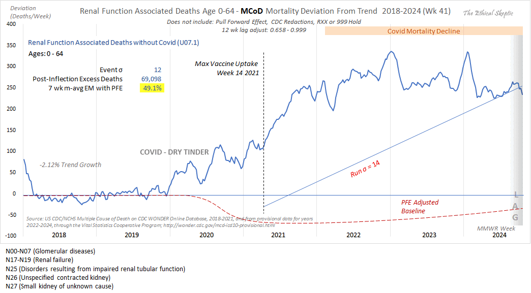
Comments to John Beaudoin - sars2.net

Contents

Increase in N17 acute renal failure deaths

Ethical Skeptic posted this tweet: [https://x.com/EthicalSkeptic/status/1849242898732077066]

Since Kidney-related mortality was our #1 death excess this week, I took a look at its DFT chart.

While there is a Covid/Treatment effect in 2020. The overall arrival form still fits the VERY familiar Wk 14 2021 inflection/death taper.

This is the mRNA vaccine = 49% excess

The reason why he got relatively high excess deaths in 2023 compared to 2022 might be if he fitted the baseline against data from only 2018 and 2019 as is demonstrated by my plot below. My plot also shows that the number of deaths under his ICD codes had a sudden jump up at the start of 2011 and a sudden jump down at the start of 2013, which may have been due to changes in coding practices. So the increase in deaths since 2020 might have similarly been due to changes to coding practices, because its magnitude is similar to the magnitude of the drop between 2012 and 2013:
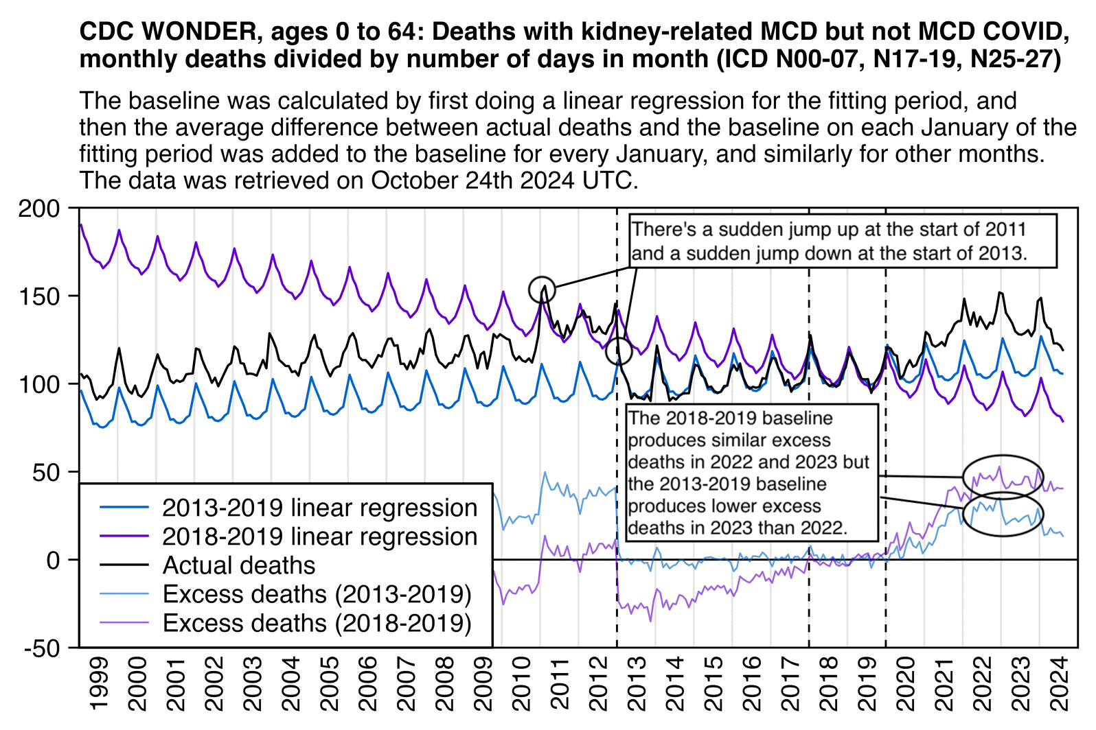
library(data.table);library(ggplot2)

t=fread("http://sars2.net/f/wonderkidney064.csv")[date<="2024-08"]

t=merge(t[cause=="MCD"],t[cause=="MCD and COVID",.(date,and=dead)],all=T)
t=t[,.(x=as.Date(paste0(date,"-1")),y=dead-nafill(and,,0),z="Actual deaths")]
t[,y:=y/lubridate::days_in_month(x)]

a=rbind(copy(t)[,group:=2018],copy(t)[,group:=2013])
a[,month:=month(x)]
a=merge(a,a[year(x)<2020&year(x)>=group,.(x=t$x,base=predict(lm(y~x),t)),group])
a=merge(a[year(x)<2020&year(x)>=group,.(monthly=mean(y-base)),.(month,group)],a)

p=rbind(a[,.(x,y=base+monthly,z=paste0(group,"-2019 linear regression"))],t)
p=rbind(p,a[,.(x,y=y-(base+monthly),z=paste0("Excess deaths (",group,"-2019)"))])

p[,z:=factor(z,unique(z))]

xstart=as.Date("1999-1-1");xend=as.Date("2025-1-1")
xbreak=seq(xstart,xend,"6 month")
xlab=c(rbind("",1999:2024),"")
ybreak=pretty(p$y,6)[-1];ystart=ybreak[1];yend=max(ybreak)

color=c("black",hsv(21/36,1,.8),hsv(27/36,1,.8))[c(2,3,1,2,3)]

ggplot(p,aes(x+15,y))+
geom_vline(xintercept=seq(xstart,xend,"year"),color="gray90",linewidth=.25)+
geom_vline(xintercept=as.Date(paste0(c(2013,2018,2020),"-1-1")),linetype=2,linewidth=.25)+
geom_hline(yintercept=c(ystart,0,yend),linewidth=.25,lineend="square")+
geom_vline(xintercept=c(xstart,xend),linewidth=.25,lineend="square")+
geom_line(aes(y=y,color=z,alpha=z,linewidth=z))+
labs(title="CDC WONDER, ages 0 to 64: Deaths with kidney-related MCD but not MCD COVID,\nmonthly deaths divided by number of days in month (ICD-10 113 cause list\n\"Nephritis, nephrotic syndrome and nephrosis\"; N00-07, N17-19, N25-27)",subtitle="The baseline was calculated by first doing a linear regression for the fitting period, and then the average difference between actual deaths and the baseline on each January of the fitting period was added to the baseline for every January, and similarly for other months. The data was retrieved on October 24th 2024 UTC."|>stringr::str_wrap(93),x=NULL,y=NULL)+
coord_cartesian(clip="off",expand=F)+
scale_x_continuous(limits=c(xstart,xend),breaks=xbreak,labels=xlab)+
scale_y_continuous(limits=c(ystart,yend),breaks=ybreak)+
scale_color_manual(values=color)+
scale_linewidth_manual(values=c(.3,.3,.3,.23,.23))+
scale_alpha_manual(values=c(1,1,1,.6,.6))+
theme(axis.text=element_text(size=7,color="black"),
  axis.ticks.x=element_line(color=alpha("black",c(1,0))),
  axis.ticks.length.x=unit(0,"pt"),
  axis.text.x=element_text(angle=90,vjust=.5,hjust=1),
  axis.ticks=element_line(linewidth=.25,color="black"),
  axis.ticks.length=unit(3,"pt"),
  legend.background=element_blank(),
  legend.box.just="left",
  legend.key=element_blank(),
  legend.spacing.x=unit(2,"pt"),
  legend.key.height=unit(8,"pt"),
  legend.key.width=unit(17,"pt"),
  legend.position=c(0,0),
  legend.justification=c(0,0),
  legend.box.background=element_rect(fill="white",color="black",linewidth=.3),
  legend.margin=margin(-3,4,3,4),
  legend.text=element_text(size=7,vjust=.5),
  legend.title=element_blank(),
  panel.background=element_blank(),
  plot.margin=margin(5,5,5,5),
  plot.subtitle=element_text(size=6.8,margin=margin(,,4)),
  plot.title=element_text(size=7,face=2,margin=margin(1,,3)))
ggsave("1.png",width=4.2,height=2.8,dpi=380*4)
system("magick 1.png -resize 25% 1.png")

The ICD codes in Ethical Skeptic's plot are the same codes that are included on the ICD 113 cause list under the label "Nephritis, nephrotic syndrome and nephrosis". Most of the increase under the label since 2020 is accounted by N17.9 (acute renal failure, unspecified). However the label is missing N28.8 (other specified disorders of kidney and ulcer) which has had a massive decrease since 2020 that has coincided with the increase in N17.9:

library(data.table)

kimi=\(x){na=is.na(x);x[na]=0;e=floor(log10(ifelse(x==0,1,abs(x))));e2=pmax(e,0)%/%3+1;x[]=ifelse(abs(x)<1e3,round(x),paste0(sprintf(paste0("%.",ifelse(e%%3==0,1,0),"f"),x/1e3^(e2-1)),c("","k","M","B","T")[e2]));x[na]="NA";x}

t=fread("http://sars2.net/f/wonderbyicd.csv.gz")[type=="MCD"&code%like%"N[012]"]
t=merge(t,fread("http://sars2.net/f/wonderkidneyandcovid.csv")[,.(code,year,and=dead)],all=T)
t=t[,.(code,year,cause,dead=dead-nafill(and,,0))]
t=t[code%in%t[,sum(dead),code][V1>=5e3,code]]
t=t[order(code)][year<2024]

pick="N0[0-7]|N1[789]|N2[567]"
t1=t[code%like%pick];t2=t[!code%like%pick]
t=rbind(t1,t2)
t=t[,label:=paste0(code,": ",cause)][,label:=factor(label,unique(label))]

m=t[,xtabs(dead~label+year)]
maxcolor=max(m)
exp=.6
pal=hsv(c(21,21,12,6,3,0,0)/36,c(0,.5,.5,.5,.5,.5,0),rep(1:0,c(6,1)))

rows1=t1[,length(unique(cause))]

maps=list(m[1:rows1,],m[(rows1+1):nrow(m),]);
for(i in 1:2){
  sub=maps[[i]]
  pheatmap::pheatmap(sub^exp,filename=paste0("i",i,".png"),
    display_numbers=ifelse(sub<10,sub,kimi(sub)),
    cluster_rows=F,cluster_cols=F,legend=F,cellwidth=19,cellheight=15,fontsize=9,fontsize_number=8,
    border_color=NA,na_col="gray90",
    number_color=ifelse(abs(sub^exp)>maxcolor^exp*.8,"white","black"),
    breaks=seq(0,maxcolor^exp,,256),
    colorRampPalette(pal)(256))}

system("w=`identify -format %w i1.png`;pad=24;magick -pointsize 44 -font Arial \\( -size $[w-pad] caption:'CDC WONDER: Yearly deaths with kidney-related MCD but not MCD COVID (causes with at least 5,000 total deaths shown)' -splice $[pad]x24 -gravity south -splice x10 \\) -gravity northwest -font Arial-Bold -pointsize 40 \\( -size $[w-pad*2] caption:'113 cause list \"Nephritis, nephrotic syndrome and nephrosis\" (N00-N07, N17-N19, N25-N27)' -splice $[pad]x1 \\) i1.png \\( -size $[w-pad*2] caption:'Other kidney-related causes of death' -splice $[pad]x1 \\) i2.png -append 1.png;magick 1.png -dither none -colors 256 1.png")

From the next table which shows deaths by UCD instead of MCD, you can see that acute renal failure isn't as common as an underlying cause of death as chronic kidney disease, and deaths with UCD chronic kidney disease were below the pre-COVID trend in 2023 and 2024. You can also see that in addition to the decrease in N28.8 (Other specified disorders of kidney and ureter), the increase in N17.9 has also been mirrored by a decrease in N19 (unspecified renal failure):

In my first plot of kidney-related deaths pre month, I only included causes of death that were included on the ICD 113 cause list under the label "Nephritis, nephrotic syndrome and nephrosis". But in the next plot where I included all ICD codes between N00 and N28, there was no longer any clear increase in deaths above the prepandemic baseline since 2020, and in fact the deaths were far below the baseline in 2023 and 2024 (even though it might be due to a change in coding practices similar to the jump down at the start of 2011):

library(data.table);library(ggplot2)

t=fread("http://sars2.net/f/wonderkidneymonth.csv")[type=="ucd"]
t[,date:=as.Date(paste(year,month,1,sep="-"))]
t[,dead:=dead/days_in_month(date)]

p=t[,.(x=date,y=dead,z=factor(cause,unique(cause)),type=factor("Actual deaths"))]
p=rbind(p,p[year(x)%in%2013:2019,.(x=unique(p$x),type="2013-2019 baseline",y=predict(lm(y~x),.(x=unique(p$x)))),z])

xstart=as.Date("1999-1-1");xend=as.Date("2025-1-1")
xbreak=seq(xstart,xend,"6 month");xlab=ifelse(month(xbreak)==7,year(xbreak),"")
ybreak=pretty(p$y,6);ystart=min(p$y);yend=max(p$y)*1.1

color=c("black",hsv(c(0,3,27,12)/36,1,.8))
lab=p[rowid(z)==1][order(z),.(z,x=as.Date(paste(c(2024,2024,2024,2024,2024),7,1,sep="-")),y=c(211,63,130,50,-6))]

ggplot(p,aes(x+15,y))+
geom_vline(xintercept=seq(xstart,xend,"year"),color="gray90",linewidth=.25)+
geom_hline(yintercept=c(ystart,0,yend),linewidth=.25,lineend="square")+
geom_vline(xintercept=c(xstart,xend),linewidth=.25,lineend="square")+
geom_text(data=lab,aes(label=z,color=z,x=x),size=2.3,hjust=1)+
geom_line(aes(y=y,color=z,linetype=type),linewidth=.3)+
labs(title="CDC WONDER: Monthly deaths by UCD, divided by number of days in month",,x=NULL,y=NULL)+
scale_x_continuous(limits=c(xstart,xend),breaks=xbreak,labels=xlab)+
scale_y_continuous(limits=c(ystart,yend),breaks=ybreak)+
scale_color_manual(values=color)+
scale_linetype_manual(values=c("solid","42"))+
coord_cartesian(clip="off",expand=F)+
theme(axis.text=element_text(size=7,color="black"),
  axis.text.x=element_text(angle=90,vjust=.5,hjust=1),
  axis.text.y=element_text(margin=margin(,1)),
  axis.ticks=element_line(linewidth=.25,color="black"),
  axis.ticks.length=unit(3,"pt"),
  axis.ticks.length.x=unit(0,"pt"),
  legend.position="none",
  panel.background=element_blank(),
  plot.margin=margin(4,4,4,4),
  plot.title=element_text(size=7,face=2,margin=margin(,,3)))
ggsave("1.png",width=4.2,height=2.8,dpi=380*4)
system("magick 1.png -resize 25% -colors 256 1.png")

When I made a similar plot for MCD deaths, the number of MCD N00-N28 deaths with MCD COVID subtracted roughly fell on the prepandemic trend in 2020 to 2024. MCD chronic renal failure was clearly below the pre-COVID trend in 2024 and 2023:

library(data.table);library(ggplot2)

t=fread("http://sars2.net/f/wonderkidneymonth.csv")
t=t[,.(x=as.Date(paste(year,month,1,sep="-")),y=dead,z=factor(cause,unique(cause)),type)]
t[,y:=y/lubridate::days_in_month(x)]

p=rbind(t[type=="mcd"][,type:=1],dcast(t,z+x~type,value.var="y")[,.(z,x,type=2,y=mcd-nafill(and,,0))])
p=rbind(p,p[type==1&year(x)%in%2014:2019,.(x=unique(p$x),y=predict(lm(y~x),.(x=unique(p$x))),type=3),z])
p[,type:=factor(type,,c("MCD COVID not subtracted","MCD COVID subtracted","2014-2019 linear trend"))]

xstart=as.Date("1999-1-1");xend=as.Date("2025-1-1")
xbreak=seq(xstart,xend,"6 month");xlab=ifelse(month(xbreak)==7,year(xbreak),"")
ybreak=pretty(p$y,6);ystart=0;yend=max(p$y)

ggplot(p,aes(x+15,y))+
geom_vline(xintercept=seq(xstart,xend,"year"),color="gray90",linewidth=.25)+
geom_hline(yintercept=c(ystart,0,yend),linewidth=.25,lineend="square")+
geom_vline(xintercept=c(xstart,xend),linewidth=.25,lineend="square")+
geom_line(aes(y=ifelse(y<0,NA,y),color=z,alpha=type,linetype=type),linewidth=.3)+
labs(title="CDC WONDER: Monthly MCD deaths divided by number of days in month",,x=NULL,y=NULL)+
scale_x_continuous(limits=c(xstart,xend),breaks=xbreak,labels=xlab)+
scale_y_continuous(limits=c(ystart,yend),breaks=ybreak)+
scale_color_manual(values=c("black",hsv(c(0,3,27,12)/36,1,.8)))+
scale_alpha_manual(values=c(1,.4,1))+
scale_linetype_manual(values=c("solid","solid","42"))+
coord_cartesian(clip="off",expand=F)+
guides(color=guide_legend(order=1),linetype=guide_legend(order=2),alpha=guide_legend(order=2))+
theme(axis.text=element_text(size=7,color="black"),
  axis.text.x=element_text(angle=90,vjust=.5,hjust=1),
  axis.text.y=element_text(margin=margin(,1)),
  axis.ticks=element_line(linewidth=.25,color="black"),
  axis.ticks.length.x=unit(0,"pt"),
  axis.ticks.length.y=unit(3,"pt"),
  legend.background=element_rect(fill=alpha("white",1),color="black",linewidth=.25),
  legend.box="vertical",
  legend.box.just="left",
  legend.box.spacing=unit(0,"pt"),
  legend.justification=c(0,1),
  legend.key=element_blank(),
  legend.margin=margin(2,3,2,2),
  legend.key.height=unit(7,"pt"),
  legend.key.width=unit(17,"pt"),
  legend.position=c(0,1),
  legend.spacing.x=unit(0,"pt"),
  legend.spacing.y=unit(0,"pt"),
  legend.text=element_text(size=7,vjust=.5),
  legend.title=element_blank(),
  panel.background=element_blank(),
  plot.margin=margin(4,4,4,4),
  plot.title=element_text(size=7,face=2,margin=margin(,,3)))
ggsave("1.png",width=4.2,height=2.8,dpi=380*4)
system("magick 1.png -resize 25% -colors 256 1.png")

If the increase in deaths from acute renal failure was caused by remdesivir or vaccines like Beaudoin has suggested, then why were the deaths still elevated in 2024? In my plot if you look at the light red line where I subtracted COVID deaths, it's much further above the baseline on average in 2024 than in 2021. And if vaccines that were administered long ago were still causing deaths from acute renal failure in 2024, then why were deaths with MCD chronic renal failure far below the pre-COVID trend in 2024? Wikipedia says that AKI is a sudden decrease in kidney function that develops within seven days: "Acute kidney injury (AKI), previously called acute renal failure (ARF),[1][2] is a sudden decrease in kidney function that develops within seven days,[3] as shown by an increase in serum creatinine or a decrease in urine output, or both.[4]" [https://en.wikipedia.org/wiki/Acute_kidney_injury]

Next I tried to look if there was some particular underlying cause of death that would've accounted for the increase in deaths from MCD acute renal failure, but the next plot shows that the deaths seem to be distributed fairly evenly across various underlying causes, apart from about 70,000 deaths with UCD COVID. John Beaudoin has been saying that there have been about 155,000 excess deaths from acute renal failure in the United States, but he means MCD and not UCD deaths, and deaths with underlying cause COVID appear to account for about half of his 155,000 excess deaths:

Relative to the 2018-2019 average baseline I used in my plot, since 2020 there have been about 1.5 times as many excess deaths with MCD I10 ("Essential (primary) hypertension") as excess deaths with MCD N17.9 ("Acute renal failure, unspecified"). So is there also a hypertension Holocaust according to John Beaudoin? Or is the primary cause of most excess deaths not actually hypertension?

library(data.table)

kimi=\(x){na=is.na(x);x[na]=0;e=floor(log10(ifelse(x==0,1,abs(x))));e2=pmax(e,0)%/%3+1;x[]=ifelse(abs(x)<1e3,round(x),paste0(sprintf(paste0("%.",ifelse(e%%3==0,1,0),"f"),x/1e3^(e2-1)),c("","k","M","B","T")[e2]));x[na]="NA";x}

t=fread("http://sars2.net/f/wonderbyicd.csv.gz")[year>=2018&type=="MCD"]
me=merge(t,t[year<2020,mean(dead),code])
m=me[,tapply(dead-V1,.(paste0(code,": ",substr(cause,1,67)),year),c)]

m=m[order(-rowSums(m[,-(1:2)],na.rm=T)),]
m=m[rowSums(m,na.rm=T)>0,][1:24,]

maxcolor=max(abs(m),na.rm=T)
exp=.8
pal=hsv(rep(c(21,0)/36,5:4),c(1,.8,.6,.3,0,.3,.6,.8,1),c(.3,.65,1,1,1,1,1,.65,.3))

pheatmap::pheatmap(sign(m)*abs(m)^exp,filename="1.png",display_numbers=kimi(m),
  cluster_rows=F,cluster_cols=F,legend=F,cellwidth=18,cellheight=14,fontsize=9,fontsize_number=8,
  border_color=NA,na_col="gray90",
  number_color=ifelse(!is.na(m)&abs(m)^exp>.7*(maxcolor^exp),"white","black"),
  breaks=seq(-maxcolor^exp,maxcolor^exp,,256),
  colorRampPalette(pal)(256))

system("w=`identify -format %w 1.png`;pad=26;magick -pointsize 44 -font Arial \\( -size $[w-pad] caption:'CDC WONDER: Excess number of deaths by multiple cause of death relative to 2018-2019 average, top 24 causes shown sorted by 2020-2024 total' -splice $[pad]x24 \\) 1.png -append 1.png")

From the fixed-width files for the NVSS data it's possible to see which set of causes of death each person had: stat.html#Download_fixed_width_and_CSV_files_for_the_NVSS_data_used_at_CDC_WONDER. In the following code I retrieved the complete MCD list of 10 random people who died with MCD N17 in 2022. Two of them fairly young persons of age 54 and 64 with underlying cause of death COVID, and the other person also had bacterial pneumonia due to staphylocccus listed as MCD. But only one out of the ten people had a kidney-related UCD, even though that person's causes of death also included respiratory failure and cardiac arrest:

system("wget https://ftp.cdc.gov/pub/Health_Statistics/NCHS/Datasets/DVS/mortality/mort2022us.zip;unzip mort2022us.zip")

library(readr);library(readxl)

t=setDT(read_fwf("VS22MORT.DUSMCPUB_r20240307",fwf_cols(restatus=c(20,20),age=c(70,73),ucod=c(146,149),enicon_1=c(167,170),enicon_2=c(174,177),enicon_3=c(181,184),enicon_4=c(188,191),enicon_5=c(195,198),enicon_6=c(202,205),enicon_7=c(209,212),enicon_8=c(216,219),enicon_9=c(223,226),enicon_10=c(230,233),enicon_11=c(237,240),enicon_12=c(244,247),enicon_13=c(251,254),enicon_14=c(258,261),enicon_15=c(265,268),enicon_16=c(272,275),enicon_17=c(279,282),enicon_18=c(286,289),enicon_19=c(293,296),enicon_20=c(300,303))))

t=t[restatus!=4][,age:=ifelse(age%/%1000%in%c(1,9),age%%1000,0)]
set.seed(0);sub=t[rowSums(t=="N179",na.rm=T)>0][sample(.N,10)]

icd=setkey(fread("http://sars2.net/f/wonderbyicd.csv.gz")[rowid(code)==1][,code:=sub(".","",code,fixed=T)],"code")

l=na.omit(sub[,.(id=.I,age,pos=rep(0:20,each=.N),code=unlist(.SD[,-(1:2)],,F))])
l$cause=icd[l$code,cause]

l[,cat(paste0("age ",age[1],", ",paste0(ifelse(pos==0,"UCD ",paste0("MCD ",pos,": ")),code," ",cause,collapse="\n"),"\n\n")),id]
# age 83, UCD M628 Other specified disorders of muscle
# MCD 1: A419 Septicaemia, unspecified
# MCD 2: N179 Acute renal failure, unspecified
# MCD 3: M628 Other specified disorders of muscle
#
# age 83, UCD I350 Aortic (valve) stenosis
# MCD 1: A419 Septicaemia, unspecified
# MCD 2: J152 Pneumonia due to staphylococcus
# MCD 3: I509 Heart failure, unspecified
# MCD 4: I350 Aortic (valve) stenosis
# MCD 5: J960 Acute respiratory failure
# MCD 6: R090 Asphyxia
# MCD 7: N179 Acute renal failure, unspecified
# MCD 8: N189 Chronic renal failure, unspecified
#
# age 67, UCD K566 Other and unspecified intestinal obstruction
# MCD 1: J960 Acute respiratory failure
# MCD 2: R090 Asphyxia
# MCD 3: R068 Other and unspecified abnormalities of breathing
# MCD 4: N179 Acute renal failure, unspecified
# MCD 5: N183 Chronic kidney disease, stage 3
# MCD 6: K566 Other and unspecified intestinal obstruction
# MCD 7: I509 Heart failure, unspecified
# MCD 8: E872 Acidosis
# MCD 9: R579 Shock, unspecified
# MCD 10: K720 Acute and subacute hepatic failure
# MCD 11: K922 Gastrointestinal haemorrhage, unspecified
#
# age 86, UCD F03 Unspecified dementia
# MCD 1: J969 Respiratory failure, unspecified
# MCD 2: N179 Acute renal failure, unspecified
# MCD 3: E86 Volume depletion
# MCD 4: R636 Insufficient intake of food and water due to self neglect
# MCD 5: F03 Unspecified dementia
# MCD 6: F03 Unspecified dementia
# MCD 7: R636 Insufficient intake of food and water due to self neglect
# MCD 8: E86 Volume depletion
# MCD 9: E878 Other disorders of electrolyte and fluid balance, not elsewhere classified
#
# age 79, UCD J841 Other interstitial pulmonary diseases with fibrosis
# MCD 1: I959 Hypotension, unspecified
# MCD 2: N179 Acute renal failure, unspecified
# MCD 3: J841 Other interstitial pulmonary diseases with fibrosis
#
# age 64, UCD U071 COVID-19
# MCD 1: J960 Acute respiratory failure
# MCD 2: U071 COVID-19
# MCD 3: J189 Pneumonia, unspecified
# MCD 4: J152 Pneumonia due to staphylococcus
# MCD 5: G931 Anoxic brain damage, not elsewhere classified
# MCD 6: N179 Acute renal failure, unspecified
#
# age 54, UCD U071 COVID-19
# MCD 1: J960 Acute respiratory failure
# MCD 2: U071 COVID-19
# MCD 3: J189 Pneumonia, unspecified
# MCD 4: U071 COVID-19
# MCD 5: J189 Pneumonia, unspecified
# MCD 6: J982 Interstitial emphysema
# MCD 7: J939 Pneumothorax, unspecified
# MCD 8: A419 Septicaemia, unspecified
# MCD 9: N179 Acute renal failure, unspecified
# MCD 10: E878 Other disorders of electrolyte and fluid balance, not elsewhere classified
#
# age 75, UCD N179 Acute renal failure, unspecified
# MCD 1: R090 Asphyxia
# MCD 2: J969 Respiratory failure, unspecified
# MCD 3: J841 Other interstitial pulmonary diseases with fibrosis
# MCD 4: N179 Acute renal failure, unspecified
# MCD 5: I469 Cardiac arrest, unspecified
# MCD 6: F179 Mental and behavioural disorders due to use of tobacco, unspecified mental and behavioural disorder
#
# age 80, UCD C900 Multiple myeloma - Malignant neoplasms
# MCD 1: N179 Acute renal failure, unspecified
# MCD 2: A419 Septicaemia, unspecified
# MCD 3: R688 Other specified general symptoms and signs
# MCD 4: C900 Multiple myeloma - Malignant neoplasms
#
# age 78, UCD I64 Stroke, not specified as haemorrhage or infarction
# MCD 1: I64 Stroke, not specified as haemorrhage or infarction
# MCD 2: N179 Acute renal failure, unspecified
# MCD 3: N189 Chronic renal failure, unspecified
# MCD 4: J449 Chronic obstructive pulmonary disease, unspecified
# MCD 5: D649 Anaemia, unspecified
# MCD 6: I509 Heart failure, unspecified

In the next plot for MCD deaths in Connecticut, N17.9 increased from 463 to 990 between 2019 and 2023 but N19 fell from 438 to 230 and N28.8 fell from 361 to 37. So the increase in N17.9 was approximately equal to the decrease for N19 and N28.8 combined. And from the row at the bottom you can see that the total kidney-related deaths have remained roughly flat since 2013 if deaths with MCD COVID are excluded:

library(data.table)

t=fread("http://sars2.net/f/wonderconnecticutkidney.csv")
t=t[order(cause%like%"Total",code)]

t=t[,label:=ifelse(cause%like%"Total",cause,paste0(code,": ",cause))][,label:=factor(label,unique(label))]

m=t[,tapply(dead,.(label,year),c)];disp=ifelse(m>=1000,sprintf("%.1fk",m/1e3),m)
maxcolor=max(m,na.rm=T);exp=.6
pal=hsv(c(21,21,12,6,3,0,0)/36,c(0,.5,.5,.5,.5,.5,0),rep(1:0,c(6,1)))

pheatmap::pheatmap(m^exp,filename="1.png",display_numbers=disp,gaps_row=nrow(m)-2,
  cluster_rows=F,cluster_cols=F,legend=F,cellwidth=15,cellheight=15,fontsize=9,fontsize_number=8,
  border_color=NA,na_col="gray90",
  number_color=ifelse(abs(m^exp)>maxcolor^exp*.8,"white","black"),
  breaks=seq(0,maxcolor^exp,,256),colorRampPalette(pal)(256))

system("w=`identify -format %w 1.png`;pad=22;magick -interline-spacing -2 -pointsize 44 -font Arial-Bold -size $[w-pad*2] \\( caption:'CDC WONDER: Yearly deaths in Connecticut by multiple cause of death, ICD code range N00 to N28' -splice $[pad]x18 \\) -font Arial -pointsize 42 \\( caption:'The deaths are by state of residence and not state of occurrence. The number of deaths was suppressed on years with less than 10 deaths, and ICD codes that had less than 10 deaths each year are not displayed, but suppressed deaths are still included on the total rows.' -splice $[pad]x8 \\) \\( 1.png -shave x4 \\) -append 1.png")

In the next plot the total excess deaths in 2022 are about 35,000 for N17.9 but -23,000 for N28.8 and -24,000 for N19. N28.8 has a big drop between 2020Q4 and 2022Q1 in the same way that N17.9 has a big increase over the same period of time:

icd=fread("http://sars2.net/f/wonderbyicd.csv.gz")[rowid(code)==1][,code:=sub(".","",code,fixed=T)]
icd=icd[,setNames(cause,code)]

v=do.call(rbind,lapply(2015:2022,\(i)fread(paste0(i,".csv.gz"))[restatus!=4,.(.I,year,month=monthdth,age,ucd=ucod,mcd=unlist(.SD,,F)),.SDcols=patterns("enicon_")][mcd%like%"N[012]|U07"]))
v=v[,age:=pmin(100,ifelse(age%/%1000%in%c(1,9),age%%1000,0))]

sub=merge(v,v[mcd=="U071",.(I,year,ignore=T)],all=T)[is.na(ignore)]
a=sub[year>=2015,.(dead=.N),.(mcd,year,q=(month+2)%/%3)]
a=rbind(a,a[,.(dead=sum(dead),mcd="Total"),.(year,q)])
a=a[mcd%in%a[,sum(dead),mcd][V1>=1000,mcd]]

slope=a[mcd=="Total"&year%in%2015:2019&q%in%2:3,sum(dead),year][,predict(lm(V1~year),.(year=2015:2022))]
a=merge(a[year%in%2015:2019,.(base=mean(dead)),.(mcd,q)],a)
a[,base:=base*(slope/slope[3])[year-2015+1]]

a[,lab:=ifelse(mcd=="Total",mcd,paste0(sub("(...)(.)","\\1.\\2",mcd),": ",icd[a$mcd]))]
m=a[,xtabs(dead-base~lab+paste0(year,"Q",q))]

maxcolor=max(abs(m),na.rm=T);exp=.8
pal=hsv(rep(c(21,0)/36,5:4),c(1,.8,.6,.3,0,.3,.6,.8,1),c(.3,.65,1,1,1,1,1,.65,.3))

pheatmap::pheatmap(sign(m)*abs(m)^exp,filename="1.png",display_numbers=kimi(m),
  gaps_col=seq(4,ncol(m),4),gaps_row=nrow(m)-1,
  cluster_rows=F,cluster_cols=F,legend=F,cellwidth=18,cellheight=14,fontsize=9,fontsize_number=8,
  border_color=NA,na_col="gray90",
  number_color=ifelse(!is.na(m)&abs(m)^exp>.55*(maxcolor^exp),"white","black"),
  breaks=seq(-maxcolor^exp,maxcolor^exp,,256),
  colorRampPalette(pal)(256))

system("w=`identify -format %w 1.png`;pad=26;magick -pointsize 44 -font Arial \\( -size $[w-pad*2] caption:'NVSS: Excess number of deaths for multiple cause of death N00-N28 but not MCD COVID. Sorted by 2020-2022 total. The baseline for each cause has its own intercept but all causes have the same slope. The intercept for each quarter was calculated relative to the average number of deaths in the same quarter of 2015-2019. The slope was determined based on the slope for all causes combined in 2015-2019 (where only second and third quarters were considered in order to reduce the impact of variation in mortality during winter peaks). Codes with less than 1,000 total deaths are not shown but they are included in the total. In order to avoid the suppression of deaths at CDC WONDER, the number of deaths was calculated using the fixed-width files from here: cdc.gov/nchs/data_access/vitalstatsonline.htm.' -splice $[pad]x24 \\) 1.png -append 1.png")

The next plot shows that the MCD to UCD ratio for N17.9 has been increasing since 2015 even if you exclude COVID, so that it was about 7.3 in 2015 but about 9.3 in 2023, which might explain part of the excess MCD deaths. The MCD to UCD ratio is much higher for stage 3 chronic kidney disease than stage 5 kidney disease, but N17.9 is located between them close to stage 4 kidney disease:

icd=fread("http://sars2.net/f/wonderbyicd.csv.gz")[year!=2024]

# sars2.net/stat.html#Download_fixed_width_and_CSV_files_for_the_NVSS_data_used_at_CDC_WONDER
v=do.call(rbind,lapply(2015:2023,\(i)fread(paste0(i,".csv.gz"))[restatus!=4,.(.I,year,month=monthdth,age,ucd=ucod,mcd=unlist(.SD,,F)),.SDcols=patterns("enicon_")][mcd%like%"N[012]|U07"]))

v2=v[!(year*1e7+I)%in%v[mcd=="U071",year*1e7+I]][,nocovid:=T]
sub=rbind(cbind(v,nocovid=F),v2)
a=melt(sub,id=c("year","month","nocovid"),c("ucd","mcd"),"type","code")
a=a[code%like%"N[012]",.(dead=.N),.(type,code,year,month,nocovid)]
a=a[code%in%a[nocovid==F,sum(dead),code][V1>=5e4,code]]
a[,code:=sub("(...)(.)","\\1.\\2",code)]
a[,date:=as.Date(paste(year,month,1,sep="-"))]
a=dcast(a,year+month+code+nocovid~type,value.var="dead")
a=a[,.(x=as.Date(paste(year,month,1,sep="-")),y=mcd/ucd,code,nocovid)]
p=merge(a,icd[,.(code,cause)])
p[,z:=paste0(code,": ",cause)]

xstart=as.Date("2015-1-1");xend=as.Date("2023-1-1")
xbreak=seq(xstart+182,xend,"year");xlab=year(xbreak)
ybreak=pretty(p$y);ystart=ybreak[1];yend=max(ybreak);ybreak=head(ybreak[-1],-1)

means=p[nocovid==F,.(lab=mean(y),x=pmean(xstart,xend)),z]
means=merge(means,p[year(x)%in%2018:2019,.(min=min(y),max=max(y)),z])
means[,y:=ifelse(max<yend/2,max+yend*.07,min-yend*.07)]

p[,nocovid:=factor(nocovid,,c("MCD COVID included","MCD COVID excluded"))]

ggplot(p,aes(x=x+14,y=y))+
facet_wrap(~z,ncol=3,strip.position="top")+
geom_vline(xintercept=seq(xstart,xend,"year"),color="gray90",linewidth=.25)+
geom_hline(yintercept=c(ystart,yend),linewidth=.25,lineend="square")+
geom_vline(xintercept=c(xstart,xend),linewidth=.25,lineend="square")+
geom_line(aes(color=nocovid),linewidth=.4)+
geom_line(data=p[nocovid==nocovid[1]],aes(color=nocovid),linewidth=.4)+
geom_text(data=p[rowid(z)==1],aes(label=str_wrap(z,28)),hjust=0,y=yend*.97,vjust=1,lineheight=.9,x=xstart+50,size=2.3)+
geom_text(data=means,aes(label=sprintf("%.1f",lab)),size=2.4)+
labs(title="NVSS: Ratio of multiple cause of death to underlying cause of death",subtitle="The number in the middle shows the average ratio with COVID included."|>stringr::str_wrap(88),x=NULL,y=NULL)+
scale_x_continuous(limits=c(xstart,xend),breaks=xbreak,labels=xlab)+
scale_y_continuous(limits=c(ystart,yend),breaks=ybreak)+
scale_color_manual(values=c("black","gray"))+
coord_cartesian(clip="off",expand=F)+
guides(color=guide_legend(ncol=2,byrow=F))+
theme(axis.text=element_text(size=7,color="black"),
  axis.text.x=element_text(angle=90,vjust=.5,hjust=1),
  axis.text.y=element_text(margin=margin(,1.5)),
  axis.ticks.x=element_line(color=alpha("black",c(1,0))),
  axis.ticks=element_line(linewidth=.25,color="black"),
  axis.ticks.length=unit(3,"pt"),
  axis.ticks.length.x=unit(0,"pt"),
  legend.background=element_blank(),
  legend.box.just="left",
  legend.box.spacing=unit(0,"pt"),
  legend.justification=c(1,1),
  legend.key=element_blank(),
  legend.key.height=unit(10,"pt"),
  legend.key.width=unit(17,"pt"),
  legend.position="top",
  legend.spacing.x=unit(2,"pt"),
  legend.spacing.y=unit(0,"pt"),
  legend.box.background=element_blank(),
  legend.margin=margin(,,3),
  legend.text=element_text(size=7,vjust=.5),
  legend.title=element_blank(),
  panel.background=element_blank(),
  panel.spacing=unit(0,"pt"),
  plot.margin=margin(4,4,4,4),
  plot.subtitle=element_text(size=7,margin=margin(,,2)),
  plot.title=element_text(size=7.2,face=2,margin=margin(1,,3)),
  strip.background=element_blank(),
  strip.text=element_blank())
ggsave("1.png",width=4.4,height=4.4,dpi=400*4)
system("magick 1.png -resize 25% -colorspace gray 1.png")

I showed a plot to Beaudoin where there were more excess MCD deaths since 2020 for cardiac arrest than for acute renal failure, but he pointed out that cardiac arrest means stopping of the heart and a bunch of deaths involve stopping of the heart. However a bunch of deaths also involve failure of other organs including the kidneys. Here when I sorted the three-letter codes with at least 40,000 UCD deaths in 2020-2023 by the MCD to UCD ratio, cardiac arrest ranked second-highest and acute renal failure ranked fourth-highest:

library(data.table);library(ggplot2);library(ggrepel);library(ggforce)

kim=\(x)ifelse(x>=1e3,ifelse(x>=1e6,paste0(x/1e6,"M"),paste0(x/1e3,"k")),x)

icd=fread("http://sars2.net/f/wondericd.csv")
icd[code=="U07",cause:="COVID-19"]

t=fread("http://sars2.net/f/wonderbyicd.csv.gz")[year%in%2020:2023]
t=t[,.(dead=sum(dead)),.(type,code=substr(code,1,3))]
t=t[code%in%code[type=="UCD"&dead>=4e4]]
t=merge(t,icd)

t=t[,dcast(.SD,code+cause~type,value.var="dead")]
p=t[,.(x=UCD,y=MCD/UCD,label=paste0(code,": ",cause),k=substr(code,1,1))]

xstart=min(p$x)*.7;xend=max(p$x)*1.1;xbreak=c(5e4,1e5,2e5,5e5,1e6)
ystart=min(p$y)*.7;yend=max(p$y)*1.04;ybreak=c(1,2,4,6,8,10,15,20,30,40)

color=c(hsv(c(27,3,12,20,0,24,31)/36,.9,.7),hsv(6/36,.9,.6),"black",hsv(c(9,2,33)/36,1,.4),"gray55","gray30")

ggplot(p,aes(x,y))+
geom_mark_hull(aes(color=k,fill=k),concavity=1000,radius=unit(.15,"cm"),expand=unit(.15,"cm"),alpha=.12,size=.12)+
geom_point(size=.6,aes(color=k))+
geom_text_repel(aes(color=k,label=label),size=2.6,max.overlaps=Inf,force=3,segment.size=.15,min.segment.length=.2,box.padding=.12)+
labs(x="UCD deaths in 2020-2023",y="MCD to UCD ratio in 2020-2023",title="CDC WONDER: MCD to UCD ratio and number of UCD deaths",subtitle="Only causes of death with at least 40,000 total UCD deaths are included. The number of deaths for each 3-letter code was aggregated based on yearly data for 3-to-4-letter codes, so a small number of deaths are missing because they were suppressed by CDC WONDER."|>stringr::str_wrap(98))+
scale_x_log10(limits=c(xstart,xend),breaks=xbreak,labels=kim)+
scale_y_log10(limits=c(ystart,yend),breaks=ybreak)+
scale_color_manual(values=color)+
scale_fill_manual(values=color)+
coord_cartesian(clip="off",expand=F)+
theme(axis.text=element_text(size=11,color="black"),
  axis.text.y=element_text(margin=margin(,2)),
  axis.text.x=element_text(margin=margin(3)),
  axis.ticks=element_line(linewidth=.5,color="gray80"),
  axis.ticks.length=unit(-6,"pt"),
  axis.title=element_text(size=11),
  legend.position="none",
  panel.background=element_rect(fill="white"),
  panel.grid=element_blank(),
  plot.background=element_rect(fill="gray80",color=NA),
  plot.margin=margin(5,5,5,5),
  plot.subtitle=element_text(margin=margin(,,4)),
  plot.title=element_text(size=11.4,face=2,margin=margin(1,,5)))
ggsave("1.png",width=8,height=7.5,dpi=300*4)
system("magick 1.png -resize 25% -colors 256 1.png")

Acute renal failure deaths in other countries

In the UK there has actually been a large decrease in deaths with UCD acute renal failure (N17) since 2018, even though UCD chronic kidney disease (N18) has remained more stable: [https://www.nomisweb.co.uk/query/161.1/advanced.aspx]

However the yearly number of hospital admissions for N17 in England has remained fairly stable, or it has gradually increased at a pace which is consistent with the aging population: [https://digital.nhs.uk/data-and-information/publications/statistical/hospital-admitted-patient-care-activity]

dlf=\(x,y,...){if(missing(y))y=sub(".*/","",x);for(i in 1:length(x))download.file(x[i],y[i],quiet=T,...)}
dlf("https://files.digital.nhs.uk/89/67CEF6/hosp-epis-stat-admi-diag-2023-24-tab.xlsx")
dlf("https://files.digital.nhs.uk/7A/DB1B00/hosp-epis-stat-admi-diag-2022-23-tab_V2.xlsx")
dlf("https://files.digital.nhs.uk/0E/E70963/hosp-epis-stat-admi-diag-2021-22-tab.xlsx")
dlf("https://files.digital.nhs.uk/5B/AD892C/hosp-epis-stat-admi-diag-2020-21-tab.xlsx")
dlf("https://files.digital.nhs.uk/37/8D9781/hosp-epis-stat-admi-diag-2019-20-tab%20supp.xlsx")
dlf("https://files.digital.nhs.uk/1C/B2AD9B/hosp-epis-stat-admi-diag-2018-19-tab.xlsx")
dlf("https://files.digital.nhs.uk/B2/5CEC8D/hosp-epis-stat-admi-diag-2017-18-tab.xlsx")
dlf("https://files.digital.nhs.uk/publication/7/d/hosp-epis-stat-admi-diag-2016-17-tab.xlsx")
dlf("https://files.digital.nhs.uk/publicationimport/pub22xxx/pub22378/hosp-epis-stat-admi-diag-2015-16-tab.xlsx")

r=do.call(rbind,lapply(2015:2023,\(i){
  t=data.table(readxl::read_excel(Sys.glob(paste0("hosp-epis-stat-admi-diag-",i,"*")),sheet=3))
  t[grep("^N17",t[[1]]),.(cause=paste0(.SD[[1]],": ",.SD[[2]]),count=as.integer(.SD[[9]]),year=i)]}))

print(r,r=F) # the years start in April and end in March of the next year
#                    cause count year
# N17: Acute renal failure 48239 2015
# N17: Acute renal failure 49771 2016
# N17: Acute renal failure 50155 2017
# N17: Acute renal failure 53203 2018
# N17: Acute renal failure 53938 2019
# N17: Acute renal failure 51397 2020
# N17: Acute renal failure 54942 2021
# N17: Acute renal failure 55723 2022
# N17: Acute renal failure 56420 2023

In the Czech Republic there was an increasing trend in the number of deaths with UCD N17 before COVID, but the number of deaths from 2020 onwards roughly fell along the prepandemic trend, except the number of deaths was slightly above the trend in 2021 and slightly below the trend in 2022: [czech2.html#Deaths_by_ICD_code_region_age_group_and_year]

t=fread("http://sars2.net/f/czicd.csv.gz")

p=t[icd=="N17",.(dead=sum(dead)),year]
p$trend=p[year<2020,predict(lm(dead~year),p)]

png("1.png",1500,900,res=300)
par(mar=c(2.6,2.7,1.8,.7),mgp=c(0,.6,0),adj=0,lend="square")

tit="Deaths with UCD N17 (acute renal failure) in Czechia"
leg=c("Deaths with UCD N17","2013-2019 linear trend")

ybreak=pretty(c(0,p$dead,p$trend));ylim=range(ybreak)
xstart=min(p$year);xend=max(p$year)
xbreak=xstart:xend

plot(p$year,p$trend,type="n",main=tit,xlab=NA,ylab=NA,xaxs="i",yaxs="i",yaxt="n",xaxt="n",ylim=ylim,xlim=c(xstart-.5,xend+.5),cex.main=1)
axis(2,at=ybreak,las=1)
mtext(xbreak,side=1,line=.3,at=xbreak,las=2)
lines(p$year,p$dead,lwd=1.5)
points(p$year,p$dead,pch=20,cex=.6)
lines(p$year,p$trend,type="l",lty=2,lwd=1.5)
legend("topleft",legend=leg,lty=c(1,2),lwd=1.5)
dev.off()

In Sweden the number of deaths with UCD N17 dropped by about 65% between the years 2010 and 2015, but then it again doubled between the years 2015 and 2016, which is probably the result of changes to coding practices. If the years 2011-2017 that had a reduced number of deaths are excluded, then the number of deaths since 2020 is close to the linear trend in 1997-2019: [https://sdb.socialstyrelsen.se/if_dor]

In Japan there was a clear increase in UCD N17 deaths above the 2010-2019 linear trend since 2020. But on the other hand there seems to have been a big drop in deaths in 2017 which might have been due to a change in coding practices, and the 2017-2019 trend is completely different from the 2010-2019 trend: [https://www.e-stat.go.jp/stat-search/files?page=1&layout=datalist&toukei=00450011&tstat=000001028897&cycle=7&tclass1=000001053058&tclass2=000001053061&tclass3=000001053065]

p=data.table(year=2010:2023)
p$dead=c(8292,8157,7795,7737,7376,7142,6803,5244,5487,5192,5300,5532,5999,6211)

p$trend=p[year<2020,predict(lm(dead~year),p)]
p$trend2=p[year%in%2017:2019,predict(lm(dead~year),p)]

png("1.png",1500,900,res=300)
par(mar=c(2.6,3.3,1.8,.7),mgp=c(0,.6,0),adj=0,lend="square")

tit="Deaths with UCD N17 (acute renal failure) in Japan"
leg=c("Deaths with UCD N17","2013-2019 linear trend","2017-2019 linear trend")

ybreak=pretty(c(0,p$dead,p$trend));ylim=range(ybreak)
xstart=min(p$year);xend=max(p$year)
xbreak=xstart:xend

plot(p$year,p$trend,type="n",main=tit,xlab=NA,ylab=NA,xaxs="i",yaxs="i",yaxt="n",xaxt="n",ylim=ylim,xlim=c(xstart-.5,xend+.5),cex.main=1)
axis(2,at=ybreak,las=1)
mtext(xbreak,side=1,line=.3,at=xbreak,las=2)
lines(p$year,p$dead,lwd=1.5)
points(p$year,p$dead,pch=20,cex=.6)
lines(p$year,p$trend,type="l",lty=2,lwd=1.5)
lines(p$year,p$trend2,type="l",lty=2,col="gray60",lwd=1.5)
legend("bottomleft",legend=leg,lty=c(1,2,2),col=c("black","black","gray60"),lwd=1.5)
dev.off()

Did excess AKI deaths result in more life years lost than COVID?

John Beaudoin said: "A lot of people are dying from say acute renal failure - 211,000 excess in the past 4 years. This is what we were talking about before. Now let me just put this in context. When you look at the ages of them versus the ages of COVID - right, excess deaths from COVID versus involving acute renal failure - acute renal failure blows away COVID. It absolutely blows away life years lost. Because if you die at 20 - the average of death is 75 - you've lost 55 years for that one person. Now COVID deaths - somebody's dying at 84 when the average age of death is 75: it's like, what do they lose, a year? I mean, at most. So if you're gonna assign 1 year to that guy and 55 years to the kid who died, and when you do all that analysis and look - multiply by say average age of death, and take the difference, and then you add them all up, it's far far more than COVID, it's more than the Hong Kong flu, smallpox, polio. The only thing that killed more people - more life years, I should say - the only thing that killed more life years than acute renal failure in the last 4 years was World War 2." [https://x.com/dralexisjazmyn/status/1890835957441593753, time 1:20:50]

In the following code I used 2019 US life expectancies for each age up to ages 100+, and I took the number of deaths by multiple cause of death from the NVSS files: https://www.cdc.gov/nchs/data/nvsr/nvsr70/nvsr70-19.pdf, stat.html#Download_fixed_width_and_CSV_files_for_the_NVSS_data_used_at_CDC_WONDER. I excluded 2024 from my analysis because the NVSS files only go up to 2023, but unlike CDC WONDER they have deaths by single year of age available for ages with less than 10 deaths per year.

I got a total of about 195,000 excess deaths in 2020-2023 with multiple cause of death N17 (acute renal failure). I calculated the baseline number of deaths for each age by multiplying the 2010-2019 trend in CMR by the mid-year resident population estimates of the age. The average life expectancy of the people who died in excess with MCD N17 was about 15.5 years and the total life expectancy was about 3 million years.

But in contrast in 2020-2023 there were a total of about 1.2 million deaths with multiple cause of COVID, where the average life expectancy was about 14.4 years and the total remaining life expectancy was about 17 million years. So the total remaining life expectancy was about 6 times higher for MCD COVID deaths than for excess MCD N17 deaths:

# life expectancies for both sexes combined from the 2019 US life table
download.file("https://ftp.cdc.gov/pub/Health_Statistics/NCHS/Publications/NVSR/70-19/Table01.xlsx","Table01.xlsx")
ex=setDT(readxl::read_excel("Table01.xlsx",skip=2,n_max=101))$ex

v=fread("curl -Ls sars2.net/f/vital.csv.xz|xz -dc")[year>=2010]
v[,age:=pmin(age,100)]

pop=fread("http://sars2.net/f/uspopdead.csv")[year%in%2010:2023][,dead:=NULL]

kid=v[cause%like%"N17",.(dead=sum(mcd)),.(year,age)]
kid=merge(kid,pop)
kid=merge(kid,kid[year<2020,.(year=2020:2023,base=predict(lm(dead/pop~year),.(year=2020:2023))),age])
kid=kid[,.(dead=sum(dead)-sum(base*pop)),age]

covid=v[cause=="U071",.(dead=sum(mcd)),age]

# excess MCD N17 deaths
kid[,sum(dead)] # 195003.9 (total deaths)
kid[,weighted.mean(ex[age+1],dead)] # 15.51 (average remaining life expectancy)
kid[,sum(dead*ex[age+1])] # 3024757 (total remaining life expectancy)

# MCD COVID deaths
covid[,sum(dead)] # 1207587 (total deaths)
covid[,weighted.mean(ex[age+1],dead)] # 14.43 (average remaining life expectancy)
covid[,sum(ex[age+1]*dead)] # 17429250 (total remaining life expectancy)

Beaudoin claims that about 80-90% of the deaths that were attributed to COVID were not actually caused by COVID. He wrote: "The covid number is about 90% fraud. So if you go further and allow for that, then AKI is greater in sheer number also. And about 10X in life years lost." [https://x.com/JohnBeaudoinSr/status/1856022413982785783] But even if you only count 10% of MCD COVID deaths, based on my calculation the excess MCD N17 deaths accounted for only about 1.7 times more life years lost than 10% COVID deaths (from 3024757/(17429250/10)).

In the code above I assumed that a 75-year-old who died with MCD COVID would've had the same remaining life expectancy as the US life expectancy at age 75 in 2019, which is not probably correct, because in the absence of COVID the true remaining life span of 75-year-old people who died with MCD COVID might have in reality been lower than about 14 years. But if the people who died of renal failure at age 75 wouldn't have developed renal failure, their remaining life span would've probably also been lower than the US life expectancy at age 75.

(The population estimates I used above were what I call "DIY intercensal population estimates", where I multiplied the population estimates based on the 2010 census with a linear slope so that they were equal to the 2020-based population estimates in 2020 when I merged the estimates: ethical.html#Files_for_US_population_estimates_by_single_year_of_age_up_to_ages_100. It is similar to the adjustment that is performed in the Census Bureau's official intercensal population estimates, but the 2010-2020 intercensal population estimates have not yet been published.)

In the following code I looked at excess deaths which had any kidney-related MCD in the range of N00 and N28 but which didn't have MCD COVID. I calculated the baseline otherwise the same way as earlier, but I used 2014-2019 as the baseline fitting period because there seems to have been some change in coding practices which resulted in a dramatic drop in N00-N28 deaths between 2012 and 2013. Now there was a total of only about 52,000 excess deaths and the total life years lost was only about 0.8 million (so it's only about one twentieth of my earlier figure of 17.4 million life years lost due to COVID):

ua=\(x,y,...){u=unique(x);y(u,...)[match(x,u)]}

download.file("https://ftp.cdc.gov/pub/Health_Statistics/NCHS/Publications/NVSR/70-19/Table01.xlsx","Table01.xlsx")
ex=setDT(readxl::read_excel("Table01.xlsx",skip=2,n_max=101))$ex

r=do.call(rbind,lapply(2010:2023,\(i){
  t=fread(paste0(i,".csv.gz"))[restatus!=4]
  t[year>=2003,age:=ifelse(age%/%1000%in%c(1,9),age%%1000,0)] # unknown age is usually 9999 but sometimes 1999
  t[year<2003,age:=ifelse(age>=200&age!=999,0,age)] # age field is 3 characters long for years before 2003
  t[,.(I=year*1e7+.I,year,month=monthdth,age,ucd=ucod,mcd=unlist(.SD,,F)),.SDcols=patterns("enicon_")][mcd!=""]}))

pop=fread("http://sars2.net/f/uspopdead.csv")[year%in%2010:2023][,dead:=NULL]

a=r[I%in%I[ua(mcd,like,"N[01]|N2[0-8]")]&!I%in%I[mcd=="U071"]]
a=a[rowid(I)==1,.(dead=.N),.(year,age)]
a=merge(a,pop)
a=merge(a,a[year%in%2014:2019,.(year=2020:2023,base=predict(lm(dead/pop~year),.(year=2020:2023))),age])

kid=a[year>=2020,.(dead=sum(dead)-sum(base*pop)),age]

# excess deaths with MCD N00-N28 but not MCD COVID
kid[,sum(dead)] # 51618.2 (total deaths)
kid[,weighted.mean(ex[age+1],dead)] # 16.31 (average remaining life expectancy)
kid[,sum(dead*ex[age+1])] # 841704.6 (total remaining life expectancy)

Cancer deaths under two ICD codes in Minnesota

Beaudoin posted this tweet: [https://twitter.com/Coquin_de_Chien/status/1727583296668713020]

Here is 1 of 150 pages of graphs from The CDC Memorandum.

However his plots had a total of 16 deaths so maybe the increase in 2022 could've been due to chance. In the US as a whole in 2022, there's not that many excess deaths with an underlying cause of death C96.9 ("Malignant neoplasm of lymphoid, hematopoietic and related tissue, unspecified"). And actually if I would've used a polynomial baseline here, then the excess deaths would've been close to zero:

Beaudoin also posted this tweet:

Nothing to see here.
Move along.
Don't tell anyone.
Keep it quiet so we can sell more vx's.

However Beaudoin's plot only includes data back to 2015 so it's not that clear that there was an increasing trend in C41 deaths before COVID. When I looked at deaths in the US as a whole and I used a 2015-2019 linear baseline, I got negative excess mortality in 2021-2023 for the underlying cause of death C41 ("Malignant neoplasm of lymphoid, hematopoietic and related tissue, unspecified"):

library(ggplot2)

t=data.frame(year=1999:2023)
t$dead=c(71,85,78,57,47,54,43,47,42,50,45,43,62,59,65,66,74,75,82,88,106,118,126,144,152)

trend=lm(dead~year,t|>subset(year>=2015&year<=2019))
t$trend=predict(trend,t)
t$poly=lm(dead~poly(year,2),t|>subset(year>=1999&year<=2019))|>predict(t)
t$excess=t$dead-t$trend
t$polyexcess=t$dead-t$poly

xy=data.frame(x=t$year,y=t$dead,z="Deaths")
xy=rbind(xy,data.frame(x=t$year,y=t$trend,z="Linear trend (2015-2019)"))
xy=rbind(xy,data.frame(x=t$year,y=t$excess,z="Excess deaths relative to linear trend"))

xy$z=factor(xy$z,unique(xy$z))

xstart=min(xy$x);xend=max(xy$x)
cand=c(sapply(c(1,2,5),\(x)x*10^c(-10:10)))
ystep=cand[which.min(abs(cand-(max(xy$y)-min(xy$y))/6))]
ystart=ystep*floor(min(xy$y,na.rm=T)/ystep)
yend=ystep*ceiling(max(xy$y,na.rm=T)/ystep)
xlab=c(rbind("",unique(xy$x)),"")
xbreak=seq(xstart-.5,xend+.5,.5)

color=c("black","gray50",hcl(225,80,40))

yheight=(yend-ystart)/15
labels=data.frame(x=xstart+.001*(xend-xstart),y=seq(yend-yheight,,-yheight,nlevels(xy$z)),label=levels(xy$z))

tit="Yearly deaths in United States with underlying cause of death C96.9 (\"Malignant neoplasm of lymphoid, hematopoietic and related tissue, unspecified\"). Data from wonder.cdc.gov/mcd.html. The data was downloaded in February 2024 so some deaths in 2023 are still missing because of a registration delay."|>stringr::str_wrap(90)

lab=na.omit(data.frame(xy,label=ifelse(!grepl("Linear",xy$z)&xy$x>=2015,round(xy$y),NA)))

ggplot(xy,aes(x,y,color=z))+
geom_hline(yintercept=c(ystart,0,yend),color="gray65",linewidth=.25)+
geom_vline(xintercept=c(xstart-.5,xend+.5,c(2019.5,2014.5)),color="gray65",linewidth=.25)+
geom_line(aes(color=z),linewidth=.3)+
geom_label(data=lab,aes(color=z,label=label),size=1.8,fill=alpha("white",.7),label.r=unit(0,"lines"),label.padding=unit(.0,"lines"),label.size=0)+
geom_text(data=lab,size=1.8,aes(color=z,label=label))+
geom_label(data=labels,aes(x=x,y=y,label=label),fill=alpha("white",.7),label.r=unit(0,"lines"),label.padding=unit(.04,"lines"),label.size=0,color=color[1:nrow(labels)],size=2.6,hjust=0)+
labs(title=tit,x=NULL,y=NULL)+
coord_cartesian(clip="off",expand=F)+
scale_x_continuous(limits=c(xstart-.5,xend+.5),breaks=xbreak,labels=xlab)+
scale_y_continuous(limits=c(ystart,yend),breaks=seq(ystart,yend,ystep))+
scale_color_manual(values=color)+
theme(axis.text=element_text(size=6.5,color="black"),
  axis.text.x=element_text(angle=90,vjust=.5,hjust=1),
  axis.ticks=element_line(linewidth=.25,color="gray65"),
  axis.ticks.x=element_line(color=alpha("gray65",c(1,0))),
  axis.ticks.length=unit(.15,"lines"),
  axis.title=element_text(size=8),
  legend.position="none",
  panel.background=element_rect(fill="white"),
  panel.grid=element_blank(),
  plot.background=element_rect(fill="white"),
  plot.margin=margin(.4,.65,.5,.4,"lines"),
  plot.caption=element_text(size=6,hjust=0,margin=margin(.6,0,0,0,"lines")),
  plot.title=element_text(size=7))
ggsave("1.png",width=4.6,height=3.3)

Increase in deaths with MCD other specified disorders of skin and subcutaneous tissue

John Beaudoin posted this tweet: [https://x.com/JohnBeaudoinSr/status/1865960799723741279]

However if you look at monthly instead of yearly data, both L98.8 and L98.9 seem to have had a sudden increase between December 2021 and January 2022. And in the case of both codes, all months of 2022 have a higher number of deaths than any month of 2021:

t=fread("http://sars2.net/f/wonderskinmonthly.csv")[date>="2020"][order(code)]
t=t[code%in%t[,sum(dead),code][V1>=2e3,code]]
t=t[,label:=paste0(code,": ",cause)][,label:=factor(label,unique(label))]

m=t[,xtabs(dead~label+date)]
disp=m
m=m/apply(m,1,max)

pal=sapply(255:0/255,\(i)rgb(i,i,i))

pheatmap::pheatmap(m,filename="1.png",display_numbers=disp,
  cluster_rows=F,cluster_cols=F,legend=F,cellwidth=15,cellheight=15,fontsize=9,fontsize_number=8,
  ## number_color=ifelse(m>.5,"white","black"),
  number_color=pal[m*255+70*ifelse(m>.5,-1,1)],
  border_color=NA,
  breaks=seq(0,1,,256),pal)

system("magick 1.png -trim -bordercolor white -border 20 1.png;w=`identify -format %w 1.png`;pad=20;magick -pointsize 44 -font Arial \\( -size $[w-pad*2] caption:'CDC WONDER: Monthly deaths with MCD L00-L98 (diseases of the skin and subcutaneous tissue). Causes with at least 2,000 total deaths shown. Each row has its own color scale where the maximum value is shown in black.' -splice $[pad]x24 \\) 1.png -append 1.png")

So the increase at the start of 2022 might be due to some kind of a change in coding practices. Often changes to coding practices seem to be adopted at the start of a new year, like how here there's a jump up for N18 at the start of 2011 and a jump down at the start of 2013, and there's a jump down for N28.8 at the start of 2022: [ethical.html#Deaths_with_kidney_related_MCD_in_ages_0_to_64]

MCD L98.8 previously also had a sudden increase between the December of 2005 and the January of 2006, so that there were about 4 times more deaths in 2006 than 2005:

Deaths with MCD other venous embolism and thrombosis

John Beaudoin posted this tweet: [https://x.com/JohnBeaudoinSr/status/1866720003485204511]

However I pointed out that ICD codes are like fashion that comes and goes. There's so many codes that it's easy to find codes that have gone up since 2021. Deaths with MCD I12 (hypertensive renal disease) almost quadrupled between 2012 and 2013. MCD I63 (cerebral infarction) almost tripled beween 2013 and 2018. And MCD I81 (portal vein thrombosis) doubled between 2015 and 2019:

library(data.table)

kimi=\(x){na=is.na(x);x[na]=0;e=floor(log10(ifelse(x==0,1,abs(x))));e2=pmax(e,0)%/%3+1;x[]=ifelse(abs(x)<1e3,round(x),paste0(sprintf(paste0("%.",ifelse(e%%3==0,1,0),"f"),x/1e3^(e2-1)),c("","k","M","B","T")[e2]));x[na]="NA";x}

icd=fread("http://sars2.net/f/wondericd.csv")
t=fread("http://sars2.net/f/wonderbyicd.csv.gz")[type=="MCD"&year!=2024&code%like%"I"]
t=merge(icd,t[,.(dead=sum(dead)),,.(code=substr(code,1,3),year)])
t=t[code%in%t[,sum(dead),code][V1>=1e4,code]]

m=t[,xtabs(dead~paste0(code,": ",cause)+year)]
maxcolor=max(m);exp=.6
pal=hsv(c(21,21,12,6,3,0,0)/36,c(0,.5,.5,.5,.5,.5,0),rep(1:0,c(6,1)))

pheatmap::pheatmap(m^exp,filename="1.png",
  display_numbers=ifelse(m<10,m,kimi(m)),
  cluster_rows=F,cluster_cols=F,legend=F,cellwidth=19,cellheight=15,fontsize=9,fontsize_number=8,
  border_color=NA,na_col="gray90",
  number_color=ifelse(abs(m^exp)>maxcolor^exp*.8,"white","black"),
  breaks=seq(0,maxcolor^exp,,256),
  colorRampPalette(pal)(256))

system("w=`identify -format %w 1.png`;pad=20;magick -pointsize 44 -font Arial-Bold -size $[w-pad*2] \\( caption:'CDC WONDER: Yearly deaths by multiple cause of death' -splice $[pad]x24 \\) \\( -font Arial -pointsize 40 caption:'Codes starting with I with at least 10,000 total deaths shown. Deaths were aggregated based on 4-letter codes so deaths under 4-letter codes with less than 10 yearly deaths were not included.' -splice $[pad]x2 \\) 1.png -append 1.png")

Deaths with disorders involving the immune mechanism

John Beaudoin posted these tweets: [https://x.com/JohnBeaudoinSr/status/1866915597331595599]

In the second plot he adjusted for the impact of COVID by dividing the number of deaths with MCD D80-D89 by the total number of deaths from all causes. But it's not an accurate method to adjust for the impact of COVID because some MCDs have a higher proportion of COVID deaths than other MCDs. In 2020-2024 the proportion of deaths with MCD COVID was about 14% for MCD D80-D89 but only about 8% for deaths from all causes.

In the next plot when I instead plotted deaths that had MCD D80-D89 but not MCD COVID, I got negative excess deaths in 2021. I still got clearly positive MCD deaths in 2023 and 2024, even though it might partially be if my linear baseline was inaccurate because the long-term trend in deaths going back to 1999 seems to be curved upwards. And for some reason the UCD deaths remained close to the baseline even in 2023 and 2024, so I don't know what explains the difference between MCD and UCD in 2023 and 2024:

library(data.table);library(ggplot2)

t=fread("http://sars2.net/f/wonderd80d89.csv")
t=t[,.(x=as.Date(paste(year,month,1,sep="-")),y=dead,z=factor(cause,unique(cause)),type)]
t[,y:=y/lubridate::days_in_month(x)]

p=t[type=="ucd",.(x,y,z,type=3)]
p=rbind(p,t[type=="mcd"][,type:=1],dcast(t,z+x~type,value.var="y")[,.(z,x,type=2,y=mcd-nafill(and,,0))])

base=p[type%in%c(1,3)&year(x)%in%2014:2019,.(x=unique(p$x),y=predict(lm(y~x),.(x=unique(p$x)))),.(type,z)]
p=rbind(p[,linetype:=1],base[,linetype:=2])
p=p[!(type==2&x<"2020-3-1")]
p[,type:=factor(type,,c("MCD with MCD COVID not subtracted","MCD with MCD COVID subtracted","UCD"))]
p[,linetype:=factor(linetype,,c("Deaths divided by number of days in month","2014-2019 linear trend"))]

xstart=as.Date("1999-1-1");xend=as.Date("2025-1-1")
xbreak=seq(xstart,xend,"6 month");xlab=ifelse(month(xbreak)==7,year(xbreak),"")
ybreak=pretty(p$y,6);ystart=0;yend=max(p$y)

cap="Includes:
D80 (Immunodeficiency with predominantly antibody defects)
D81 (Combined immunodeficiencies)
D82 (Immunodeficiency associated with other major defects)
D83 (Common variable immunodeficiency)
D84 (Other immunodeficiencies)
D86 (Sarcoidosis)
D89 (Other disorders involving the immune mechanism, not elsewhere classified)"

ggplot(p,aes(x+15,y))+
geom_vline(xintercept=seq(xstart,xend,"year"),color="gray90",linewidth=.25)+
geom_hline(yintercept=c(ystart,0,yend),linewidth=.25,lineend="square")+
geom_vline(xintercept=c(xstart,xend),linewidth=.25,lineend="square")+
geom_line(aes(y=ifelse(y<0,NA,y),color=type,linetype=linetype),linewidth=.3)+
labs(title="CDC WONDER, D80-D89: Monthly deaths divided by number of days in month",x=NULL,y=NULL,caption=cap)+
scale_x_continuous(limits=c(xstart,xend),breaks=xbreak,labels=xlab)+
scale_y_continuous(limits=c(ystart,yend),breaks=ybreak)+
scale_color_manual(values=c("#6666ff","#bbbbff","black"))+
scale_linetype_manual(values=c("solid","42"))+
coord_cartesian(clip="off",expand=F)+
guides(color=guide_legend(order=1),linetype=guide_legend(order=2),alpha=guide_legend(order=2))+
theme(axis.text=element_text(size=7,color="black"),
  axis.text.x=element_text(angle=90,vjust=.5,hjust=1),
  axis.text.y=element_text(margin=margin(,1)),
  axis.ticks=element_line(linewidth=.25,color="black"),
  axis.ticks.length.x=unit(0,"pt"),
  axis.ticks.length.y=unit(3,"pt"),
  legend.background=element_rect(fill=alpha("white",1),color="black",linewidth=.25),
  legend.box="vertical",
  legend.box.just="left",
  legend.box.spacing=unit(0,"pt"),
  legend.justification=c(0,1),
  legend.key=element_blank(),
  legend.margin=margin(2,3,2,2),
  legend.key.height=unit(7,"pt"),
  legend.key.width=unit(17,"pt"),
  legend.position=c(0,1),
  legend.spacing.x=unit(0,"pt"),
  legend.spacing.y=unit(0,"pt"),
  legend.text=element_text(size=7,vjust=.5),
  legend.title=element_blank(),
  panel.background=element_blank(),
  plot.caption=element_text(size=6,hjust=0,margin=margin(4)),
  plot.margin=margin(4,4,4,4),
  plot.title=element_text(size=7,face=2,margin=margin(,,3)))
ggsave("1.png",width=4.2,height=2.8,dpi=380*4)
system("magick 1.png -resize 25% PNG8:1.png")

The next plot shows that the increase in MCD deaths seems to be primarily due to D89.9 (Other disorders involving the immune mechanism, unspecified) and secondarily due to D86.9 (Sarcoidosis, unspecified). However the number of deaths under D89.9 also had a sudden ten-fold increase between 2005 and 2006, so I guess Beaudoin would've also blamed it on the COVID vaccines if the vaccines would've been rolled out in 2006:

library(data.table)

kimi=\(x){na=is.na(x);x[na]=0;e=floor(log10(ifelse(x==0,1,abs(x))));e2=pmax(e,0)%/%3+1;x[]=ifelse(abs(x)<1e3,round(x),paste0(sprintf(paste0("%.",ifelse(e%%3==0,1,0),"f"),x/1e3^(e2-1)),c("","k","M","B","T")[e2]));x[na]="NA";x}

t=fread("http://sars2.net/f/wonderbyicd.csv.gz")[type=="MCD"&year!=2024&code%like%"D8"]
t=t[code%in%t[,sum(dead),code][V1>=100,code]]
t=t[order(code)]
t=t[,label:=paste0(code,": ",sub(" \\[.*","",cause))][,label:=factor(label,unique(label))]

m=t[,tapply(dead,.(label,year),c)]
maxcolor=max(m,na.rm=T);exp=.6
pal=hsv(c(21,21,12,6,3,0,0)/36,c(0,.5,.5,.5,.5,.5,0),rep(1:0,c(6,1)))

pheatmap::pheatmap(m^exp,filename="1.png",
  display_numbers=ifelse(m<10,m,kimi(m)),
  cluster_rows=F,cluster_cols=F,legend=F,cellwidth=19,cellheight=15,fontsize=9,fontsize_number=8,
  border_color=NA,na_col="gray90",
  number_color=ifelse(abs(m^exp)>maxcolor^exp*.8,"white","black"),
  breaks=seq(0,maxcolor^exp,,256),
  colorRampPalette(pal)(256))

system("w=`identify -format %w 1.png`;pad=20;magick -pointsize 44 -font Arial-Bold \\( -size $[w-pad] caption:'CDC WONDER: Yearly deaths by multiple cause of death (ICD codes starting with D8 with at least 100 total nonsuppressed deaths)' -splice $[pad]x24 \\) 1.png -append 1.png")

Ages 25-54 had higher excess purpura and thrombocytopenia deaths in 2021 than 2020

Beaudoin posted this tweet: [https://x.com/JohnBeaudoinSr/status/1881176052749181303]

To those saying there was no new pathogen and that COVID was flu or 100% iatrogenic

Doctors lived this in early 2020
There was a prothrombotic pathogen
There is no way around data. Not even fraud

COVID waned in virulence of thrombotic effects when the vx stepped into the thrombosis signal and amplified it >10X

D69 Thrombocytopenia et al > 1,200 EXCESS deaths, ages 25-54, USA, 2021-2023

However ages 25-54 had about 2.3 times more MCD COVID deaths in 2021 than 2020:

> v=fread("http://sars2.net/f/vital.csv.gz")
> v[age%in%25:54&cause=="U071",sum(mcd),year][,V1[year==2021]/V1[year==2020]]
[1] 2.3172

So it might explain why ages 25-54 also had much more excess MCD D69 deaths in 2021 than 2020. And I believe Beaudoin used a 2015-2019 linear baseline in his plot, which might explain why he was still getting fairly high excess deaths in 2024, because the long-term trend in deaths seems to be curved upwards, so the 2015-2019 baseline might be too low by 2024 in the same way that it's too low here in 2010 and earlier:

library(data.table);library(ggplot2)

t=fread("http://sars2.net/f/wonderpurpura.csv")
t=t[,.(x=as.Date(paste(year,month,1,sep="-")),y=dead,z=age,type)]
t[,y:=y/lubridate::days_in_month(x)]
t[,z:=factor(z,c("all","25-54"),c("All ages","Ages 25-54"))]

p=rbind(t[type=="mcd"][,type:=1],dcast(t,z+x~type,value.var="y")[,.(z,x,type=2,y=mcd-nafill(and,,0))])

base=p[type%in%c(1,3)&year(x)%in%2015:2019,.(x=unique(p$x),y=predict(lm(y~x),.(x=unique(p$x)))),.(type,z)]
p=rbind(p,base[,type:=3])
p=p[!(type==2&x<"2020-3-1")]
p[,type:=factor(type,,c("Deaths","Deaths with MCD COVID subtracted","2015-2019 trend"))]

p=p[year(x)>=2005]

xstart=as.Date("2005-1-1");xend=as.Date("2025-1-1")
xbreak=seq(xstart+182,xend,"year");xlab=year(xbreak)

ggplot(p,aes(x+15,y))+
facet_wrap(~z,ncol=1,scales="free")+
geom_vline(xintercept=seq(xstart,xend,"year"),color="gray90",linewidth=.4)+
geom_line(aes(color=type,linetype=type),linewidth=.6)+
geom_line(data=p[type==type[1]],aes(color=type,linetype=type),linewidth=.6)+
labs(title="CDC WONDER, multiple cause of death D69 (purpura and other hemorrhagic\nconditions): Monthly deaths divided by number of days in month",x=NULL,y=NULL)+
geom_text(data=p[,.(y=max(y)),z],x=pmean(xstart,xend),hjust=0,vjust=1.7,aes(label=z),size=3.8,fontface=2)+
scale_x_continuous(limits=c(xstart,xend),breaks=xbreak,labels=substr(xbreak,3,4))+
scale_y_continuous(limits=c(0,NA),breaks=\(x)pretty(c(0,x),7))+
scale_color_manual(values=c("#6666ff","#bbbbff","#6666ff"))+
scale_linetype_manual(values=c("solid","solid","42"))+
coord_cartesian(clip="off",expand=F)+
theme(axis.text=element_text(size=11,color="black"),
  axis.ticks=element_line(linewidth=.4,color="black"),
  axis.ticks.length.x=unit(0,"pt"),
  axis.ticks.length.y=unit(4,"pt"),
  legend.background=element_blank(),
  legend.box.spacing=unit(0,"pt"),
  legend.key=element_blank(),
  legend.margin=margin(,,3),
  legend.key.height=unit(17,"pt"),
  legend.key.width=unit(26,"pt"),
  legend.position="top",
  legend.spacing.x=unit(2,"pt"),
  legend.spacing.y=unit(0,"pt"),
  legend.text=element_text(size=11,vjust=.5),
  legend.title=element_blank(),
  panel.background=element_blank(),
  panel.border=element_rect(fill=NA,linewidth=.4),
  panel.spacing=unit(2,"pt"),
  plot.caption=element_text(size=11,hjust=0,margin=margin(4)),
  plot.margin=margin(5,5,5,5),
  plot.title=element_text(size=11,face=2,margin=margin(,,2)),
  strip.background=element_blank(),
  strip.text=element_blank())
ggsave("1.png",width=6,height=5.2,dpi=300*4)
system("magick 1.png -resize 25% PNG8:1.png")

Beaudoin said that the increase in MCD D69 deaths was mainly caused by the vaccines and not COVID. But then why don't elderly age groups also have much more MCD D69 deaths in 2021 than 2020? Why is it only working-age people, who also happened to have much more COVID deaths in 2021 than 2020?

This also shows how the ratio of COVID deaths in 2021 relative to 2020 is much higher in working-age people than in elderly people:

agecut=\(x,y)cut(x,c(y,Inf),paste0(y,c(paste0("-",y[-1]-1),"+")),T,F)

# sars2.net/stat.html#Download_fixed_width_and_CSV_files_for_the_NVSS_data_used_at_CDC_WONDER
t=do.call(rbind,lapply(2020:2022,\(i)fread(paste0(i,".csv.gz"))[restatus!=4,.(age,ucod,monthdth,year)]))
t=t[age!=9999]
t[,age:=ifelse(age>1000,age-1000,0)]
t[,q:=paste0(year,"Q",(monthdth-1)%/%3+1)]
t[,agegroup:=agecut(age,0:10*10)]

a=merge(t[,.N,.(q,agegroup)],t[ucod=="U071",.(covid=.N),.(q,agegroup)])

pal=hsv(c(21,21,21,16,11,6,3,0,0)/36,c(0,.25,rep(.5,6),0),c(rep(1,8),.0))
pal=sapply(255:0,\(i)rgb(i,i,i,maxColorValue=255))

m=a[,tapply(covid/N*100,.(agegroup,q),c)]
m[is.na(m)]=0
maxcolor=max(m)

pheatmap::pheatmap(m,filename="1.png",display_numbers=round(m),
  cluster_rows=F,cluster_cols=F,legend=F,cellwidth=14,cellheight=14,fontsize=9,fontsize_number=8,
  border_color=NA,na_col="gray90",
  number_color=ifelse(m>maxcolor*.4&!is.na(m),"white","black"),
  breaks=seq(0,maxcolor,,256),colorRampPalette(pal)(256))

system("magick 1.png -gravity center -extent 120%x100% 1.png;w=`identify -format %w 1.png`;pad=24;convert -gravity northwest -pointsize 41 -interline-spacing -2 -font Arial-Bold \\( -size $[w-pad*2]x caption:'NVSS: Percentage of COVID deaths out of all deaths by age group and quarter' -splice $[pad]x14 \\) \\( -size $[w-pad*2]x -font Arial -pointsize 37 caption:'COVID deaths are deaths with underlying cause U07.1. To avoid suppression of deaths on rows with less than 10 deaths, the data was not retrieved from CDC WONDER but from the fixed-width files here: cdc.gov/nchs/nvss/mortality_public_use_data.htm.' -splice $[pad]x10 \\) \\( 1.png -shave 0x6 \\) -append -colorspace gray 1.png")

From the next plot of cumulative COVID deaths in ages 25-54, you can see that only about 25% of all COVID deaths had occurred by the end of 2020. The increase in deaths in 2023 and 2024 is not as steep as in Beaudoin's plot, but I suspect it's because Beaudoin's baseline might have been too low by 2023 and 2024:

Beaudoin posted this explanation for the spike in deaths during the Delta wave: [https://x.com/JohnBeaudoinSr/status/1881185647118909808]

Yes, that giant spike was coincident with the age group getting the boosters or the first and second round depending on age.

In order to coach kids in the fall sports or to attned certain post summer events, people opted to get vx'd after delaying it for the first half of the year. But some who'd gotten their March 2 doses also got their boosters in September.

August - October 2021 was a huge uptake of the cvid vx.

However this plot shows that ages 25-49 didn't have that many new people who only got the first dose in August to October 2021:

t=fread("Archive__COVID-19_Vaccination_and_Case_Trends_by_Age_Group__United_States_20250121.csv")

p=t[,.(x=as.Date(`Date Administered`,"%m/%d/%Y"),y=Administered_Dose1_pct_agegroup*100,z=AgeGroupVacc)]
p[,z:=sub(" - ","-",sub(" Years","",sub("<2 Years","0-1",z)))]
ages=unique(p$z)
p[,z:=factor(z,ages[order(as.integer(sub("[-+].*","",ages)))])]

xstart=as.Date("2020-1-1");xend=as.Date("2023-1-1")
xbreak=seq(xstart+182,xend,"year");xlab=year(xbreak)

ggplot(p,aes(x,y))+
geom_vline(xintercept=seq(xstart,xend,"month"),color="gray92",linewidth=.4)+
geom_vline(xintercept=seq(xstart,xend,"3 month"),color="gray80",linewidth=.4)+
geom_vline(xintercept=seq(xstart,xend,"year"),color="gray40",linewidth=.5)+
geom_line(aes(color=z),linewidth=.6)+
labs(title="Percentage of people with first vaccine dose by age group in the US",subtitle=paste0("Source: CDC dataset \"COVID-19 Vaccination and Case Trends by Age Group, United States\". The percentage of vaccinated people was capped at 95% in ages 65+.")|>stringr::str_wrap(73),x=NULL,y=NULL)+
scale_x_continuous(limits=c(xstart-.5,xend+.5),breaks=xbreak,labels=xlab)+
scale_y_continuous(limits=c(0,100),breaks=0:10*10,labels=\(x)paste0(x,"%"))+
coord_cartesian(clip="off",expand=F)+
scale_color_manual(values=c("#ffbbbb","#ff7777","#ffbb55","#55cc55","#55cccc","black",hsv(30/36,.7,1),hsv(32/36,.8,.7)))+
theme(axis.text=element_text(size=11,color="black"),
  axis.text.x=element_text(margin=margin(5)),
  axis.ticks=element_line(linewidth=.4,color="black"),
  axis.ticks.length.x=unit(0,"pt"),
  axis.ticks.length.y=unit(4,"pt"),
  axis.title=element_text(size=8),
  legend.background=element_rect(fill="white",color="black",linewidth=.4),
  legend.box.spacing=unit(0,"pt"),
  legend.key=element_blank(),
  legend.key.height=unit(13,"pt"),
  legend.key.width=unit(26,"pt"),
  legend.position=c(0,1),
  legend.justification=c(0,1),
  legend.spacing.x=unit(3,"pt"),
  legend.spacing.y=unit(0,"pt"),
  legend.margin=margin(4,6,4,5),
  legend.text=element_text(size=11,vjust=.5),
  legend.title=element_blank(),
  panel.background=element_blank(),
  panel.border=element_rect(fill=NA,linewidth=.4),
  panel.spacing.x=unit(4,"pt"),
  panel.spacing.y=unit(3,"pt"),
  plot.margin=margin(7,7,7,7),
  plot.subtitle=element_text(size=11,margin=margin(,,4)),
  plot.title=element_text(size=11.5,face=2,margin=margin(2,,6)))
ggsave("1.png",width=6,height=4,dpi=300*4)
system("magick 1.png -resize 25% -colors 256 1.png")

And if the vaccines caused a huge increase in deaths among working-age people during the Delta wave, then why weren't people also dropping like flies earlier in 2021 when a much larger number of people got vaccinated?

During the Delta wave all-cause mortality peaked on the week ending September 11th 2021, but there weren't many people in ages 25-54 who had received a booster dose that early. A recommendation for all people aged 18 and above to get a booster dose was only issued on November 19th. [https://www.cdc.gov/mmwr/volumes/70/wr/mm7050e2.htm]

I only found data for booster doses administered by age group that started on the week ending December 13th 2021, but at that point ages 18-49 had only about 10% of people with a booster dose: [https://data.cdc.gov/Vaccinations/COVID-19-Vaccinations-in-the-United-States-County/8xkx-amqh]

agecut=\(x,y)cut(x,c(y,Inf),paste0(y,c(paste0("-",y[-1]-1),"+")),T,F)

t=fread("c/COVID-19_Vaccinations_in_the_United_States_County_20240227.csv.gz")

age=c("5-11","12-17","18-49","50-64","65+")
a=t[,.(date=as.Date(Date,"%m/%d/%Y")-3,vax=c(Booster_Doses_5Plus-Booster_Doses_12Plus,Booster_Doses_12Plus-Booster_Doses_18Plus,Booster_Doses_18Plus-Booster_Doses_50Plus,Booster_Doses_50Plus-Booster_Doses_65Plus,Booster_Doses_65Plus),age=factor(rep(age,each=.N),age))]
a=a[,.(vax=sum(vax,na.rm=T)),.(date,age)]

pop=fread("http://sars2.net/f/uspopdeadmonthly.csv")
pop=pop[,.(pop=sum(pop)),.(date=as.Date(paste(year,month,15,sep="-")),age=agecut(age,c(5,12,18,50,65)))]
pop=na.omit(pop)[,spline(date,pop,xout=unique(a$date)),age][,.(date=`class<-`(x,"Date"),pop=y,age)]
a=merge(a,pop)

p=a[,.(x=date,y=vax/pop*100,z=age)]
p=p[y>0]

xstart=as.Date("2020-1-1");xend=as.Date("2023-1-1")
xbreak=seq(xstart+182,xend,"year");xlab=year(xbreak)

ggplot(p,aes(x,y))+
geom_vline(xintercept=seq(xstart,xend,"month"),color="gray92",linewidth=.4)+
geom_vline(xintercept=seq(xstart,xend,"3 month"),color="gray80",linewidth=.4)+
geom_vline(xintercept=seq(xstart,xend,"year"),color="gray40",linewidth=.5)+
geom_line(aes(color=z),linewidth=.6)+
labs(title="Percentage of people with a booster dose by age group in the US",subtitle=paste0("Source: CDC dataset \"COVID-19 Vaccinations in the United States, County\".")|>stringr::str_wrap(73),x=NULL,y=NULL)+
scale_x_continuous(limits=c(xstart-.5,xend+.5),breaks=xbreak,labels=xlab)+
scale_y_continuous(limits=c(0,100),breaks=0:10*10,labels=\(x)paste0(x,"%"))+
coord_cartesian(clip="off",expand=F)+
scale_color_manual(values=c("#ffbb55","#55cc55","black",hsv(30/36,.7,1),hsv(32/36,.8,.7)))+
theme(axis.text=element_text(size=11,color="black"),
  axis.text.x=element_text(margin=margin(5)),
  axis.ticks=element_line(linewidth=.4,color="black"),
  axis.ticks.length.x=unit(0,"pt"),
  axis.ticks.length.y=unit(4,"pt"),
  axis.title=element_text(size=8),
  legend.background=element_rect(fill="white",color="black",linewidth=.4),
  legend.box.spacing=unit(0,"pt"),
  legend.key=element_blank(),
  legend.key.height=unit(13,"pt"),
  legend.key.width=unit(26,"pt"),
  legend.position=c(0,1),
  legend.justification=c(0,1),
  legend.spacing.x=unit(3,"pt"),
  legend.spacing.y=unit(0,"pt"),
  legend.margin=margin(4,6,4,5),
  legend.text=element_text(size=11,vjust=.5),
  legend.title=element_blank(),
  panel.background=element_blank(),
  panel.border=element_rect(fill=NA,linewidth=.4),
  panel.spacing.x=unit(4,"pt"),
  panel.spacing.y=unit(3,"pt"),
  plot.margin=margin(7,7,7,7),
  plot.subtitle=element_text(size=11,margin=margin(,,4)),
  plot.title=element_text(size=11.5,face=2,margin=margin(2,,6)))
ggsave("1.png",width=6,height=4,dpi=300*4)
system("magick 1.png -resize 25% -colors 256 1.png")

Steve Kirsch has a source at HHS who gave him data for all-cause mortality by vaccination status at Medicare. But it shows that the bump in deaths during the Delta wave was nearly flat in vaccinated people: [rootclaim.html#Post_by_Spiro_Pantazatos_for_mortality_by_state_during_the_Delta_wave]

Only people aged 65 and above and younger people with certain disabilities or health conditions are eligible for Medicare, so Kirsch's Medicare data is probably not representative of mortality among working-age people. But among working-age people the spike in deaths during the Delta wave would be even higher relative to the spikes in winter 2020-2021 and spring 2020.

Korean paper about rate of acute kidney injury in a WHO pharmacovigilance database

In February 2025 Korean authors published a paper which showed that in the WHO pharmacovigilance database VigiBase, COVID vaccines had a relative odds ratio of about 2.4 for acute kidney injury: https://www.nature.com/articles/s41598-025-88713-x. Kevin McKernan and Nicolas Hulscher promoted the paper as evidence that Beaudoin's N17 Holocaust theory had been vindicated.

The paper said: "The formula for calculating the ROR is as follows: ROR = (a/b)/(c/d), where 'a' represents the number of cases for a certain AE, 'b' is the number of cases for all other AEs associated with a specific drug, 'c' is the number of all cases for a certain AE not related to a specific drug, and 'd' is the number of all cases not related to the specific AEs and drugs." I don't understand why b and d terms in their formula didn't include total adverse events but total adverse events excluding the certain AE, even though it doesn't make much difference either way.

But anyway, the relative odds ratio values were not adjusted for age. The paper said: "The age at onset of AKI was predominantly > 65 years". But the baseline against which the ROR values were calculated also included childhood vaccines.

The paper says: "COVID-19 mRNA vaccines showed higher reporting of AKI compared with the entire database (ROR, 2.38, 95% CI 2.30-2.46; IC025, 1.09). In the age-specific subgroup analysis, disproportionate signals of COVID-19 mRNA vaccines for AKI reporting were significant in individuals aged 2 years and older (Table S3)."

Table S3 is listed in the table of contents of the supplementary docx file, but the supplementary file seems to be cut off after Table S2 for some reason. I tried to open the file with both Pages and Google Docs but neither of them showed Table S3. I also didn't find the supplementary materials posted on preprint servers, so I didn't find Table S3 anywhere.

So it's difficult to tell to what extent the ROR values were confounded by age.