Rootclaim vaccine debate between Steve Kirsch and Saar Wilf (part 4) - sars2.net

Other parts: rootclaim.html, rootclaim2.html, rootclaim3.html.

Contents

Ratio between unvaccinated and vaccinated mortality in ONS data

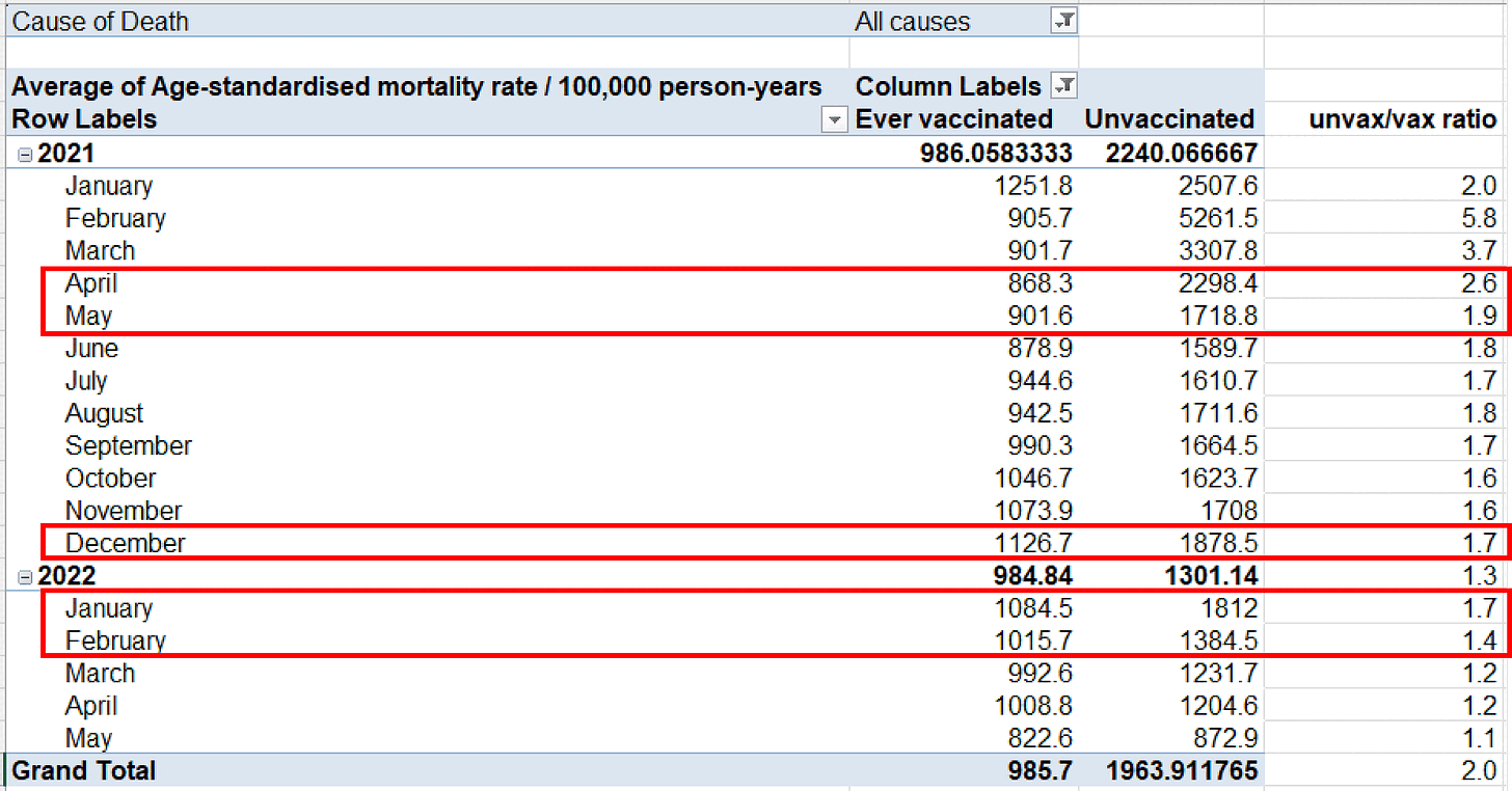
Kirsch posted this table of the English ONS data, where he pointed out that in April to May 2021 when there was a low number of COVID cases, the ratio between unvaccinated and vaccinated ASMR was higher than in December 2021 to February 2022 when there was a high number of COVID cases: [https://kirschsubstack.com/p/official-uk-ons-data-shows-the-covid]

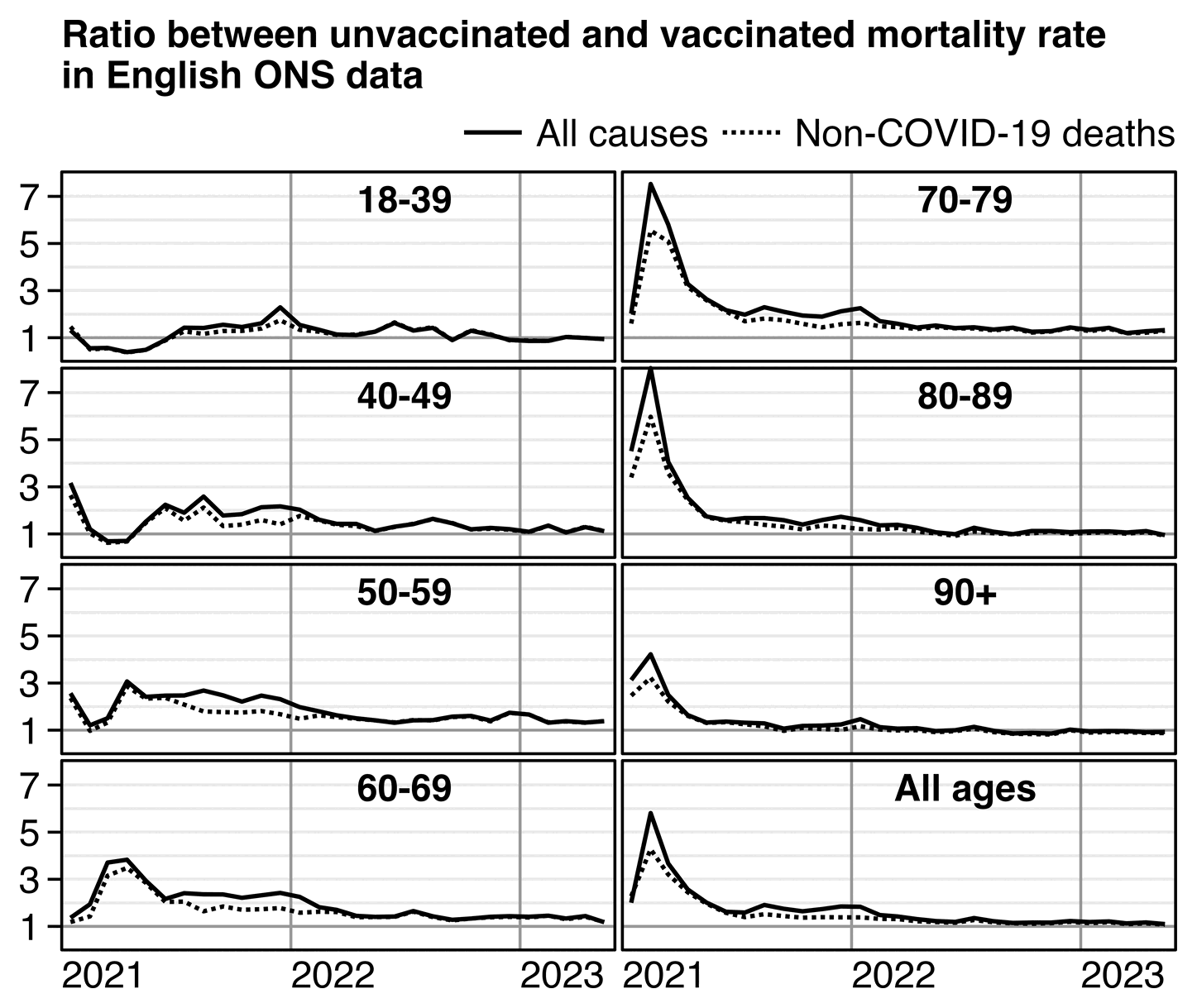
However in April to May 2021 there were still many people who had been recently vaccinated, so vaccinated people were still heavily impacted by the temporal healthy vaccinee effect (which is a term coined by Jeffrey Morris for the stronger form of HVE which lasts for the first weeks or months after vaccination, as opposed to the inherent HVE that remains in place even long after vaccination).

From the plot below you can roughly see the magnitude of the HVE from the dashed line which shows non-COVID ASMR. The plot below also shows that the ratio between unvaccinated and vaccinated ASMR was in fact elevated during the Delta peak in August 2021 and the COVID wave that peaked in December 2021 to January 2022. But in October 2021 when there was a lower number of COVID deaths than in the surrounding months, the ratio between unvaccinated and vaccinated ASMR was also lower than in the surrounding months:

t=fread("http://sars2.net/f/ons.csv")
t=rbind(t[ed==7&month<="2021-03"],t[ed==9])[cause!="Deaths involving COVID-19"]

t[,x:=as.Date(paste0(month,"-15"))]
t[,vax:=factor(status!="Unvaccinated",,c("Unvaccinated","Vaccinated"))]
a=t[age!="Total",.(cmr=sum(dead)/sum(pop)),.(age,vax,x,cause)]

p=a[,.(y=cmr[1]/cmr[2]),.(age,x,cause)]
p=rbind(p,t[age=="Total"&status%like%"accin",.(y=asmr[1]/asmr[2],age="All ages"),.(x,cause)])

xstart=as.Date("2021-1-1");xend=as.Date("2023-6-1");xbreak=seq(xstart,xend,"year");yend=max(p$y)

ggplot(p)+
facet_wrap(~age,dir="v",ncol=2)+
geom_hline(yintercept=2:8,color="gray91",linewidth=.4)+
geom_hline(yintercept=1,color="gray60",linewidth=.4)+
geom_vline(xintercept=seq(xstart,xend,"year"),color="gray60",linewidth=.4)+
geom_rect(data=p[,max(y),age],aes(xmin=xstart,xmax=xend,ymin=0,ymax=yend),linewidth=.4,fill=NA,color="black",lineend="square")+
geom_line(aes(x,y,linetype=cause),linewidth=.6)+
geom_text(data=p[,max(y),age],aes(x=as.Date("2022-7-1"),y=yend,label=age),hjust=.5,fontface=2,vjust=1.5,size=3.8)+
labs(x=NULL,y=NULL,title="Ratio between unvaccinated and vaccinated mortality rate\nin English ONS data")+
scale_x_continuous(limits=c(xstart-.5,xend+.5),breaks=xbreak,labels=year(xbreak))+
scale_y_continuous(breaks=seq(1,7,2))+
scale_linetype_manual(values=c("solid","11"))+
scale_alpha_manual(values=c(1,0),guide="none")+
coord_cartesian(clip="off",expand=F)+
guides(color=guide_legend(order=1),linetype=guide_legend(order=2))+
theme(axis.text=element_text(hjust=0,size=11,color="black"),
  axis.title=element_text(size=11,face=2),
  axis.text.x=element_text(margin=margin(3)),
  axis.ticks=element_line(linewidth=.4,color="black"),
  axis.ticks.length.x=unit(0,"pt"),
  axis.ticks.length.y=unit(4,"pt"),
  legend.background=element_blank(),
  legend.box.spacing=unit(0,"pt"),
  legend.direction="horizontal",
  legend.justification="right",
  legend.key=element_blank(),
  legend.key.height=unit(13,"pt"),
  legend.key.width=unit(21,"pt"),
  legend.margin=margin(,,5),
  legend.position="top",
  legend.spacing.x=unit(2,"pt"),
  legend.spacing.y=unit(0,"pt"),
  legend.text=element_text(size=11,vjust=.5),
  legend.title=element_blank(),
  panel.background=element_blank(),
  panel.spacing=unit(2,"pt"),
  plot.margin=margin(5,5,5,5),
  plot.title=element_text(size=11,face=2,margin=margin(2,,4)),
  strip.background=element_blank(),
  strip.text=element_blank())
ggsave("1.png",width=4.8,height=4.1,dpi=300*4)
system(paste0("magick 1.png -trim -resize 25% -bordercolor white -border 24 -colors 256 1.png"))

The next plot shows that there was a period with elevated COVID deaths that lasted from around August 2021 until January 2022. But between January and February 2022 when there was a big drop in COVID deaths, there was also a clear drop in the ratio of all-cause ASMR between unvaccinated and vaccinated people:

library(data.table);library(ggplot2)

t=fread("http://sars2.net/f/ons.csv")
t=rbind(t[ed==7&month<="2021-03"],t[ed==9])
t[,x:=as.Date(paste0(month,"-15"))]
t[,vax:=factor(status!="Unvaccinated",,c("Unvaccinated","Vaccinated"))]
a=t[age!="Total",.(y=sum(dead)/sum(pop)*1e5),.(age,x,vax,cause)]
a=rbind(a,t[age=="Total"&status%like%"accin",.(x,y=asmr,age="All ages",vax,cause)])

p=a[cause!="Non-COVID-19 deaths"]
p[cause=="Deaths involving COVID-19",cause:="COVID deaths"]

xstart=as.Date("2021-1-1");xend=as.Date("2023-6-1");xbreak=seq(xstart,xend,"year")

ggplot(p)+
facet_wrap(~age,dir="v",scales="free_y",ncol=2)+
geom_vline(xintercept=seq(xstart,xend,"year"),color="gray60",linewidth=.4)+
geom_rect(data=p[,max(y),age],aes(xmin=xstart,xmax=xend,ymin=0,ymax=V1),linewidth=.4,fill=NA,color="black",lineend="square")+
geom_line(aes(x,y,linetype=cause,color=vax))+
geom_text(data=p[,max(y),age],aes(x=as.Date("2022-7-1"),y=V1,label=age),hjust=.5,fontface=2,vjust=1.5,size=3.8)+
labs(x=NULL,y=NULL,title="Monthly mortality rates in English ONS data")+
scale_x_continuous(limits=c(xstart-.5,xend+.5),breaks=xbreak,labels=year(xbreak))+
scale_y_continuous(breaks=\(x){y=pretty(x,4);y[y<.85*max(x)]},labels=\(x)ifelse(x<1000,x,paste0(x/1e3,"k")))+
scale_color_manual(values=c("#66f","#f66","black"))+
scale_linetype_manual(values=c("solid","11"))+
scale_alpha_manual(values=1:0)+
coord_cartesian(clip="off",expand=F)+
guides(color=guide_legend(order=1),linetype=guide_legend(order=2))+
theme(axis.text=element_text(hjust=0,size=11,color="black"),
  axis.title=element_text(size=11,face=2),
  axis.text.x=element_text(margin=margin(3)),
  axis.ticks=element_line(linewidth=.4,color="black"),
  axis.ticks.length.x=unit(0,"pt"),
  axis.ticks.length.y=unit(4,"pt"),
  legend.background=element_rect(color="black",linewidth=.4),
  legend.box.margin=margin(,,2),
  legend.box.spacing=unit(0,"pt"),
  legend.direction="horizontal",
  legend.justification="right",
  legend.key=element_blank(),
  legend.key.height=unit(13,"pt"),
  legend.key.width=unit(21,"pt"),
  legend.margin=margin(3,4,3,3),
  legend.position="top",
  legend.spacing.x=unit(2,"pt"),
  legend.spacing.y=unit(0,"pt"),
  legend.text=element_text(size=11,vjust=.5),
  legend.title=element_blank(),
  panel.background=element_blank(),
  panel.spacing=unit(2,"pt"),
  plot.margin=margin(5,5,5,5),
  plot.title=element_text(hjust=.5,size=11,face=2,margin=margin(2,,4)),
  strip.background=element_blank(),
  strip.text=element_blank())
ggsave("1.png",width=5.47,height=4.3,dpi=300*4)

sub="The values for individual age groups are crude mortality rates per 100,000 person-years, and the values for all ages are age-standardized mortality rates per 100,000 person-years. The data was taken from Tables 1 and 2 of the ONS dataset \"Deaths involving COVID-19 by vaccination status, England\". Data for the first three months of 2021 was taken from the July 2022 edition and data for other months was taken from the August 2023 edition. People are counted as vaccinated on the day of the first dose. COVID deaths are deaths where COVID was mentioned anywhere on the death certificate."
system(paste0("mogrify -trim 1.png;magick 1.png \\( -size `identify -format %w 1.png`x -font Arial -interline-spacing -3 -pointsize $[43*4] caption:'",gsub("'","'\\\\'",sub),"' -splice x80 \\) -append -resize 25% -bordercolor white -border 24 -colors 256 1.png"))

Someone in Kirsch's Substack comments asked why February 2021 was an outlier in Kirsch's table, because in his table the ratio between unvaccinated and vaccinated ASMR was about 2.0 in January 2021, 5.8 in February, 3.7 in March, and 2.6 in April. I pointed out that in February a large part of vaccinated people had been vaccinated in recent weeks, and the ONS dataset has a very low number of deaths in the first 2 weeks after vaccination: [stat.html#Plot_deaths_by_weeks_after_vaccination_and_age_group]

I also pointed out that there was high COVID mortality in both January and February 2021. In January 2021 COVID ASMR accounted for about half of total ASMR in both unvaccinated and vaccinated people, but in February COVID ASMR now accounted for about 41% of total ASMR in unvaccinated people but only about 20% of total ASMR in vaccinated people, so vaccinated people had a much bigger drop in the percentage between January and February. I think it's because in Janury 2021 many vaccinated people had been vaccinated so recently that there had not yet been enough time for the immune response to build up after vaccination. But in February 2021 a larger part of vaccinated people had been vaccinated at least 2 or 3 weeks ago so the vaccines were now more effective. So the COVID deaths increased the ratio between unvaccinated and vaccinated ASMR more in February than January:

ons=fread("https://sars2.net/f/ons.csv")[ed==7&age=="Total"]
o=ons[status%like%"accin",asmr[cause=="Deaths involving COVID-19"]/asmr[cause=="All causes"]*100,.(month,status)]
o[,.(unvaccinated=V1[1],vaccinated=V1[2]),month][,ratio:=unvaccinated/vaccinated]|>mutate_if(is.double,round,1)|>print(r=F)
#   month unvaccinated vaccinated ratio
# 2021-01         47.3       53.7   0.9
# 2021-02         41.3       20.3   2.0
# 2021-03         17.9        6.0   3.0
# 2021-04          6.3        1.8   3.5
# 2021-05          2.6        0.7   3.8
# 2021-06          3.5        0.8   4.6
# 2021-07         13.5        2.6   5.3
# 2021-08         23.6        5.0   4.7
# 2021-09         22.1        6.6   3.3
# 2021-10         19.8        6.4   3.1
# 2021-11         24.7        6.5   3.8
# 2021-12         27.7        5.0   5.5
# 2022-01         32.3       10.1   3.2
# 2022-02         18.7        7.4   2.5
# 2022-03         14.9        7.5   2.0
# 2022-04         17.0        9.6   1.8
# 2022-05          8.9        4.3   2.1

Another reason why the ratio between unvaccinated and vaccinated ASMR was higher in February than January is probably because vulnerable groups of people were priorized for early vaccination.

In the next plot of Dutch CBS data if you look at the left panel which shows people who are not in long-term care, the black line shows that the ratio between unvaccinated and vaccinated ASMR was clearly elevated during the COVID wave in the winter of 2021-2022. But the black line was still higher in May 2021 than in the winter of 2021-2022, because the HVE was stronger in May 2021. You can estimate the magnitude of the HVE based on the gray line which shows the ratio of non-COVID ASMR: [rootclaim3.html#Comparison_to_Dutch_CBS_data]

From the light blue line in the next plot, you can see that in the Czech record-level datasets the ratio between unvaccinated and vaccinated non-COVID ASMR follows a fairly smooth downward curve like in the English and Dutch data. But the bright blue line shows that the ratio between unvaccinated and vaccinated all-cause ASMR is elevated in the Czech Republic in the winter of 2021-2022:

In the Substack I linked previously, Kirsch also wrote:

I did it by 10 year age groups (using a pivot on Table 2) just to make sure and here's what it looks like for 60-69:

As you can see, the ASMR jumps instantly with Omicron at a time when the unvaccinated are decreasing their mortality.

That's hard to explain how the vaccine is helping with such a huge disparity where the vaccinated start dying in droves exactly when Omicron rolls out. Coincidence?

So you'd have to argue that the data is invalid.

The healthy vaccinee effect explains why the ASMR of people with two but not more doses shoots up when the third dose was rolled out, because the healthy vaccinees moved under the third dose and people with elevated mortality risk remained under the second dose:

t=fread("http://sars2.net/f/ons.csv")[cause=="All causes"&age=="60-69"]
t=rbind(t[ed==7&month<="2021-03"],t[ed==9])

p=t[,.(dead=sum(dead),pop=sum(pop)),.(date=as.Date(paste0(month,"-1")),status=sub("(,| or).*","",status))]
p=rbind(p,a[status!="Unvaccinated",.(dead=sum(dead),pop=sum(pop),status="Ever vaccinated"),date])
p[,status:=factor(status,unique(status))]
p[,cmr:=dead/pop*1e5]

ybreak=pretty(p$cmr,6);ystart=0;yend=max(ybreak);xstart=min(p$date);xend=max(p$date)

pal=c(hcl(c(21,11,6,0,30)*10+15,90,70),"black")

frac=p[status!="Ever vaccinated",.(frac=pop/sum(pop),status),date]

ggplot(p,aes(date,cmr,color=status))+
geom_area(data=frac,aes(y=frac*yend*.9999,fill=status),linewidth=.15,show.legend=F,alpha=.3)+
annotate("rect",xmin=xstart,xmax=xend,ymin=ystart,ymax=yend,linewidth=.4,lineend="square",fill=NA,color="black")+
geom_line(linewidth=.4)+
geom_point(size=1.1)+
scale_x_date(breaks=unique(p$date)[c(T,F)],date_labels="%b\n%y")+
scale_y_continuous(limits=c(ystart,yend),breaks=seq(0,yend,1000),labels=\(i)ifelse(i<1000,i,paste0(i/1e3,"k")),sec.axis=sec_axis(trans=~./yend*100,name="Percentage of group"))+
labs(x=NULL,y="Crude mortality rate per 100,000 person-years")+
ggtitle("English ONS data, ages 60-69: All-cause CMR per 100,000 person-years")+
scale_color_manual(values=pal)+
scale_fill_manual(values=pal)+
coord_cartesian(clip="off",expand=F)+
guides(color=guide_legend(ncol=3))+
theme(axis.text=element_text(size=11,color="black"),
  axis.ticks=element_line(linewidth=.4),
  axis.ticks.length=unit(3,"pt"),
  axis.title=element_text(size=11),
  legend.background=element_blank(),
  legend.box.just="center",
  legend.box.spacing=unit(0,"pt"),
  legend.direction="vertical",
  legend.justification="center",
  legend.key=element_rect(fill="white"),
  legend.key.height=unit(13,"pt"),
  legend.key.width=unit(26,"pt"),
  legend.margin=margin(,,5),
  legend.position="top",
  legend.spacing.x=unit(2,"pt"),
  legend.spacing.y=unit(0,"pt"),
  legend.text=element_text(size=11),
  legend.title=element_blank(),
  panel.background=element_blank(),
  plot.title=element_text(size=11,hjust=.5,face=2,margin=margin(,,3)))
ggsave("1.png",width=6,height=3.7,dpi=300*4)
system("magick 1.png -trim -resize 25% -bordercolor white -border 24 -dither none -colors 256 1.png")

In the previous plot the "Second dose" category meant people with two but not more doses. But if you look at people with two or more doses instead, their CMR remains stable even after the third dose is rolled out:

t=fread("http://sars2.net/f/ons.csv")[cause=="All causes"&age=="60-69"]
t=rbind(t[ed==7&month<="2021-03"],t[ed==9])

t[,status:=sub("(,| or).*","",status)]
t[,status:=as.integer(factor(status,unique(status)))]
t[,date:=as.Date(paste0(month,"-1"))]

p=do.call(rbind,lapply(1:5,\(i)t[if(i==1)status==1 else status>=i,.(dead=sum(dead),pop=sum(pop),status=i),date]))
p[,status:=factor(status,,c("Unvaccinated",paste(c("One","Two","Three","Four"),"or more doses")))]

p[,cmr:=dead/pop*1e5]

ybreak=pretty(p$cmr,6);ystart=0;yend=max(ybreak);xstart=min(p$date);xend=max(p$date)

pal=c(hcl(c(21,11,6,0,30)*10+15,90,70),"black")

ggplot(p,aes(date,cmr,color=status))+
annotate("rect",xmin=xstart,xmax=xend,ymin=ystart,ymax=yend,linewidth=.4,lineend="square",fill=NA,color="black")+
geom_line(linewidth=.4)+
geom_point(size=1.1)+
scale_x_date(breaks=unique(p$date)[c(T,F)],date_labels="%b\n%y")+
scale_y_continuous(limits=c(ystart,yend),breaks=seq(0,yend,1000),labels=\(i)ifelse(i<1000,i,paste0(i/1e3,"k")))+
labs(x=NULL,y=NULL)+
ggtitle("English ONS data, ages 60-69: All-cause CMR per 100,000 person-years")+
scale_color_manual(values=pal)+
scale_fill_manual(values=pal)+
coord_cartesian(clip="off",expand=F)+
guides(color=guide_legend(ncol=3))+
theme(axis.text=element_text(size=11,color="black"),
  axis.ticks=element_line(linewidth=.4),
  axis.ticks.length=unit(3,"pt"),
  axis.title=element_text(size=11),
  legend.background=element_blank(),
  legend.box.just="center",
  legend.box.spacing=unit(0,"pt"),
  legend.direction="vertical",
  legend.justification="center",
  legend.key=element_rect(fill="white"),
  legend.key.height=unit(13,"pt"),
  legend.key.width=unit(26,"pt"),
  legend.margin=margin(,,5),
  legend.position="top",
  legend.spacing.x=unit(2,"pt"),
  legend.spacing.y=unit(0,"pt"),
  legend.text=element_text(size=11),
  legend.title=element_blank(),
  panel.background=element_blank(),
  plot.margin=margin(5,10,5,5),
  plot.title=element_text(size=11,hjust=.5,face=2,margin=margin(,,3)))
ggsave("1.png",width=6,height=3.7,dpi=300*4)
system("magick 1.png -trim -resize 25% -bordercolor white -border 24 -dither none -colors 256 1.png")

Fenton et al. have hypothesized that the reason why the mortality rate of people with two but not more doses shot up when the third dose was rolled out was because people who died soon after getting the third dose were misclassified under the second dose. But if that was the case, you'd expect there to also be an increase in the mortality rate of people with two or more doses.

But that's not the case, as you can also see from the next plot where I plotted an excess crude mortality rate in ages 60-69 relative to the general population of England. It shows that in December 2021 people with three doses had about 45% lower crude mortality rate than the general population of England. So conversely people who remained under the second dose had elevated mortality in December 2021, because the total mortality of people with two or more doses remained stable. In October 2021 people with three doses had -60% excess mortality which was even lower than in December 2021, but in October the population size of people with two doses was still so large that people with two doses still had negative excess mortality. But the excess mortality of people with two doses gradually increased over the next three months as more people moved under the third dose, so that the monthly person-years of people with two doses dropped from about 432,000 in October 2021 to about 31,000 in January 2022:

download.file("https://www.ons.gov.uk/file?uri=/peoplepopulationandcommunity/birthsdeathsandmarriages/deaths/adhocs/1343dailydeathsbydateofoccurrence1stjune2014to31stmay2023bysingleyearofageengland/dailydeaths2014to2023england.xlsx","dailydeaths2014to2023england.xlsx")

library(data.table)

sum0=\(...)sum(...,na.rm=T)
kimi=\(x){e=floor(log10(ifelse(x==0,1,abs(x))));e2=pmax(e,0)%/%3+1;p=!is.na(x);x[p]=paste0(sprintf(paste0("%.",ifelse(e[p]%%3==0,1,0),"f"),x[p]/1e3^(e2[p]-1)),c("","k","M","B","T")[e2[p]]);x}

ons=fread("http://sars2.net/f/ons.csv")[cause=="All causes"&age=="60-69"]
ons=rbind(ons[ed==9],ons[ed==7&month<="2021-03"])

p=ons[,.(dead=sum0(dead),pop=sum0(pop)),.(status=sub("( or booster|,).*","",status),month)]
p=rbind(p,ons[status!="Unvaccinated",.(dead=sum0(dead),pop=sum0(pop),status="Ever vaccinated"),month])
p=rbind(p,ons[status%like%"Second|Third|Fourth",.(dead=sum0(dead),pop=sum0(pop),status="Dose 2+"),month])
p=rbind(p,ons[status%like%"Third|Fourth",.(dead=sum0(dead),pop=sum0(pop),status="Dose 3+"),month])

p[,status:=factor(status,c("Unvaccinated","First dose","Second dose","Third dose","Fourth dose","Ever vaccinated","Dose 2+","Dose 3+"))]

dead=setDT(readxl::read_excel("dailydeaths2014to2023england.xlsx",sheet=4,range="A6:CP3293"))
dead=dead[,.(date=as.Date(paste0(Year,"-",Month,"-",Day)),age=rep(0:90,each=.N),dead=unlist(.SD[,-(1:3)],,F))]
pop=fread("http://sars2.net/f/englandpop.csv")[,date:=as.Date(paste0(year,"-7-1"))]
pop=pop[,with(spline(date,pop,xout=unique(dead$date)),.(date=`class<-`(x,"Date"),pop=y)),age]
p=merge(p,merge(dead,pop)[age%in%60:69,.(basedead=sum(dead),basepop=sum(pop)/365),.(month=substr(date,1,7))])

p=rbind(p,p[,.(dead=sum(dead),pop=sum(pop),basedead=sum(basedead),basepop=sum(basepop),month="Total"),status])
p[,cmr:=dead/pop][,base:=basedead/basepop]

m=p[,tapply((cmr-base)/ifelse(cmr>base,base,cmr),.(status,month),c)]
disp=p[,tapply((cmr/base-1)*100,.(status,month),round)]
m2=p[,xtabs(pop~status+month)]

max1=9;max2=max(m2[,-ncol(m2)]);exp1=.6;exp2=1
m[m==-Inf]=-max1

pal1=hsv(rep(c(21/36,0),4:5),c(1,.8,.6,.3,0,.3,.6,.8,1),c(.3,.65,1,1,1,1,1,.65,.3))
pal2=sapply(seq(1,0,,256),\(i)rgb(i,i,i))

pheatmap::pheatmap(sign(m)*abs(m)^exp1,filename=paste0("i1.png"),display_numbers=disp,
  cluster_rows=F,cluster_cols=F,legend=F,cellwidth=19,cellheight=19,fontsize=9,fontsize_number=8,
  border_color=NA,na_col="gray90",number_color=ifelse(abs(m)^exp1>max1^exp1*.53,"white","black"),
  breaks=seq(-max1^exp1,max1^exp1,,256),colorRampPalette(pal1)(256))

pheatmap::pheatmap(m2^exp2,filename=paste0("i2.png"),display_numbers=ifelse(m2<10,m2,kimi(m2)),
  cluster_rows=F,cluster_cols=F,legend=F,cellwidth=19,cellheight=19,fontsize=9,fontsize_number=8,
  border_color=NA,na_col="gray90",number_color=ifelse(m2^exp2>max2^exp2*.42,"white","black"),
  breaks=seq(0,max2^exp2,,256),pal2)

sub="\u00a0     Source: ONS datasets \"Deaths by vaccination status, England\", \"Daily deaths by date of occurrence, 1st June 2014 to 31st May 2023 by single year of age, England\", and \"Estimates of the population for the UK, England, Wales, Scotland, and Northern Ireland\".
      Data for the first three months of 2021 is taken from the July 2022 edition of the ONS dataset which was linked against the 2011 census, and data for other months is taken from the August 2023 edition which was linked against the 2021 census.
      The ONS dataset for mortality by vaccination status was released in August 2023, and the dataset for deaths in the general English population was released in July 2023, so both datasets are missing some deaths because of a registration delay in 2023 (but the dataset for deaths in the general population is missing a larger percentage of deaths in May 2023, which explains why ever vaccinated people get positive excess mortality here in May 2023)."

system(paste0("mogrify -trim i[12].png;w=`identify -format %w i1.png`;magick -size $w \\( -pointsize 50 -font Arial-Bold caption:'ONS dataset for mortality by vaccination status, ages 60-69' -splice x10 \\) -pointsize 45 -font Arial \\( caption:'Excess CMR percent relative to CMR the same month among the general population of England' i1.png -splice x24 \\) \\( caption:'Population size in person-years' i2.png -splice x24 \\) \\( -pointsize 42 -font Arial caption:'",gsub("'","'\\\\'",sub),"' -splice x20 \\) -append -trim -bordercolor white -border 32 1.png"))

So Kirsch was wrong when he wrote that "the vaccinated start dying in droves exactly when Omicron rolls out". The total mortality rate of vaccinated people remained roughly stable even after Omicron emerged, but Kirsch's table only showed that the mortality rate of people with two but not more doses went up in December 2021. But it wasn't because of Omicron but because the third dose was rolled out.

Excess deaths by US state in 2021 to 2022 relative to July to November 2020

In this plot the x-axis shows doses per 100 people in each state, and the y-axis shows average monthly deaths in 2021-2022 divided by the average monthly deaths in July to November 2020: [https://kirschsubstack.com/p/simple-linear-regression-of-official]

The reason why Kirsch got a positive correlation between the variables was because many southern states had a COVID wave in summer to fall of 2020 but northern states generally did not, and southern states had a lower percentage of vaccinated people. So the excess deaths due to COVID elevated the baseline more in southern states.

When I used the average monthly deaths in 2019 as the baseline instead, I got a negative correlation between the percentage of vaccinated people and deaths in 2021-2022:

# copied from Kirsch's spreadsheet (doses per 100 in November 2021 CDC data)
vax=data.table(state=c(state.name,"District of Columbia"))
vax$vax=c(99,112,114,106,136,129,150,129,129,105,NA,93,126,104,115,116,108,102,147,139,150,112,125,98,107,107,104,117,140,138,134,141,117,99,108,110,131,139,149,108,115,102,115,113,151,134,133,90,121,95,135)
vax=vax[state!="Hawaii"]

t=fread("http://sars2.net/f/wonderstatemonthlydead.csv")

t1=t[date>="2021-01"&date<="2022-12",.(dead=mean(dead)),state]
t2=t[date>="2019-01"&date<="2019-12",.(base=mean(dead)),state]
merge(merge(t1,t2),vax)[,cor(dead/base,vax)]
# [1] -0.4080108 (baseline is whole 2019)

And I also got a negative correlation when I used the whole of 2020 as the baseline:

t3=t[date>="2020-01"&date<="2020-12",.(base=mean(dead)),state]
merge(merge(t1,t3),vax)[,cor(dead/base,vax)]
# [1] -0.2157941

But I only got a positive correlation when I used July to November 2020 as the baseline like Kirsch:

t3=t[date>="2020-07"&date<="2020-11",.(base=mean(dead)),state]
merge(merge(t1,t3),vax)[,cor(dead/base,vax)]
# [1] 0.5609224

In the next plot I first converted monthly deaths in each state to a percentage of average monthly deaths in the same state in 2019. Then I picked the 10 states with the highest and lowest number of vaccine doses per hundred people in Kirsch's spreadsheet, and I calculated the average monthly percentage of deaths for both groups. It's easy to see how the least-vaccinated states had higher mortality in July to November 2020 than the most-vaccinated states:

# copied from Kirsch's spreadsheet (doses per 100 in November 2021 CDC data)
vax=data.table(state=c(state.name,"District of Columbia"))
vax$vax=c(99,112,114,106,136,129,150,129,129,105,NA,93,126,104,115,116,108,102,147,139,150,112,125,98,107,107,104,117,140,138,134,141,117,99,108,110,131,139,149,108,115,102,115,113,151,134,133,90,121,95,135)
vax=vax[state!="Hawaii"]

t=fread("http://sars2.net/f/wonderstatemonthlydead.csv")
a=merge(t,t[date%like%2019,mean(dead),state])[,.(state,date,pct=dead/V1*100)]

states=vax[order(vax),state]

p=a[state%in%states[1:10],.(y=mean(pct),z=1),.(x=date)]
p=rbind(p,a[state%in%tail(states,10),.(y=mean(pct),z=2),.(x=date)])
p[,z:=factor(z,,paste("Ten",c("least","most"),"vaccinated states"))]
p[,x:=as.Date(paste0(x,"-15"))]

xstart=as.Date("2018-1-1");xend=as.Date("2025-1-1")
xbreak=seq(xstart+182,xend,"year")
p=p[x%in%xstart:xend]
ybreak=pretty(p$y,5)

x1=as.Date("2020-7-1");x2=as.Date("2020-12-1")
annoy=p[x%in%x1:x2,range(y)]

ggplot(p)+
geom_vline(xintercept=seq(xstart,xend,"year"),color="gray50",linewidth=.4)+
geom_hline(yintercept=100,linewidth=.4)+
geom_line(aes(x,y,color=z),linewidth=.6)+
geom_point(aes(x,y,color=z),stroke=0,size=1.2)+
annotate("rect",xmin=x1,xmax=x2,ymin=annoy[1]-5,ymax=annoy[2]+5,linewidth=.5,color="black",fill=NA,lineend="square")+
annotate("text",hjust=0,x=x1,y=89,size=4,label="Kirsch's baseline period")+
labs(x=NULL,y=NULL,title="Deaths as percentage of average monthly deaths in 2019")+
scale_x_continuous(limits=c(xstart,xend),breaks=xbreak,labels=year(xbreak))+
scale_y_continuous(limits=range(ybreak),breaks=ybreak)+
scale_color_manual(values=c("#ff6666","#6666ff"))+
coord_cartesian(clip="off",expand=F)+
theme(axis.text=element_text(size=11,color="black"),
  axis.text.x=element_text(margin=margin(3)),
  axis.ticks=element_line(linewidth=.4,color="black"),
  axis.ticks.length.x=unit(0,"pt"),
  axis.ticks.length.y=unit(4,"pt"),
  legend.background=element_blank(),
  legend.box.spacing=unit(0,"pt"),
  legend.direction="horizontal",
  legend.justification="right",
  legend.key=element_blank(),
  legend.key.height=unit(13,"pt"),
  legend.key.width=unit(24,"pt"),
  legend.margin=margin(,,4),
  legend.position="top",
  legend.spacing.x=unit(3,"pt"),
  legend.spacing.y=unit(0,"pt"),
  legend.text=element_text(size=11,vjust=.5),
  legend.title=element_blank(),
  panel.background=element_blank(),
  panel.border=element_rect(fill=NA,linewidth=.4),
  plot.margin=margin(4,5,4,5),
  plot.title=element_text(size=11,face=2,margin=margin(1,,3)))
ggsave("1.png",width=4.92,height=2.8,dpi=300*4)

(In order to be consistent with Kirsch's analysis, in my analysis above I excluded Hawaii but I treated District of Columbia as a state.)

Paper about fertility rate in Czech Republic by Manniche et al.

Kirsch linked a paper by Vibeke Manniche, Tomáš Fürst, and Max Schmelling titled "Rates of Successful Conceptions According to COVID-19 Vaccination Status: Data from the Czech Republic": https://www.preprints.org/manuscript/202504.2487/v1.

Number of women vaccinated at conception calculated wrong

The authors made a major error when they calculated the number of women who were vaccinated at conception. The error was independently discovered by Uncle John Returns and Peter Hegarty: https://x.com/PeterHegarty17/status/1917606473644879924.

In order to estimate the number of women who were vaccinated at conception, the authors took the number of women who were vaccinated at delivery and subtracted the number of women who received a vaccine during pregnancy, even thuogh the women who received a vaccinate during pregnancy included women who had received a first dose before conception but who got a second dose or a booster dose during pregnancy.

The authors posted a spreadsheet of the data here: https://github.com/Schmeling-M/C-19-Conception. The "Computation" sheet shows that the authors calculated that in June 2021 there were 493 successful conceptions in vaccinated women:

The figure was calculated based on the row for October 2022 in the "Data-translation" sheet, since the authors assumed that the date of conception was 9 months before the date of birth. The authors took total births (7,618), subtracted unvaccinated births (4,499), and subtracted women who were vaccinated during pregnancy (2,626), which gave them the figure of 493:

However in reality the number of women who were unvaccinated at conception may have been much higher, if the 2,626 women who were vaccinated during pregnancy included many women who had received the first dose before conception but who received an additional dose during pregnancy.

In October 2022 the spreadsheet has 813 births in women who were "vaccinated by any dose during pregnancy", which is about 10% of 7,752 total births the same month. You can tell it doesn't mean that the women received a first dose during pregnancy but that they received any dose, because in the Czech record-level data about 15.8% of women aged 18-39 had received any vaccine dose in the 270-day period October 16th 2022, but only about 1.0% of women had received a first dose in the same period:

rec=fread("curl -Ls github.com/skirsch/Czech/raw/refs/heads/main/data/CR_records.csv.xz|xz -dc")
sub=rec[(2021-Rok_narozeni)%in%18:39&Pohlavikod=="F"]
d=sub[,.(id=.I,dose=rep(1:7,each=.N),date=`class<-`(unlist(.SD),"Date")),.SDcols=grep("^Datum_",names(sub))]

dates=seq(as.Date("2021-1-16"),as.Date("2023-12-16"),"month")
r=do.call(rbind,lapply(dates,\(x)d[(x-date)%in%0:270,.(date=x,any=length(unique(id)),first=sum(dose==1))]))
people=max(d$id)
mutate_if(r[,.(date,anydose=any/people*100,firstdose=first/people*100)],is.double,round,1)|>print(r=F)
#       date anydose firstdose
# 2021-01-16     1.3       1.3
# 2021-02-16     2.2       2.2
# 2021-03-16     4.3       4.3
# 2021-04-16     6.7       6.7
# 2021-05-16    10.1      10.1
# 2021-06-16    28.5      28.5
# 2021-07-16    43.7      43.7
# 2021-08-16    50.3      50.3
# 2021-09-16    53.2      53.2
# 2021-10-16    54.7      53.3
# 2021-11-16    59.1      57.8
# 2021-12-16    64.1      60.3
# 2022-01-16    65.0      59.2
# 2022-02-16    65.5      56.2
# 2022-03-16    64.2      36.6
# 2022-04-16    59.3      22.7
# 2022-05-16    47.5      16.6
# 2022-06-16    42.3      13.9
# 2022-07-16    40.6      12.5
# 2022-08-16    36.9       6.9
# 2022-09-16    28.7       2.2
# 2022-10-16    15.8       1.0
# 2022-11-16     7.6       0.5
# 2022-12-16     6.2       0.4
# 2023-01-16     5.2       0.3
# 2023-02-16     4.2       0.2
# 2023-03-16     3.6       0.2
# 2023-04-16     3.1       0.2
# 2023-05-16     2.4       0.1
# 2023-06-16     1.8       0.1
# 2023-07-16     1.1       0.1
# 2023-08-16     0.5       0.0
# 2023-09-16     0.3       0.0
# 2023-10-16     0.3       0.0
# 2023-11-16     0.5       0.0
# 2023-12-16     0.5       0.0
#       date anydose firstdose

So based on the data provided by the authors, it is not possible to calculate fertility rate by date of conception but only by date of delivery.

Fertility rate at time of delivery and not conception

In the next plot I didn't attempt to estimate vaccination status at the date of conception, but I simply plotted the fertility rate by vaccination status at delivery instead. But the fertility rate among vaccinated women was still extremely low in 2021, and unvaccinated women still had a large increase in fertility rate which peaked in the second half of 2021:

system("wget https://onemocneni-aktualne.mzcr.cz/api/v2/covid-19/ockovani-demografie.csv")
system("wget https://github.com/Schmeling-M/C-19-Conception/raw/refs/heads/main/CZ-source-data.zip;unzip CZ-source-data.zip")

api="https://ec.europa.eu/eurostat/api/dissemination/sdmx/2.1/data/"
pop=fread(paste0(api,"demo_pjan?format=TSV"),sep="\t",header=T,na.strings=":")
meta=fread(text=pop[[1]],header=F)
pick=meta[,V5=="CZ"&V4=="F"]
pop=cbind(meta[pick,.(age=V3)],year=rep(1960:2024,each=sum(pick)),pop=unlist(pop[pick,-1]))
pop[,pop:=as.integer(gsub("\\D","",pop))]
pop=pop[age%like%"Y1[89]|Y[23].$",.(pop=sum(pop)),.(date=as.Date(paste0(year,"-1-1")))]
pop=pop[,spline(date,pop,xout=seq(as.Date("2021-1-16"),as.Date("2023-12-16"),"month"))]

o=fread("ockovani-demografie.csv")
d=o[vekova_skupina%in%c("18-24","25-29","30-34","35-39")&pohlavi=="Z"]
d=d[poradi_davky==1,.(vax=sum(pocet_davek)),,.(date=datum)]
d=rbind(d,d[,.(date=seq(min(date),max(date),1),vax=0)])[rowid(date)==1][order(date)]
d[,cum:=cumsum(vax)]
vaxpop=d[year(date)%in%2021:2023,.(vax=mean(cum)),.(month=yemo(date))]$vax

t=setDT(read_excel("CZ-Source-data-total.xlsx",sheet=3,skip=16))[,c(1,2,3,9)]
names(t)=c("month","total","unvaccinated","vaxduringpreg")

t$pop=pop$y
t$vaxpop=vaxpop

vax=t[,(total-unvaccinated)/vaxpop]
unvax=t[,unvaccinated/(pop-vaxpop)]
all=t[,total/pop]

p=t[,.(x=month,y=c(unvax,vax,all)*1000,type=rep(1:3,each=.N))]
p[,type:=factor(type,,c("Unvaccinated","Vaccinated","Total"))]
p[,x:=as.Date(paste0(x,"-16"))]

xstart=as.Date("2021-1-1");xend=as.Date("2024-1-1")
xbreak=seq(xstart,xend,"6 month");xlab=ifelse(month(xbreak)==7,year(xbreak),"")
ybreak=pretty(c(0,p$y),8);ystart=0;yend=max(p$y)*1.02

ggplot(p,aes(x,y))+
geom_vline(xintercept=seq(xstart,xend,"year"),color="gray80",linewidth=.4)+
geom_hline(yintercept=c(ystart,0,yend),linewidth=.4,lineend="square")+
geom_vline(xintercept=c(xstart,xend),linewidth=.4,lineend="square")+
geom_line(aes(color=type),linewidth=.5)+
geom_point(aes(color=type),shape=16,size=1.2)+
labs(title="Czech Republic: Live births per 1,000 women aged 18-39 by\nvaccination status at delivery",x=NULL,y=NULL)+
scale_x_continuous(limits=c(xstart,xend),breaks=xbreak,labels=xlab)+
scale_y_continuous(limits=c(ystart,yend),breaks=ybreak)+
scale_color_manual(values=c("#5555ff","#ff5555","black"))+
coord_cartesian(clip="off",expand=F)+
theme(axis.text=element_text(size=11,color="black"),
  axis.text.x=element_text(margin=margin(4)),
  axis.ticks=element_line(linewidth=.4,color="black"),
  axis.ticks.length.x=unit(0,"pt"),
  axis.ticks.length.y=unit(4,"pt"),
  legend.background=element_rect(fill=alpha("white",1),color="black",linewidth=.4),
  legend.box="vertical",
  legend.box.just="left",
  legend.box.spacing=unit(0,"pt"),
  legend.justification=c(1,1),
  legend.key=element_blank(),
  legend.margin=margin(4,5,4,4),
  legend.key.height=unit(12,"pt"),
  legend.key.width=unit(26,"pt"),
  legend.position=c(1,1),
  legend.spacing.x=unit(2,"pt"),
  legend.spacing.y=unit(0,"pt"),
  legend.text=element_text(size=11,vjust=.5),
  legend.title=element_blank(),
  panel.background=element_blank(),
  plot.margin=margin(5,5,5,5),
  plot.title=element_text(size=11,face=2,margin=margin(1,,4)))
ggsave("1.png",width=5.2,height=3,dpi=300*4)

sub="Source: github.com/Schmeling-M/C-19-Conception, Eurostat dataset demo_pjan, and onemocneni-aktualne.mzcr.cz/api/v2/covid-19 (tab \"Očkování\", file \"COVID-19: Demografický přehled vykázaných očkování v čase\"). Monthly population estimates were interpolated from population estimates on January 1st in the Eurostat dataset demo_pjan. The monthly number of vaccinated women aged 18-39 was calculated as a monthly average of the daily cumulative number of women who had received the first dose at age 18-39 (so that aging over time, migration, and deaths were not accounted for)."

system(paste0("mogrify -trim 1.png;w=`identify -format %w 1.png`;magick 1.png \\( -size $[w]x -font Arial -interline-spacing -3 -pointsize $[43*4] caption:'",gsub("'","'\\\\''",sub),"' -splice x100 \\) -append -resize 25% -bordercolor white -border 26 -colors 256 1.png"))

In my plot I took the monthly number of vaccinated women aged 18-39 from this file that was also used by Manniche et al.: https://onemocneni-aktualne.mzcr.cz/api/v2/covid-19/ockovani-demografie.csv. In Manniche et al.'s spreadsheet the number of vaccinated women each month was the number of vaccinated women at the end of the month, which overestimated the vaccinated population size particularly during the early vaccine rollout. So I calculated the average number of vaccinated women throughout each month instead.

I may have made some error in the plot above or there might be some error in the data, because for example in April 2021 the fertility rate is about 300 times higher in unvaccinated women than vaccinated women, and even in October 2021 the fertility rate is still about 11 times higher in unvaccinated women. Such a large difference seems counterintuitive unless a very high proportion of pregnant women avoided getting vaccinated:

Month Unvaccinated
births
Vaccinated
births
Unvaccinated
population
Vaccinated
population
Vaccinated
percent
Unvaccinated
rate per 1000
Vaccinated
rate per 1000
Ratio
2021-01 8451 0 1271573 15031 1.2 6.646 0.000 Inf
2021-02 7947 0 1253388 28936 2.3 6.340 0.000 Inf
2021-03 8710 2 1223597 55409 4.3 7.118 0.036 197.2
2021-04 8215 2 1188259 87692 6.9 6.913 0.023 303.1
2021-05 8371 17 1139265 134359 10.5 7.348 0.127 58.1
2021-06 8865 66 918989 352895 27.7 9.646 0.187 51.6
2021-07 9060 193 708913 561939 44.2 12.780 0.343 37.2
2021-08 8750 397 618081 652393 51.4 14.157 0.609 23.3
2021-09 8279 615 581490 689316 54.2 14.238 0.892 16.0
2021-10 7549 869 559553 712264 56.0 13.491 1.220 11.1
2021-11 6903 1153 494432 779152 61.2 13.961 1.480 9.4
2021-12 6266 1591 434544 841461 65.9 14.420 1.891 7.6
2022-01 5584 2149 419199 860054 67.2 13.321 2.499 5.3
2022-02 4585 2387 414542 868671 67.7 11.060 2.748 4.0
2022-03 4499 3119 416875 870440 67.6 10.792 3.583 3.0
2022-04 4090 3311 420653 871688 67.4 9.723 3.798 2.6
2022-05 4228 4056 425095 872499 67.2 9.946 4.649 2.1
2022-06 4286 4242 430260 873060 67.0 9.961 4.859 2.0
2022-07 4030 4496 435527 873525 66.7 9.253 5.147 1.8
2022-08 3742 4572 440916 874150 66.5 8.487 5.230 1.6
2022-09 3521 4660 446512 874558 66.2 7.886 5.328 1.5
2022-10 3307 4445 451849 874921 65.9 7.319 5.080 1.4
2022-11 3003 4083 457267 875176 65.7 6.567 4.665 1.4
2022-12 3052 4022 462302 875322 65.4 6.602 4.595 1.4
2023-01 3129 3993 467101 875454 65.2 6.699 4.561 1.5
2023-02 2711 3629 471371 875594 65.0 5.751 4.145 1.4
2023-03 3155 4182 474751 875679 64.8 6.646 4.776 1.4
2023-04 2947 3835 477872 875745 64.7 6.167 4.379 1.4
2023-05 3096 4209 480182 875795 64.6 6.448 4.806 1.3
2023-06 3067 4128 481776 875810 64.5 6.366 4.713 1.4
2023-07 3339 4399 482450 875814 64.5 6.921 5.023 1.4
2023-08 3221 4327 482157 875819 64.5 6.680 4.941 1.4
2023-09 2946 3960 480780 875823 64.6 6.128 4.521 1.4
2023-10 2847 3872 478314 875848 64.7 5.952 4.421 1.3
2023-11 2850 3727 474493 875918 64.9 6.006 4.255 1.4
2023-12 2747 3466 469553 875961 65.1 5.850 3.957 1.5

Guidelines for vaccination during pregnancy

Manniche et al. wrote that "to defer vaccination" during pregnancy "was against sanctioned national public recommendations in the Czech Republic at the time".

However Czech vaccination guidelines dated January 21st 2021 said: "Pregnancy and lactation are relative contraindications, as data on the administration of vaccines to pregnant women are limited and should only be considered if the potential benefits outweigh any potential risks to the mother and fetus." [https://pacientskeorganizace.mzcr.cz/res/file/dokumenty/ockovani/stanoviska/konsensualni_doporuceni_pro_ockovani_proticovid-19_leden_2021.pdf, translated]

Guidelines published in June 2021 recommended vaccination to be avoided during the first 12 weeks of pregnancy: "Vaccination during pregnancy should be planned after the 12th week of pregnancy, i.e. anytime from the 13th week of pregnancy. The first 12 weeks of pregnancy are the most important for the development of the baby. If pregnancy is detected after the first dose of the Covid-19 vaccine, it is advisable to administer the second dose only after the 12th week of pregnancy. The vaccine is functional and stimulates the immune system regardless of the stage of pregnancy in which it is administered." [https://www.vakcinace.eu/doporuceni-a-stanoviska/ockovani-proti-onemocneni-covid-19-u-tehotnych-a-kojicich-zen, translated]

In September 2021 the guidelines were updated to say: "The benefits of vaccination for pregnant women far outweigh the theoretical risks of vaccination, and therefore vaccination of pregnant women is recommended. Vaccination is possible at any stage of pregnancy. There is no evidence that it is necessary to delay vaccination beyond the first 12 weeks of pregnancy. Vaccination is considered effective and without increased risk at any stage of pregnancy." [https://vakcinace.eu/doporuceni-a-stanoviska/aktualizace-ockovani-proti-onemocneni-covid-19-u-tehotnych-a-kojicich-zen, translated]

Initially vaccination during pregnancy may have been recommended particularly to women who were at increased risk of COVID, because for example an article from June 2021 said: "'Vaccination is appropriate to plan after the twelfth week of pregnancy,' Professor Marian Kacerovský, Chairman of the Committee of the Perinatology and Fetomaternal Medicine Section of the Czech Gynecological and Obstetrics Society, also told iDNES.cz. 'Vaccination is appropriate for women with a higher risk of infection (healthcare workers) or for women with an increased risk of a severe course of COVID-19, i.e. age over 35, obesity, diabetes mellitus, hypertension, chronic and oncological diseases.'" [https://www.idnes.cz/onadnes/zdravi/ockovani-proti-covidu-19-tehotne-a-kojici-zeny-koronavirus-vakcina.A210601_113824_zdravi_pet, translated] But overall the same article gave the impression that vaccination was appropriate in general during pregnancy, and at the end of the article there was a poll which asked the readers if they would choose to get vaccinated during pregnancy and breastfeeding, but about half of the respondents replied yes.

Fertility rate in Czech Republic

Mannische et al. also drew attention to how the fertility rate in the Czech Republic had dropped after 2021.

In order to explore to what extent the drop may have been due to a changing age composition of women of childbearing age, I used the Eurostat dataset demo_fordagec to calculate an age-standardized fertility rate, but it was not much different from the crude fertility rate in the years 2020 to 2023: [https://ec.europa.eu/eurostat/api/dissemination/sdmx/2.1/data/demo_fordagec?format=TSV]

api="https://ec.europa.eu/eurostat/api/dissemination/sdmx/2.1/data/"
pop=fread(paste0(api,"demo_pjan?format=TSV"),sep="\t",header=T,na.strings=":")
meta=fread(text=pop[[1]],header=F)
pick=meta[,V5=="CZ"&V4=="F"]
pop=cbind(meta[pick,.(age=V3)],year=rep(1960:2024,each=sum(pick)),pop=unlist(pop[pick,-1]))
pop[,pop:=as.integer(gsub("\\D","",pop))]

t=fread(paste0(api,"demo_fordagec?format=TSV"),header=T,na.strings=":")
meta=fread(text=t[[1]])
pick=meta[,V5=="CZ"&V4=="TOTAL"]
d=cbind(meta[pick,.(age=V3)],year=rep(1960:2023,each=sum(pick)),births=as.integer(unlist(t[pick,-1])))
d=d[age%like%"^Y..$"&year>=1995]

me=merge(d,pop)
me=merge(me[year==2020,.(age,std=pop/sum(pop)*1e3)],me)

p=me[,.(y=c(sum(births)/sum(pop)*1e3,sum(births/pop*std)),z=1:2),.(x=year)]
p[,z:=factor(z,,paste(c("Crude","Age-standardized"),"fertility rate"))]

xstart=1995;xend=2023;xbreak=xstart:xend
p=p[x%in%xstart:xend]
ylim=extendrange(p$y,,.04);ybreak=pretty(ylim,7)

ggplot(p,aes(x,y,z))+
geom_line(aes(color=z),linewidth=.6)+
geom_point(aes(color=z),size=1.1)+
labs(x=NULL,y=NULL,title="Eurostat: Births per 1,000 women aged 15 to 49 in Czech Republic")+
annotate("text",x=1995,y=25.3,label=note,color=hsv(3/36,.5,.5),size=3.8,hjust=0,vjust=1,lineheight=.9)+
scale_x_continuous(limits=c(xstart-.5,xend+.5),breaks=xbreak)+
scale_y_continuous(limits=ylim,breaks=ybreak)+
scale_color_manual(values=c("black",hsv(3/36,.5,.7)))+
coord_cartesian(clip="off",expand=F)+
guides(color=guide_legend(ncol=2,byrow=F))+
theme(axis.text=element_text(size=11,color="black"),
  axis.text.x=element_text(angle=90,vjust=.5,hjust=1),
  axis.text.y=element_text(margin=margin(,3)),
  axis.ticks=element_line(linewidth=.4,color="black"),
  axis.ticks.length.x=unit(0,"pt"),
  axis.ticks.length.y=unit(4,"pt"),
  legend.background=element_blank(),
  legend.box.background=element_blank(),
  legend.box.spacing=unit(0,"pt"),
  legend.direction="vertical",
  legend.justification="center",
  legend.key=element_blank(),
  legend.key.height=unit(13,"pt"),
  legend.key.width=unit(26,"pt"),
  legend.margin=margin(,,4),
  legend.position="top",
  legend.spacing.x=unit(2,"pt"),
  legend.spacing.y=unit(0,"pt"),
  legend.text=element_text(size=11,vjust=.5),
  legend.title=element_blank(),
  panel.background=element_blank(),
  panel.border=element_rect(fill=NA,linewidth=.4),
  panel.spacing=unit(2,"pt"),
  plot.margin=margin(5,5,5,5),
  plot.subtitle=element_text(margin=margin(,,5)),
  plot.title=element_text(size=11.3,face=2,margin=margin(2,,3)))
ggsave("1.png",width=5.6,height=2.8,dpi=300*4)

sub="Births by maternal age are from the Eurostat dataset demo_fordagec, and population estimates are from the Eurostat dataset demo_pjan. Population estimates on January 1st are used for each year. The 2020 population estimates by single year of age were used as the standard population. The years 2021 and 2011 were census years, when the change in census base may have affected the population estimates. Due to the war in Ukraine, the population estimate of women aged 15-49 increased by about 4.7% between January 1st 2022 and January 1st 2023."
system(paste0("mogrify -trim 1.png;w=`identify -format %w 1.png`;magick 1.png \\( -size $[w]x -font Arial -interline-spacing -3 -pointsize $[43*4] caption:'",gsub("'","'\\\\''",sub),"' -splice x100 \\) -append -resize 25% -bordercolor white -border 26 -colors 256 1.png"))

In my plot above there was a large increase in the fertility rate between 2020 and 2021, but it is partially because the population estimates for 2020 were based on the 2011 census but the population estimates for 2021 were based on the 2021 census, and the estimated population size of reproductive-age women was revised downwards in the 2021 census. The issue was discussed in a blog post by the Czech COVID data group SMIS: [https://smis-lab.cz/2023/02/23/opomenute-aspekty-hodnoceni-nejnovejsich-trendu-ve-vyvoji-poctu-narozenych-deti-a-plodnosti/]

The estimated numbers of women of reproductive age will then be used for the standard calculation of total fertility for the years 2011 to 2021. For the calculation, we will also use data on the number of live births by mother's age, which are regularly published by the Czech Statistical Office in the Demographic Yearbooks of the Czech Republic . Specifically, we are based on tables D.04 Live births by mother's age, legitimacy and birth order.

The resulting estimate of the development of total fertility in the Czech Republic from 2011 to 2021 is shown in Figure 5 in green, the red line shows the original, officially published values.


Figure 5: Development of total fertility in the Czech Republic from 2011 to 2021 according to official data from the Czech Statistical Office (red) and after recalculation based on data from the 2021 census (green). Data: Czech Statistical Office.

It should be noted that the officially reported total fertility rates were published gradually in the years between censuses, when statisticians adjusted estimates of the number of women of reproductive age. However, the latest census (2021) showed that these estimates were significantly overestimated and the actual total fertility rate was therefore probably higher than officially published.

In the green line in the plot above, the population estimates based on the 2011 census were incrementally lowered further each year, which got rid of the sudden jump down in population size after the switch to population estimates based on the 2021 census. Old population estimates that have been modified to match new census data are known as "intercensal population estimates", but the population data I took from Eurostat did not seem to incorporate intercensal population estimates, because there was a sudden jump down in the population size of reproductive-age women between the years 2020 and 2021.

The blog post I quoted above also included the following plot, which shows the yearly percentage change in the population estimate of reproducive-age women compared to the previous year. There are regular drops in the population estimate during census years, but there's a particularly big drop in 2021:

The next plot is based on the same two Eurostat datasets as my previous plot. There's a sudden drop in population size between 2020 and 2021, but it's due to the switch of census base. And there's a big increase in the population size between 2022 and 2023, but it's because the population estimates represented the population on January 1st of each year, so Ukrainian migrants were only added to the population estimates in 2023:

api="https://ec.europa.eu/eurostat/api/dissemination/sdmx/2.1/data/"
pop=fread(paste0(api,"demo_pjan?format=TSV"),sep="\t",header=T,na.strings=":")
meta=fread(text=pop[[1]],header=F)
pick=meta[,V5=="CZ"&V4=="F"]
pop=cbind(meta[pick,.(age=V3)],year=rep(1960:2024,each=sum(pick)),pop=unlist(pop[pick,-1]))
pop[,pop:=as.integer(gsub("\\D","",pop))]

t=fread(paste0(api,"demo_fordagec?format=TSV"),header=T,na.strings=":")
meta=fread(text=t[[1]])
pick=meta[,V5=="CZ"&V4=="TOTAL"]
d=cbind(meta[pick,.(age=V3)],year=rep(1960:2023,each=sum(pick)),births=as.integer(unlist(t[pick,-1])))
d=d[age%like%"^Y..$"&year>=1995]

me=merge(d,pop)
me=merge(me[year==2020,.(age,std=pop/sum(pop)*1e3)],me)

p=me[,.(y=c(sum(births),sum(pop)),z=1:2),.(x=year)]

p[,z:=factor(z,,c("Births","Population"))]

xstart=1995;xend=2023;xbreak=xstart:xend
p=p[x%in%xstart:xend]
ybreak=pretty(c(0,max(p[z==levels(z)[1],y])),7);ylim=range(ybreak)
ybreak2=p[z==z[2],pretty(c(0,y),7)];secmult=max(ybreak)/max(ybreak2)

pal=c("#ffaa11","#00aa00")

ggplot(p,aes(x,y=ifelse(z==levels(z)[2],y*secmult,y),z))+
annotate("rect",xmin=xstart-.5,xmax=xend+.5,ymin=0,ymax=ylim[2],linewidth=.4,lineend="square",fill=NA,color="black")+
geom_line(aes(color=z),linewidth=.6)+
geom_point(aes(color=z),size=1.1)+
labs(x=NULL,y="Births",title="Eurostat: Births and population of women aged 15 to 49 in Czech Republic")+
scale_x_continuous(limits=c(xstart-.5,xend+.5),breaks=xbreak)+
scale_y_continuous(limits=ylim,breaks=ybreak,labels=kim,sec.axis=sec_axis(trans=~./secmult,breaks=ybreak2,name="Population",labels=kim))+
scale_color_manual(values=pal)+
coord_cartesian(clip="off",expand=F)+
guides(color=guide_legend(ncol=2,byrow=F))+
theme(axis.text=element_text(size=11,color="black"),
  axis.text.x=element_text(angle=90,vjust=.5,hjust=1),
  axis.text.y.left=element_text(color=pal[1]),
  axis.text.y.right=element_text(color=pal[2]),
  axis.title.y.left=element_text(color=pal[1]),
  axis.title.y.right=element_text(margin=margin(,,,4),color=pal[2]),
  axis.ticks=element_line(linewidth=.4,color="black"),
  axis.ticks.length.x=unit(0,"pt"),
  axis.ticks.length.y=unit(4,"pt"),
  legend.position="none",
  panel.background=element_blank(),
  plot.margin=margin(5,5,5,5),
  plot.title=element_text(size=11.3,face=2,margin=margin(2,,7),hjust=.5))
ggsave("1.png",width=5.8,height=2.8,dpi=300*4)
system("magick 1.png -resize 25% -colors 256 1.png")

The orange line in the plot above shows that the number of births started going down after 2017, and even the number of births in the year 2022 roughly fell on the 2015-2020 quadratic trend. But there was an unusually high number of births in 2021, which may have partially been due to babies conceived during the lockdown.

In Manniche et al.'s spreadsheet the population size of women aged 18 to 39 was listed as 1,277,590 in 2021, 1,340,229 in 2022, and 1,342,367 in 2023. The figures were population estimates on December 31st of each year: [https://data.gov.cz/datová-sada?iri=https%3A%2F%2Fdata.gov.cz%2Fzdroj%2Fdatové-sady%2F00025593%2Fa129a5408e8e5fd99497e9a22c39775e]

system("wget csu.gov.cz/docs/107508/a53bbc83-5e04-5a74-36f9-549a090a806e/130142-24data051724.zip;unzip 130142-24data051724.zip")
pop=fread("130181-23data2022.csv")
pop[pohlavi_txt=="žena"&vek_txt%in%18:39&uzemi_typ=="stát",sum(hodnota)]
# 1340229 (population estimate of women aged 18 to 39 on December 31st 2022

The population estimates on December 31st are identical to Eurostat's population estimates on January 1st the next year (or off by 3 in the case of 2021/2022 for some reason):

Year Women aged 18 to 39 at Eurostat Comment
2019 1390299
2020 1360326
2021 1288901 decrease due to census
2022 1277587
2023 1340229 increase due to Ukrainian migrants
2024 1342367

Due to Ukrainian refugees, the population size of women aged 18 to 39 increased by about 4.9% between 2022 and 2023 at Eurostat, or between 2021 and 2022 in Manniche's spreadsheet. The war started on February 24th 2022, so there were about 150,000 migrants who arrived to the Czech Republic in March 2022, and about 180,000 migrants who arrived during the rest of 2022, who were presumbaly mainly Ukrainian or Russian. [https://zpravy.kurzy.cz/787003-vyvoj-obyvatelstva-ceske-republiky-migrace/]

However even after accounting for Ukrainian migrants and the change in census base, the birth rate in 2023 in particular was still very low, and I don't know how to explain it.

Inconsistencies between earlier FOI responses

Manniche et al.'s spreadsheet says that their data came from the FOI request "UZIS/055697/2023". When I googled for the identifier of the request, I found a PDF of another FOI request where someone asked these questions from Czech Institute of Health Information and Statistics: [https://www.uzis.cz/res/file/poskytnute-informace/25-01-inf106-1999-odpoved.pdf, translated]

  1. Did your institution approve the request, in the sense that the applicant was granted the requested data under ref. no.: UZIS/000065/2025?
  2. If so, what was considered in this request regarding childbirth of vaccinated and unvaccinated women aged 18 to 39?
  3. According to analysis UZIS/000065/2025, among women aged 18 to 39 in 2023, there were 32,999 childbirths by unvaccinated women and 47,098 childbirths by vaccinated women, while analysis UZIS/074752/2024 states that among the same group in 2023, 36,055 childbirths were by unvaccinated and 47,104 by vaccinated women. Why do these two analyses differ so fundamentally in their claims?
  4. The updated analysis (UZIS/055697/2023) also matches the data of UZIS/000065/2025 and UZIS/074752/2024. According to it, there were 36,055 childbirths by unvaccinated women and 47,104 childbirths by vaccinated women in 2023. Is this already the third analysis of the same dataset with completely different results? Why are the results of three analyses of the same dataset so fundamentally different?

They received the following response:

Thank you for your notification, based on which we discovered that in the first output (ref. no.: UZIS/000065/2025) there was an administrative error, involving a swap of labels for the categories (vaccinated and unvaccinated mothers). We have also informed the original requester about this fact.

As for other discrepancies in outputs, each request was not completely identical, which led to minor limitations in the individual outputs (e.g., in some cases, invalid identifiers were removed, data were filtered by gender, age, or processed with delays, etc.).

Definition of the first output (UZIS/074752/2024): Mothers aged 18-39 based on the age entered in the National Register of Reproductive Health (NRRZ).

Definition of the second output (UZIS/055697/2023): Mothers aged 18-39 based on age calculated from year of birth and year of delivery.

Definition of the third output (UZIS/000065/2025): Mothers aged 18-39 based on age entered in NRRZ with limitation to valid records and linkable personal identifiers. Vaccination limited by gender and age.

Blog posts my SMIS

The Czech COVID data group SMIS has also published multiple blog posts about Czech fertility data: https://smis-lab.cz/2025/04/30/jak-se-dela-konsensus-aneb-dlouho-slibovana-publikace-o-propadu-plodnosti-ceskych-zen-je-na-svete-tedy-vlastne-neni/, https://smis-lab.cz/2025/02/19/ctyri-sady-staci-drahousku-aneb-jak-jsme-s-uzisem-pocitali-kolik-se-u-nas-narodilo-deti-2/, https://smis-lab.cz/2024/10/31/propad-porodnosti-oprava-omylu-predsedy-vlady-cr/, https://smis-lab.cz/2024/01/01/komu-chybi-deti/.

Response by Peter Hegarty

Peter Hegarty posted a critique of Manniche et al.'s paper here: https://x.com/PeterHegarty17/status/1921204556492419389. He showed how the number of women who were vaccinated at conception was calculated incorrectly. He also pointed out how the results of the paper were presented in a misleading way on social media:

4. Dissemination of results in social media

As we said above, in the paper itself the authors are careful and don't claim that they have actually demonstrated adverse effects of Covid-19 vaccination on female fertility. It is not surprising that some prominent Covid vaccine sceptics have nevertheless "jumped the gun" and portrayed the findings that way on social media. What is more troubling is that the lead author, Vibeke Manniche, has engaged positively with several such postings. She did so even during the period between when the statistical errors in Version 1 were pointed out to both her and co-author Max Schmeling, on April 30, and the corrected Version 2 appeared on May 7. On May 5, she did an hour-long live interview with Peter McCullough and John Leake in which the concerns about Version 1 were never mentioned. Manniche's first tweet on April 29, announcing the appearance of Version 1, which she also reposted on May 7 after Version 2 appeared, begins as follows:

BREAKING!! Our fertility study is now out. Lower birth rates only among women vaccinated against COVID-19. A study of national data from the Czech Republic shows that the birth rate was approximately 30% lower among women vaccinated for COVID-19 compared to those that were unvaccinated

The last sentence here is basically correct, though it could have been made clear that the result held only after the vaccination campaign had effectively ended. However, I think the previous sentence could easily be misinterpreted: it seems to suggest that birth rates, which fell overall in Czechia after 2021 (the downward trend is clear in Table (1), only did so amongst vaccinees. This is not true: the fact that the 30% differential remains stable means birth rates must have trended downwards by similar proportions irrespective of vaccination status.

In fact, I don't think Manniche was just being sloppy here, because in her interview with McCullough and Leake, she repeats the same point. The following are her exact words, starting at time 14:08:

And another very strong point is that, when we look into this, it's quite a big amount of data, when we look into it we can see that the women who wasn't (sic) having had the vaccination, they didn't have a drop in the birth rate. So the women who have had a drop in the birth rate was (sic) only women who were vaccinated.

Particularly egregious examples of tweets with which Manniche engaged positively were two posted by Steve Kirsch. On April 29, Kirsch reposted Manniche's announcement above and wrote

This is huge. COVID vaccines recommended by CDC if you are pregnant caused 30% decrease in birth rate.

Manniche reposted this in turn without comment. On May 6, Kirsch went even further and wrote

New study shows COVID vaccines REDUCE risk of successful pregnancy by up to 50%.

This time, Manniche reposted the tweet along with a comment:

No comment from any nations relevant authorities. Why this hiding ? Neglect. Harmed women and women has (sic) the right to be informed.

This is highly irresponsible. Even if she herself believes there is a causal relationship between vaccination and reduced fertility, and even if one allows that she should be able to express those beliefs in social media without providing the rigorous evidence expected in an academic study, her own data does not suggest the reduction is "up to 50%".

Most recently, on May 9, she reposted without comment a tweet from the McCullough Foundation which included a screenshot of Figure 1 in Version 1 of the paper, the one which contained the miscategorization error and had been replaced in Version 2 a couple of days earlier. Manniche is either being disingenuous, or is very incompetent, or both.

Ratio of cumulative vaccinated and unvaccinated deaths in Czech data

Explanation of method used by Kirsch

In May 2025 Kirsch published another analysis based on the newer Czech record-level dataset. [https://kirschsubstack.com/p/czech-data-clearly-shows-covid-vaccines, https://github.com/skirsch/Czech/blob/main/analysis/ACM_analysis.xlsx] He picked people born in 1950-1954, he divided cumulative vaccinated deaths since week 23 of 2021 by cumulative unvaccinated deaths since week 23 of 2021, and he divided the ratio by a constant factor of about 1.15:

He got the constant factor from the ratio of vaccinated to unvaccinated deaths on weeks 23-35 of 2021, which was a period with low COVID deaths that he used as his baseline period. The purpose of the constant factor was to adjust for the difference in population size between the unvaccinated and vaccinated cohorts, and to simultaneously adjust for the healthy vaccinee effect.

In order to get fixed cohorts of vaccinated and unvaccinated people, Kirsch only counted people who were vaccinated on week 24 of 2021 or earlier as vaccinated, and he counted people who were vaccinated later as unvaccinated. However on week 24 there were about 3.66 times more vaccinated than unvaccinated people:

# from nzip.cz/data/2135-covid-19-prehled-populace
t=fread("Otevrena-data-NR-26-30-COVID-19-prehled-populace-2024-01.csv.gz")[RokNarozeni=="1950-1954"]

# exclude rows for second and further cases in people with multiple cases
t2=t[!(!is.na(Infekce)&Infekce>1)]

# exclude people who died on week 23 of 2021 or earlier
t2=t2[!(DatumUmrtiLPZ!=""&DatumUmrtiLPZ<="2021-23")]

# there's about 3.66 times more vaccinated than unvaccinated people on week 24
t2[,.N,.(vax=Datum_Prvni_davka!=""&Datum_Prvni_davka<="2021-24")][,N[vax]/N[!vax]]
# 3.66497

So if Kirsch would've adjusted his calculation for only population size but not HVE, he could've divided the ratio of vaccinated to unvaccinated deaths by about 3.66. But he only divided the ratio by about 1.15, so essentially he assumed that the HVE would've caused unvaccinated people to have about 3.2 times higher mortality than vaccinated people (because 3.66497 divided by 1.1498 is about 3.2).

Crude mortality rate by vaccination status

A flaw of Kirsch's approach is that the strength of the HVE is not constant, because the HVE gets weaker over time as more time passes from vaccination. During the baseline period in weeks 23 to 35 of 2021, there were still many people who had recently received the first dose, so the ratio between unvaccinated and vaccinated mortality was very high. But the ratio gradually got lower over time as the HVE became weaker. The ratio of unvaccinated to vaccinated mortality outside of COVID waves can be used as a proxy for the strength of the HVE:

ma=\(x,b=1,f=b){x[]=rowMeans(embed(c(rep(NA,b),x,rep(NA,f)),f+b+1),na.rm=T);x}

t0=fread("Otevrena-data-NR-26-30-COVID-19-prehled-populace-2024-01.csv.gz")[RokNarozeni=="1950-1954"]

t=t0[!(DatumUmrtiLPZ!=""&Datum_Prvni_davka>DatumUmrtiLPZ)]
t=t[!(Umrti!=""&Datum_Prvni_davka>Umrti)]
t[Umrti!=""&DatumUmrtiLPZ=="",DatumUmrtiLPZ:=Umrti]

# count people vaccinated on week 25 or later as unvaccinated
t[Datum_Prvni_davka>"2021-24",Datum_Prvni_davka:=""][,vax:=Datum_Prvni_davka!=""]

# # don't count people vaccinated on week 25 or later as unvaccinated
# t[,vax:=Datum_Prvni_davka!=""]

t2=t[!(!is.na(Infekce)&Infekce>1)]
dead=t2[,.(unvaxdead=sum(!vax),vaxdead=sum(vax)),.(week=DatumUmrtiLPZ)]
coviddead=t[,.(unvaxcoviddead=sum(!vax),vaxcoviddead=sum(vax)),.(week=Umrti)]
vax=t2[,.(newvax=.N),.(week=Datum_Prvni_davka)]

a=merge(dead,merge(coviddead,vax,all=T),all=T)[week!=""];a[is.na(a)]=0
a[,unvaxpop:=t2[,.N]-cumsum(unvaxdead)-cumsum(newvax)]
a[,vaxpop:=cumsum(newvax)-cumsum(vaxdead)]

l=a[,.(week,dead=c(unvaxdead,vaxdead),covid=c(unvaxcoviddead,vaxcoviddead),pop=c(unvaxpop,vaxpop),dose=rep(1:2,each=.N))]
l=rbind(l,l[,.(dead=sum(dead),pop=sum(pop),covid=sum(covid),dose=0),week])
l=l[week%like%"202[123]"]

p=l[,.(y=c(dead,dead-covid)/pop/7*365e5,week,dose,type=rep(1:2,each=.N),facet=1)]
p[,y:=ma(y,1),.(dose,type)]
p2=l[week>="2021-23",.(y=c(cumsum(dead),cumsum(dead-covid))/cumsum(pop)/7*365e5,week=rep(week,2),type=rep(1:2,each=.N),facet=1),dose]
p=rbind(cbind(p,cum="Not cumulative"),cbind(p2,cum="Cumulative from 2021 week 23"))[,cum:=factor(cum,unique(cum))]

p=rbind(p,na.omit(dcast(p,week+type+cum~dose,value.var="y"))[,.(week,y=`1`/`2`,type,dose=0,facet=2,cum)])

p[,dose:=factor(dose,,c("Total","Unvaccinated","Vaccinated"))]
p[,type:=factor(type,,c("All causes","Not COVID"))]
p[,facet:=factor(facet,,c("Mortality rate","Unvax-vax ratio"))]

weeks=data.table(date=as.Date("2019-1-1")+(0:2e3))[,week:=format(date,"%G-%V")][rowid(week)==4,setNames(date,week)]
p[,x:=weeks[week]]

xstart=as.Date("2021-1-1");xend=as.Date("2024-1-1");xbreak=seq(xstart+182,xend,"year");xlab=year(xbreak)

ggplot(p)+
facet_grid(facet~cum,scales="free")+
geom_vline(xintercept=seq(xstart,xend,"year"),color="gray87",linewidth=.4,lineend="square")+
annotate("rect",xmin=weeks["2021-23"],xmax=weeks["2021-35"],ymin=0,ymax=Inf,fill="green",alpha=.25)+
geom_line(aes(x,y,color=dose,alpha=type),linewidth=.6)+
labs(x=NULL,y=NULL,title="Mortality among people born in 1950-1954 in Czech Republic",subtitle="People vaccinated on week 25 of 2021 or later are counted as\nunvaccinated. Low-COVID baseline period is shown in green.")+
scale_x_continuous(limits=c(xstart,xend),breaks=xbreak,labels=xlab)+
scale_y_continuous(limits=\(x)`if`(max(x)>1000,c(0,1e4),c(0,7)),breaks=\(x)`if`(max(x)>1000,0:5*2000,0:7),labels=\(x)ifelse(x==7,"",ifelse(x>=1e3,paste0(x/1e3,"k"),x)))+
scale_color_manual(values=c("black","#66f","#f66"))+
scale_fill_manual(values=c("green"))+
scale_alpha_manual(values=c(1,.4))+
coord_cartesian(clip="off",expand=F)+
guides(color=guide_legend(order=1),alpha=guide_legend(order=2),fill=guide_legend(keyheight=unit(1,"pt"),order=3))+
theme(axis.text=element_text(size=11,color="gray50"),
  axis.text.x=element_text(margin=margin(3)),
  axis.text.y=element_text(margin=margin(,3)),
  axis.ticks.length=unit(0,"pt"),
  legend.box="vertical",
  legend.box.background=element_blank(),
  legend.box.just="center",
  legend.box.margin=margin(2,,2),
  legend.box.spacing=unit(0,"pt"),
  legend.direction="horizontal",
  legend.justification="center",
  legend.key=element_blank(),
  legend.key.height=unit(13,"pt"),
  legend.key.width=unit(26,"pt"),
  legend.background=element_rect(color="gray87",linewidth=.4),
  legend.margin=margin(2.5,5.5,2.5,2.5),
  legend.position="top",
  legend.spacing.x=unit(3,"pt"),
  legend.spacing.y=unit(0,"pt"),
  legend.text=element_text(size=11,vjust=.5),
  legend.title=element_blank(),
  panel.background=element_blank(),
  panel.grid.major.x=element_blank(),
  panel.grid.major.y=element_line(linewidth=.4,color="gray87"),
  panel.spacing=unit(4,"pt"),
  plot.margin=margin(5,5,5,5),
  plot.title=element_text(size=11,face=2,hjust=.5,margin=margin(2,,4)),
  plot.subtitle=element_text(face=3,hjust=.5,margin=margin(,,3)),
  strip.background=element_blank(),
  strip.text=element_text(size=11,margin=margin(3,3,3,3)))
ggsave("1.png",width=4.9,height=3.9,dpi=300*4)
system("magick 1.png -resize 25% -dither none -colors 256 1.png")

In my plot above I plotted crude mortality rates instead of the raw number of deaths, so I wouldn't have had to rely on the hack used by Kirsch where he counted people who were vaccinated after week 24 of 2021 as unvaccinated. In the next plot where I omitted the hack, it increased the unvaccinated mortality and decreased the vaccinated mortality (which demonstrates how classifying vaccinated people as unvaccinated generally reduces the mortality of unvaccinated people, contrary to what people like Fenton would want you to believe):

I also made this spreadsheet where I demonstrated how I calculated the crude mortality rates: [https://docs.google.com/spreadsheets/d/1-KzEK6D3iKK-mAO1q7AELTbTP91pu1kjxTg8WSFQV5s]

Comparison to older Czech record-level dataset

Someone in Kirsch's Substack comments said that the Czech data was not reliable because unvaccinated people had higher mortality rates than vaccinated people. But I told him the English ONS data and the Dutch CBS data look similar to the Czech data, because in both of them unvaccinated people have much higher ASMR than vaccinated people, and the ratio is elevated during COVID waves, even though the ratio gradually gets lower over time.

Kirsch's analysis was based on the newer Czech record-level dataset published in November 2024, but the newer Czech dataset is consistent with the older Czech record-level dataset that was published in March 2024. [https://github.com/PalackyUniversity/uzis-data-analysis, czech.html#Bucket_analysis]

In the following code I selected people born in 1950 to 1954 in the older dataset. The ratio between unvaccinated and vaccinated mortality rate peaked at about 6.3 in May 2021, when many people had still been vaccinated recently so they were impacted by the temporal healthy vaccinee effect. But the ratio gradually dropped to about 2.9 in October 2021 before the Delta wave. But then the ratio again increased to about 4.0 in December, because a lot of unvaccinated people were dying of COVID during the Delta wave. But by April 2022 when the COVID wave in the winter had ended, the ratio had dropped to about 2.3, and after that it remained at a stable level of about 2.0:

t=fread("curl -Ls github.com/skirsch/Czech/raw/refs/heads/main/data/CR_records.csv.xz|xz -dc")
t2=t[Rok_narozeni%in%1950:1954]

a=t2[,.N,.(vax=!is.na(Datum_1),date=DatumUmrti)][,.(vaxdead=N[vax],unvaxdead=N[!vax]),date]
a=merge(a,t2[,.(newvax=.N),.(date=Datum_1)],all=T)[!is.na(date)&year(date)<2023]
a[is.na(a)]=0

a[,unvaxpop:=t2[,.N]-cumsum(newvax)-cumsum(unvaxdead)]
a[,vaxpop:=cumsum(newvax)-cumsum(vaxdead)]

o=a[year(date)!=2020,.(unvax=sum(unvaxdead)/sum(unvaxpop)*365e5,vax=sum(vaxdead)/sum(vaxpop)*365e5),.(month=substr(date,1,7))]
o[,.(month,unvax=round(unvax),vax=round(vax),ratio=round(unvax/vax,1))]|>print(r=F)
#   month unvax  vax ratio
# 2021-01  3077 2187   1.4
# 2021-02  3184 4727   0.7 # low because vulnerable groups got vaccinated early
# 2021-03  3908 2115   1.8
# 2021-04  3329 1044   3.2
# 2021-05  4405  703   6.3 # very high because of temporal HVE
# 2021-06  4476  978   4.6
# 2021-07  4164 1063   3.9
# 2021-08  3922 1333   2.9
# 2021-09  4245 1361   3.1
# 2021-10  4304 1469   2.9
# 2021-11  7257 1873   3.9 # high because of Delta wave
# 2021-12  8072 2017   4.0 # high because of Delta wave
# 2022-01  5931 1764   3.4
# 2022-02  5695 1682   3.4
# 2022-03  4977 1744   2.9
# 2022-04  4006 1768   2.3 # low because Omicron wave ended
# 2022-05  3623 1740   2.1
# 2022-06  3309 1670   2.0
# 2022-07  3240 1741   1.9
# 2022-08  3252 1677   1.9
# 2022-09  3500 1854   1.9
# 2022-10  3702 1801   2.1 # elevated because of a minor COVID wave
# 2022-11  3654 1943   1.9
# 2022-12  4350 2219   2.0
#   month unvax  vax ratio

Hump during first half of 2021

Kirsch also showed the plot below, where he highlighted how there was a hump during the second half of 2021 so that vaccinated people had temporarily elevated mortality relative to unvaccinated people:

But the increase at the start of the hump was because the period with the strongest HVE in mid-2021 was passing by. And the decrease at the end of the hump was because a lot of unvaccinated people died of COVID during the Delta and Omicron waves. A non-cumulative version of the plot shows how the hump can be modeled as a combination of HVE and COVID deaths:

Spreadsheet modified to use week 1 to 52 of 2023 as the baseline period

The reason why the line in Kirsch's plot crossed above 1 was because Kirsch assumed the HVE would've continued to have the same strength indefinitely as in mid-2021. Kirsch arbitrarily picked weeks 23 to 35 of 2021 as his low-COVID baseline period, but if for example he would've used weeks 1 to 52 of 2023 as his baseline period instead, there would've been 8990 deaths in vaccinated people and 3805 deaths in vaccinated people, which would've given him a constant factor of about 2.36, so then the line in his plot would've never crossed above 1:

Kirsch posted this response to the plot above (he has given me permission to share his DMs):

In his calculation 1.78 was the ratio of vaccinated to unvaccinated deaths from week 23 of 2021 up to week 52 of 2023, and 1.53 was the same ratio up to week 1 of 2023.

So the formula he used was: (cumulative vaccinated deaths up to end of baseline period / cumulative unvaccinated deaths up to end of baseline period) / (cumulative vaccinated deaths up to start of baseline period / cumulative unvaccinated deaths up to start of baseline period).

But that's not the proper way to calculate the baseline rate in the year 2023, because it also includes the effect of deaths in 2021 and 2022.

Kirsch calculated his constant factor of about 1.15 by dividing cumulative deaths in vaccinated people up to week 35 with cumulative deaths in unvaccinated people up to week 35, but his observation period started on week 22, so the cumulative sums happened to be the same as the sums of deaths on weeks 22 to 35. But if the baseline period which is used to calculate the constant factor doesn't start on the first week of the observation period, then the correct way to calculate the baseline rate is not to divide the cumulative ratio at the end of the baseline period by the cumulative ratio at the start of the baseline period.

But rather he should use a formula like (cumulative vaccinated deaths up to end of baseline period - cumulative vaccinated deaths up to last week before start of baseline period) / (cumulative unvaccinated deaths up to end of baseline period - cumulative unvaccinated deaths up to last week before start of baseline period). Which is the same as vaccinated deaths during the baseline period divided by unvaccinated deaths during the baseline period.

Simulation with a constant likelihood of dying

Jeffrey Morris posted this comment to Kirsch: [https://kirschsubstack.com/p/czech-data-clearly-shows-covid-vaccines/comments]

Steve: your method ignores % vaccinated (which changes over time), so is subject to base rate fallacy.

If you take your spreadsheets and do a simulation whereby you force the death rates to be identical between vaccinated and unvaccinated and compute your "statistical method", you could test the validity of your method.

If valid, in that case the ratios should be 1.00 across the board. But when you do that simulation, you see the same type of pattern you demonstrate in your analysis of the real data – with normalized ratios >1.00 and increasing over time – in fact even higher magnitude than you get for the real data.

This shows your method is completely invalid. It preordains false conclusions that "vaccines increase death risk"

Kirsch replied: "Thanks for sending the spreadsheet. you had a bad cell reference in a key formula (did not reference total deaths) and you forgot to freeze the vaccination % at the start of the time period. I've corrected both errors, sent you back the fixed spreadsheet, As predicted, the slopes were 1 after the corrections were made."

Morris also didn't realize that Kirsch counted people who were vaccinated on week 25 of 2021 or later as unvaccinated, so the percentage of vaccinated people remained at a stable level of about 79% throughout his observation period.

But anyway, in Kirsch's spreadsheet vaccinated people did not in fact have the same mortality rate as unvaccinated people. But even in a scenario where both unvaccinated and vaccinated people have a constant mortality rate but the mortality rate is higher in unvaccinated people, the unvaccinated cohort depletes faster than the vaccinated cohort, so the ratio between the raw number of deaths changes over time.

I tried doing a simulation which had similar parameters as the real Czech data, so I first calculated the number of vaccinated and unvaccinated people on week 23 of 2021, and I calculated the total number of deaths and person-weeks during the baseline period of weeks 23 to 35 of 2021:

system("wget https://data.mzcr.cz/data/distribuce/402/Otevrena-data-NR-26-30-COVID-19-prehled-populace-2024-01.csv;gzip Otev*csv")

t0=fread("Otevrena-data-NR-26-30-COVID-19-prehled-populace-2024-01.csv.gz")[RokNarozeni=="1950-1954"]
t=copy(t0)

# exclude 32 people with a date of vaccination after a date of death
t=t[!(DatumUmrtiLPZ!=""&Datum_Prvni_davka>DatumUmrtiLPZ)]

# treat people with no first dose listed on week 24 of 2021 or earlier as unvaccinated
t[Datum_Prvni_davka>"2021-24",Datum_Prvni_davka:=""][,vax:=Datum_Prvni_davka!=""]

# exclude duplicate rows for people with 2 or more cases
t2=t[!(!is.na(Infekce)&Infekce>1)]

dead=t2[,.(unvaxdead=sum(!vax),vaxdead=sum(vax)),.(week=DatumUmrtiLPZ)]
vax=t2[,.(newvax=.N),.(week=Datum_Prvni_davka)]
a=merge(dead,vax,all=T)[week!=""];a[is.na(a)]=0

a[,unvaxpop:=t2[,.N]-cumsum(unvaxdead)-cumsum(newvax)]
a[,vaxpop:=cumsum(newvax)-cumsum(vaxdead)]

# get the number of unvaccinated and vaccinated people on the first week of the observation period
a[week=="2021-23"]
#    week unvaxdead vaxdead newvax unvaxpop vaxpop
# 2021-23       111      92   9077   144016 500347

# get deaths and person-weeks during baseline period
colSums(a[week>="2021-23"&week<="2021-35",-1])[-3]
# unvaxdead   vaxdead    newvax  unvaxpop    vaxpop
#      1237      1427     14965   1793840   6566953

During the baseline period, unvaccinated people had about 3.2 times more deaths per person-week than vaccinated people:

(1237/1793840)/(1427/6566953)
# 3.173408

Then I did a simulation which started out with 144016 unvaccinated people and 500347 vaccinated people, and which ran for a total of 1000 weeks. Unvaccinated people had about 3.2 times higher mortality rate than vaccinated people throughout the simulation.

Then I plotted the ratio of cumulative_vaccinated_deaths / cumulative_unvaccinated_deaths / constant_factor, where the constant factor was calculated the same way as in Kirsch's spreadsheet, so it was the ratio of vaccinated to unvaccinated deaths on weeks 23 to 35 of 2021. I got an increasing trend in the ratio over time, so that the ratio reached about 1.07 by week 500 and about 1.18 by week 1000:

people=rep(0:1,c(144016,500347)) # 0 is unvaccinated and 1 is vaccinated
basedead=c(1237,1427) # deaths on weeks 23-35 of 2021
basepop=c(1793840,6566953) # person-weeks on weeks 23-35 of 2021
cmr=basedead/basepop

sim=data.table()
set.seed(0)
for(i in 1:1000){
  died=runif(length(people))<cmr[people+1]
  sim=rbind(sim,data.table(week=i,unvax=sum(people[died]==0),vax=sum(people[died]==1)))
  people=people[!died]
}

p=sim[,.(week,ratio=cumsum(vax)/cumsum(unvax)/(basedead[2]/basedead[1]))]

png("1.png",1300,800,res=300)
par(mar=c(2.3,3.3,1.8,.8),mgp=c(0,.5,0),tcl=-.3)
tit="Weekly ratio in simulation"
plot(p,type="l",main=tit,xlab=NA,ylab=NA,lwd=1.7,xaxt="n",las=1,cex.main=1.08)
axis(1,at=c(1,1:10*100),las=2)
dev.off()
system("magick 1.png -colorspace gray -colors 32 -trim -bordercolor white -border 26 1.png")

So even if mortality rates remain constant, the ratio plotted by Kirsch doesn't necessarily remain constant, because he calculated the baseline ratio based on the raw number of deaths, but the unvaccinated cohort gets depleted faster than the vaccinated cohort, so even if mortality rates remain constant, the adjusted ratio still changes over time. (However that's not really a major problem with his methodology compared to all the other problems, because it doesn't make too much difference during a period of only 1 to 3 years like what is shown in his plots.)

Comparison to other datasets

In other datasets for all-cause mortality by vaccination status, the ratio between unvaccinated and vaccinated mortality is initially very high during the vaccine rollout when the HVE is the strongest, but the ratio gradually falls down over time: [https://x.com/hudikaha/status/1921935565894852619, statistic.html#Wouter_Aukema_Dutch_CBS_mortality_statistics_by_vaccination_status, statistic2.html#Japanese_FOI_data_shows_why_cheap_trick_is_not_needed_to_explain_n_1_dose_phenomenon]

cul=\(x,y)y[cut(x,c(y,Inf),,T,F)]

esp=data.table(age=c(0,1,seq(5,95,5)))
esp$std=c(10,40,55,55,55,60,60,65,70,70,70,70,65,60,55,50,40,25,15,8,2)/1e3

ons=fread("http://sars2.net/f/ons.csv")
ons=rbind(ons[ed==9],ons[ed==7&month<="2021-03"])[age=="Total"&cause=="All causes"]
ons=ons[,.(y=asmr[status=="Unvaccinated"]/asmr[status=="Ever vaccinated"]),.(x=month)]
ons$z="English ONS data (ASMR)"

nl=fread("http://sars2.net/f/dutch_cbs_aukema.csv")[long_term_care==F]
nl=nl[,.(y=sum(asmr[status=="Unvaccinated"])/sum(asmr[status=="Vaccinated"])),.(x=week_ending-3)]
nl$z="Dutch CBS data (ASMR)"

cz=fread("http://sars2.net/f/czbuckets.csv.gz")
cz=cz[,.(dead=sum(dead),pop=sum(alive)),.(month,age=cul(age,esp$age),dose=pmin(dose,1))]
cz=merge(cz,esp)[,sum(dead/pop*std),.(dose,month)][,.(y=V1[dose==0]/V1[dose==1]),.(x=month)]
cz$z="Czech record-level data (ASMR)"

jp=fread("http://sars2.net/f/japanfoihudikaha.csv")
jp=jp[location==location[1]&age=="80over"]
jp=jp[,.(y=(dead/pop)[dose==0]/sum(dead[dose>0])*sum(pop[dose>0])),.(x=month)]
jp$z="Japanese FOI data (CMR of ages 80+)"

p=rbind(rbind(ons,cz,jp)[,x:=as.IDate(paste0(x,"-15"))],nl)
p[,z:=factor(z,unique(z))]
p=p[y!=Inf]

xstart=as.Date("2021-1-1");xend=as.Date("2025-1-1")
xbreak=seq(xstart+182,xend,"year");xlab=year(xbreak)
ybreak=pretty(p$y,7);ystart=0;yend=max(ybreak)

cap="Sources:
ONS dataset \"Deaths involving COVID-19 by vaccination status\"
x.com/hudikaha/status/1921935565894852619
github.com/PalackyUniversity/uzis-data-analysis
cbs.nl/nl-nl/longread/rapportages/2024/covid-vaccinatiestatus-en-sterfte"

ggplot(p)+
geom_vline(xintercept=seq(xstart,xend,"year"),color="gray90",linewidth=.4)+
geom_hline(yintercept=1,linetype="42",linewidth=.4)+
annotate("rect",xmin=xstart,xmax=xend,ymin=ystart,ymax=yend,linewidth=.4,lineend="square",fill=NA,color="black")+
geom_line(aes(x,y,color=z),linewidth=.5)+
geom_point(aes(x,y,color=z),size=1)+
labs(title="Ratio between unvaccinated and vaccinated mortality",x=NULL,y=NULL,caption=cap)+
scale_x_continuous(limits=c(xstart,xend),breaks=xbreak,labels=xlab)+
scale_y_continuous(limits=c(ystart,yend),breaks=ybreak)+
scale_color_manual(values=c("black","#ee0000","#0038A8","#ff8833"))+
coord_cartesian(clip="off",expand=F)+
theme(axis.text=element_text(size=11,color="black"),
  axis.text.x=element_text(margin=margin(3)),
  axis.ticks=element_line(linewidth=.4,color="black"),
  axis.ticks.length.x=unit(0,"pt"),
  axis.ticks.length.y=unit(4,"pt"),
  legend.background=element_rect(color="black",linewidth=.4),
  legend.box.spacing=unit(0,"pt"),
  legend.direction="vertical",
  legend.justification=c(1,1),
  legend.key=element_blank(),
  legend.margin=margin(3,7,3,3),
  legend.key.height=unit(13,"pt"),
  legend.key.width=unit(26,"pt"),
  legend.position=c(1,1),
  legend.spacing.x=unit(2,"pt"),
  legend.spacing.y=unit(0,"pt"),
  legend.text=element_text(size=11,vjust=.5),
  legend.title=element_blank(),
  panel.background=element_blank(),
  plot.caption=element_text(size=10,hjust=0),
  plot.margin=margin(5,5,5,5),
  plot.title=element_text(size=11,face=2,margin=margin(1,,4)))
ggsave("1.png",width=4.8,height=3.7,dpi=300*4)
system("magick 1.png -resize 25% -dither none -colors 256 1.png")

Deaths in people with a missing year of birth

Kirsch sent me this DM:

His plot was based on the newer Czech record-level dataset published in November 2024. The earliest death in the dataset is on week 10 of 2020. However a lot of the people who died in 2020 are missing a date of birth, so the people were not included in the plot by Kirsch. In the new dataset people born in 1950-1954 have only 7135 deaths on weeks 10 to 53 of 2020:

system("wget data.mzcr.cz/data/distribuce/402/Otevrena-data-NR-26-30-COVID-19-prehled-populace-2024-01.csv;gzip Ote*csv")
new=fread("Otevrena-data-NR-26-30-COVID-19-prehled-populace-2024-01.csv.gz")
new[RokNarozeni=="1950-1954"][is.na(Infekce)|Infekce==1][DatumUmrtiLPZ>="2020-10"&DatumUmrtiLPZ<="2020-53",.N]
# 7135

But in the old Czech dataset published in March 2024, people born in 1950-1954 have about 60% more deaths in the same period of weeks 10 to 53 of 2020:

old=fread("curl -Ls github.com/skirsch/Czech/raw/refs/heads/main/data/CR_records.csv.xz|xz -dc")
old[Rok_narozeni%in%1950:1954][DatumUmrti>="2020-03-02"&DatumUmrti<="2021-01-03",.N]
# 11421

But on the other hand if you include all ages, then the new and old datasets have close to the same number of deaths during weeks 10 to 53 of 2020:

new[is.na(Infekce)|Infekce==1][DatumUmrtiLPZ>="2020-10"&DatumUmrtiLPZ<="2020-53",.N]
# 110177

old[DatumUmrti>="2020-03-02"&DatumUmrti<="2021-01-03",.N]
# 110463

In the new dataset, the proportion of dead people with a year of birth missing is about 34% in 2020, 7% in 2021, and 4% in 2022:

new[DatumUmrtiLPZ!="",.(yobmissingpct=mean(RokNarozeni=="-")),,.(year=substr(DatumUmrtiLPZ,1,4))]
# year  yobmising
# 2020 0.34005808
# 2021 0.06897389
# 2022 0.04473465
# 2023 0.06000670
# 2024 0.05582271

Almost all of the ghost people with a year of birth missing are also missing all other columns except the week of death. The website where the new dataset was published said: "The dataset is derived from data from the National Register of Reimbursed Health Services (NRHZS) (parameter DCCI and Long COVID), the database of deceased persons (Date of death) and the Information System of Infectious Diseases [ISIN]." [https://www.nzip.cz/data/2135-covid-19-prehled-populace] NRHZS is described here: https://www.uzis.cz/index.php?pg=registry-sber-dat--narodni-registr-hrazenych-zdravotnich-sluzeb. ISIN is described here: https://vladci.cz/archive/covid/106/UZIS_2022-02_Struktura_NZIS_106.pdf, https://www.nzip.cz/data/2135-covid-19-prehled-populace. So the ghost people seem to be people who are only included in the database for deaths but not in the other two databases. ISIN is the Czech database that records information about both COVID cases and vaccinations, so people who are missing from ISIN are highly likely to be unvaccinated.

In fact if you look at deaths in people born in 1950-1954 on ISO weeks of 2021, the old and new datasets have close to the same number of deaths in vaccinated people, but the old dataset has about 15% less deaths in unvaccinated people:

old[Rok_narozeni%in%1950:1954][DatumUmrti>="2021-01-01"&DatumUmrti<="2022-01-02",.(dead=.N),,.(vax=!is.na(Datum_1))]
#   vax  dead
# FALSE 11063
#  TRUE  5162

new[RokNarozeni=="1950-1954"][!(!is.na(Infekce)&Infekce>1)][DatumUmrtiLPZ>="2021-01"&DatumUmrtiLPZ<="2021-52",.(dead=.N),,.(vax=Datum_Prvni_davka!="")]
#   vax dead
# FALSE 9451
#  TRUE 5142

In the next plot the gray line shows the number of deaths among people born in 1950-1954 in the new dataset as a proportion of the old dataset. There's one sudden increase to the ratio in spring 2020, a second increase during the COVID wave in late 2020, and a third increase during the Alpha wave around March 2021, which might possibly be either if new people get added to ISIN after they have a COVID case recorded:

new=fread("Otevrena-data-NR-26-30-COVID-19-prehled-populace-2024-01.csv.gz")[RokNarozeni=="1950-1954"]
old=fread("xz -dc CR_records.csv.xz")[Rok_narozeni%in%1950:1954]

p=old[!is.na(DatumUmrti),.(y=.N,z=1),.(week=format(DatumUmrti,"%G-%V"))]
p=rbind(p,new[,.(y=.N,z=2),.(week=DatumUmrtiLPZ)][week!=""])

p=rbind(p,na.omit(dcast(p,week~z,value.var="y"))[,.(week,y=`2`/`1`,z=3)])

ybreak=pretty(p[z<3,c(0,max(y))])
ybreak2=pretty(p[z==3,c(0,max(y))])
secmult=max(ybreak)/max(ybreak2)

iso=data.table(x=as.Date("2020-1-1")+0:5000)[,week:=format(x,"%G-%V")][rowid(week)==4]
p=merge(iso,p)
xstart=as.Date("2020-1-1");xend=as.Date("2025-1-1");xbreak=seq(xstart+182,xend,"year")

p[,z:=factor(z,,c("Old March 2024 dataset","New November 2024 dataset","Ratio"))]

ggplot(p)+
geom_vline(xintercept=seq(xstart,xend,"year"),color="gray87",linewidth=.4)+
geom_hline(yintercept=ybreak,color="gray87",linewidth=.4)+
geom_line(aes(x,y=ifelse(z==levels(z)[3],y*secmult,y),color=z),linewidth=.6)+
labs(x=NULL,y="Deaths",title="Weekly deaths in Czech people born in 1950-1954")+
scale_x_continuous(limits=c(xstart,xend),breaks=xbreak,labels=year(xbreak))+
scale_y_continuous(limits=range(ybreak),breaks=ybreak,sec.axis=sec_axis(trans=~./secmult,breaks=ybreak2,name="Ratio"))+
scale_color_manual(values=c(hsv(c(5,12)/36,1,.7),"gray50"))+
coord_cartesian(clip="off",expand=F)+
theme(axis.text=element_text(size=11,color="black"),
  axis.text.x=element_text(margin=margin(3)),
  axis.text.y=element_text(margin=margin(,3)),
  axis.ticks.length=unit(0,"pt"),
  axis.title.y.right=element_text(margin=margin(,,,4)),
  legend.background=element_blank(),
  legend.box.spacing=unit(0,"pt"),
  legend.direction="horizontal",
  legend.justification="center",
  legend.key=element_blank(),
  legend.key.height=unit(13,"pt"),
  legend.key.width=unit(26,"pt"),
  legend.margin=margin(,,8),
  legend.position="top",
  legend.spacing.x=unit(2,"pt"),
  legend.spacing.y=unit(0,"pt"),
  legend.text=element_text(size=11,vjust=.5),
  legend.title=element_blank(),
  panel.background=element_blank(),
  panel.border=element_rect(fill=NA,linewidth=.4),
  panel.spacing=unit(3,"pt"),
  plot.margin=margin(5,15,5,5),
  plot.title=element_text(size=11.3,face=2,margin=margin(2,,4),hjust=.5),
  strip.background=element_blank(),
  strip.text=element_blank())
ggsave("1.png",width=5.7,height=3.5,dpi=300*4)
system("magick 1.png -resize 25% -dither none -colors 256 1.png")

Deaths by weeks since first dose among people born in 1950-1954

I used this code to generate a file of the newer Czech dataset for people born in 1950-1954, which shows the number of deaths, COVID deaths, and person-weeks for each combination of vaccination status, vaccination week, and observation week:

t=fread("Otevrena-data-NR-26-30-COVID-19-prehled-populace-2024-01.csv.gz")

# exclude people with a date of death after a date of vaccination
t=t[!(DatumUmrtiLPZ!=""&Datum_Prvni_davka>DatumUmrtiLPZ)]
t=t[!(Umrti!=""&Datum_Prvni_davka>Umrti)]

weeks=unique(format(seq(as.Date("2020-1-1"),as.Date("2024-12-31"),1),"%G-%V"))

# convert weeks to integers strating from week 1 of 2020
t[,vaxweek:=match(Datum_Prvni_davka,weeks)]
t[,dead:=match(DatumUmrtiLPZ,weeks)]
t[,coviddead:=match(Umrti,weeks)]

# 0 is unvaccinated and 1 is vaccinated
t[,dose:=as.integer(Datum_Prvni_davka!="")]

# omit rows for second and further cases for people with multiple cases
t2=t[!(!is.na(Infekce)&Infekce>1)]

d=t2[,.(vaxweek,dead,id=.I)]
d=rbind(d[!is.na(vaxweek)][,dose:=1],d[,vaxweek:=1][,dose:=0][])

buck=data.table()
for(obsweek in sort(na.omit(unique(t$dead)))){
  s=d[vaxweek<=obsweek&!(!is.na(dead)&obsweek>dead)]
  s=s[rowid(id)==1,.(vaxweek,obsweek,dose,pop=1,dead=dead==obsweek)]
  buck=rbind(buck,s[,.(pop=sum(pop),dead=sum(dead,na.rm=T)),,.(dose,vaxweek,obsweek)])
}

covid=t[!is.na(coviddead),.(coviddead=.N),.(dose,vaxweek,obsweek=coviddead)]

buck2=merge(buck[dose==0,vaxweek:=NA][],covid,all=T)[is.na(coviddead),coviddead:=0]

fwrite(buck2,"nzipbuckets1950.csv.gz",quote=F)

I used the output of the script to make this plot which shows that the number of deaths is clearly reduced below the baseline for at least about 15-20 weeks after vaccination:

t=fread("https://sars2.net/f/nzipbuckets1950.csv.gz")

a=t[dose==1,.(dead=sum(dead),pop=sum(pop)),.(weeksince=obsweek-vaxweek,obsweek)]

a=merge(a,t[,.(base=sum(dead)/sum(pop)),obsweek])
a=a[,.(dead=sum(dead),pop=sum(pop),base=sum(pop*base)),weeksince]

p=a[,.(x=weeksince,y=c(dead,base),z=rep(1:2,each=.N),facet=1)]
p=rbind(p,a[pop>=1e4,.(x=weeksince,y=dead/base*100,z=1,facet=2)])

p[,z:=factor(z,,c("Deaths","Baseline"))]
p[,facet:=factor(facet,,c("Deaths by weeks since vaccination","Deaths as percentage of baseline"))]

xstart=0;xend=200;xbreak=0:10*20

ggplot(p)+
facet_wrap(~facet,dir="v",scales="free")+
geom_line(aes(x,y,color=z),linewidth=.6)+
labs(x=NULL,y=NULL,title="Czech people born in 1950-1954: Deaths by weeks since first dose")+
geom_label(data=p[,.(y=max(pretty(y))),facet],aes(label=facet,y=y,x=pmean(xstart,xend)),vjust=1,fill="white",label.r=unit(0,"pt"),label.padding=unit(5,"pt"),label.size=.4,size=3.9)+
scale_x_continuous(limits=c(xstart,xend),breaks=xbreak)+
scale_y_continuous(limits=\(x)range(pretty(x)),breaks=pretty)+
scale_color_manual(values=c("black","#00aa00"))+
coord_cartesian(clip="off",expand=F)+
theme(axis.text=element_text(size=11,color="black"),
  axis.text.x=element_text(margin=margin(3)),
  axis.text.y=element_text(margin=margin(,3)),
  axis.ticks.length=unit(0,"pt"),
  legend.background=element_blank(),
  legend.box.background=element_rect(fill="white",color="black",linewidth=.4),
  legend.box.spacing=unit(0,"pt"),
  legend.direction="vertical",
  legend.justification=c(1,1),
  legend.key=element_blank(),
  legend.key.height=unit(13,"pt"),
  legend.key.width=unit(26,"pt"),
  legend.margin=margin(3,5,3,3),
  legend.position=c(1,1),
  legend.spacing.x=unit(2,"pt"),
  legend.spacing.y=unit(0,"pt"),
  legend.text=element_text(size=11,vjust=.5),
  legend.title=element_blank(),
  panel.background=element_blank(),
  panel.border=element_rect(fill=NA,linewidth=.4),
  panel.grid.major=element_line(linewidth=.4,color="gray87"),
  panel.spacing=unit(3,"pt"),
  plot.margin=margin(5,15,5,5),
  plot.subtitle=element_text(margin=margin(,,5)),
  plot.title=element_text(size=11.3,face=2,margin=margin(2,,5),hjust=.5),
  strip.background=element_blank(),
  strip.text=element_blank())
ggsave("1.png",width=5.7,height=4.5,dpi=300*4)

sub="Source: nzip.cz/data/2135-covid-19-prehled-populace. The baseline was calculated by multiplying the person-weeks for each observation week by deaths per person-week among all people included in the dataset during the same observation week. The excess percentage is not shown on weeks with population size below 10,000."
system(paste0("mogrify -trim 1.png;magick 1.png \\( -size `identify -format %w 1.png`x -font Arial -interline-spacing -3 -pointsize $[46*4] caption:'",gsub("'","'\\\\''",sub),"' -splice x80 \\) -append -resize 25% -bordercolor white -border 24 -colors 256 1.png"))

Kirsch keeps saying that the healthy vaccinee effect only lasts for 3 weeks, because in 2023 when he made plots of deaths by days since the first vaccine dose in his Medicare datasets, a period with clearly reduced deaths lasted for only about 3 weeks. But it was because many of the people in the dataset got the first dose in early 2021, when there was a sharply decreasing trend in the background mortality because the COVID wave in the winter of 2020-2021 was on the way out. So the increasing trend in deaths due to waning out of the HVE was counteracted by the decreasing trend in the background mortality rate. A somewhat similar phenomenon can be seen in the plot above, where during the first 5 weeks there's a sharp drop to the green line which shows the background mortality among the general Czech population.

But anyway, from the bottom panel which shows the deaths as a percentage of the baseline, you can see that it takes about 20 weeks for the number of deaths to reach near 100% of the baseline. After that there's a dip in deaths again around weeks 20 to 40, because unvaccinated people have elevated mortality during the Delta and Omicron waves, but after week 40 there is no longer any clear increase in the percentage of deaths relative to the baseline. (But I think it's partially because about 88% of my baseline population is vaccinated, so I'm basically just comparing vaccinated people against a baseline of mostly vaccinated people. Unvaccinated people would have a bigger difference relative to the baseline, but it's obviously not possible to calculate weeks since vaccination for unvaccinated people.)

In the next plot I assumed that each person would've had the same excess mortality curve as in the bottom panel of the previous plot, so that I assumed all people would've had about 12% baseline mortality on week 0 after vaccination, 29% on week 1, 44% on week 2, 71% on week 3, 51% on week 4, and so on. This time it took a fairly long time for the curve to reach close to a 100% level.

I also inferred unvaccinated mortality using the formula (1 - vaccinated population proportion * vaccinated mortality proportion of baseline) / (1 - vaccinated population proportion). For example on week 30 of 2024 which was the last week I included in the plot, the formula gave me a value of about (1 - 0.91 * 0.88) / (1 - 0.88), which is about 1.70. So even though vaccinated people had about 91% baseline mortality, they accounted for about 88% of the population, which meant that in order for the unvaccinated and vaccinated mortality to add up to 100%, unvaccinated people needed to have about 170% the baseline mortality level:

t=fread("http://sars2.net/f/nzipbuckets1950.csv.gz")

a=t[dose==1,.(dead=sum(dead),pop=sum(pop)),.(weeksince=obsweek-vaxweek,obsweek)]

a=merge(a,t[,.(base=sum(dead)/sum(pop)),obsweek])
a=a[,.(dead=sum(dead),pop=sum(pop),base=sum(pop*base)),weeksince]

base=a[,.(weeksince,base=dead/base)]
a=merge(base,merge(t[dose==1&vaxweek==obsweek,.(vaxweek,pop)],CJ(vaxweek=1:250,weeksince=1:200)))

vax=a[,.(y=weighted.mean(base,pop)),.(x=vaxweek+weeksince)]
unvax=merge(t[,.(vaxprop=sum(pop[dose==1])/sum(pop)),.(x=obsweek)],vax)

p=rbind(vax[,z:=1],unvax[,.(x,y=(1-vaxprop*y)/(1-vaxprop),z=0)])[,y:=y*100]
p[,z:=factor(z,,c("Unvaccinated (inferred)","Vaccinated model"))]

iso=data.table(date=as.Date("2020-1-1")+0:5000)[,iso:=format(date,"%G-%V")][rowid(iso)==4][,x:=.I]
p=merge(p,iso)
p=p[iso<="2024-30"]

xbreak=iso[year(date)<2025&iso%like%"-27",x];xlab=year(iso$date)[xbreak]

ggplot(p)+
geom_vline(xintercept=iso[iso%like%"-01",x],color="gray87",linewidth=.4)+
geom_hline(yintercept=100,linewidth=.4,linetype="42")+
geom_line(aes(x,y,color=z),linewidth=.6)+
labs(x=NULL,y=NULL,title="Czech people born in 1950-1954: Predicted mortality as percentage\nof baseline derived from excess deaths by weeks after vaccination")+
scale_x_continuous(limits=c(1,iso[iso=="2025-01",x]),breaks=xbreak,labels=xlab)+
scale_y_continuous(limits=c(0,300),breaks=0:6*50,labels=\(x)paste0(x,"%"))+
scale_color_manual(values=c("#5555ff","#ff5555"))+
coord_cartesian(clip="off",expand=F)+
theme(axis.text=element_text(size=11,color="black"),
  axis.text.x=element_text(margin=margin(3)),
  axis.text.y=element_text(margin=margin(,3)),
  axis.ticks.length=unit(0,"pt"),
  legend.background=element_blank(),
  legend.box.background=element_rect(fill="white",color="black",linewidth=.4),
  legend.box.spacing=unit(0,"pt"),
  legend.direction="vertical",
  legend.justification=c(1,1),
  legend.key=element_blank(),
  legend.key.height=unit(13,"pt"),
  legend.key.width=unit(26,"pt"),
  legend.margin=margin(3,5,3,3),
  legend.position=c(1,1),
  legend.spacing.x=unit(2,"pt"),
  legend.spacing.y=unit(0,"pt"),
  legend.text=element_text(size=11,vjust=.5),
  legend.title=element_blank(),
  panel.background=element_blank(),
  panel.border=element_rect(fill=NA,linewidth=.4),
  panel.grid.major.x=element_blank(),
  panel.grid.major.y=element_line(linewidth=.4,color="gray87"),
  panel.spacing=unit(3,"pt"),
  plot.margin=margin(5,15,5,5),
  plot.subtitle=element_text(margin=margin(,,5)),
  plot.title=element_text(size=11.3,face=2,margin=margin(2,,5),hjust=.5))
ggsave("1.png",width=5.7,height=3,dpi=300*4)
system("magick 1.png -resize 25% -dither none -colors 256 1.png")

In this plot for excess deaths by weeks after vaccination where I included all ages and I also included other doses besides the first dose, the curves for all doses have a similar shape where it takes about 15 to 20 weeks for the excess deaths to reach a plateau: [czech2.html#Excess_mortality_by_weeks_after_vaccination]

No evidence of cumulative death curves merging

Kirsch showed the plot below and wrote: "There is short term HVE. People who are going to die don't get vaccinated. We ONLY would be able to see this effect shortly after the start date of our study when the cohorts are defined and it will be small because only recently vaccinated people would have it. But you can see from the curves above there is NO EVIDENCE WHATSOEVER of a merging of the cumulative death count curves." [https://kirschsubstack.com/p/czech-data-clearly-shows-covid-vaccines]

But there were about 3.7 times more vaccinated people than unvaccinated people, which explains why the vaccinated curve had a higher slope and the curves did not converge. If Kirsch would've plotted cumulative mortality rates instead, the curves would've started to converge over time like in this plot:

23% increase in mortality caused by vaccines

Kirsch wrote: "For those born in 1950, the intercept is 1.23 (1 year from the reference date) which means the vaccines caused a 23% net mortality increase in the first year and that includes all mortality benefits from the vaccine preventing COVID." [https://kirschsubstack.com/p/czech-data-clearly-shows-covid-vaccines]

He meant that on week 34 of 2022 which was about a year after his baseline period ended, the ratio of cumulative vaccinated deaths / cumulative unvaccinated deaths / (baseline vaccinated deaths / baseline unvaccinated deaths) was about 1.23.

However even in the period up to week 34 of 2022, unvaccinated people still had about 2.63 times higher CMR than vaccinated people:

Variable Baseline Until year later
Unvaccinated deaths 1237 6584
Vaccinated deaths 1427 9308
Unvaccinated person-weeks 1793840 8628357
Vaccinated person-weeks 6566953 32112062
Unvaccinated CMR 3596 3979
Vaccinated CMR 1133 1511
Unvax-vax CMR ratio 3.17 2.63
Vax-unvax deaths ratio 1.15 1.41
Normalized deaths ratio 1.00 1.23
t=fread("Otevrena-data-NR-26-30-COVID-19-prehled-populace-2024-01.csv.gz")[RokNarozeni=="1950-1954"]

# exclude 32 people with a date of vaccination after a date of death
t=t[!(DatumUmrtiLPZ!=""&Datum_Prvni_davka>DatumUmrtiLPZ)]

# treat people with a first dose on week 25 of 2021 or later as unvaccinated
t[Datum_Prvni_davka>"2021-24",Datum_Prvni_davka:=""]
t[,vax:=Datum_Prvni_davka!=""]

# exclude duplicate rows for people with 2 or more cases
t2=t[!(!is.na(Infekce)&Infekce>1)]

dead=t2[,.(unvaxdead=sum(!vax),vaxdead=sum(vax)),.(week=DatumUmrtiLPZ)]
vax=t2[,.(newvax=.N),.(week=Datum_Prvni_davka)]
a=merge(dead,vax,all=T)[week!=""];a[is.na(a)]=0

a[,unvaxpop:=t2[,.N]-cumsum(unvaxdead)-cumsum(newvax)]
a[,vaxpop:=cumsum(newvax)-cumsum(vaxdead)]

o=a[week>="2021-23"&week<="2021-35"][,period:="baseline"]
o=rbind(o,a[week>="2021-23"&week<="2022-34"][,period:="yearlater"])
o=o[,.(unvaxdead=sum(unvaxdead),vaxdead=sum(vaxdead),unvaxpop=sum(unvaxpop),vaxpop=sum(vaxpop)),period]

o[,unvaxcmr:=unvaxdead/unvaxpop/7*365e5]
o[,vaxcmr:=vaxdead/vaxpop/7*365e5]
o[,unvaxvaxcmrratio:=unvaxcmr/vaxcmr]
o[,vaxunvaxcmrratio:=vaxcmr/unvaxcmr]
o[,vaxunvaxdeathsratio:=vaxdead/unvaxdead]
o[,normalizeddeathsratio:=vaxdead/unvaxdead/o[period=="baseline",vaxdead/unvaxdead]]
o

(In the table above both periods start on week 23 of 2021, but the baseline period ends on week 35 of 2021 and the period until a year later ends on week 34 of 2022. I treated people who were vaccinated on week 25 of 2021 or later as unvaccinated like Kirsch. The CMR values are deaths per 100,000 person-years.)

In the baseline period unvaccinated people had about 3.17 times higher mortality rate than vaccinated people. So basically Kirsch says that if later unvaccinated people were dying at only about 2.63 times the rate of vaccinated people, it was because vaccines were now killing about 20% more people than in the baseline period.

Similarly by Kirsch's logic, if unvaccinated people had 2 times higher mortality than vaccinated people in the baseline period but 3 times higher mortality a year later, he would probably claim it's because vaccines killed 50% more people in the baseline period. So going by his reasoning, the only way vaccines do not kill any people is if the ratio between vaccinated and unvaccinated mortality remains constant over time, because he will attribute any change in mortality over time to vaccines killing people.

In 2024 when Kirsch published his analysis of the first Czech record-level dataset, his big spin on the data was that people who got a Moderna vaccine for their first dose had about 30% higher mortality than people who got a Pfizer vaccine for the first dose, so he interpreted it to mean that Moderna was killing about 30% more people. But in 2025 when the team of Retsef Levi and Joseph Ladapo found that in Florida Pfizer vaccinees had about 36% higher adjusted mortality rate than Moderna vaccinees, Kirsch interpreted it to mean that Pfizer was now killing 36% more people. He picks the brand that has lower mortality as the baseline, and he attributes the higher mortality of the other brand on deaths caused by vaccines.

But in reality the difference in mortality between Moderna and Pfizer may have been due to confounders that were not adjusted for, and the change in the ratio of vaccinated and unvaccinated mortality over time might be due to a changing profile of confounders over time.

Massive increase in vaccinated mortality after a low point

Kirsch told me that because there was a huge increase in vaccinated mortality rate after the low point in the second quarter of 2021, it meant that vaccines were killing people. But I told him that the increase was because HVE got weaker over time, and at the lowest point on week 20 of 2021, vaccinated people had less than half of the mortality rate of vaccinated and unvaccinated people combined. So it's not reasonable to assume that vaccinated people would continue to have a similarly low mortality rate indefinitely:

Method invented by Kirsch applied to ONS data

Norman Fenton and Clare Craig posted tweets where they endorsed the method invented by Kirsch for calculating ratios of cumulative deaths: [https://x.com/ClareCraigPath/status/1925811215151849646]

Fenton and Craig are both infamous for their analysis of the English ONS dataset for mortality by vaccination status, so I thought of using the ONS data to demonstrate to them how Kirsch's method works.

I looked at data for ages 70-79 from Table 2 of the ONS spreadsheet. [https://www.ons.gov.uk/peoplepopulationandcommunity/birthsdeathsandmarriages/deaths/bulletins/deathsinvolvingcovid19byvaccinationstatusengland/deathsoccurringbetween1april2021and31may2023]

I wasn't able to divide people into fixed cohorts based on whether the people had been vaccinated before a given cutoff date or not. But I started my observation period in June 2021 when there were already about 97.3% vaccinated people, and the percentage of vaccinated people remained at a stable level of about 97.3% to 97.5% throughout my observation period. My cohorts were also not fixed in the sense that people who were 69 years old at the start of observation period entered the population when they turned 70, and people also left the population when they turned 80 years old. But the vaccinated and unvaccinated populations were still stable enough that it's possible to roughly approximate Kirsch's method using the ONS dataset.

My baseline period consisted of June to August 2021, and at the end of the period the ratio between cumulative vaccinated deaths and cumulative unvaccinated deaths was about 17.02, which is more than an order of magnitude more than the ratio of 1.15 in Kirsch's analysis of the Czech data. The reason for the large difference is partially because vaccines were rolled out earlier in England than the Czech Republic, and partially because unvaccinated people are underrepresented in the ONS dataset.

But anyway, at the end of the observation period in May 2023, there was now a total of 220,507 deaths in vaccinated people and 9,289 deaths in unvaccinated people, so by dividing the ratio of vaccinated to unvaccinated deaths by the baseline ratio of about 17.02, I got a figure of about 1.39, which by Kirsch's logic would mean that vaccines had killed about 39% extra people:

At the end of my baseline period unvaccinated people had about 2.14 times higher cumulative CMR than vaccinated people, but by the end of the observation period the ratio had fallen to about 1.63. So if I wanted to interpret the results like Kirsch, I could say that unvaccinated people should've continued to have 2.14 times higher CMR than vaccinated people indefinitely, and if the ratio later fell any lower than 2.14, it's proof that vaccines were killing people.

Hospitalizations by vaccination status

In the next plot I looked at COVID hospitalizations among people who were born in 1950-1954, but I didn't classify people who were vaccinated on week 25 or later as unvaccinated.

During the Delta wave unvaccinated people had almost 10 times as many hospitalizations per person as vaccinated people. During the Alpha wave the ratio was only about 2-3, but it might be if vaccines had not yet reached full efficacy, because many vaccinated people had been vaccinated recently or they had not yet received a second dose:

t0=fread("Otevrena-data-NR-26-30-COVID-19-prehled-populace-2024-01.csv.gz")[RokNarozeni=="1950-1954"]
t=copy(t0)

t=t[!(DatumUmrtiLPZ!=""&Datum_Prvni_davka>DatumUmrtiLPZ)]
t[,vaxdate:=Datum_Prvni_davka]
#t[vaxdate>"2021-24",vaxdate:=""]
t2=t[!(!is.na(Infekce)&Infekce>1)]

hosp=t[,.(hosp=.N),.(week=min_Hospitalizace,dose=as.integer(vaxdate!=""&vaxdate<=min_Hospitalizace))][week!=""]
dead=t2[,.(unvaxdead=sum(vaxdate==""),vaxdead=sum(vaxdate!="")),.(week=DatumUmrtiLPZ)]
vax=t2[,.(newvax=.N),.(week=vaxdate)]
a=merge(dead,vax,all=T)[week!=""];a[is.na(a)]=0

p=a[,.(week,pop=c(t2[,.N]-cumsum(unvaxdead)-cumsum(newvax),cumsum(newvax)-cumsum(vaxdead)),dose=rep(0:1,each=.N))]
p=merge(p,hosp,all=T);p[is.na(p)]=0
p=rbind(p,p[,.(hosp=sum(hosp),pop=sum(pop),dose=2),week])
p=p[,.(week,y=ifelse(pop<1e3,NA,hosp/pop*1e5),z=dose)]

weeks=data.table(date=as.Date("2019-1-1")+(0:1e4))[,week:=format(date,"%G-%V")][rowid(week)==4,setNames(date,week)]
p[,x:=weeks[week]]

p[,z:=factor(z,,c("Unvaccinated","Vaccinated","Total"))]

xstart=as.Date("2020-1-1");xend=as.Date("2025-1-1");xbreak=seq(xstart+182,xend,"year")
ybreak=pretty(p$y);yend=max(ybreak)

p=rbind(p,dcast(p,x+week~z,value.var="y")[,.(x,week,y=ma(Unvaccinated,2)/ma(Vaccinated,2),z="Ratio (±2-week moving average)")])
yend2=10;secmult=max(ybreak)/yend2

leg=p[,.(label=levels(z),hjust=rep(0:1,c(3,1)),x=rep(c(xstart+30,xend-30),c(3,1)),y=yend-(c(1:3,1)-.2)*yend/12)]
color=c("#5555ff","#ff5555","black","gray60")

ggplot(p)+
geom_vline(xintercept=seq(xstart,xend,"year"),color="gray87",linewidth=.4)+
geom_text(data=leg,aes(x,y,hjust=hjust,label=label),size=3.9,color=color)+
geom_line(aes(x,y=ifelse(z%like%"Ratio",y*secmult,y),color=z),linewidth=.6)+
labs(x=NULL,y=NULL,title="Czech people born 1950-1954: Weekly hospitalizations per 100,000")+
scale_x_continuous(limits=c(xstart,xend),breaks=xbreak,labels=year(xbreak))+
scale_y_continuous(limits=range(ybreak),breaks=ybreak,sec.axis=sec_axis(trans=~./secmult,breaks=0:4*2.5))+
scale_color_manual(values=color)+
coord_cartesian(clip="off",expand=F)+
theme(axis.text=element_text(size=11,margin=margin(3,3,3,3),color="gray30"),
  axis.ticks.length=unit(0,"pt"),
  legend.position="none",
  panel.background=element_blank(),
  panel.border=element_rect(fill=NA,linewidth=.4,color="gray30"),
  panel.grid.major.x=element_blank(),
  panel.grid.major.y=element_line(linewidth=.4,color="gray87"),
  panel.spacing=unit(3,"pt"),
  plot.margin=margin(5,5,4,5),
  plot.title=element_text(size=11,face=2,margin=margin(1,,5),hjust=.5))
ggsave("1.png",width=5.56,height=2.6,dpi=300*4)
system("magick 1.png -resize 25% -dither none -colors 256 1.png")

During the Delta peak on week 48 of 2021, over 0.3% of all unvaccinated people born in 1950-1954 got hospitalized for COVID, because 300 out of 83140 unvaccinated people had a first week of hospitalization on week 48 of 2021. And 59 out of the 300 people are listed as having died of COVID:

t0=fread("Otevrena-data-NR-26-30-COVID-19-prehled-populace-2024-01.csv.gz")[RokNarozeni=="1950-1954"]

t=copy(t0)[!(DatumUmrtiLPZ!=""&Datum_Prvni_davka>DatumUmrtiLPZ)]
t[,vaxdate:=Datum_Prvni_davka]
t[,dose:=as.integer(vaxdate!="")]
t2=t[is.na(Infekce)|Infekce==1]

hosp=t[,.(hosp=.N),.(week=min_Hospitalizace,dose=as.integer(dose==1&vaxdate<=min_Hospitalizace))]
covid=t[,.(coviddead=.N),.(week=Umrti,dose)]
dead=t2[,.(unvaxdead=sum(dose==0),vaxdead=sum(dose==1)),.(week=DatumUmrtiLPZ)]
vax=t2[,.(newvax=.N),.(week=vaxdate)]
a=merge(dead,vax,all=T)[week!=""];a[is.na(a)]=0

p=a[,.(week,pop=c(t2[,.N]-cumsum(unvaxdead)-cumsum(newvax),cumsum(newvax)-cumsum(vaxdead)),dose=rep(0:1,each=.N))]
p=merge(merge(p,hosp,all=T),covid,all=T);p[is.na(p)]=0
print(p[week=="2021-48"],r=F)
#    week dose    pop hosp coviddead
# 2021-48    0  83140  300        59
# 2021-48    1 555266  305        43

In total from week 23 of 2021 until the end of the data, about 3% of unvaccinated people got hospitalized for COVID, and about 0.5% of all unvaccinated people are listed as having died of COVID:

o=p[week>="2021-23",.(pop=pop[1],hosp=sum(hosp),coviddead=sum(coviddead)),dose]
print(round(o[,hosppct:=hosp/pop*100][,coviddeadpct:=coviddead/pop*100][],2),r=F)
# dose    pop hosp coviddead hosppct coviddeadpct
#    0 144016 4701       769    3.26         0.53
#    1 500347 8496       712    1.70         0.14

(People with multiple COVID cases that led to a hospitalization are counted multiple times in my previous code, because there's no way to tell which COVID cases belong to the same person. But COVID deaths are only listed under the case that led to the death, so they are not counted multiple times.)

Twitter thread by Uncle John Returns

The Twitter user Uncle John Returns posted this thread about the analysis by Kirsch: [https://x.com/UncleJo46902375/status/1926956419485503860]

Powerful yet simple from @stkirsch?

Kirsch is celebrating the unvaccinated only dying at twice the rate of the vaccinated at the end of 2022 compared to more than 3 times the rate in his reference period.

Let have a look.

I have calculated the mortality rates using the same source data as Kirsch (NZIP). Obviously, Kirsch doesn't want to show these so he obfuscates by using cumulative deaths.

TL;DR Essentially Kirsch is saying that the grey zone is normal enough to set baseline expectations.

I've allowed for depletion of both cohorts due to all-cause deaths but the unvaccinated cohort is shrinking twice as fast as the vaccinated one. KCOR ignore this but it's a comparatively small factor.

Here a simple simulation. The cohort mortality rates are constant except in the reference period when the vaccinated rate tapers down and the unvaccinated rate increase. Initial cohort sizes are from the Czechia 1950-1954 band. Rates are typical for late 2022.

The KCOR method yields this scary diagram. That's despite the cohort mortality rates remaining constant after the reference period.

And here I've assumed a bad vaccine with higher mortality in the early weeks similar to numerous Kirsch takes on VAERS data.

But KCOR indicates that it's a good vaccine.

Back to the real data. There were lots of first doses in the weeks preceding 2021-24. Kirsch always minimises HVE (unless it's convenient) but I think it's a factor especially considering the mortality rates in the reference period.

HVE is a double hit, lowering vaccinated mortality rates and raising unvaccinated ones. This period should be excluded from serious analysis.

Positive tests peaked in the previous wave among people who would later join the unvaccinated cohort.

And so did hospitalisations. Could it be that people who were recuperating from serious COVID delayed vaccination? Perhaps some died of post-COVID sequeliae which didn't rate as COVID deaths because of timing?

Also 23% of the "unvaccinated cohort" was vaccinated during the reference period during which time the mortality rate for this cohort fell from 76 to 54 deaths per 100,000 per week.

Although he provides a link to the original FOI data, Kirsch actually used the later data from NZIP. Compared to the FOI, NZIP has about 2% more vaccinated and 13% fewer unvaccinated deaths. Kirsch has managed to exaggerate the difference through minor inconsistencies.

For all age deaths, the FOI agrees with the Czech Statistic Office records bar 3 weeks which differ by +/-1 death. NZIP is consistently higher till 2023 even if you eliminate potential duplicates by excluding 2nd and subsequent infections (which Kirsch doesn't).

But a number of year of birth values are blank in NZIP so the age band deaths are lower than the FOI. These are mostly unvaccinated deaths. I've used the NZIP data for consistency with Kirsch but the FOI data is superior in some respects, complete and no duplicates.

Kirsch has used vaccinated by week 24 for his week 24 deaths but vaccinated by week 25 for the remainder. It's the sort of inconsistency which makes debugging his spreadsheets such fun.

I've used consistent rules. To be in the analysis persons must be alive at start of the first week. To be in the vaccinated cohort they must be vaccinated before the start of the first week.

Ends

Kirsch actually treated people who were vaccinated on week 24 or earlier as vaccinated throughout his analysis: https://github.com/skirsch/Czech/blob/main/code/cfr_by_week.py#L240. But none of the people who got vaccinated on week 24 happened to die on week 24, so on week 24 the number of vaccinated deaths happened to be the same regardless of whether he used week 24 or week 23 as the cutoff date.

At first Kirsch started his observation period on week 23 but he treated people who were vaccinated on week 24 or earlier as vaccinated, which may have been by mistake, because he later edited his spreadsheet to change the start of the observation period to week 24 to be consistent with his vaccination cutoff date.

But actually if the observation period started on week 24, then it would've make more sense to only treat people who had been vaccinated by the end of week 23 as vaccinated. Currently Kirsch's vaccinated cohort includes people who were unvaccinated at the start of the observation period but who got vaccinated during the first 7 days of the observation period.

Cumulative deaths in ages below 80

Kirsch sent me this DM (he has told me I'm free to post his DMs on my website):

I told him that if he would've plotted cumulative CMR or ASMR instead, his lines would've convergeed and not diverged over time. Unvaccinated people had high mortality first because of the straggler effect and next because of the Delta and Omicron waves. His lines diverge in the second to fourth quarters of 2022, when unvaccinated people have only about 1.5 to 2 times higher ASMR than vaccinated people, and not about 2 to 4 times higher ASMR like earlier:

agecut=\(x,y)cut(x,c(y,Inf),paste0(y,c(paste0("-",y[-1]-1),"+")),T,F)

t=fread("Otevrena-data-NR-26-30-COVID-19-prehled-populace-2024-01.csv.gz")
t=t[RokNarozeni!="-"]
t[Umrti!=""&DatumUmrtiLPZ=="",DatumUmrtiLPZ:=Umrti]
t[Umrti!=""&DatumUmrtiLPZ!=Umrti,Umrti:=DatumUmrtiLPZ]
t=t[!(DatumUmrtiLPZ!=""&Datum_Prvni_davka>DatumUmrtiLPZ)]
t[,vax:=Datum_Prvni_davka!=""]
t[,born:=agecut(as.integer(substr(RokNarozeni,1,4)),seq(1925,1990,5))]

t2=t[!(!is.na(Infekce)&Infekce>1)]
dead=t2[,.(unvaxdead=sum(!vax),vaxdead=sum(vax)),.(week=DatumUmrtiLPZ,born)]
coviddead=t[,.(unvaxcoviddead=sum(!vax),vaxcoviddead=sum(vax)),.(week=Umrti,born)]
vax=t2[,.(newvax=.N),.(week=Datum_Prvni_davka,born)]

a=merge(dead,merge(coviddead,vax,all=T),all=T)[week!=""]
a[is.na(a)]=0

a=merge(t2[,.(startpop=.N),born],a)
a[,unvaxpop:=startpop-cumsum(unvaxdead)-cumsum(newvax),born]
a[,vaxpop:=cumsum(newvax)-cumsum(vaxdead),born]

l=a[,.(week,dead=c(unvaxdead,vaxdead),covid=c(unvaxcoviddead,vaxcoviddead),pop=c(unvaxpop,vaxpop),dose=rep(1:2,each=.N),born)]
l=rbind(l,l[,.(dead=sum(dead),pop=sum(pop),covid=sum(covid),dose=0),.(born,week)])
l=merge(l,l[week=="2022-01",sum(pop),born][,.(std=V1/sum(V1),born)])

p=na.omit(l)[,.(y=c(sum(dead/pop*std),sum((dead-covid)/pop*std))/7*365e5,type=1:2,facet=1),.(week,dose)]

p=rbind(p,p[!week%like%2020,.(y=y[dose==1]/y[dose==2],dose=0,facet=2),.(type,week)])

p[,dose:=factor(dose,,c("Total","Unvaccinated","Vaccinated"))]
p[,type:=factor(type,,c("All causes","Not COVID"))]
p[,facet:=factor(facet,,c("ASMR","Unvaccinated-vaccinated ratio"))]

weeks=data.table(date=as.Date("2019-1-1")+(0:2e3))[,week:=format(date,"%G-%V")][rowid(week)==4,setNames(date,week)]
p[,x:=weeks[week]]

xstart=as.Date("2020-1-1");xend=as.Date("2025-1-1");xbreak=seq(xstart+182,xend,"year");xlab=year(xbreak)
ybreak=pretty(c(0,p$y),7);yend=max(ybreak)

ggplot(p)+
facet_wrap(~facet,ncol=1,strip.position="top",dir="v",scales="free")+
geom_vline(xintercept=seq(xstart,xend,"year"),color="gray87",linewidth=.4,lineend="square")+
geom_line(aes(x,y,color=dose,alpha=type),linewidth=.6)+
labs(x=NULL,y=NULL,title="Weekly ASMR per 100,000 person-years in Czech Republic")+
geom_label(data=p[,.(y=max(pretty(y,4))),facet],aes(label=facet,y=y),x=xend,hjust=1,vjust=1,fill="white",label.r=unit(0,"pt"),label.padding=unit(5,"pt"),label.size=.4,color="gray87",size=3.8)+
geom_label(data=p[,.(y=max(pretty(y,4))),facet],aes(label=facet,y=y),x=xend,hjust=1,vjust=1,fill=NA,label.r=unit(0,"pt"),label.padding=unit(5,"pt"),label.size=0,size=3.8)+
scale_x_continuous(limits=c(xstart,xend),breaks=xbreak,labels=xlab)+
scale_y_continuous(limits=\(x)range(pretty(x,4)),breaks=\(x)pretty(x,4),labels=\(x)ifelse(x>=1e3,paste0(x/1e3,"k"),x))+
scale_color_manual(values=c("black","#66f","#f66"))+
scale_alpha_manual(values=c(1,.4))+
coord_cartesian(clip="off",expand=F)+
theme(axis.text=element_text(size=11,color="gray50",margin=margin(3,3,3,3)),
  axis.ticks.length=unit(0,"pt"),
  legend.background=element_rect(color="gray87",linewidth=.4),
  legend.box="vertical",
  legend.box.just="center",
  legend.box.margin=margin(,,3),
  legend.box.spacing=unit(0,"pt"),
  legend.direction="horizontal",
  legend.key=element_blank(),
  legend.key.height=unit(13,"pt"),
  legend.key.width=unit(26,"pt"),
  legend.margin=margin(2.5,5.5,2.5,2.5),
  legend.position="top",
  legend.spacing.x=unit(3,"pt"),
  legend.spacing.y=unit(0,"pt"),
  legend.text=element_text(size=11),
  legend.title=element_blank(),
  panel.background=element_blank(),
  panel.grid.major.x=element_blank(),
  panel.grid.major.y=element_line(linewidth=.4,color="gray87"),
  panel.spacing=unit(2,"pt"),
  plot.margin=margin(4,5,4,5),
  plot.title=element_text(size=11,face=2,hjust=.5,margin=margin(2,,4)),
  strip.background=element_blank(),
  strip.text=element_blank())
ggsave("1.png",width=4.6,height=3.5,dpi=300*4)

sub="Source: nzip.cz/data/2135-covid-19-prehled-populace. The people included in the dataset on week 1 of 2022 were used as the standard population. Due to a missing year of birth, about 40% of deaths are missing in mid-2020, about 20% from December 2020 and January 2021, about 10% in March 2021, and about 4% in 2022, so the mortality rates are too low particularly in 2020 and early 2021. People are counted as vaccinated from the week of the first dose, and partially vaccinated people are not excluded."
system(paste0("mogrify -trim 1.png;magick 1.png \\( -size `identify -format %w 1.png`x -font Arial -interline-spacing -3 -pointsize $[44*4] caption:'",gsub("'","'\\\\''",sub),"' -splice x80 \\) -append -resize 25% -bordercolor white -border 24 -dither none -colors 256 1.png"))

Comparison to people with and without a third dose

During Kirsch's baseline period in mid-2021, the ratio between unvaccinated and vaccinated mortality was elevated because there were many recently vaccinated people who had low mortality because of the healthy vaccinee effect. But because the HVE does not have too much effect on the total mortality rate of the whole population, there was simultaneously a temporary increase in the mortality rate of unvaccinated people.

Similarly in the winter of 2021-2022 when the third dose was rolled out, people with 3 or more doses had low mortality rate due to the HVE, but the mortality rate of people with 2 but not more doses was temporarily elevated:

ages=c(0,3:4*10,seq(50,95,5))

t=fread("http://sars2.net/f/czbuckets.csv.gz")
std=fread("http://sars2.net/f/czcensus2021pop.csv")

doses=c("Unvaccinated",paste("Dose ",c(1:3,"4+")))
a=t[,.(dead=sum(dead),pop=sum(alive)),.(dose=factor(doses[pmin(dose,4)+1],doses),age=agecut(age,ages),month)]
a=rbind(a,a[dose!="Unvaccinated",.(dead=sum(dead),pop=sum(pop),dose="Vaccinated"),.(age,month)])
a=rbind(a,a[dose%like%"accinated",.(dead=sum(dead),pop=sum(pop),dose="All people"),.(age,month)])
a=merge(a,std[,.(std=sum(pop)),.(age=agecut(age,ages))][,std:=std/sum(std)])

p=a[,.(pop=sum(pop),y=sum(dead/pop*std*365e5)),.(x=as.Date(paste0(month,"-1")),z=dose)]
p[pop/365<1e3,y:=NA]
frac=p[!z%in%c("Vaccinated","All people"),.(frac=pop/sum(pop),z),x]

ybreak=pretty(p$y,8);ystart=0;yend=max(ybreak);xstart=min(p$x);xend=max(p$x)

pal=c(hcl(c(21,11,6,0,31)*10+15,90,70),"black","gray50")

ggplot(p,aes(x,y,color=z))+
geom_area(data=frac,aes(y=frac*yend*.9999,fill=z),linewidth=.15,show.legend=F,alpha=.3)+
annotate("rect",xmin=xstart,xmax=xend,ymin=ystart,ymax=yend,linewidth=.4,lineend="square",fill=NA,color="black")+
geom_line(aes(linetype=z,linewidth=z))+
geom_point(aes(alpha=z),size=1)+
annotate("label",x=xstart,y=yend,hjust=0,vjust=1,size=3.8,label="ASMR per 100,000 person-years",label.r=unit(0,"pt"),label.padding=unit(5,"pt"),label.size=.4)+
annotate("label",x=xend,y=yend,hjust=1,vjust=1,size=3.8,label="Percentage of group",label.r=unit(0,"pt"),label.padding=unit(5,"pt"),label.size=.4)+
scale_x_date(breaks=unique(p$x)[c(T,F)],date_labels="%b\n%y")+
scale_y_continuous(limits=c(ystart,yend),breaks=seq(0,yend,1000),labels=\(i)ifelse(i<1000,i,paste0(i/1e3,"k")),sec.axis=sec_axis(trans=~./yend*100,labels=\(x)paste0(x,"%")))+
labs(x=NULL,y=NULL)+
ggtitle("Age-standardized mortality rate in Czech Republic")+
scale_color_manual(values=pal)+
scale_linetype_manual(values=rep(c("solid","42"),c(6,1)))+
scale_linewidth_manual(values=rep(c(.4,.6),c(6,1)))+
scale_alpha_manual(values=rep(1:0,c(6,1)))+
scale_fill_manual(values=pal)+
coord_cartesian(clip="off",expand=F)+
guides(color=guide_legend(nrow=2))+
theme(axis.text=element_text(size=10,color="black"),
  axis.ticks=element_line(linewidth=.4),
  axis.ticks.length=unit(3,"pt"),
  axis.title=element_text(size=11),
  legend.background=element_blank(),
  legend.box.background=element_blank(),
  legend.box.just="center",
  legend.box.spacing=unit(0,"pt"),
  legend.direction="vertical",
  legend.key=element_rect(fill="white"),
  legend.key.height=unit(13,"pt"),
  legend.key.width=unit(26,"pt"),
  legend.justification="center",
  legend.margin=margin(,,3),
  legend.position="top",
  legend.spacing.x=unit(2,"pt"),
  legend.spacing.y=unit(0,"pt"),
  legend.text=element_text(size=10.5),
  legend.title=element_blank(),
  panel.background=element_blank(),
  plot.margin=margin(5,5,4,5),
  plot.title=element_text(size=11,face=2,hjust=.5,margin=margin(,,2)))
ggsave("1.png",width=5.6,height=3.7,dpi=300*4)

In the next plot you can also see how the mortality rate of people without a third dose drops dramatically over 2022. The third dose was rolled out during a high-COVID period so my plot is confounded by COVID to some extent, even though the difference in COVID mortality rate between the 3-dose and 2-dose groups is not nearly as high as the difference in COVID mortality rate between vaccinated and unvaccinated groups:

t0=fread("Otevrena-data-NR-26-30-COVID-19-prehled-populace-2024-01.csv.gz")[RokNarozeni=="1950-1954"]

t0=copy(t)
t[Umrti!=""&DatumUmrtiLPZ=="",DatumUmrtiLPZ:=Umrti]
t=t[!(DatumUmrtiLPZ!=""&Datum_Prvni_davka>DatumUmrtiLPZ)]

t[Datum_Treti_davka>="2022-16",Datum_Treti_davka:=""][,vax:=Datum_Treti_davka!=""]

t2=t[!(!is.na(Infekce)&Infekce>1)]
dead=t2[,.(unvaxdead=sum(!vax),vaxdead=sum(vax)),.(week=DatumUmrtiLPZ)]
coviddead=t[,.(unvaxcoviddead=sum(!vax),vaxcoviddead=sum(vax)),.(week=Umrti)]
vax=t2[,.(newvax=.N),.(week=Datum_Treti_davka)]

a=merge(dead,merge(coviddead,vax,all=T),all=T)[week!=""];a[is.na(a)]=0
a[,unvaxpop:=t2[,.N]-cumsum(unvaxdead)-cumsum(newvax)]
a[,vaxpop:=cumsum(newvax)-cumsum(vaxdead)]

l=a[,.(week,dead=c(unvaxdead,vaxdead),covid=c(unvaxcoviddead,vaxcoviddead),pop=c(unvaxpop,vaxpop),dose=rep(1:2,each=.N))]
l=rbind(l,l[,.(dead=sum(dead),pop=sum(pop),covid=sum(covid),dose=0),week])
l=l[week%like%"202[1234]"]

p=l[,.(y=c(dead,dead-covid)/pop/7*365e5,week,dose,type=rep(1:2,each=.N),facet=1)]

p2=l[week>="2022-16",.(y=c(cumsum(dead),cumsum(dead-covid))/cumsum(pop)/7*365e5,week=rep(week,2),type=rep(1:2,each=.N),facet=1),dose]
p=rbind(cbind(p,cum="Not cumulative"),cbind(p2,cum="Cumulative from 2022 week 16"))[,cum:=factor(cum,unique(cum))]

p=rbind(p,na.omit(dcast(p,week+type+cum~dose,value.var="y"))[,.(week,y=`1`/`2`,type,dose=0,facet=2,cum)])
p[y==Inf,y:=NA]

p[,dose:=factor(dose,,c("Total","No dose 3 by cutoff date","Dose 3 by cutoff date"))]
p[,type:=factor(type,,c("All causes","Not COVID"))]
p[,facet:=factor(facet,,c("Mortality rate","Ratio"))]

weeks=data.table(date=as.Date("2019-1-1")+(0:2e3))[,week:=format(date,"%G-%V")][rowid(week)==4,setNames(date,week)]
p[,x:=weeks[week]]

xstart=as.Date("2021-1-1");xend=as.Date("2025-1-1");xbreak=seq(xstart+182,xend,"year");xlab=year(xbreak)

ggplot(p)+
facet_grid(facet~cum,scales="free")+
geom_vline(xintercept=seq(xstart,xend,"year"),color="gray87",linewidth=.4,lineend="square")+
geom_vline(xintercept=weeks["2022-16"],color="gray87",linewidth=.4,linetype="22")+
geom_line(aes(x,y,color=dose,alpha=type),linewidth=.6)+
labs(x=NULL,y=NULL,title="Mortality among people born in 1950-1954 in Czech Republic",subtitle="The mortality rates are deaths per 100,000 person-years.\nThe cutoff date was the end of week 15 of 2022.")+
scale_x_continuous(limits=c(xstart,xend),breaks=xbreak,labels=xlab)+
scale_y_continuous(limits=\(x)range(pretty(x)),breaks=pretty,labels=\(x)ifelse(x==8,"",ifelse(x>=1e3,paste0(x/1e3,"k"),x)))+
scale_color_manual(values=c("black","#66f","#f66"))+
scale_fill_manual(values=c("green"))+
scale_alpha_manual(values=c(1,.4))+
coord_cartesian(clip="off",expand=F)+
guides(color=guide_legend(order=1),alpha=guide_legend(order=2),fill=guide_legend(keyheight=unit(1,"pt"),order=3))+
theme(axis.text=element_text(size=11,color="gray50"),
  axis.text.x=element_text(margin=margin(3)),
  axis.text.y=element_text(margin=margin(,3)),
  axis.ticks.length=unit(0,"pt"),
  legend.box="vertical",
  legend.box.background=element_blank(),
  legend.box.just="center",
  legend.box.margin=margin(,,1),
  legend.box.spacing=unit(0,"pt"),
  legend.direction="horizontal",
  legend.justification="center",
  legend.key=element_blank(),
  legend.key.height=unit(13,"pt"),
  legend.key.width=unit(23,"pt"),
  legend.background=element_rect(color="gray87",linewidth=.4),
  legend.margin=margin(2,5,2,2),
  legend.position="top",
  legend.spacing.x=unit(2,"pt"),
  legend.spacing.y=unit(0,"pt"),
  legend.text=element_text(size=11,vjust=.5),
  legend.title=element_blank(),
  panel.background=element_blank(),
  panel.grid.major.x=element_blank(),
  panel.grid.major.y=element_line(linewidth=.4,color="gray87"),
  panel.spacing=unit(4,"pt"),
  plot.margin=margin(5,4,5,5),
  plot.title=element_text(size=11,face=2,hjust=.5,margin=margin(1,,3)),
  plot.subtitle=element_text(face=3,hjust=.5,margin=margin(,,3)),
  strip.background=element_blank(),
  strip.text=element_text(size=11,margin=margin(3,3,3,3)))
ggsave("1.png",width=4.9,height=3.9,dpi=300*4)

In the Japanese FOI dataset that shows monthly deaths by dose number, you can see a similar phenomenon where the mortality rate of people with n-1 doses shoots up when the nth dose is rolled out: [statistic2.html#Japanese_FOI_data_shows_why_cheap_trick_is_not_needed_to_explain_n_1_dose_phenomenon]