Other parts: ethical2.
Ethical Skeptic posted this tweet where he commented on a plot by
Truth In Numbers: [https://
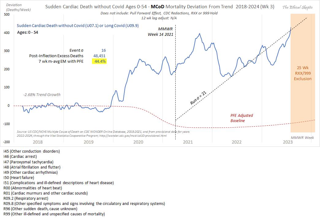
1. He used the wrong ICD-codes: used 'heart disease in older persons' (many of whom died in 2020/21 from Covid), not 'sudden cardiac death in younger persons' (see panel 1 chart done correctly).
2. Used an ICD R99/999 and Lag depleted 2023 data set (see data in panel 2). This is simply malicious.
3. Diluted the group with population growth (this cohort shrank actually, but he used total population - cheating, idiocy or both).
4. Did not use pull forward effect, as a professional does.
5. Quashed the chart into a full range y-axis magnitude to make it appear flat.
6. Put in a fictitious regression line, when the weekly line shows clearly an increase (save for his corrupted 2023 numbers)
Ethical Skeptic didn't specify how he calculated the baseline for excess deaths. But if he only fitted the baseline based on data from 2018 and 2019, then it might explain why the line for excess deaths appears to be so flat in 2018 and 2019, and the line would've probably looked less flat if he used a longer fitting period so the baseline wouldn't have adapted as closely to the data in 2018-2019.
I did queries at CDC WONDER for ICD codes in Ethical Skeptic's plot,
but I split it out into one query where the multiple cause of death
included one of the cardiac-related ICD codes he used in his plot, and I
did a second query for the R96 and R99 ICD codes which are used for
unknown and unresolved causes of death:
https://
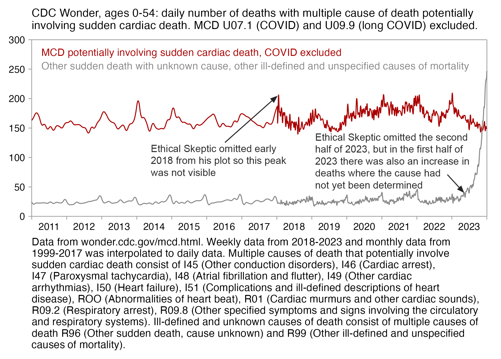
I got a large spike in cardiac deaths in early 2018, even though it
lasted only a single week. It was not visible from Ethical Skeptic's
plot because his blue line which shows the excess deaths only starts
around the beginning of March 2018. At first I thought Ethical Skeptic
may have deliberately omitted early weeks of 2018 from his plot to make
later spikes in deaths seem more impressive in comparison to the flat
excess deaths in 2018 and 2019, but he told me that the blue line in his
plot was actually a moving average, so the first weeks of data were
included in the moving average for the point that was plotted around the
start of March 2018. He wrote: "The initial months
are smoothed into a 7-w moving average data line, so they are in there.
I will add a tapered-moving average version of the the initial months
into the future versions of the chart to allay that
misconception." [https://
Ethical Skeptic omitted the last 26 weeks of 2023 from his plot because there was a large increase in R96 and R99 deaths where the cause had not yet been specified. His plot also had a large increase in deaths in the first half of 2023, but it seems to be mainly due to deaths where the cause has not yet been specified and not due to cardiac deaths (especially since I retrieved the data in my plot below later than Ethical Skeptic retrieved his data, so at the time he retrieved his data the number of R96 and R99 deaths in the first half of 2023 would've been even higher than in my plot):
In Ethical Skeptic's plot the excess deaths looked flat in 2018-2019, but it might partially be because he fitted his baseline against data from only 2018 and 2019, because if you fit a seasonality-adjusted trend against only two years of data then it's easy to get the baseline to match the data closely. In the plot below where I fitted the baseline against data from 2021-2022, I also got my excess deaths to look roughly flat in 2021-2022:
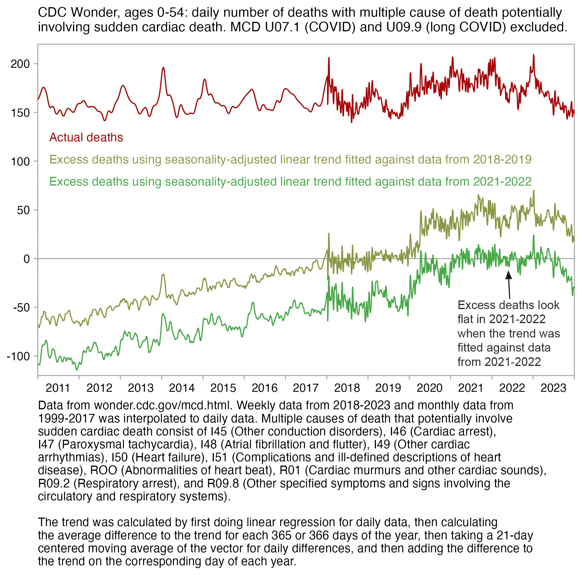
library(tempdisagg); library( ggplot2); library( stringr) wonder=\( x){ t=readLines( x); t=paste( t[ 1:( grep( "^\ "(---| Total) ", t)[ 1]- 1)], collapse="\ n"); read. table( sep="\ t", text=t, header=T, na. strings=" Not Applicable")[- 1]} old=wonder( " Multiple Cause of Death, 1999- 2020. txt") old=td( data. frame( as. Date( paste( old$ Month. Code, 1), "% Y/% m %d"), old$ Deaths)~ 1,, " daily", " fast")$ values new=wonder( " Provisional Mortality Statistics, 2018 through Last Week. txt") covid=wonder( " wondercovid. txt") mt=match( covid$ MMWR. Week. Code, new$ MMWR. Week. Code) new$ Deaths[ mt] =new$ Deaths[ mt]- covid$ Deaths new=td( data. frame( as. Date( sub( ".* ending ", " ", new$ MMWR. Week), "% B %d, %Y")+ 3, new$ Deaths)~ 1,, " daily", " fast")$ values ill=wonder( " ill. txt") ill=td( data. frame( as. Date( sub( ".* ending ", " ", ill$ MMWR. Week), "% B %d, %Y")+ 3, ill$ Deaths)~ 1,, " daily", " fast")$ values illold=wonder( " illold. txt") illold=td( data. frame( as. Date( paste( illold$ Month. Code, 1), "% Y/% m %d"), illold$ Deaths)~ 1,, " daily", " fast")$ values d=rbind( old[! old$ time% in% new$ time,], new)| > " colnames<- "( c( " x", " y")) xy=cbind( d, z=" Actual deaths") ma=\( x, b=1, f=b) rowMeans( embed( c( rep( NA, b), x, rep( NA, f)), f+ b+ 1), na. rm=T) prediction=d$ x> =" 2018- 1- 1" & d$ x< =" 2019- 12- 31" linear=predict( lm( y~ x, d[ prediction,]), d) days=substr( d$ x, 6, 10) daily=tapply( d$ y[ prediction]- linear[ prediction], days[ prediction], mean) daily=ma( rep( daily, 3), 10)[( length( daily)+ 1):( 2* length( daily))]| > setNames( names( daily)) excess=d$ y-( linear+ daily[